Chantalle McDaniel's Blog Posts

Hello again! Chantalle with you today and I’m so glad to be back, sharing some of my latest projects with you all. Do you sometimes look at all of your lovely scrappy goodies and wonder what you can do ‘differently’ with them? I’ve created two pages which share a similar theme - both working around specific colours. Pulling out coordinates has the potential to look at our supplies in a fresh light.
 
What is Inside Red?
 
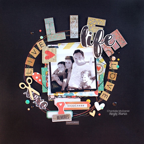
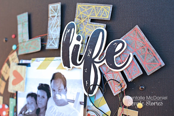
This page captures the moment when my Daughter used her new glasses to read a book for the first time. It was an i-spy book and she came running to me in the bathroom, amazed at all the little details she had never noticed before!
 
 
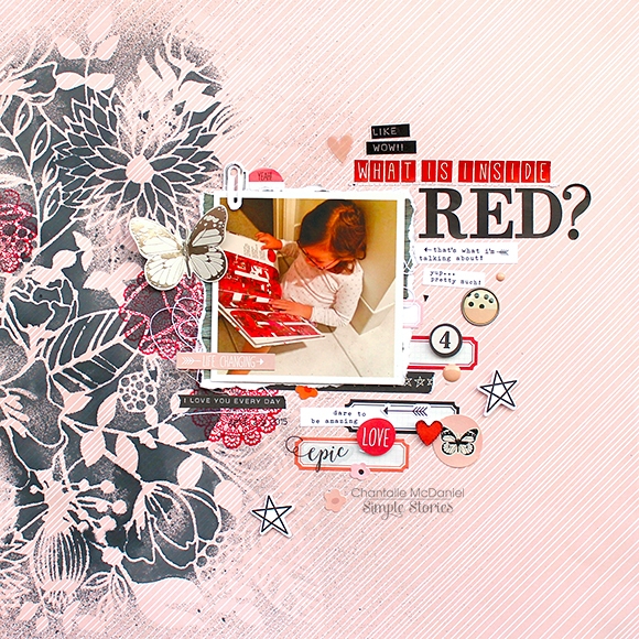
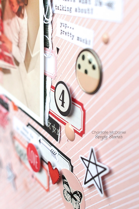
As you can see, I have pulled out some pinks, red and blacks from the Life in Color collection.
 
 
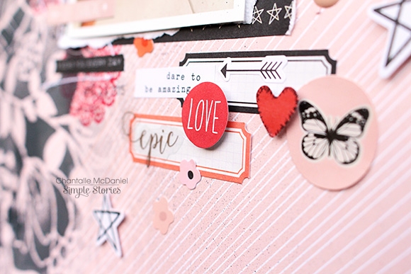
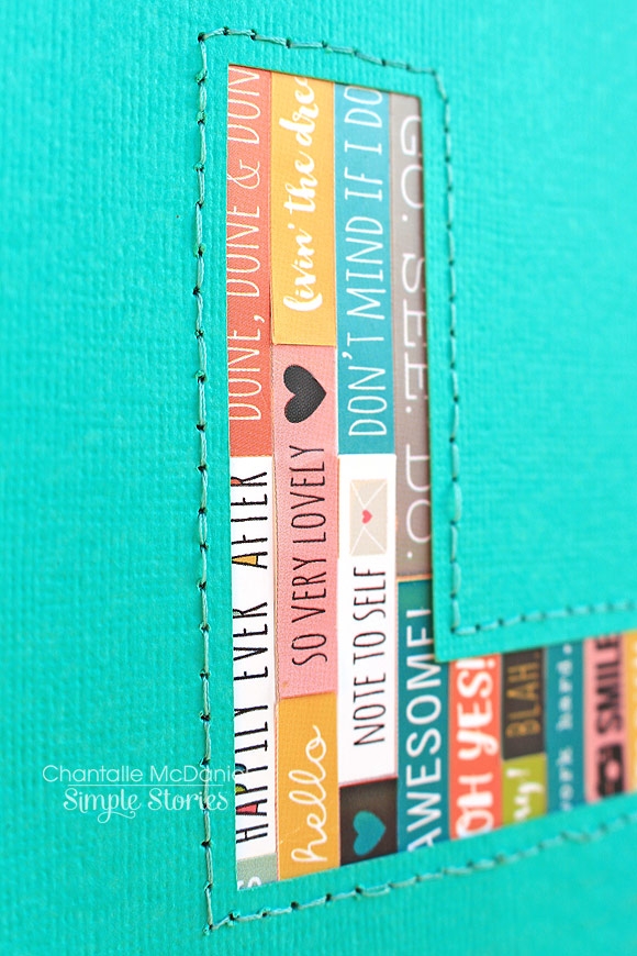
I don’t know what it is about this stunning collection that begs me to get a little messy! I’ve used one of my favourite stencils with some matt black mist. Over the top of that, I’ve added a bit more detail with some red stamping. The pops of red on the left really balance out the elements on the right. You’ll notice I’ve snipped a part of the silver foiled paperclip from the Bits & Pieces pack and used it to mimic a real paperclip. The light isn’t working in my favour in this close up but that butterfly is gorgeous silver foil too!
 
 
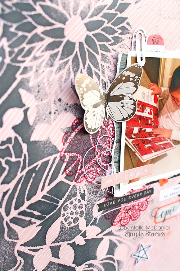
I love using bits and pieces to further tell a story. See a number in a pack of ephemera? Could it be used to show an age of a person? The phrases in the Life in Color 4x6 stickers are so useful for so many day-to-day situations. I love adding them to my pages for a bit of extra info.
 
 
************
 
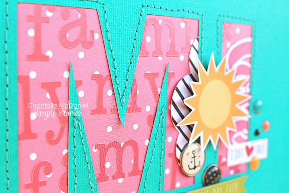
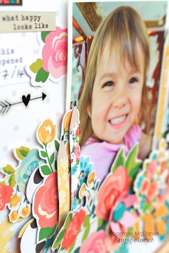
My next page, 'Best Day Ever’ focuses on the reds and a smattering of orange from the Let’s Party collection. This line is bursting at the seams with vibrance and fun! Narrowing the colour palette has brought a softness to it where we can appreciate the subtle details like the pretty sparkle of the glitter print.
 
 
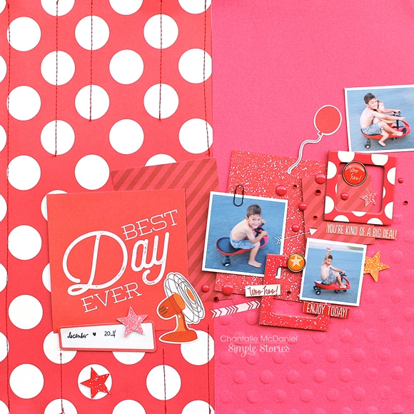
I’ve turned to my ever-faithful SN@P! Pack for a selection of red cards in various sizes. I’m sure you’ve heard me go on about how much I adore SN@P! Packs. They really pack a punch when it comes to value for money!
 
 
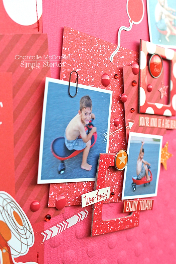
I’ve tried to create a sense of movement by loosely arranging the cards across the horizon and then working on filling the spaces in between, with my photos and some chipboard frames. The little fan was sneaked from a sheet of Summer Vibes Fundamentals stickers. I love the way it makes it look as if it’s blowing my crazy little boy across the page.
 
 
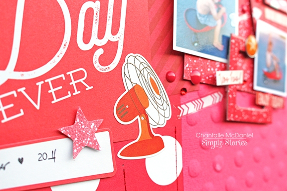
Check out the runaway balloon! Another favourite technique I like to incorporate, is to mimic patterns. In this case I’ve jazzed up some plain cardstock with a dotted embossing folder. I initially thought about doing the whole piece of paper but it would’ve been too dotty! This way, there are just enough to echo the shape without going overboard.
 
 
Thank you so much for stopping by today. Wishing you a fantastic weekend!


Supplies

Hello everyone! Chantalle with you with today. It’s great to be back on the blog with two pages, which both have one of my favourite family photos. It’s so rare that we get a good one of all of us (I’m usually the one behind the lens!) but it inspires me to just grab a passerby to snap a quick shot - you never know, it could be a gem! As you will see below, it’s amazing how a simple colour scheme can influence the feel of a photo.
 
In my first page, titled ’Live, Life, Love’  I’ve used the gorgeous Life in Color. I am continually surprised by this collection. Each time I look at all the elements, I find something new to drool over! I’ve really embraced the artistic side to this line, drawn to just creating freely, knowing it will all coordinate perfectly.
 
 
At a very busy time in our family’s life, I am being reminded that we need to hold on tight to each other. The circle of life goes on and on! I’ve used the letters in the Bits & Pieces pack to spell out the word ‘life’ and then reiterated the idea with a chipboard sticker with the same word. 
 
 
Lots of layering is contained within some machine stitching. Sn@p! cards are an easy way to create a stack with minimal effort as they are pre-cut and ready to go. I’ve used some rainbow thread which is so striking against the black card. Tip: Makes your chipboard frames literally stretch further by snipping them in half.
 
 
The heart is fashioned out of some thin flexible wire. I’m loving this textile at the moment! It adds a sense of delicate grunginess to the page.
 
 
One heart-shaped wood veneer has been painted white so the two don’t blend in to each other too much. It’s tricky to see in this pic, but the happiness tag, with its lush silver foil, co-ordinates perfectly with the black and white photo.
 
 
************
In this page you can see what a difference it has made by removing the dark frame and focusing more on the lighter areas of the photo! Carpe Diem was a great choice for something fun and vibrant. I keep seeing lots of large letters around at the moment and they look fabulous! I had to try it out for myself, so I cut the title out using my Silhouette Cameo. Behind the letters, I have filled the spaces with different elements, trying not to take away from the words themselves too much.
 
 
Behind the word ‘My’ we have some super cute ‘Fist Bump’ paper. I’ve played with the dot pattern, popping some circular cardstock and chipboard stickers over a few of them. I’ve also applied a good dose of Glossy Accents over some of them so give them a nice pop of height and shine.
 
 
Inside the ‘F’ of Family, I have gathered lots of hearts from the collection. Tip: It’s always a good idea to add a bit of extra adhesive to chipboard stickers, just in case.
 
 
Inside the ‘M’, I have used some alphabet stickers from the Expressions cardstock sticker sheet to spell out the word ‘family’ repeatedly.
 
 
Bits & Pieces are also tucked inside the letter, with a bright sun topping it off. This was hand cut from a sheet of ’Total Chaos’.
 
 
For the ‘L’ I have used lots of little phrases, also from the Expressions cardstock sticker sheet. I really loved the mixed up effect of all the different letters and their contents but I felt it needed something to bring it all together. Enter a very slow and painstaking backstitch! It really was worth the effort I think, adding a bit of texture and unifying the elements.
 
 
Thank you so much for stopping by today. I look forward to sharing more with you again soon!

Supplies

Hello! Chantalle (www.copasetique.blogspot.com.au) with you today and I’m so excited to be sharing a layout using the new Carpe Diem scrapbook collection!  Live Colorfully, Erin was inspired by the beautiful blooms in this collection. I’m so glad this line has expanded from planners into a scrapbooking collection!

Using a 12x12 sheet of ‘Don’t Mind Me’ as a base, I looked through all the papers and elements in this collection and pulled out everything that had the flower print. I wanted to carry on the floral theme to both frame and emphasise the photo of my Daughter riding the carousel.

By using both chipboard and paper elements, I was able to build up some nice layers and height contrast. So that the print didn’t blend in to itself too much, I also added a few plain floral elements which I cut using some metal dies I have in my stash.

Building layers can really use up lots of foam tape! I like to add height (especially with larger elements) by using some cardboard instead. It is easily found around the home. Thinner card can also be excellent to provide support for hand-cut items, like these pencils. They looked a little out of shape with foam tape, so I backed them with card first and then added foam tape to the card instead.

They now stand nice and straight on my page.

I hope you enjoy creating with Carpe Diem as much as I have!

Supplies

Pages