Christine Meyer's Blog Posts

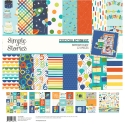
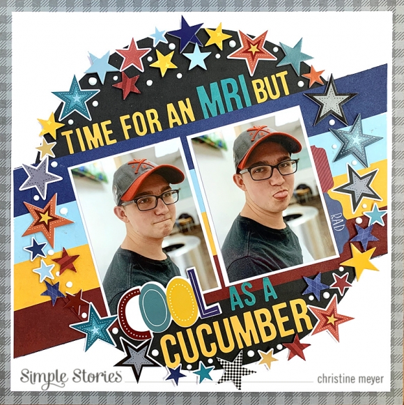
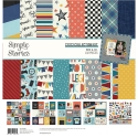
As a mom to three boys, I feel like I am always scrapbooking boy birthdays! Because of that I am always happy to get my hands on a new boy birthday collection that has great patterned papers and embellishments.  Birthday blast has those and so much more!  Christine joining you today to share an Epic Boy Birthday Layout! 

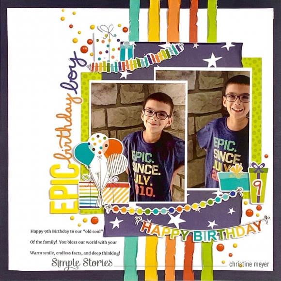
This layout contains lots of layers with the patterned papers and various banners really being the highlight.  I made use of papers from both the 6 X 8 paper book and the 12 X 12 papers.

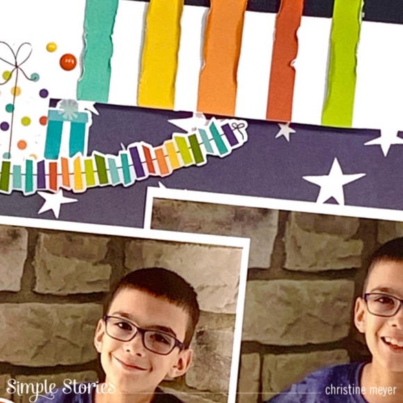
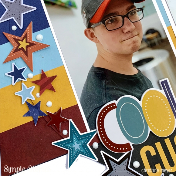
I was drawn to the wonky striped paper "Yay" and decided to use that as a unique base beneath my photos and patterned paper.  I cut them out and then distressed the edges so that they would add some neat texture. Because the stripes weren't perfectly straight, I was able to keep that from being a distraction by doing the distressing. I chose which color stripes to use based on the colors in my son's shirt.

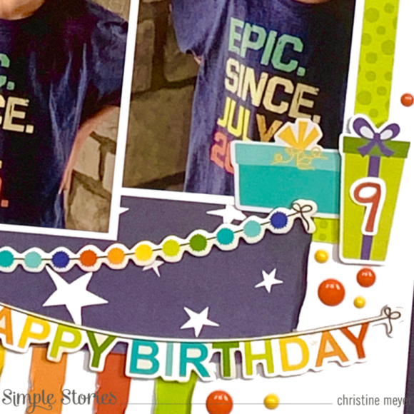
I also made use of several of the birthday present shapes in chipboard, cardstock stickers, and bits & pieces.  I added a "9" to one of them from the 6 X 8 sticker pad to help personalize the story.

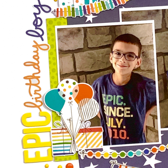
The title is probably my favorite part of this layout.  His shirt says "epic" on it, so I knew that I wanted to include that word.  By combining the Color Vibe Foam Letter Stickers with the script cardstock stickers, I was able to create a really eye catching and colorful title.

If you've got another boy birthday layout to capture, get your hands on Birthday Blast and have a blast ;) creating with it.  Be sure to swing by my YouTube Channel to see the full video on how this came together!

Supplies

Do you ever use really big photos on a layout?  As I looked through the Simple vintage Great Escape collection I was inspired to try printing a really big photo to use with it.  I knew the rich colors from my outdoor photograph would really pop amidst the colors in this collection.  Christine joining you today to showcase a big photo on an outdoors themed layout!

As you can already see, the colors in this were a perfect match.  I cut the picture out in a circular shape allowing one part of the circle to be filled with this gorgeous green patterned paper.  That paper was the perfect match for bringing out all the greens in my photograph! The plaid paper plays nicely off all the colors as well.  I didn't want quite so much of a contrast with the white background, so to soften that I used some of the map washi tape.  I tore it in half to give it an even softer look.

I don't often put my title in a different orientation from my photograph - usually for designs sake - the title is horizontal.  But for today's layout, I really liked the way the chipboard word "wander" looked sitting on the border between the picture and patterned paper. The eyes sometimes like something unexpected and you run with it!

The ephemera in this collection is to die for.  I loved the foliage pack especially and as you can see, I used it to create a giant fern cluster on one side of my photo and used it a second time as anchors for my title work.

My final big design choice involved how to add more colorful to this very green layout.  I opted to bring in some of the butterflies from the ephemera packs alongside the brads.  Both of these brought in some additional pops of color and dimension without being too overwhelming.

If you want to check out how this whole layout came together, you can catch all of the details on my <a href="youtube.com/cameyer71">YouTube Channel</a>!

Supplies

Teenage boys can be hard to scrapbook about!  Then you add a tough situation and it gets a little more challenging.  Bro & Co was perfect for helping me tell the story of my oldest son waiting for an MRI after having a seizure.  It's not really a moment a mom wants to ever encounter, but since we did, we need to tell the story!

One of the cool things about this collection is that it has so many on-trend items.  I know it will make it easy to scrapbook a lot of everyday moments.

You simply can't go wrong with stars for those boy layouts, no matter what their age is, they work so great.  The colors in this collection really make these ones shine for teenagers.

Patterned papers are also abundant in style and colors for this one.  I couldn't resist this retro striped one.  After cutting it out into a circle, I cut out the stripes on another sheet of it.  Then I layered the circle onto white paper with the additional stripes continuing outward on both sides.

The colors in the stripes then guided me in choosing embellishments and title colors.  My title combines both Foam Stickers and Color Vibe Letters.

While there aren't a ton of elements on this layout, I really gave a workout to the ones I did use.  If you'd like to see more detail on how it came together you can check out my YouTube channel for a full process video.

Thanks so much for stopping by today!

Supplies

Pages