Rachel Newman's Blog Posts

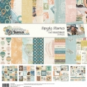
Hi Planner Friends! It’s Rachel and I’m on the blog sharing my travel planner setup for this summer using the Simple Vintage Traveler Collection ! It is never too early to start planning, right? We have two great trips coming up this summer and with a big move as well, I thought it would be a good idea to get this Aztec Traveler’s Notebook ready to go before all the moving and traveling begins!

For both trips, we will be traveling lite, so I wanted to try and prep this travelers notebook ahead time to limit the amount I am bringing on the trip.

To do this, I decided to not only decorate the covers of the inserts, but also a majority of the insert pages. I used the Combo Stickers, papers scraps from the decorated covers, washi, 4x6 stickers and the stamps. With pre-decorated pages, I will be better able to focus on documenting instead of decorating while I’m on my trips.

I have three inserts inside this travelers notebook cover. The first insert is a slimmed-down weekly insert with only the number of weeks I will need for my two trips. To do this, I simply removed the staples from a weekly insert and pulled out the pages I needed. I also added two dot grid insert pages and adhered June and July monthly printables to these pages. I am left with an insert that is totally customized to what I need, and a lot less bulky! I kept the Kraft paper cover and decorated directly on top. I used the Take Detours Paper from the collection and decorated with the Combo stickers and 3x4 card from the SN@P pack that I fussy cut to use as a big label to write the dates and places we will travel to.

One thing I love about this collection is the muted colors, that will easily match any kind of travel photos that I take, or memorabilia I collect. I am also a big fan of the vintage vibes along with the photo real elements. This collection is great for someone looking to just add photos and journaling. With the pre-made clustered elements so much of the decorating “guess work” is done for you, allowing you to focusing documenting the memories!

The second insert is the more “functional” insert . The cover was super simple to put together (again, this collection does the heavy lifting for you!) with a trimmed down piece of the Off the Grid Paper, Combo stickers and SN@P Cards, washi tape and 4x6 Stickers!

This lined insert will house all the logistics of our trips including our flights, accommodations, packing list, agendas, transportation and lists like things to do and places to eat. I have pre-decorated a few pages but, for the most part, this insert will be a lot of pen and paper. It is always nice to include one insert like this that you don’t mind looking a little messy. With very minimal trimming, I can also half letter size pages into the insert, or slip inside the elastic band.

The third insert is my memory keeping insert. This graph insert will be part journal, part scrapbook and part junk journal (for all those receipts, brochures, business cards, map I inevitably accumulate during my travels). On previous trips, I would have separate notebooks for each and would always come home with three, half-completed inserts. My goal is to fill one insert with all my travel memories from this summer, and not hold onto a bunch of items I think I will use later to document(and never do!)

To make it a little easier on myself, I have decided to prep a few pages outside the insert using the the 6x8 paper pad and from the Simple Basics Kit. Having a few unbound pages gives me dedicated spaces to create more scrapbook type layouts that I can adhere into the notebook once they are completed. This is especially helping if I plan on stamping, as it gives me a flat surface to stamp on. For two of the pages, I used the layered frames, removed the extra cardboard from the back and adhere only part of the frame so that I can slip my photos right inside. I will be able to add a little bit of journaling, and those memories will be documented!

We can’t talk about a planner setup without talking about the pocket! I used mostly elements from the bits and pieces and a few scraps of paper. When traveling, my goal is to have pockets that aren’t bulky, with decorated pieces I can add to my pages later. If my pockets are bare by the end of the trip, that is good, because it means I did some documenting on my trip!

I hope you enjoyed this look inside my travelers notebook! What are best tips for documenting your travels?

Supplies

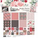
Hey planner enthusiast! It is Rachel again, and I on the blog today sharing my A5 Planner setup for February that I am just SMITTEN with it! I not only love this beautiful blush pink planner, but I am also swooning over the Kissing Booth Collection! The pinks and reds with the pops of black and white - its perfection!

Probably the hardest part of setting up a planner for the month is figuring out which gorgeous papers to use. This collection did not make it easy on me!

This year, I am using the Good Vibes Monthly Planner inserts, but I decided to just alter the February divider a little bit with the element cards and combo stickers. You don’t always have to create a monthly dividers from scratch! Use the dividers you have, and just alter them a little to fit the theme you are going for.

Another trick? Use a removable adhesive on your altered divider. You can always make it permanent later!

This month, I am switching things up in my A5 planner to better fit my needs. I decide to put all of my necessary sections right behind my monthly divider and move the rest of the monthly inserts to the back of my planner. Since this planner is for all things home and personal projects, I made different sections based my needs. To make these sectioned dividers, I pulled out some of my favorite DIY divider tools - My divider templates, a scissor or paper trimmer, my 6 hole punch and my Labels A5 Sticker tablet. With just these tools you can make a planner divider out of anything!

My dividers are pretty simple this month for two reasons. One, I just couldn’t bring myself to cover up these papers (sorry, not sorry)! And two, this planner often bulks up pretty quickly, so I’ve learned to keep the dividers pretty simple so that I have a smooth surface to write on. Plus, that means I can add in some sticker storage, which is a higher planner priority for me!

I mentioned that I moved all my monthly inserts to the back of the planner. While the tab colors are beautiful, they didn’t match my theme for this month, so I decided to add in a 6X8 pocket page with a trimmed piece of paper from the collection to separate the sections. Fun Fact: this planner punch is AMAZING! It is quite heavy duty and punch through pocket pages with ease! I have also used this punch with laminated pages too. I have had my fair share of 6 ring punches since my planner addiction began, and this one is by far the best!

Here is the pocket page inside the planner. The monthly inserts are behind and easy to reference, but are not interfering with this months setup! Added bonus: this pocket page can act as storage for important papers, receipts, and photos collected throughout the month.

Again, that punch for the win! I re-punched a 4x6 pocket pages easily for sticker storage in my planner. If the stickers aren’t with my planner, I’m less likely to use them so onboard storage is a must for me.

And now for the planner pages! Here is my monthly setup for February. I used scraps from the divider papers along the top of the pages and as faux washi to mark off a trip I’ll be taking this month.

I love using the insta square stickers from the 4x6 Sticker pack on the monthly pages and layering label stickers over them.

One of thing I am most excited about this month is the opportunity to attend the Chicago Planner Conference! A weekend with other planner enthusiast - yes, please!

My Monthly dashboard helps me remember the big events for the month, set a few goals and have another place to add all the pretty things! I love that the Carpe Diem version of this page is very simple and easy to customize.

I think it is safe to say that I LOVE how this weekly spread turned out! If you have been following me for a while, then you know I am all about making planner inserts work for you. These appointment inserts usually come with Monday through Thursday on the left side of the page, but my brain likes to Monday through Wednesday on the left side.

Since these inserts have such a simple layout, it was pretty easy to just shift the days of the week over. I used Alpha stickers to mark the days of the week. I even was able to add a sidebar on the left hand-side to track a few things (like happy mail!)

These inserts have an hourly schedule on Monday and Thursday. I didn’t need it, so I covered it with circle stickers to use for daily tasks I left plenty of space on the weekend to record my highlights from the planner conference, too!

I hope you enjoyed this pink peak inside my planner for February. At the end of the month, I will share a flip through of the completed pages on instagram, so make sure to check it out!.

Supplies

Hey planner friends! It’s Rachel, and I am back on the blog sharing my January setup in my “on the go” planner/wallet. Now I know that from the outside, this looks a ring bound planner, but surprise! It’s actually a travelers notebook! I shared a few months back how I converted or “hacked” my personal size planner into a B6 (5x7in) travelers notebook and I’m back in this planner for the month of January!

I “hacked”a few of the travelers notebook inserts by trimming off less than an inch from the top and bottom to make the notebooks a B6 size. I have three inserts this month; 1 blank insert for notes/brain dump, 1 for my calendar/bullet journal, and 1 lined insert for journaling. In the back, I have a pvc wallet insert.

I am using the Simple Stories Freezin Season collection this month for decoration and I could not be more in love! Even though this is a winter collection, I love the mix of coral, yellow and pink - such a cheery choice for winter!

And how adorable are all the little creatures with their cozy winter gear? This penguin makes me so happy every time I open my planner.

Making insert covers is alway so fun! And easy! My process involves only one 7 inch cut of the 12x12 papers I used. Once this cut is made, I simply fold the rest of the paper around the insert and adhere down with a little washi tape on the inside cover. Add a few element cards and combo stickers and I am done!

Sometimes, I think people shy away from travelers notebooks because they are worried they won’t be able to finish the whole insert. If that’s you, here is a trick: since these inserts are stapled and not sewn, you can easily remove the staples and take out some of the pages to have a slimmer insert, which makes it easier to fill up! This is exactly what I did. I knew I only wanted my planning insert to be for this month, I removed the staples and pulled only 6 insert pages and slipped these insert pages into the cover. This is especially helpful if you are like me and you love to stamp. I can just pull the pages you are working on from the travelers notebook and stamp on a flat surface.

I wanted to do something a little different this month, so I am trying my hand at bullet journaling. Honestly, I don’t think this is a true bullet journal, but that is ok with me! For the monthly spread, I measured out the boxes I needed and used my rectangle photo crop to make the lines. I knew I wanted to use my stamps, so I found some inks that perfectly matched this collection and then stamped out the days of the month. Once the month was setup, I got to decorating! I used the 4x6 stickers to decorate in the open space. I love coming back to this page all month!

I decided to create a monthly dashboard that I can use as a “currently” page and for some memory keeping. Again, I used the photo crops to trace out my shapes, some washi, and the 4x6 stickers and I was done! These pages will get filled in at the end of the month to act as a “recap” of what happened.

On the next two pages, I made an expense log and wishlist. I’m trying to be better at tracking my personal spending and to make a wishlist first, to avoid spending impulsively.

On to the weekly spreads! Part of the reason I wanted to try out bullet journaling this month was to experiment with different weekly layouts. Here I chose a favorite vertical layout. I mixed stickers and stamps including Make a List, It’s a Date, and Plan It Stamps.

The following week I switched things up and created a week on 1 page layout on the right-hand side with my to do’s and habit tracking on the left-hand side. I used several of the A5 Sticker Tablets on this week including fitness, calendar, and home. A great layout option, though, I was pretty sick all week and not much got done or tracked. That said, I would definitely use this weekly format again.

Thank you for stopping by to see my planner setup for January. Be sure to check my instagram to see how the rest of the weeks turned out.

Supplies

Pages