Jennifer McMurtrey's Blog Posts

Hello Simple Stories friends! It’s Jen today with a layout using the new Cozy Days collection. Fall is without a doubt my favorite season – the beautiful leaves, going to football games (usually), and of course pumpkin spice lattes. This year autumn activities may look a little different, but I know I will enjoy it just the same.

When it came to using Cozy Days, I literally could have used every single piece. There is not one thing in this collection that I do not love. With that being said, let’s take a look at my layout.
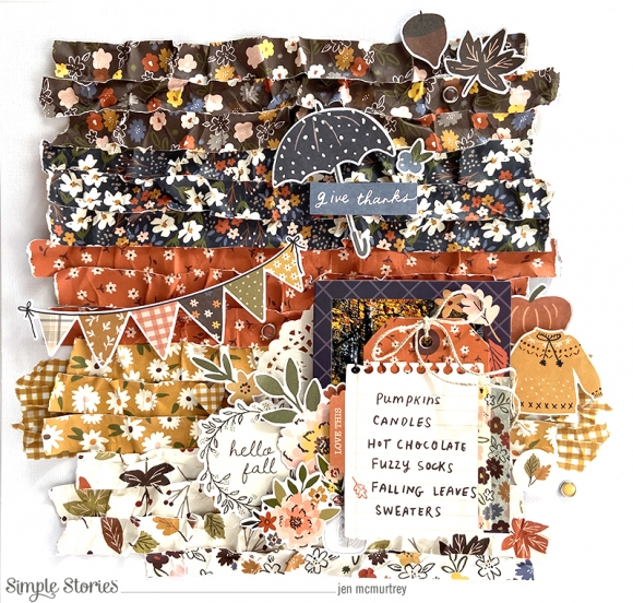
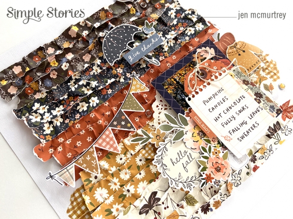
Adding texture to projects is one of my go-to methods, which is exactly what I did here. After choosing several of the floral-patterned papers, I cut three strips from each that were ¾” wide. Next, I took each strip and balled them up in my hands, rolled them around, and did my very best to make them look like they went through the laundry. LOL!

Once the strips of paper looked good and worn, I attached each with my ATG making sure to wrinkle and fold them as I went.
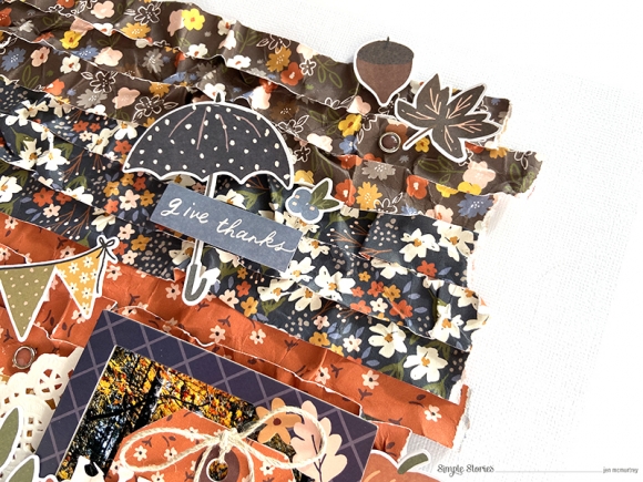
Embellishments followed, and I tried to keep like colors together . . . meaning I used orange embellishments on the orange patterned paper, etc. At this point, I did not yet adhere them to the background because I was still working with the placement of the photo.
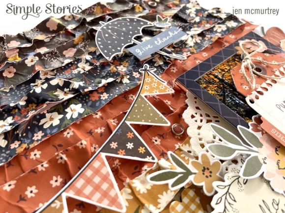
For the photo, I selected a cardboard frame to use with it and adhered both to the layout with foam squares. This particular frame has an adorable raccoon on it, but I decided to layer flowers and a sentiment with it.

I fell in love with the cute tag die cut that looks like notebook paper that’s been torn out (must be the teacher in me). To give it a bit more color, I stamped the leaf onto it using orange ink. Next, I adhered it to the frame with washi tape and put my journaling behind it.
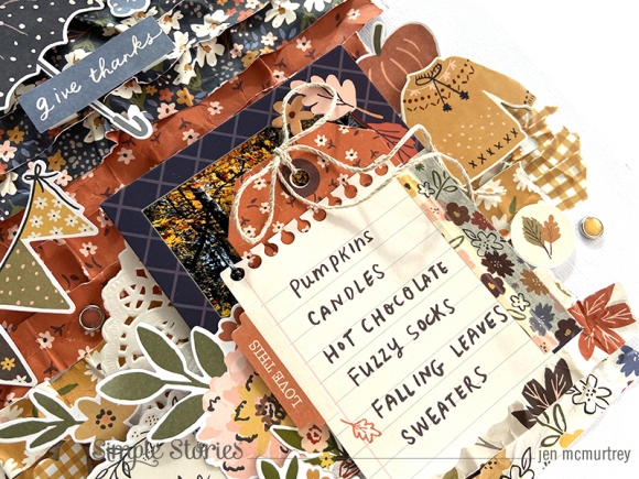
I hadn’t planned on covering the photo in the beginning but I like how it turned out.

After completing the embellishments on and around the photo, I adhered everything to the page.
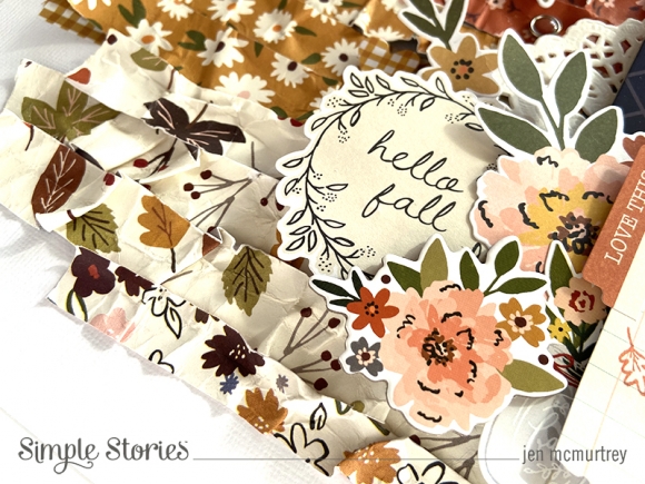
The colors and patterns in the Cozy Days collection absolutely warm my heart, and I cannot wait to create more projects with it.
Thank you so much for stopping by today! I hope that you have been inspired to document your favorite fall memories with this lovely collection.

Supplies

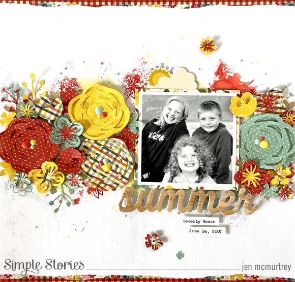
Hello friends! It’s Jen today with a layout using the Summer Farmhouse collection, which is one of my favorite Simple Stories releases. The cute prints and bright colors make me so happy!

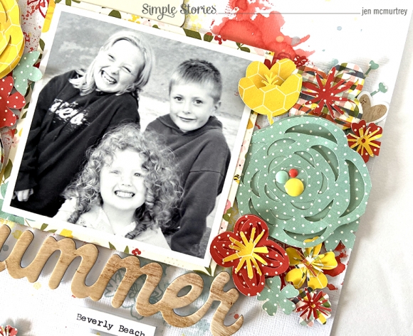
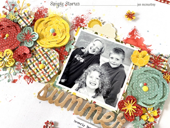
This summer has been different from those in the past in that we haven’t been able to take a vacation. Because of this, I have spent a lot of time looking through and printing some of our older family photos. This picture of my three kids is one that I just love - they are all sitting together and actually smiling! Bonus!

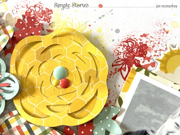
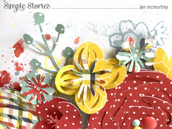
To begin this project, I used oxide inks to create a mixed media background. First, I mixed one color with water and used the smushing method to apply it to the white cardstock, followed by the next, etc. Next, I used the Summer Farmhouse stamps with the same inks and stamped flowers on top.

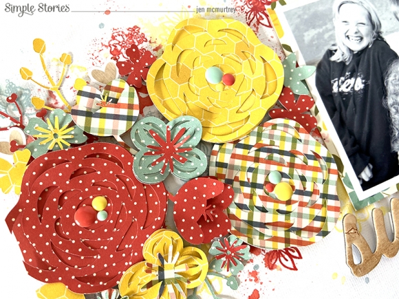
The next step was to cut several flowers and leaves using the Flowers cut file from the Silhouette Design Store.

After adhering my photo with foam squares, I began layering flowers across the page. Each of the flowers and leaves is adhered with foam as well to give them dimension.

The flowers and inks complement one another perfectly and bring so much depth to the layout.

The color and dimension from the inks and flowers looks amazing. To give them even more texture, I added enamel dots to the centers of each of the large flowers.

Because the flowers are so detailed, I kept the title and journaling to a minimum. To anchor the white space, I added strips of torn washi tape along the top and bottom of the layout.

I love the dimension on this layout and can’t wait to create with this gorgeous collection again. Thank you so much for stopping by today.

Supplies

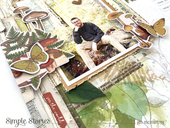
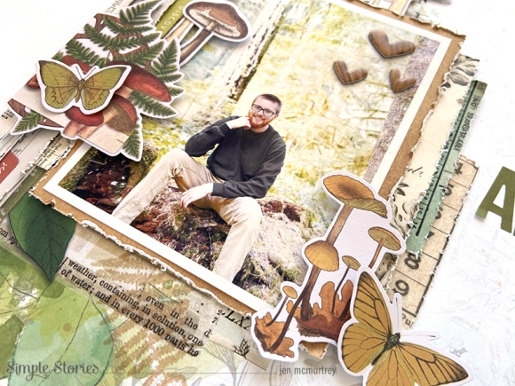
Hey everyone! It’s Jen today with a project using the amazing Simple Vintage Great Escape collection. Recently, my son embarked on a camping trip with his girlfriend to nearby Mt. Rainier. Because my love of memory keeping is no secret with our friends and family, they took tons of great photos and shared them with me. What a gift!

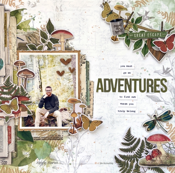
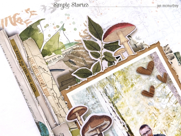
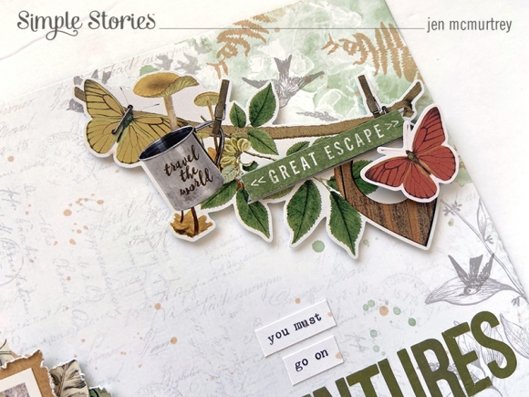
I was really drawn to the Wild & Free patterned paper and used it for the background – the illustration of the old book pages is gorgeous. Before adding any embellishments, I used the stamp set to add more fern leaves in brown and a few more birds in gray.

To add more depth, I cut apart another of the same background paper, distressed the edges of what I’d cut, and layered the pieces on top of their identical counterparts along the left edge. Doing this really made the background look as if it’s made of pages from a book.

Next, I moved to the right side of the layout where I added a cardstock banner sticker in the upper corner. I used foam squares to adhere the Great Escape sentiment sticker with a die cut butterfly on top of the banner for more texture.

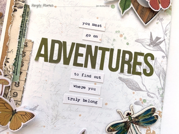
The title, which is a quote, uses Color Vibe Bold alphas with wording created on my manual typewriter.

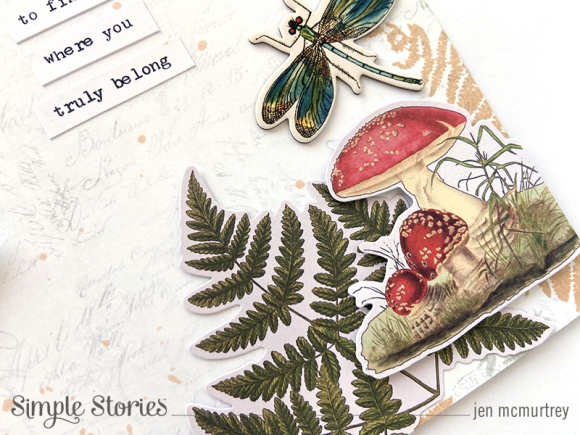
In the bottom-right corner, I used die cuts and chipboard to add more color to the project. The embellishments in this collection use such deep, rich hues that are absolutely stunning.

To complete the layout, I added more embellishments around the photo as well as within the layers of “pages” along the border.

I love this photo of my son and can’t wait to use this collection with the remaining photos from his trip.

Thank you so much for stopping by today!

Supplies

Pages