May 2014 Blog Posts

Hi Simple Stories fans! Cari here with you today and I'm excited to share with you some layouts that I created using some of the new releases.

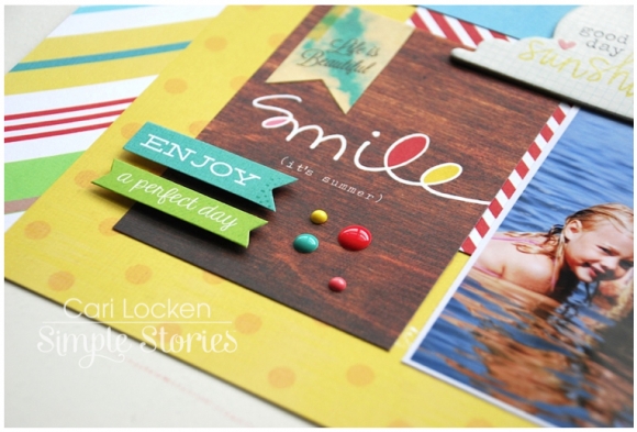
The first layout I'd like to share is one I created using the Good Day Sunshine collection.  I love the warmth of this collection and the super cute designs that capture what summer is all about.

We live close to the beach and spend many summer days there. So my layout is about our last big summer day at the beach before school started up last year.
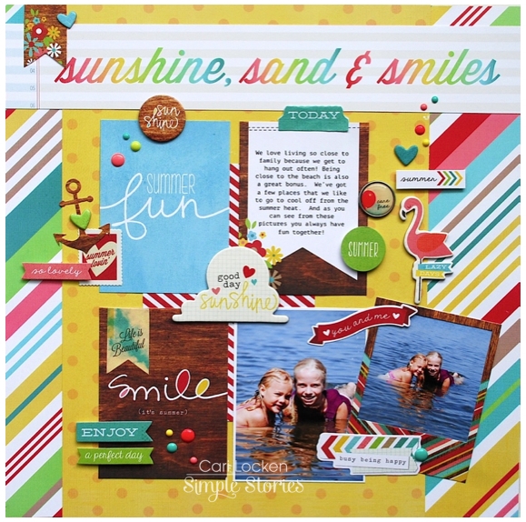
The coordinating stickers, brads and chipboard add so much visual interest and texture.
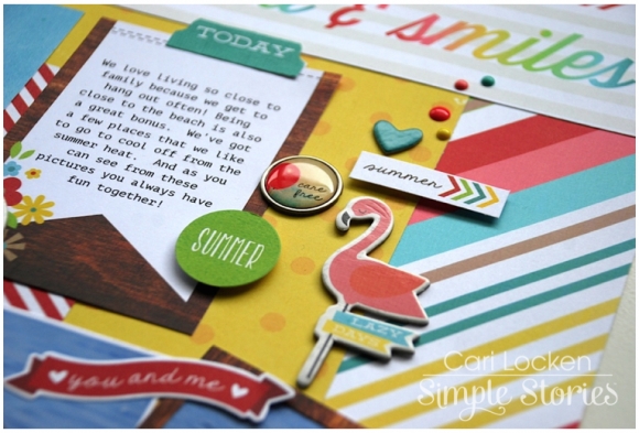
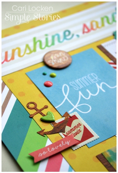
And I just love the new Enamel Dots. Love them!!
The second layout that I'd like to share with you is using The Story of Us collection. This is a beautiful & romantic collection.  I love the chalkboard theme that is throughout the entire collection.  Plus you don't have to use wedding photos - the theme is love and you can definitely use other photos with this collection.

I decided to create a layout about my hubby and me.  We celebrated 16 years of marriage just a few weeks ago. Time flies and boy ... the wrinkles sure do creep in there too.  We really do look young (but we were 30 when we got married so not that young at all!!)
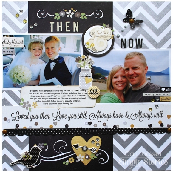
The Enamel Dots in this collection sparkle - how fun is that?

And once again, I just love how everything (stickers, chipboard embellishments, etc) all matches. It makes creating a project so much fun and easy to do.

Thanks for joining me today!

Hi there! Donna here with you as your host for the blog today, and I have a few projects to share with you. First up, by now you know that Simple Stories is the featured manufacturer for the May issue of Scrapbook Generation’s CREATE Magazine! I created a layout using the single-page sketch for this month:

As soon as I saw the sketch I was immediately drawn to the horizontal row of 3x4 photographs. Since there were three of them I decided to do a page about my three boys and use papers and embellishments from A Charmed Life to create this layout:

I simplified the design by moving the journaling space so it would be in line with the photos. I also eliminated the two small detail photos, and instead put a circular die-cut from the Bits & Pieces embellishment pack in their place.

I used the chipboard word “Lucky” and a few arrows from the same collection to create a simple, easy, and fun title. These changes to the design reflect my personal style, but still keep the feeling of the original sketch. Here’s a closer look at the journaling:

I am indeed so lucky to be the mom to these three boys!

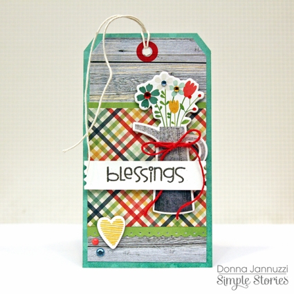
I also made a tag for the issue using the Homespun Collection:

In total, our team created 27 projects for the magazine! See all the sketches and projects and download the May issue for free, here.

Switching gears a bit, I’ve also had a lot of fun playing with the newest collections including Good Day Sunshine. I have loved every summer collection released by Simple Stories (remember 100Days of Summer!?) and this one is no exception. I decided to create a grid using 3x4 Sn@p! cards and photos of the same size.

Summertime is upon us and the papers and embellishments from this collection were perfect for documenting my guys enjoying some of the some sweet treats I’ve been making for them such as popsicles and ice cream.

We’ve made a few of our favorites, but have also been experimenting with new flavors like lemon-buttermilk sherbet and avocado ice cream. Yes, when you live in California avocado ice cream is not so strange! It is surprisingly good and even baby Sam enjoyed it!

I’ve mentioned this before several times, but all of the collections from Simple Stories mix and match so well. The background paper for this layout actually comes from the Hello Baby Simple Basics Kit. I absolutely love the colored woodgrain in that collection and the blue was a perfect match to the colors in Good Day Sunshine.

Thank you for stopping by!

Supplies:

 Fundamentals Stickers, 4x6 Sn@p! Cards,  Enamel Dots, Bits & Pieces, Beach Wood/Ledger


Hello Baby: Simple Basics Kit, Blue Wood/Stars


A Charmed Life: Collection Kit, Simple Basics Kit, Expressions Stickers, 4x6 Sn@p! Cards, Chipboard Stickers, Bits & Pieces, Decorative Brads, Happy Go Lucky, Be Still My Heart, Whitewashed Wood, Yellow Stripes


Homespun: Collection Kit, 6x6 Paper Pad, Chipboard Stickers, Grey Wood/Grid

Supplies

Hi, Angella here with you today, I am so excited to share with you what I have been creating  with the new Good Day Sunshine collection.

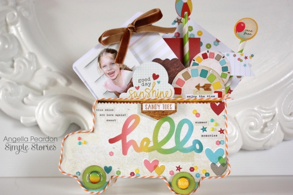
And as soon as I saw the new ranges I was so excited, I just could not stop smiling I had to start creating straight away.  I have created this little Bus Caddy for a few snapshots of my niece who loves playing around in the sun, her smile is a true sunshine.

I inserted a photo of her in a SN@P! Pocket - they're great for your little snapshots; just pop a photo or 2 into the pockets to showcase your memories.  The 4x6 SN@P! Cards are perfect for journaling.

For a great idea, fundamental 12x12 stickers matted onto cardstock and attached to straws make great embellishments.

And it is always fun to finish off creating a card

Thanks for joining me today!

Hello Everyone. It's Mindi here with you today and I am sharing a Life Documented layout using the brand new The Story Of Us collection. 

Being the only scrapbooker of the family (besides my mom), I took on the task of putting together an album for my brother and sister-in-law, all about their wedding. 

When I first saw this line, I knew it was absolutely perfect for my brother's wedding. The pictures, papers, embellishments seemed to be made for each other. I was in heaven. So many fun things to work with. 

For this first page I used the Pocket Page Design 5. I had lots of vertical shots that needed to be included.

To start out I decided that this page really didn't need a title card, but simply some journaling surrounding the photos and to explain what was going on. These photos were taken at the hotel where we all stayed, the ceremony was held elsewhere. 

There were so many fun cards to choose from but I narrowed it down to this card. I gave my Brother and Sister-in-law some "homework" to do and they provided the journaling for all of the cards on this layout. I finished it off with some great embellishments from The Story of Us collection. 

I am always looking for different ways, techniques, ect. to add to my Life Documented layouts. This time I used vellum for a different and elegant look.  Instead of printing off my picture on photo paper I printed it out on vellum. It is real easy to do and has a great, almost transparent, soft look. Here is a quick tip, rub a paper bag (for instance, a brown lunch bag) over the whole piece of vellum before printing. It makes the ink stick better. 

After I had my picture printed out on the vellum, I added photo corners and placed on top of one of the SN@P! cuts that I had embellished. 

I used some more vellum for this photo. I started out with a picture printed on photo paper on the bottom in color. I then turned the photo black and white and printed it again onto vellum. I wanted to make the people in the photo the focal point and so I punched a circle in the vellum photo to make them stand out. 

Here are some more close ups. 

I hope you have enjoyed this look at The Story Of Us. It is both beautiful, classy, and super fun to work with ! 

Hi all! Rebecca Keppel here with a look at the newest Simple Stories summer collection Good Day Sunshine

I love everything about summer. From the warm sunshine to the relaxed schedules to the many, many dips in the pool. I have always been a summer person. So each year since Simple Stories' first summer collection I have waited anxiously to get my hands on the latest and greatest scrapbooking goodies for summer lovers. Good Day Sunshine does NOT disappoint! It is loaded with amazing summer colors, deep rich wood grains, fun playful images and much more. I think the rainbow ombre paper might be my favorite. 

I usually hide some journaling or memorabilia in the Simple Stories Pockets, but this time I added a strip of wallet photos.

I LOVED fussy cutting out a bunch of viewfinder circles and popped up some other fun circles on top.

I literally can't say enough about how much I love this collection. I guess it is fortunate that I will have about 6 months of photos to document with it (since our "summer" in Arizona is a long one to say the least)!

I also made a card based on a sketch from the May issue of Scrapbook Generation's Magazine.

Have you ever seen such a fun combination of ombre, rainbow, polka dots, hearts confetti, epoxy dots and more? Good Day Sunshine will be hitting the stores any day now, so run and scoop it up because summer is on its way!
Supplies

Hi Simple Stories fans, Wendy here today.  I am so excited to share some of what I have created using the newest collections from Simple Stories.  In addition to some great new collections I always stumbled upon a great new discovery (for me).  Besides using the SN@P! Journal Pages in the 6x8 SN@P! Binders and Albums, did you know that you can also use the SN@P! Journal Pages on your scrapbook layouts? 
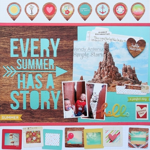
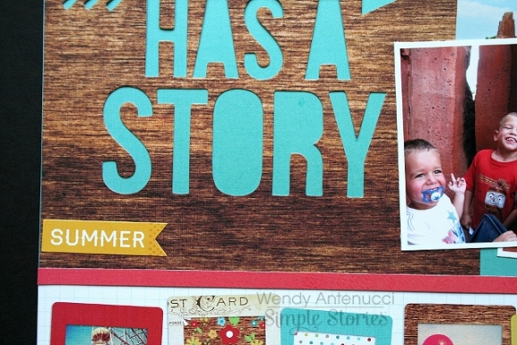
Every Summer has a Story

I never thought about using the SN@P! Journal Pages on my layouts until I was looking through my goodies from the Good Day Sunshine collection and the wood grain and saying on this page totally jumped out at me.

I paired a SN@P! Journal Page with the amazing blue ombre paper (my favorite) which made my sentiment pop.  

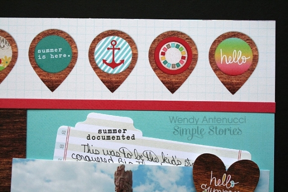
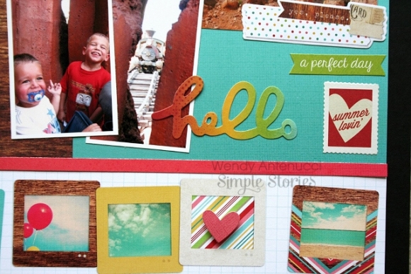
I finished this rather simple page by using the 2x12 Element Borders, one at the top and one at the bottom.  I used a heart die-cut with foam adhesive to add some dimension to the bottom strip.  A few pictures and a journaling card slipped behind my picture that doubles as a pocket finishes up the page.

And a few more details...


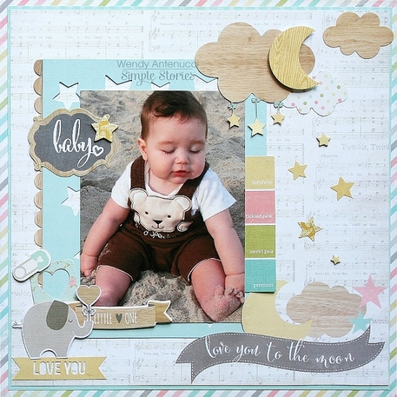
Love You to the Moon

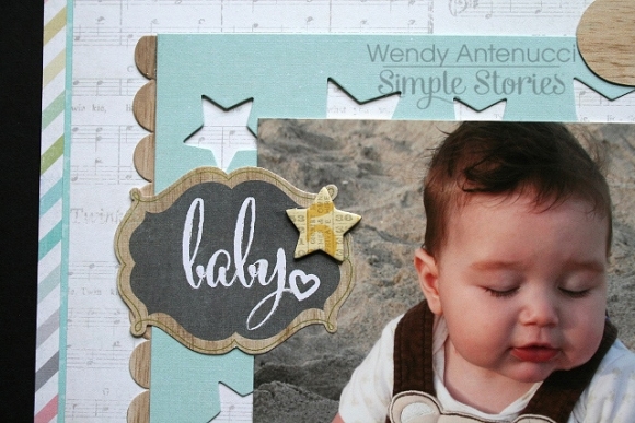
After my ah-ha moment  about using the SN@P! Journal Pages, I couldn't wait to tear into the next collection, Hello Baby  and see what SN@P! Journal Pages were included and I wasn't disappointed!

Do you see that wooden scallop and the lovely star mat?  Yep, those are both SN@P! Journal Pages!

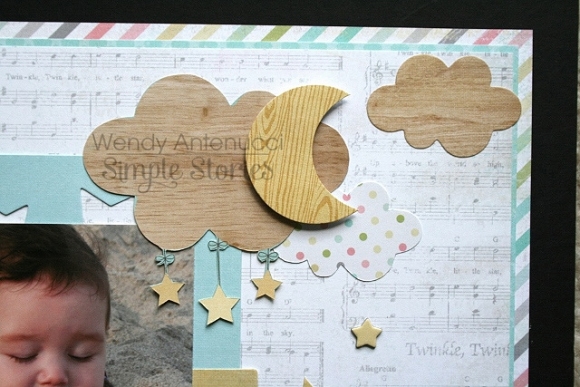
A few fussy cut clouds, moon, and stars to mimic the design on the bottom of the page.  Foam adhesive is definitely my friend, I love layering different embellishments!

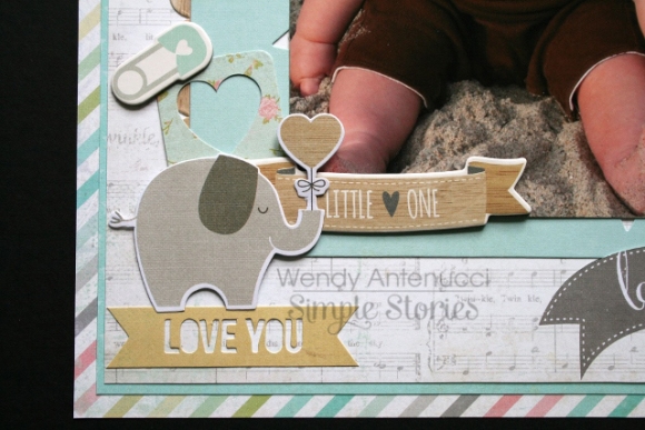
Another cluster of embellishments finish up the page.  I love mixing the chipboard elements with the die-cut pieces, there are so many lovely choices.


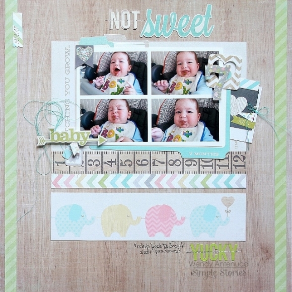
Not Sweet, Yucky

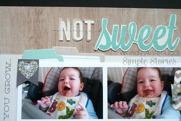
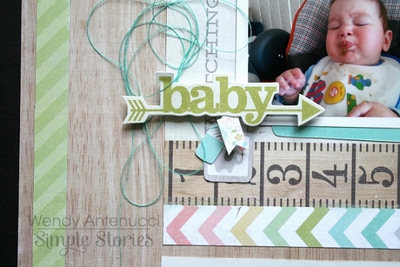
Can you spy the SN@P! Journal Pages I used in this layout?  I used another to mat my picture and added a border to finish off my design.  I couldn't resist using these pictures of my little guy's first taste of green beans and the sweet die-cut and hence my title, 'not sweet, yucky'!  He has since this picture was taken learned to eat them without gagging, but he still spits!

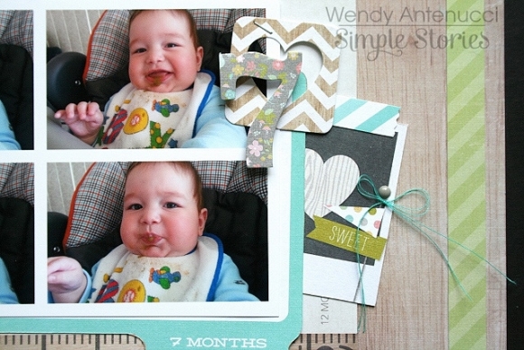
I used the 7 month card from the 4x6 designs to document how old my son is here and a few bits and pieces tucked in to draw attention to the 7.  I tied my thread in a bow and placed an enamel dot on the top of the flag to give the impression that this was a stick pin.

Some messy string to imitate the mess my little guy was making and a few cute tags and pieces to draw attention to his facial expressions.

Thanks so much for joining me today, I can't wait to see what you discover by thinking out of the box!  Stop by my blog for another layout created using the Good Day Sunshine collection, hope to see you there!

Hi friends. It's Heather and I have to tell you that I love the soft palette of colors in the Hello Baby collection and the fun mix of patterns is inspiring me to pull out my girls' baby albums and start working on them again. I love the mix of 12x12 papers combined with the SN@P sets. I think it will make completing their albums a breeze because now I can do a main layout and Pocket Page for each month. Here are 1st and 2nd month layouts of my youngest daughter.

Sweet Little One

I was inspired to create this layout based on the So Sweet 12x12 paper. I love the pattern and wanted to use it as a background but I my photo got a bit lost so I cut up some of the paper elements and recreated the background.

I trimmed the pieces and then arranged them on the page and then stitched lines down the page. Once that was done, I added the title, photo and embellishments. I chose tone on tone wood grain alphas to add her name to the page. The journaling is included on a pull out tab behind the photo.


Baby Love

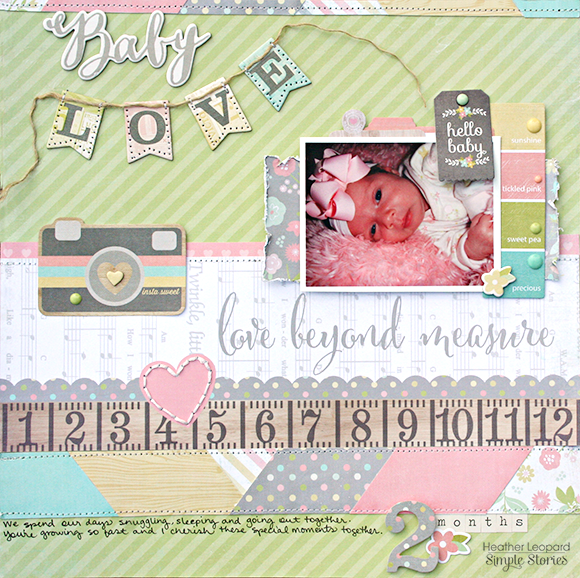
You know when you are so inspired by the products that the pages just come together naturally? Yep, that's what happens every time I get Hello Baby out. This collection makes creating these baby pages a breeze. I had some leftover pieces from paper I cut out for the layout above so I put them to use on this layout by creating a wide border at the bottom and smaller one at the top.

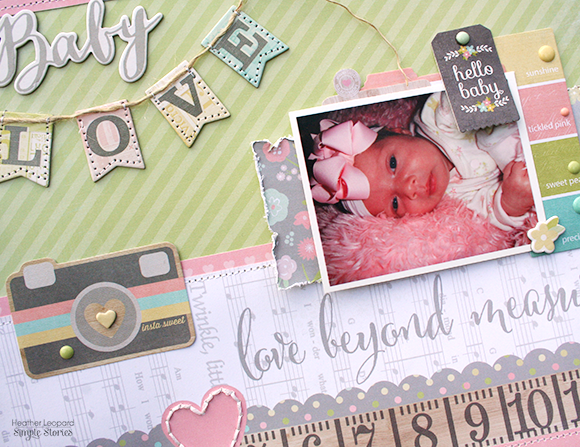
I adore the sentiments that are pre-printed on the papers. They are great to use them as titles but I choose to create a title above and use the pre-printed one as a subtle message. I added hand and machine stitching, embellishments and journaling to complete the page.

Now I just need to get my hands on some 12x12 Pocket Pages so I can complete the complimentary 2nd page for each month!

Hey Simple fans, Nancy here today with a look at our bright and fun new release, Good Day Sunshine. This collections pair a bold color scheme, wood grains and beautiful ombre solids perfect for all of your summer season photos.

I started this layout with a white cardstock background and layers of blue and yellow ombre patterned paper. The postage stamp paper adds a punch of color and whimsy,  while the chevron on wood pattern adds contrast.  

A 4x6 SN@P! Cut card was used (blue dots) to mat the focal point and was the perfect place to tuck a chipboard flamingo. 

Key elements on the page were highlighted with a handstitched circle of white floss. This adds dimension and shape to the page in a subtle way. Enamel dots were added for little splashes of color.

Good Day Sunshine is packed with fun summer icons great for travels near and far or just those things you do at home. Creating layers with SN@P! Pages and Cuts make it easy and fun - just add photos!

Pages