April 2014 Blog Posts

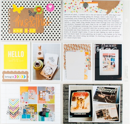
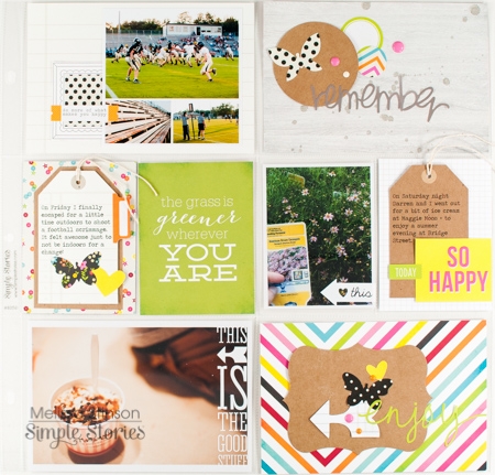
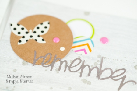
Hello, everyone! Melissa here with you today to share a Life Documented layout using Simple Stories' DIY and DIY Boutique collections.

I had a little help designing this page thanks to a fabulous sketch by Becky Fleck of PageMaps. Becky put together lots of great sketches last month with inspiration for using Simple Stories' Pocket Pages, and this particular one centers around Simple Stories' Pocket Page Design 3.

I didn't have many photos for this particular week in my album, so I was glad to have some extra inspiration to fill those empty pockets!

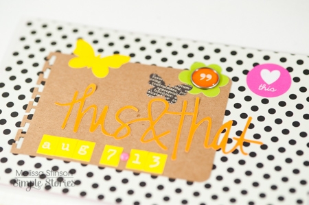
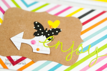
Using a combination of the embellishment cues from the sketch and the layering elements from DIY and DIY Boutique, I was able to quickly build a few decorative clusters to fill in the blank space.

DIY Boutique has a great combination of neutral bases in kraft, cream, white, and black, and I used them liberally to keep the bright colors from the title words, shape stickers, and enamel dots from overwhelming my page.

Hey there!  It's Vicki here today with some DIY goodness to share.  For CHA Winter I had lots of fun creating a series of make 'n takes using pieces of the DIY line.  Let me tell you…I am head over heels for DIY!!  I love to layer and build projects and this line was made for exactly that!  Take a look at some of the pieces I had to work with and let me tell you a little more about it.

This system is set up for success!  First, you have your "Foundations" i.e. tags, cards, pockets and envelopes.  The next step is "Layers" (probably my favourite Simple Stories invention ever!!).  And finally you have the "embellishments" which include stickers (6 sets with 8 sheets in EACH pack!!!!), Clear Photo Stickers, stamps, Enamel Dots and Burlap Icons, Banners and Arrow Stickers!!!  The Foundations and Layers come in both Kraft and Office.  That, my friends, makes for a ton of choices and combinations!!  Take a look at a few that I came up with…

Here are a few ideas using the tags…

Here are some samples using the cards…

Take a look at some pocket samples…

And finally, here are a few ideas using the envelopes…

I could create these DIY projects ALL DAY LONG!!!  They are versatile and fun.  This system works for any type of crafter…cardmakers, scrapbookers, pocket page lovers, etc.  The possibilities seem endless.  I plan on making more with a few different elements and additions and I will post them when it's my turn again to spend some time with you here.

Thanks for stopping by!  I can't wait to hear your thoughts on DIY and see what you create with it!!

Hi everyone! Nichol here today with a 12x12 layout and set of four cards showcasing Insta-Squares from the Homespun CollectionSummer Sn@p! Insta-Squares & Pieces SetWedding Sn@p! Insta-Squares & Pieces Set and Birthday Sn@p! Insta-Squares & Pieces Set. I'm a big fan of using repetitive patterns or shapes on my layouts and other paper crafting projects and the squares in the Insta-Squares makes it so easy to create amazing projects!  

For my layout share today, I used an assortment of 2" squares from several collections. To give these squares even more "pop", I used pierced nesting square dies from My Favorite Things to give the squares and square photos pierced decorative edges.

The dies make the 2" squares slightly smaller so I used a ruler to figure out where to begin adhering these small squares so that the design would be centered in the middle of the white cardstock background. I left a space in the center of the page where I adhered a 4" square from the Homespun Collection and then layered a vellum die cut square and a square from the Homespun Collection die cut with another one of the pierced nesting square dies. I embellished this title square with some Simple Stories stickers.

I embellished the smaller squares with additional Simple Stories stickers, sequins, enamel dots, etc.

I printed my journaling on a Sn@p! label sticker and adhered it across two of the 2" squares.

The Insta-Squares also make super fast cards. I used the same nesting square dies to cut the center panels for the cards.

I've created four completely different themed cards but they all four have the same design. I adhered a 4x4 patterned Insta-Square on a 4.25" square white card base, cut a piece of 4" square vellum to layer over the patterned design and then die cut the center Insta-Square and adhered the center piece with foam adhesive. Simple embellishments are all these cards need. The design of the Insta-Squares don't need much!


Hi Everyone, Angella here to bring you a couple of Easter treats.

I always like to put my spin on any of our holiday treats, especially when it involves gift giving. Making it all more personalized and special, instead of just  grabbing something off the shelf.

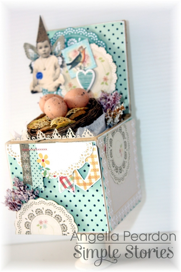
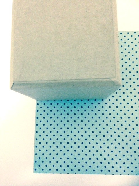
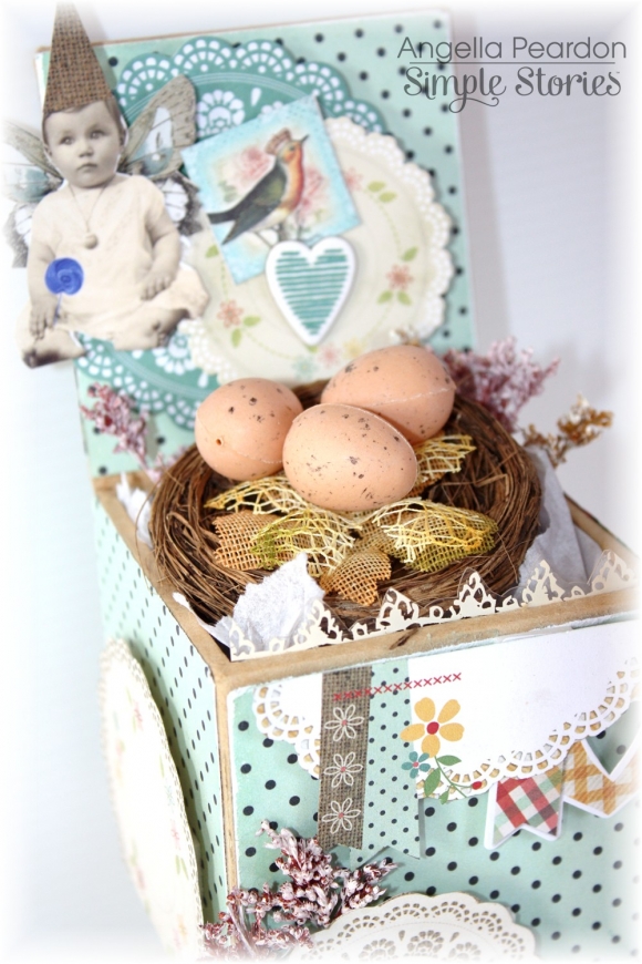
I have used a little chipboard box in which I have  covered with papers from the Homespun collection.

Then all you have to do is decorate your box with fussy cut images from your pattern paper, fill the box with tissue paper, add a nest and eggs and glue a cotton reel to the bottom of the box, to act as a stand for the gift box.

For my next project I created this fun ladybug by drawing an egg for the body, then a circle, cut both shapes out, cut the circle in half for the wings and voila!  

Wishing you all a Happy Easter, and if you're like me, I will be trying to avoid the chocolate overload !

Have a great day!

Supplies

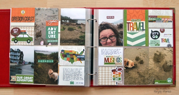
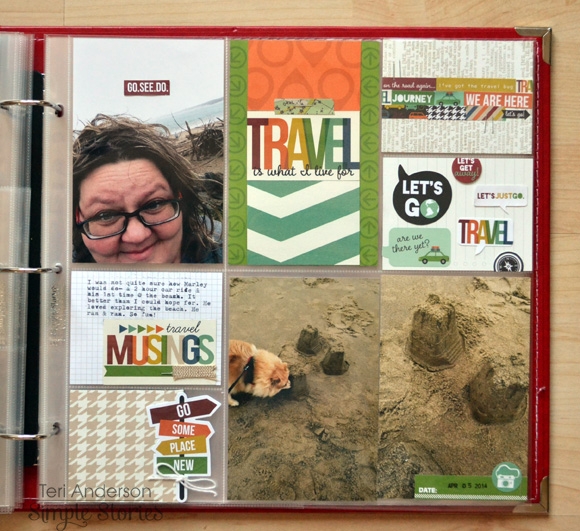
Hi all! Teri here today, and I'm here with another Life Documented project. I'm excited to share with you a few pages I made with the SN@P! Travel set. 

I went on a spur-of-the-moment trip to the Oregon Coast this month with my family. I just love the beach. And this trip was extra special because it was the first time I've ever taken my dog Marley to the ocean.

The SN@P! Travel set was perfect to use for these pages. If you have ever been to the Oregon Coast, you'll know our beaches aren't like the ones in California and Florida. It's a little more windy, a little bit more chilly and a little more rugged here. Instead of seeing folks lying on our beachers in swimsuits, you often see people bundled up in sweatshirts and jeans as they explore the beach.

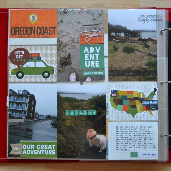
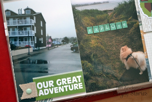
One of my favorite elements on this page is the "Our Great Adventure" title. I made it simply by cutting up a 3x4 SN@P! card and then added a burlap banner sticker to it.

I really went to town cutting up my SN@P! cards on this page too.

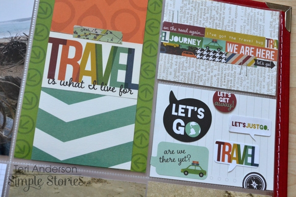
I just love the large "Travel" card. I made it by cutting up several of 3x4 and 4x6 SN@P! Travel cards and mixing them together to make one really big 4x6 card. One of the great things about using cards from the same SN@P! set is you can easily mix them together because they all are in the same color scheme! Sometimes, my brain just needs to grab a pack of SN@P! cards and know they are going to work together no matter which ones I use.

Oh. By the way, what's the little rectangle at the top of the travel block? That's a sticker from SN@P! Travel Stickers.

And check out the card in the upper right corner. I created the border that goes across with stickers. Yep. Stickers. I just love how those stickers together.

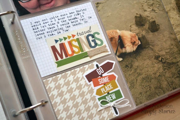
The "Travel Musings" block here was... you guessed it... cut from a 3x4 SN@P! card. I embellished it by adding a burlap banner sticker to it.

By the way, I'm using a 12x12 SN@P! faux leather album in red to document all my 2014 adventures in. Being able to scrapbook out of order is big to me, and I love that the album's ring binding allows me to do that. I used the SN@P! Pocket Pages Design 5 for these pages. I dig that Simple Stories offers so many different styles of pages. It's great to have so many creative options.

Thanks for stopping by today. I'll be back again soon!

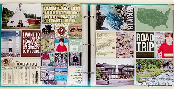
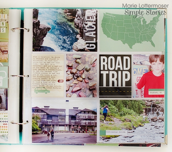
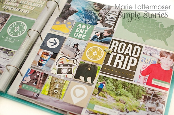
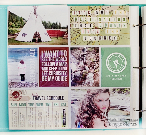
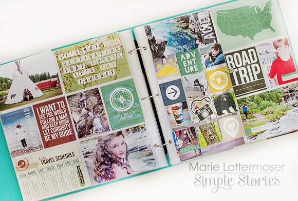
Hi there! Marie here with you today to take you on a road trip adventure with our family using the Travel SN@P! Set.

Every time we go on a vacation I seem to do the same thing. I take 500 photos and promise myself someday I will do something with them.  But usually the photos just end up sitting on my hard drive.  Using the SN@P! Sets has made it easier than ever to actually put my photos together in an album.

These pages are of a road trip we took to Montana to visit Glacier National Park.  We also went on a lot of day trips such as the National Bison Reserve and Bigfork.

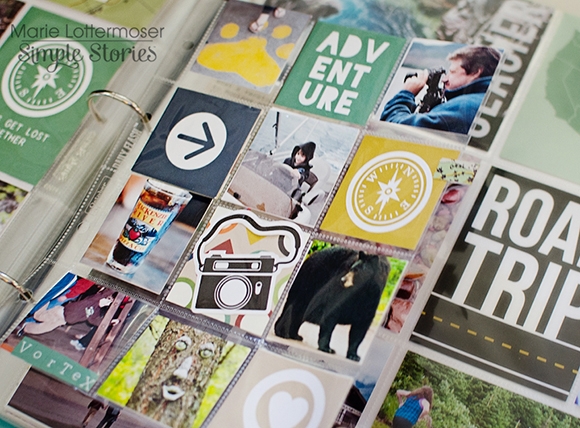
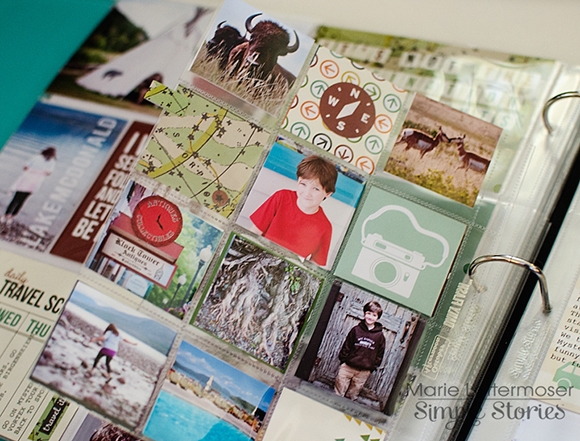
I added a 2x2 Insta-Pocket page in the middle of my spread so I could fit in extra photos.  I love how many pictures and embellishments such a small page can hold.

I like having different size Pocket Pages in the same album.  I added a tab made out of a sticker to the side of the 2x2 Insta-Pocket Page to make flipping through even easier.

We packed a lot into a few days and I needed to find a way to organize all of the different side trips we took.  I typed out our itinerary on a 4x6 SN@P! card.  Having a record of all the different places we went is very helpful to remember our trip.

And that's our road trip in a nutshell.  Do you have any vacation plans coming up?  I highly recommend the Travel SN@P!! Set if you do!

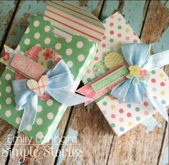
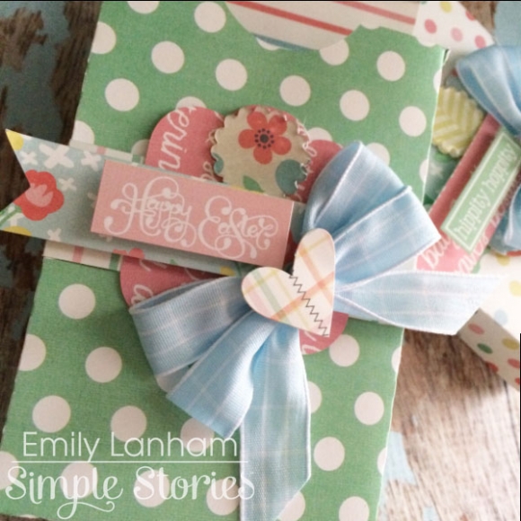
Hi there, Emily here with you today!  For my project, I decided to cut some cute little treat boxes for Easter with my Silhouette Cameo. There are SO many treat box files to choose from in the Silhouette online store, the possibilities are endless! 

The Fresh Air Simple Set is the PERFECT collection for anything Spring. I don't buy a ton of Spring paper because I'm not always a fan of pastels, so the size of this kit is great for someone like me who is only going to use it a couple times and be done with it. I've used the entire kit up on a couple of Spring projects that I've done and no leftovers so I feel accomplished! 

I loved that I was able to reach for this beautiful collection and create some perfect little treat boxes to go in my kids' Easter baskets this weekend. Thanks for stopping by today! Have a Happy Easter! 

Supplies

Hi there!  Shellye along today with a handsome little mini album made with pieces from the SN@P! Baby Boy Set and a onesie shaped die by Top Dog Dies.  I love to make small albums such as this to give as gifts to a new mom or grandma...they're the perfect size for a brag book and display so sweetly on a shelf or cabinet!

The die that I used is actually a 'card' die, so look for that if you're interested in shopping for it.  First, I cut the shape from white mat board; you can also use a medium-heavy weight chipboard.  When I cut the shape, the scoring area of the die actually cut instead of score, which worked out perfectly.  So a 12 page mini album would consist of cutting the entire die shape three times from a 6X12 sheet of material.  Next, repeat the process and cut the shape  from either a cardstock or patterned paper. 

The 'mat' portion of the pages were die-cut with a onesie 'finisher' die set, but you could also cut an oval or rectangle so that it fits nicely.  I die cut the pieces from various 4X6 cards found in the SN@P! Baby Boy Set, as well as some plaid and solid patterns found in the Homespun 6X6 paper pad.  The front is simply decorated with some layered hearts and adorable stickers from the set.

I decided to go with a 'flip-up' style album, so just keep in mind the direction that your pages need to be decorated when putting it together.  Between each chipboard page, I added 2-3 of the 'months' cards found in the Baby Boy SN@P! 3x4 cards.  Great place for mom to journal or add extra photos.

Also, when putting the album together, I try to stagger the embellishments from page-to-page so that one page's embellishments doesn't layer right on top of the next page's. 

Use designs found on the larger, 4X6 cards as embellishments.  Below, I cut one of the hearts from a card and then simply added some hand-stitching over it. 

Although I try to keep the 'bulk' to minimum with such a thick album, I still like to raise up a few of the stickers by adding foam adhesive to the back.  Brads and buttons dress up plain stickers and give a touch of dimension.

And don't forget about the other fun products by Simple Stories that you can mix in!  The DIY Kraft and Burlap pieces are great for layering.

One of my favorite SN@P! products are the adorable pockets!  Here, I've added one of the smaller ones to the page and then simply tucked in one of the DIY Kraft tags.

In finishing, I like to add some baker's twine around the edge of the album. This isn't necessary, especially when using a clean-cut die, but it does add such a soft texture.  For the binding, I took the first page of the album and punched two holes at the top.  I then used it as a template for creating holes in all of the following pages.  The album is quite thick, so I strung through two 1.5" rings and tied on single ribbon bows to each.  Now it's ready to be adored for many years to come!

Pages