July 2014 Blog Posts

Howdy friends, Layle back with you again today for Day 2 of our Summer 2014 Reveal Week!

If you missed us yesterday, you can catch the reveal of our first brand new collection, Legacy, here.  Be sure to check back with us each day this week for more new goodies as well as a chance to win our new products before you can buy them!  You can also follow us on Instagram at simplestories_  for additional chances to win!

Today I'm excited to introduce you to the 2nd of our new Summer Release collections - Cozy Christmas.

Jingle all the way and deck the halls with Cozy Christmas!  Christmas really is the most wonderful time of year!


So there you have it - Cozy Christmas!  Did you see those SN@P! Recipe Binder Pages and Recipe Cards there at the end?!  They were so wildly popular when we first introduced Recipe Binder Pages and Recipe Cards with Homespun that we just knew we HAD to do them for Cozy Christmas as well!   Wouldn't they just make the best Holiday Favorites Recipe Book?  My mouth is just watering thinking about it!

We'd love it if we could show each and every one of you this amazing new collection in person.  But since we can't do that, we've done the next best thing - we shot a short video at the Sierra Pacific Mixed Media Event last week to show you Cozy Christmas - almost as if you were there in person; so take a peek at Cozy Christmas as I walk you through the collection!  Make sure you head back here when you're done to enter for a chance to WIN Cozy Christmas before you can buy it!

Cozy Christmas begins shipping to retailers mid August, so it won't be long before you can get your hot little hands on it! 

How about a chance to win a Cozy Christmas prize pack before you can buy it?!!  You have 2 chances to win!  

First, simply enter via the Rafflecopter widget below and tell us what you think about Cozy Christmas  -

a Rafflecopter giveaway

Second - PIN TO WIN!  Just pin your favorite(s) of the Cozy Christmas images in this post, name your pin Simple Stories Cozy Christmas, then leave us a comment on this blog post telling us that we've been pinned and include your Pinterest user name.

That's 2 chances to win a Cozy Christmas goodie box before you can buy it!  And because we're feeling extra generous, how about a 3rd chance?!  I'll be doing random giveaways on Instagram as well throughout the week, so follow us at  simplestories_  for a 3rd chance to win! 

I'll announce all of the winners throughout the week in one giant celebratory post here on Sunday the 3rd, so make sure to check back then to see if you're one of the lucky winners!

Good luck - we can't wait to hear what you think about Cozy Christmas!

And remember, today is only Day 2 of 6 fun filled days, so meet me back here tomorrow morning for Day 3 for the reveal of Sweater Weather!

Hello Simple Stories fans! 

I'm excited to share this layout with you today because it combines many of my favourite things! 

First of all, there's these super fabulous colours from the Good Day Sunshine collection, then the Simple Stories Silhouette Print & Cut files (which are so much fun!) and last of all pictures of my family enjoying time together at the beach! It can't get better than that!

I love using my Silhouette when I create my layouts and I'm so excited that Simple Stories has created some Print & Cut files to go along with their amazing collections.  I used 4 different files on my layout.

Here's a close-up of the Silhouette print & cut Surfboards.

I just love this Camera design and used the Silhouette Print & Cut feature for this one as well.

This Silhouette Print & Cut beach sign is so cool. Don't ya think?

I also typed my journaling onto a 4x6 journaling card that comes with the 12x12 Good Day Sunshine collection.  I was enjoying creating the print & cut embellishments so much that instead of using the chipboard of this cloud shaped design I used the Silhouette Print & Cut feature once again!

To finish off my page and add a bit more colour I adhered some of the Enamel Dots in various places on my layout and a few stickers. 

I hope that I've inspired you to use this wonderful collection and for all of you Silhouette lovers you definitely have to give the Print & Cut feature a try.  You will love it!

Thanks for stopping by!

Supplies

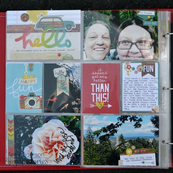
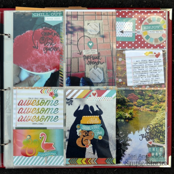
Hello, Simple Stories fans! Teri here today, and I'm here with another Life Documented project. I'm excited to share with you a couple more pages made with the Good Day Sunshine collection. 

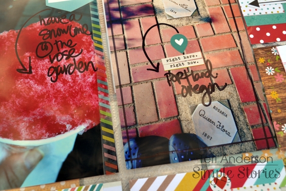
A dear friend of mine recently came to town. I spent a fun afternoon hanging out with her and exploring some of our local landmarks. Talk about fun! I had such a good time (and took so many pictures) that I wanted to include a couple pages about the experience in my 2014 album.

Because this meet-up happened during Summer and these pictures were shot on a hot Summer day, the Good Day Sunshine collection was perfect to use for these pages. It's such a happy collection and has so many fun Summer'ish elements. I felt it justed worked.


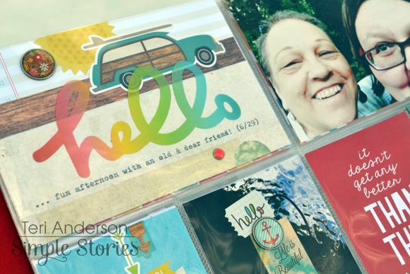
One of my favorite elements is that title card! I made it myself by mixing and matching together stickers, paper and an overlay from the Good Day Sunshine collection. The great thing about using things from the same collection is that it takes the guesswork out of it. You don't have to think about the colors. You don't have to think about patterns. Everything just goes together because it's designed to do so. I love that.

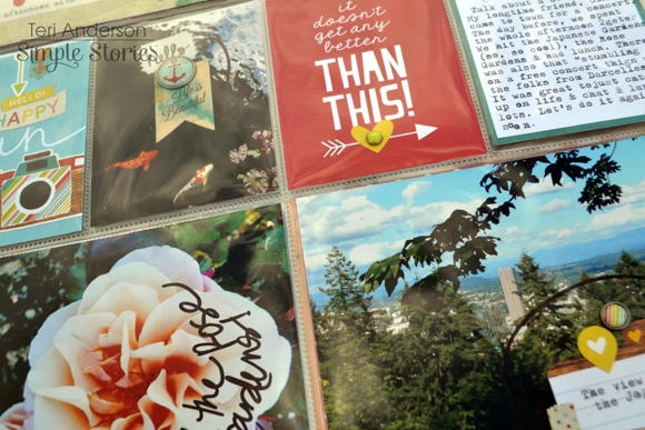
I also had a good time with the smaller pockets on this Pocket Page. I cut down the Koi fish picture to fit into one of them. Yes, friends. No fancy schmanzy photo resizing here. I printed the fish picture as a 4" x 6" photo (to save time) and then just used my paper trimmer to cut it down to size. (By the way, have you seen the Simple Stories' Photo Crops tools? They are designed to make photo cropping easy!) 

I had such a fun time putting together the second page of my spread!

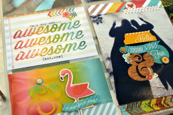
I must admit that I went a bit wild, embellishing some of the pictures with stickers, brads and other Good Day Sunshine embellishments. I even wrote on some of them. I sure love how I was able to mix my handwriting with the Good Day Sunshine word stickers on this one here.

I also love the SN@P! cards on this page! The Awesome Awesome Awesome one was 4"x6". I cut it down to fit in my pocket and then used my trusty typewriter to add some text. 

Let's talk albums for a minute. I'm using a 12x12 SN@P! faux leather album in red to document all my 2014 adventures in. I frequently scrapbook out of order so I really appreciate that the album's ring binding allows me to do that. I used the SN@P! Pocket Pages Design 3 and 5 for these pages. It's nice that Simple Stories offers so many different styles of pages. I enjoy having creative options!

Supplies

Hi everyone, it's Wendy with you today to share some grid-style layouts using the Good Day Sunshine collection.

As I looked through the Good Day Sunshine collection I was drawn to the cloud paper, it just FIT my beach pictures.  I couldn't resist creating two different layouts using the same background and a simple grid design.

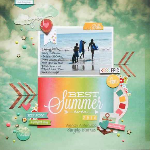
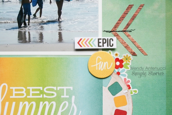
In my first layout, Best Summer 2014 -

I wanted to feature this shot I got of a few of my kids at the beach.  The wide expanse of water seemed to call for the cloud paper, it continued the calm peaceful feeling of my picture.  Because I wanted a calm layout, I chose one 4x6 card to give some color to my layout and to give my layout a title.  This was the basis of my layout and the next step was to add some interest to my page.

I began adding pieces such as the year stickers, the film die-cut and the anchor to give a triangle of colors (woodgrain, yellow, teal) using items that were meaningful to my layout.

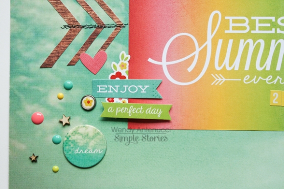
I added in some woodgrain chevrons to give some movement to my page and to direct your eyes inward.  I couldn't resist adding a pop of bright color with the flower stickers.  

I used a few of the chipboard circles throughout my page; I loved the tone-on-tone that I achieved with the dream piece.

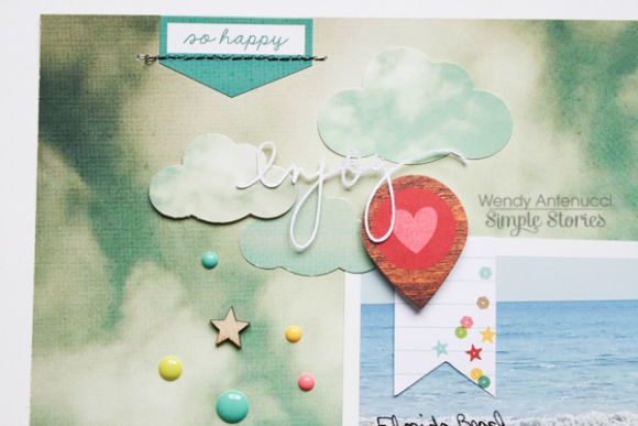
My Fiskar cloud punch is probably my most favorite tool I own; I wanted clouds, but didn't want to detract from my page, so I used the tone-on-tone approach again.

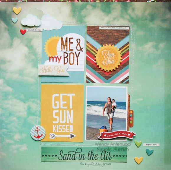
My next page, Me and my Boy -

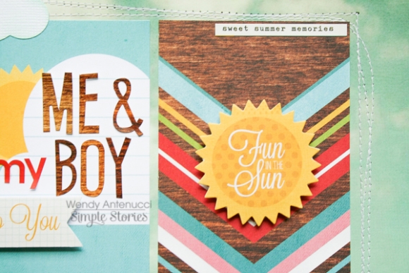
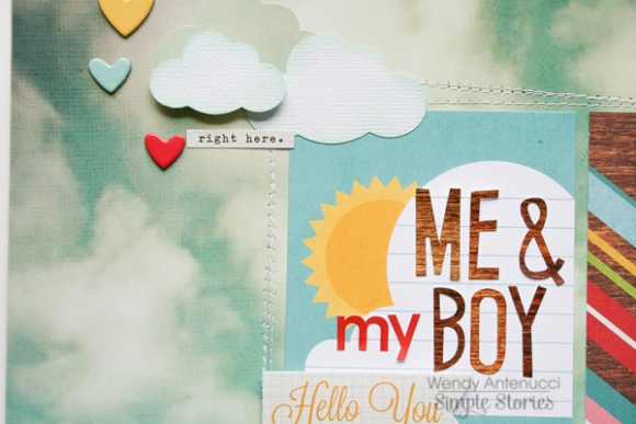
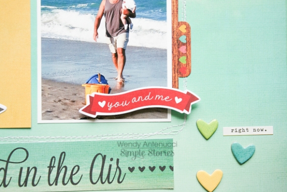
This layout was also built on the cloud page again using just the 3x4 cards and my picture.  I chose to do a 2x2 grid design on this layout.  The 3x4 cards provided a place for my title, a pop of color, and a chevron card to direct your eyes to my picture.

I used a scattering of hearts to lead your eyes from the top of my page to the bottom.

Again you can see my clouds; these were created using white cardstock and inked to make them blend more.

The tiny phrases on the sticker sheet add just enough detail to my page without overpowering my design.

Thanks for joining me today!  I have one more page I created using the Good Day Sunshine collection on my blog http://antenucci.blogspot.com/2014/07/hello-summer-simple-stories.html hope to see you there!

Hi Simple Stories fans! Rebecca Keppel here to share a quick way to document your 4th of July today! I take tons of photos on the Fourth of July, and with the summer being so busy, I like to quickly get them into a layout. Simple Stories has a SIMPLE answer - the latest Sea to Shining Sea Simple Set includes everything you need to get your 4th of July or other summer layout done in a snap!

I used 2 strips of 4x11.5 paper and one 3.5x11.5 patterned paper and stitched around each rectangle and adhered those down as horizontal blocks to create my background. I combined 15 photos into three 4 x 4 collages to use on my center strip of paper. I trimmed down the Original Summer Memories card so you could see more of the patterned paper and machine sewing behind it. Plus, I added some letter stickers for a title to it.

I trimmed down the journaling card so that it match in height to the Red White and Cute card and typed my journaling, adding a border sticker to take up some empty space.

The large star was fussy cut from another card on the 12 x 12 Elements patterned paper and then popped up with 3 dimensional adhesive.

Lastly, I love including tiny Simple Stories stickers right on my photos as a banner or in the case of collages right in the middle where the points between photos intersect.

Sea to Shining Sea is such a fun collection and could be used for a number of summer themes, but I loved getting my Fourth of July memories down on a page so quickly!

Hi everyone ! It's Mindi here with you. I'm going to be sharing a life documented layout with you today, featuring the Good Day Sunshine collection. 

The bright colors along with the wood grained paper were a great match for our fun and fast road trip down to the beach. 

We were fortunate enough to be able to join my husband down by the beach while he was working in the area. I wanted to make sure that I included the "work" and the "play" aspects of our trip. For this journaling card I wanted to keep it clean and fun, I loved the rainbow ampersand and thought it was perfect for the top of the journaling card. I had some fun mixing different texts for my journaling. 

For this layout I thought I would play around with some watercolor paints. I broke out the kids watercolors and made my own journaling card. After I was happy with my paint job,  I added a few stamps and some embellishments. 

I needed to add my "play" factor to my layout and added a photo of Maddie at play in the water. 

Here is a look at the second page of my layout. The weather was foggy and on the cooler side. Noah was the only one we could get in the water that day for more than one or two times. But once he got in, meaning his feet, we couldn't get him out ! 

I loved mixing a little of the wood grained cards and colors in here and there. I used the wood grained SN@P cuts and put some patterned paper behind it. Then added the chipboard sun and cut up the word "Smile" from the DIY photo overlays. 

I played around with a few different things on the photo that is split over the two pockets and ended up adding a vellum tag onto half of the photo. Finishing it off by using a fun DIY word sticker and a few extras. 

I really didn't have too much to say about our short trip so I decided to play around with one of the colorful cards. I started off with the chevron patterned card and wanted to fold it over so I could add my journaling. The other side of the card didn't work for what I needed. I simply found a simple patterned and glued the two cards together and folded it over. 

I have really loved working with the fun products from the Good Day Sunshine line. They make it so easy to make fun and fast pocket pages. That is key when your working in the summer months, when time is tight !! 

21

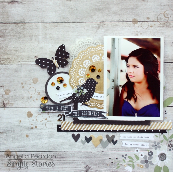
Hi there. Angella here with you today!  I have created a layout using the The Story of Us collection -  a layout of my darling daughter turning 21 and it was perfect.  I love that you can use this collection for so many other things besides love/wedding!

I have used the Forever and Always Designer Cardstock and the 2x12 & 4x12 Elements for the base page with circle ink stenciling using a light gold ink.

Gold and black sequins go really well with colour tones in the papers, and with so many elements for fussy cutting make creating with this range so easy and fun.

Here is close up of the hearts I have fussy cut

I love how the paper range was so perfect for my daughter's photo, fresh and beautiful tones to match in.

Thanks for joining me today, and I hope I have inspired you today with the  The Story of Us collection.

Hi there, Nichol here!  I'm a huge fan of the Simple Stories Insta-squares  and I'm always looking for new ways to use them in my traditional scrapbooking. Like many of you, I have loads of older photos to scrapbook and I grabbed a couple of old layouts from my "to re-do" pile that had zero journaling and only 1-2 photos and created two new layouts that I absolutely love. The Insta-squares make creating an eye-pleasing arrangement just as easy for a traditional 12x12 layout as they do for pocket scrapping!

I created both "boy" and "girl" versions to show just how versatile this collection is.

The girl-ish layout features four photos, three trimmed down to 2" wide by approx 5" tall and one 4x6 photo. Once I had the photos cropped and/or arranged, I "filled in" the rest of the 10" square design with Hello Baby Insta-squares and a piece of ledger paper from the Good Day Sunshine Collection which I trimmed down for my journaling.

I popped up some of the Hello Baby Stickers on foam adhesive to give them some dimension and help them stand out from the tone-on-tone look of the Insta-squares. I also popped up the 3" Insta-square which works as the title of the page and is matted on one of the 4" Insta-squares!

I let the photos dictate the design of the pages and simply laid them out and then added Insta-squares and strips of 6x6 paper to fill in the design so it would make a 10" square. I laid out all the blue, yellow and white/cream squares I could find for the "boy-ish" layout and put it together similar to the girl version.

I used one of the 3" Insta-squares for my page title again, this time adding some Simple Stories phrase stickers as well.

I combined the chipboard moon, cloud and star stickers onto one of the 4" squares to create a perfect sleepy accent for my page.

The border of 2" squares along the bottom of the page are embellished with Hello Baby cardstock stickers adhered with foam adhesive for dimension, a 2" square photo and sequins in blue and yellow.

Pages