Lisa Saunders's Blog Posts

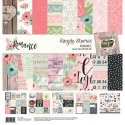
Hello!!  It's Lisa and a cute sloth here today. I have the cutest photo to scrapbook. The colours just went so well with the 'Romance' collection, so I decided it was the perfect time to document our Sloth encounter from last year.
 

I love this photo so much and wanted all the focus to be right there in the centre on that adorable sloth. So I created various different frames to do this.

I started off by adding a thick white border to my photo before printing. This really helps the photo stand out from the page. Otherwise the colours would just blend in to the back ground.
 
Then I cut one the the 4X6 elements out, cutting it in to a rectangle to border the photo. I made sure there was a good space to add my title 'Kisses' here which came from the coordinating 12x12 sticker sheet.
 
I then took my circle cutter and a couple of pieces of patterned paper and cut out 3 large circles to go around my photo. I love how this creates such a pretty frame and then by adding some of the 'Bits and Pieces', more stickers from the 12x12 sheet, a couple of pieces of the Chipboard Stickers and some stickers from the 6x4 pack. It just works so well.
I wouldn't usually use black on my pages, except when journaling, but I have to say, I love this contrast. It just works and compliments the page and really helps the title stand out too.
 
 
I'm so happy with my cute page. I think this collection was the perfect choice. Thank you for joining me today. If you would like to watch me create this layout, please see my video here.  I had so much fun!!
    

Supplies

 
Hi There!! It's Lisa here with you today. Seeing as it's February, the official month of 'Love' I thought I'd create a 12x12 layout about something we as a family love. And what better collection to use, the 'Romance' collection.


 This background paper here is such a perfect backdrop to my story. I do love texture and although there is no texture as such to this page it really does look like it should have some. Seeing that eye catching heart there in the middle, as soon as I looked through the collection, I was instantly drawn to this 12x12 and had to use it straight away.


I wanted to add more of a contrast though to the page to help the elements stand out more. By scraping some white paint over the centre of the design this was just what I needed. Enough to do what I needed it to, but not so much that it covered the design of the paper. I needed that heart to stand out.
You can really see here how the pieces from the 'Bits and Pieces' pack really POP!! That paint worked just perfect.
 
 
I teamed up the 'Bits and Pieces' with some of the Chipboard Stickers and the 4x6 Stickers from the coordinating pack too. To help the shape of the heart stand out even more, I sewed around the outside. Not only does this help it to stand out it adds a wonderful texture to my page. See here how I've woven my stitches under and over the heart. I love seeing detail like this on my pages.
 
 
I printed off some wording and cut into strips to document the things that we love about our favourite Disney Resort. It was such a fun way to add journaling to a page. Keeping it in the shape of the heart. Thinking back to the heart as being the original inspiration for this page.


I've enjoyed making this page so much and I'm so happy with the result.Why don't you document something either you or you and your family really love this month. I hope you've enjoyed this today. If you would like to watch me creating this page and also looking through the 'Romance' collection that I received. Please watch my video here.
Thank you.
 

Supplies

I decided to document the Christmas gift that my husband and myself have treated ourselves to this year. A new coffee machine. We've been having problems with ours for so long now and as we both work from home, we do like to make decent coffee. So this little story need to be documented this Christmas.


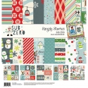
I used the 'Sub Zero' collection to tell this story. The Wintery elements are just so perfect. I love a Winter line that isn't overly Christmassy. So this is perfect for me.
 
I really like the contrast here between the white card that I used and the creamy colours in this collection. For me it represents the snow in Winter along with the coziness that you feel at the same time.
 
I used one of the 6x4 and a 4x3 Element. These 12x12 Element sheets are great to cut up and use. I've layered them up here to home my photo and my journaling.


I really liked the idea originally of lots of white space, but once I'd created the middle section, the page just didn't look finished to me. So I continued on and used the coordinating Washi from the collection and some of the die cuts from the Bits and Pieces pack. It was just what I needed to finish the page.


 I have a short video here of this page being created.
 
I love this paper collection so much and I love that I can use it on all my Winter stories and not just for those over Christmas.  I have so many more ideas now.


Supplies

Pages