Christine Meyer's Blog Posts

It feels like life lately has had us getting back to the basics.  Perfect timing to create a layout with some new basic products from Simple Stories, the Color Vibe collection! This collection has basics to help supplement your patterned paper collections or to take out on it's own.  Today I am going to show you how I used it on it's own!
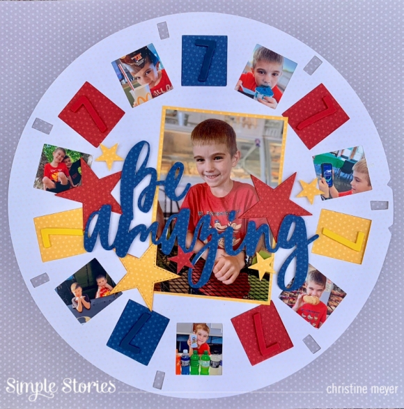
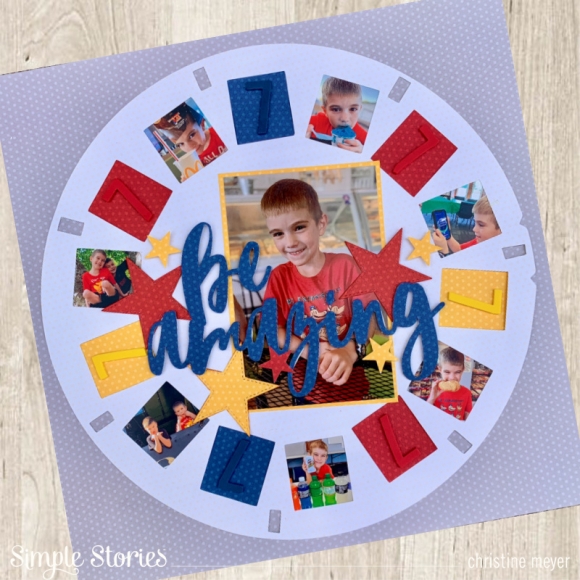
When I am working with simple patterns, I often go to cut files!  Today was no exception!  For this layout I used an older viewfinder cut file from the Simple Stories store.  By enlarging it to fit on a 12 X 12 layout, I was able to add a lot of pictures to it!  
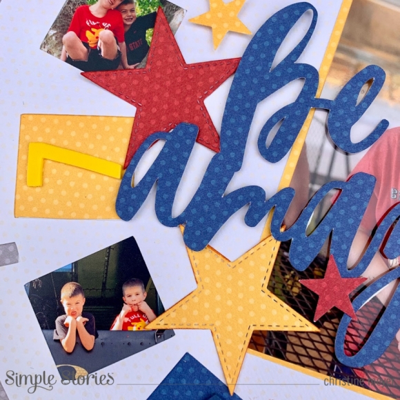
The Color Vibe papers are textured with one side being solid and one side have dots.  I love the dots as an added option!  I utilized that side for my entire layout combining both the Basics & Bolds paper collections.
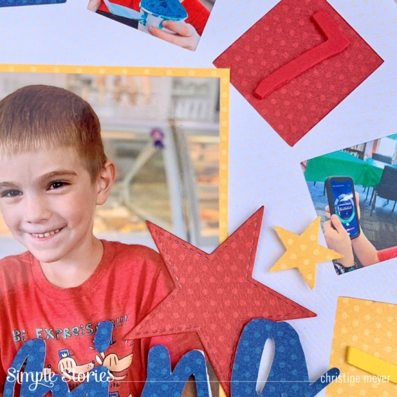
One advantage to working with Color Vibe is that you can totally tailor the colors to match your photos exactly!  Having a lot of reds, yellows, and blues in my pictures; I opted for those as my main colors!  I cut out stars and the title in those colors.
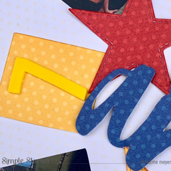
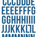
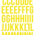
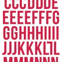
I also used the Foam Alphabets in coordinating colors to add "7" to my spots without pictures.  This was a nice way to add in a meaningful element!
If you'd like to check out more of this project and how it came together you can find more details in my process video here

Thanks so much for stopping by today!

Supplies

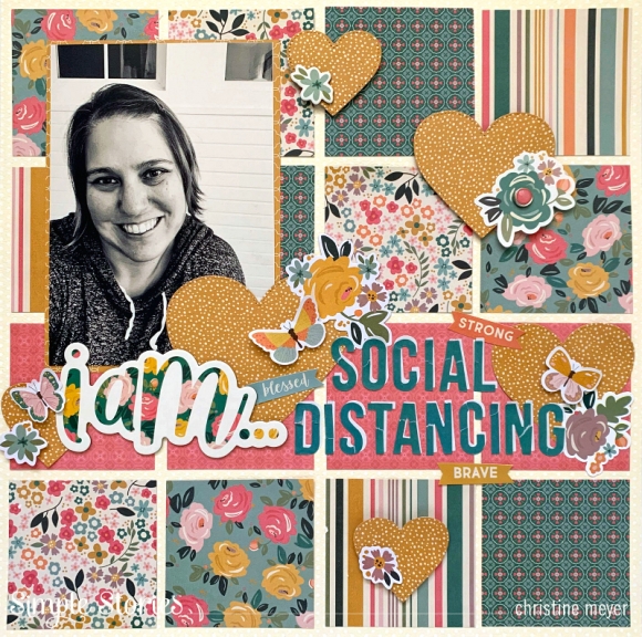
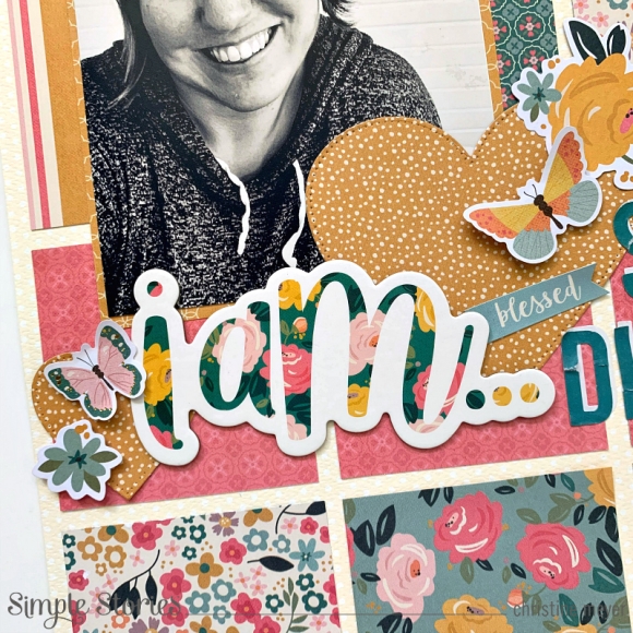
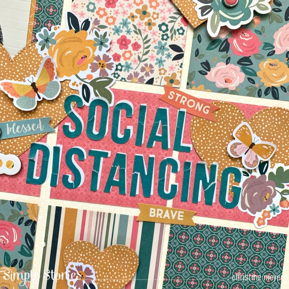
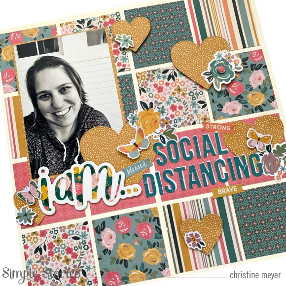
I got my hands on the "I Am" collection a couple of months ago and if you had told me then what I would be using it to document, I'm not sure I would have believed you.  But here we are, mid-way through April with most of the United States in our homes and practicing social distancing.  So, it seemed only appropriate, to document this crazy moment in time!  I was glad I had a good collection to do just that!  Here's my layout!

 
With so many great patterned papers in this collection, I struggled to determine what to use.  I also was just struggling with creativity in general.  When that happens, I default to a grid layout.  Grids seem to always get me going with creativity!  As I created this grid, I knew I wanted a "solid" line for my title area.  I picked out four additional papers, two with the ivory background and two with the teal background, using some from both the 12 X 12 collection kit and the 6 X 8 paper pad.  By choosing two different background colors, I was able to keep things balanced between dark and light.
 
 
I put the most work into my title area. It combines chipboard, cardstock stickers, ephemera, and brand new Color Vibe letter stickers.  By adding the yellow hearts throughout, I was able to ground things and build beyond the title into the rest of my layout. It also creates some softer lines amidst the squares.
 
 
Although the title begins with chipboard - it continues with Color Vibe letter stickers.  Because I wanted some white in there - I used the white letters as shadows to the teal.  I did not try to make them fit in an exact way with each letter - allowing again for a softer look amidst the grid.  I also tore the top layer of the letters in at least one spot.  I wanted this to symbolize how we are "torn apart" by this pandemic.
 
 
I know most of us will want to document this time, I hope this is inspired to tell not only the story of your family, but also of you!  You can see the whole process for this video on my YouTube Channel!
 
Thanks so much for stopping by today!
Supplies

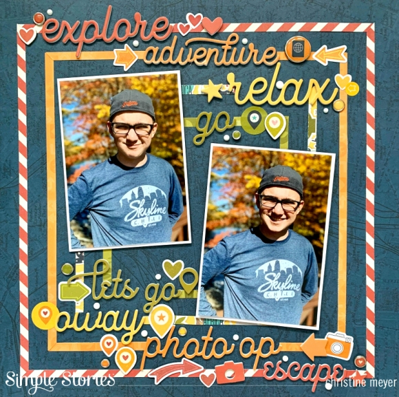
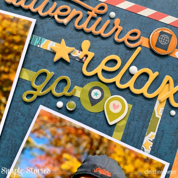
Where does your inspiration usually start for a layout?  Mine can come from a variety of places including products, pictures, and the stories themselves.  For today's layout showcasing Going Places my inspiration began with the Foam Stickers in this collection and evolved from there.
Let's take a look at the fun to be had with Going Places!


Basing my color choices on the colors in my pictures, blues and autumn colors, I opted to use puffy words to work with that.  I then chose patterned papers in those colors and cut 1/4" strips. I built concentric squares in the coordinating colors

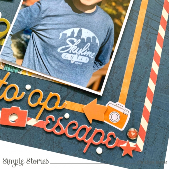
I wanted to build the foam words into each border but with movement going down the layout. I did one for each color on the top of the layout and likewise on the bottom. The contrast of the script font against the straight borders worked nicely.

Once I had applied all the words and my pictures, I began embellishing.

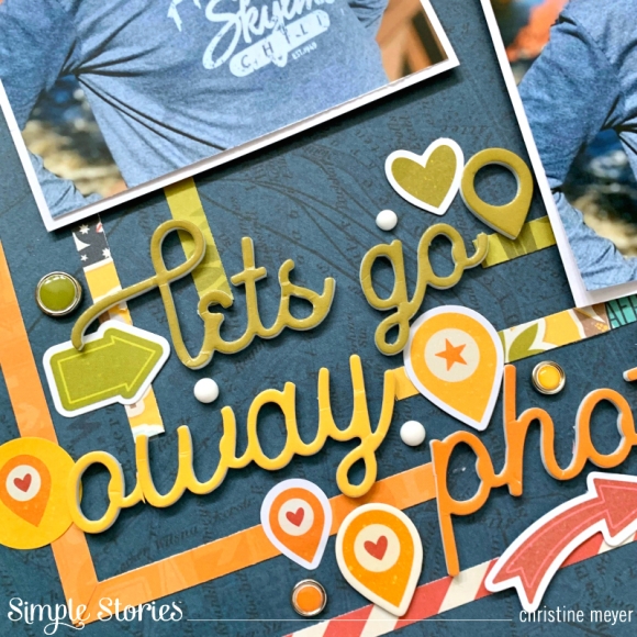
I used pieces of embellishments from nearly every part of this collection, going one at a time and adding pieces as they fit well, considering both shape and texture throughout. I created a process video to go with the whole layout that you can check out here!  

Thanks so much for joining me today - I hope that you and yours are staying healthy and soon we will all be Going Places again!

Supplies

Pages