December 2015 Blog Posts

Hello, again!   This is Amber, founder and creative director of Simple Stories.  I'm here for the last installment of my monthly Document IT blog feature for the year.  Today is New Year's Eve - the last day of 2015.  Do you believe it; where does the time go?!  Not sure about you, but this year has literally flown by for me!

Monday begins the reveal of our Winter release - 4 main new collections along with 3 new Simple Sets and a few other goodies as well!  Because we've been so busy this month with the release & getting ready for the CHA tradeshow next week, my post this month is short & sweet :)

We've created some pretty awesome free printables for you this month, focusing on the start of the new year!


You'll find 3x4 cards along with dashboards, a 2016 calendar glance and week on 2 page vertical inserts for your Carpe Diem A5 planner!

Click here to download December's Free Life Documented Printables.

TIP: The December free printables are on a single PDF document with 6 pages - print off what you want and the quantity you need.  We've added cut marks to each printable, so you can easily trim the images/inserts to size.  If you missed any of the free printables this year, you can find them here on the Project Downloads page!  

Thank you from the bottom of my heart for your support this past year, we owe all of our success to you!  Wishing you a very happy & safe New Year!

Hello, Simple Stories friends and Happy New Year's Wishes to you!  As a gift to myself, I prepped my Carpe Diem Planner so that I can greet the New Year prepared!
 

I will be honest and say that I was torn between choosing the Aqua Planner and the Coral Planner.  As you can see, I chose Coral, but after a little thought, I was able to add a pop of the aqua color too!
 

I added a trio of large, aqua eyelets to the leather closure strap of the planner.  To do so, I used a crop-a-dile punch, but a leather punch can be used as well. 


I also wanted to change the length of one of the ball chains for the charm, so a pair of wire snips were used to cut a piece from the strand.  The heart charm was embellished with a few light-colored coral enamel dots.
 

To keep all of my extra goodies and planner pages in one spot, I chose to use the handy clear box for the Daily Planner Insert pages.  It has a handle on the top so I was able to clip on the packages of Stickers and Clips by attaching them with a ring.
 

I had an extra charm leftover, so I added it to the inside pocket area of the binder!
 

I kept the inside pretty simple and basic.  I organized the front section with stickered tabs from the Basic Divider Pack
 

I dressed up one of the Pocket Pages with Bits & Pieces so that it can hold bills and coupon booklets.
 

For the monthly divider pages, I added some of my own hand-drawn sentiments to the all ready adorable designs provided.  Here is a look at some of the other decorated dividers:


Before each month's divider page, I added a Dashboard Insert just to give it more interest!  They were embellished with enamel dots, washi tapes, stickers and die-cuts for even more fun.
 

Dates, birthdays and events were added to the calendar area...I'm all set to go as I begin 2016 with new assignments, dates to remember and places to go!  I can't wait to plan it all with my beautiful Carpe Diem Planner from Simple Stories!

Hey all!  Sara here with my very last digital showcase of the year here with Simple Stories! 
 
I can't believe we're on the cusp of a new year, I feel like we just started into this one.  Alas, the new year is coming and I love this time where it feels like you can hit a "reset" on life - like it's this perfect blank slate that you can use as a launch pad for change and goals.  I don't usually choose a word to focus on each year, but if I were to do so, I decided that in 2016 that word would be ENOUGH.  I spend way too much time second guessing and doubting myself, I am ready to bring myself to a place where I feel like I am enough.  
 
Naturally, the digital I AM... collection was exactly what I needed to document this goal I have for the new year.  I am in LOVE with the colors and idea behind this collection.  It is beyond beautiful and I had so much fun layering word strips on my page and deciding which ones described me best.  


I decided to include the word enough in alphabet stickers as well as two different word strips to really make it stand out as the centerpiece to my layout.  I used a sketch I found at Scrapbook Challenges (sketch 435) which allowed me to bring in some of the beautiful colors and showcase some of the cards as well in the place of two of the photo spots.  It turned out colorful and busy, I couldn't stop adding patterns and word strips and elements all over the place!  


I have to say, as a mom of two boys, I don't usually take time to play with kits that are more feminine and I really enjoyed this one!  
 
Cheers to a happy new year and a wonderful 2016!
Hi all!
 
Teri here, and I'm happy to share with you some cards I created with Simple Stories' You & Me collection. 
 
Can you believe it will be 2016 in just a couple days? Now is a great time to get going on your card stash for 2016! And a fun way to kick off the New Year is to make some cards for your loved ones with a New Year's twist. The You & Me collection is perfect for that.
 
 
This first card is perfect to give to a someone close to you or just someone who needs a little extra encouragement. 
 
 
The  "it doesn't matter where you're going, it's who you have beside you" phrase came from a piece of patterned paper. I cut it down to fit on a card and then added the "in '16..." stickers above it. 
 
 
I thought the globe sticker was a great addition because globes symbolize going places. And, seriously, a globe with a heart is just so cute! To make the heart really stand out, I plopped an enamel dot onto it.
 
Here's another fun one to give to a loved one.
 
 
Donut you love it? Hee! 
 
I built this card around the donut panel, which came from the collection's All You Need Is Love patterned paper.  I placed the donut panel on a card and then added strips of patterned paper around it. Then I embellished the panel by adding some stickers and enamel dots in it. Since I'll be sending this card out early in the year, I went big by placing the "2016" stickers right on top of the donut. 
 
 
To really pull the recipient's eyes to the "I Love You" saying, I added the clear stickers. 
 
This last card doesn't have an actual date on it.
 
 
Instead I reference the year of "365 days" by applying letter and number to the heart. Since they are the same color, it's subtle but the big size of the stickers keeps you from missing them!
 
 
And then I built the rest of the card around the heart by adding the "I Love You" and flower stickers below it and then adding a smaller heart and sentiment sticker above it. And then I just added some patterned paper strips around the panel with the heart. Easy peasy! 
 
Thanks for stopping by today! I'll see you again real soon!


Supplies

Holiday time is crazy busy...running here/there/everywhere, baking, shopping, wrapping...it can get out of hand pretty quickly. I am always a fan of a more simple look, but at this time of year I find myself buying into the 'less can be more' theory even more so than normal. For our family, it is a time to focus on a specific event or memory we want to remember...like the afternoon that our daughter sang at the Cleveland Botanical Gardens with her Madrigal Choir. They give me goosebumps when they all work together, and seeing them in their costumes in front of a room full of people wandering through the facility that afternoon was surreal. 

One photo + one piece of patterned paper paired with lots of fun embellishments from the Claus & Co. collection. The photo captured the moment just as I remember it, and the words fill in the rest of the story. 

I clustered stickers, die cuts, a chipboard frame piece and other embellishments around the top and bottom of the photo. I wanted to draw attention to the photo, without overwhelming it with too many patterned papers, etc...super simple, but just the right amount of cheer. :)

Wishing you and your families happy holidays and a safe New Year!

  •  
Hi there everyone!  I just love this time of year! So many memories from past years to remember and many more to create with each new year!
 
Today I'd like to share with you a layout and a card that I created using the Claus & Co. collection.
 
 
I used my photos to create a tree shape and then embellished it using stickers, ...
 
 
die cuts, ...
 
 
and wood veneer shapes. 
 
 
I also used some of the clear stickers on the stocking shape.
 
 
The tag is from the die cut collection and I simply typed my journaling on it and added that to my layout.


Simple Stories make it so easy to just 'whip' up a christmas card in no time at all!!  That's what I love about the collections so much!!!
 
I created this Christmas card using a journaling 4x6 card.
 
 
I simply added some chipboard embellishments and the 'noel' stickers. I used some foam squares for the wreath to give a bit of depth and interest for the sentiment.
 
 
Thanks for stopping by today.


Supplies:
Clause & Co (12x12 papers, Fundamental Stickers, Element Stickers, Clear Stickers, Die cuts, Enamel Dots,  Wood Veneer, Chipboard,
 

Click here to download the free Claus & Co. eBook.  To view more Claus & Co. inspiration, check out our Claus & Co. Pinterest board here!

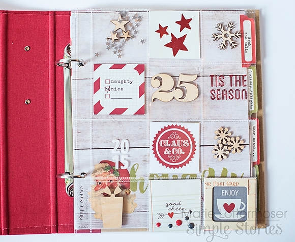
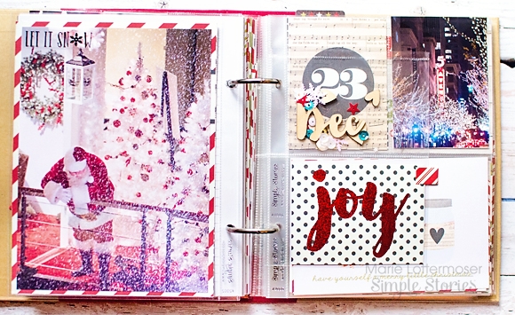
Hi Everyone!  Marie here today to share my continued progress on the holiday planner I am making with the  Claus & Co. collection.  I am making this planner as a place I can refer back to year after year, full of gift lists, planning calendars, addresses, and so on.   Now that I have a lot of the basics set up, I am going back in and adding some extra decorative touches.

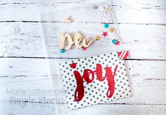
First up is my cover page.   I used a 2x2 Pocket Page and filled it will all sorts of little decorations, such as the wood veneers that are part of Claus & Co. They are a perfect way to add a little dimension and fun to your album.

I sealed up the open pockets with a fuse tool to keep everything contained.  I also added  some clear photo stickers to add to the see-through look of the pocket pages.

Next I wanted to add some pages to my planner that reminded me of places we can visit during the holidays.   I try to mix things up and do some different activities every year.  I first added a page of some of the fun things to do downtown.  We have one shopping center that makes it snow inside every night in December, and we even caught Santa taking it all in.

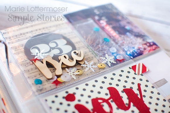
Once again, I used a smaller Pocket Page insert to add in some more wood veneers and sequins for a fun little divider.

And finally I included a page about store displays.  One of my favorite things to do this time of year is to stroll through downtown checking out all of the store windows.  Once again I add in some extra pockets of veneers and sequins for a festive touch.

If you are making a planner this year, I highly recommend that you don't make it all business.  Half the fun is adding some decorative touches throughout.  Thanks so much for letting me share my holiday planner with you today!

Supplies

Pages