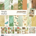
Ready To Go! By Christine Meyer!
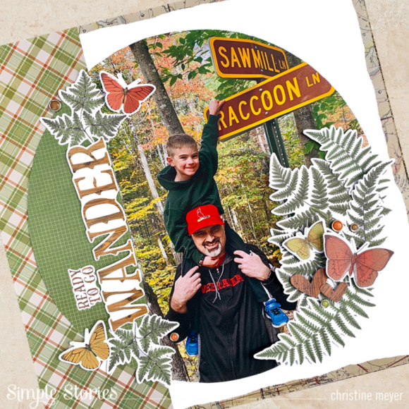
Do you ever use really big photos on a layout? As I looked through the Simple vintage Great Escape collection I was inspired to try printing a really big photo to use with it. I knew the rich colors from my outdoor photograph would really pop amidst the colors in this collection. Christine joining you today to showcase a big photo on an outdoors themed layout!
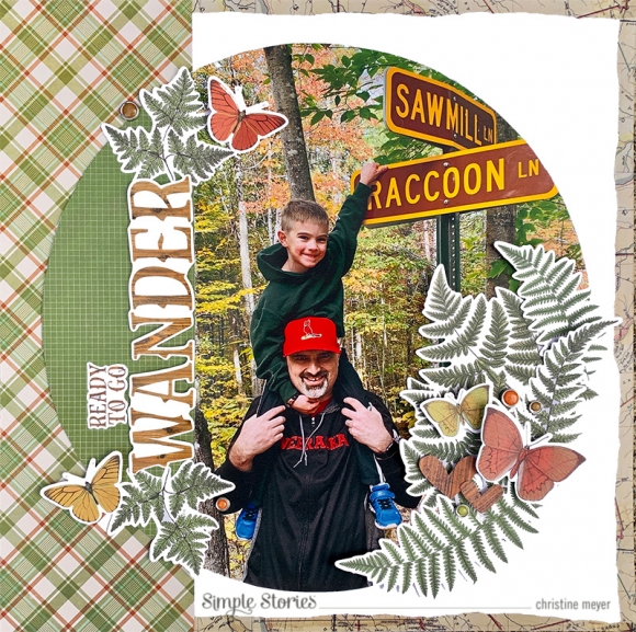
As you can already see, the colors in this were a perfect match. I cut the picture out in a circular shape allowing one part of the circle to be filled with this gorgeous green patterned paper. That paper was the perfect match for bringing out all the greens in my photograph! The plaid paper plays nicely off all the colors as well. I didn't want quite so much of a contrast with the white background, so to soften that I used some of the map washi tape. I tore it in half to give it an even softer look.
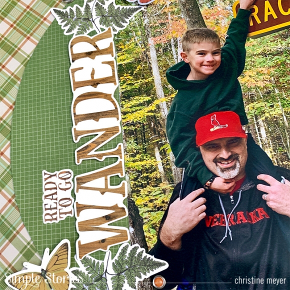
I don't often put my title in a different orientation from my photograph - usually for designs sake - the title is horizontal. But for today's layout, I really liked the way the chipboard word "wander" looked sitting on the border between the picture and patterned paper. The eyes sometimes like something unexpected and you run with it!
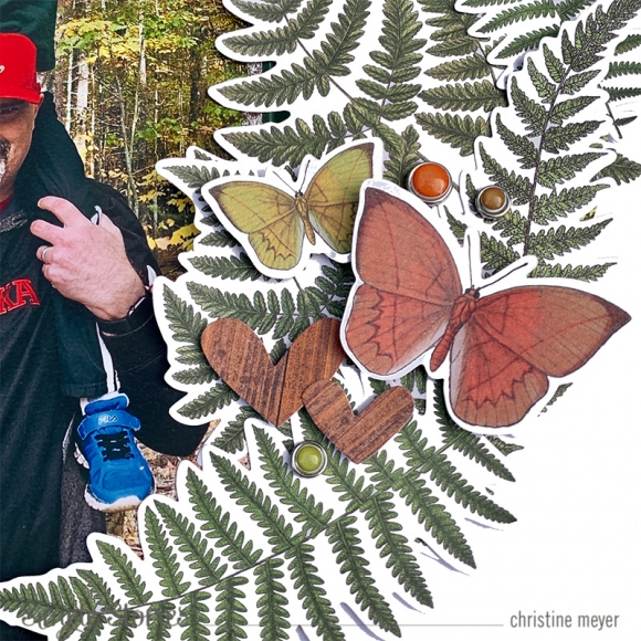
The ephemera in this collection is to die for. I loved the foliage pack especially and as you can see, I used it to create a giant fern cluster on one side of my photo and used it a second time as anchors for my title work.
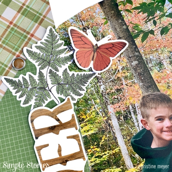
My final big design choice involved how to add more colorful to this very green layout. I opted to bring in some of the butterflies from the ephemera packs alongside the brads. Both of these brought in some additional pops of color and dimension without being too overwhelming.
If you want to check out how this whole layout came together, you can catch all of the details on my <a href="youtube.com/cameyer71">YouTube Channel</a>!

