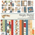
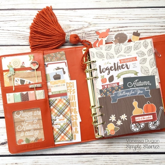
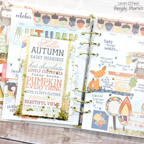
Hello friends and hello fall! Leah here to show you how I’ve added touches of my favorite season to my planner using the Hello Fall collection. I cannot say enough just how much I love my Ivory Carpe Diem planner! I know darker colors tend to be more popular for fall and winter, but the warm neutral tone of the Ivory really compliments and emphasizes the beautiful colors in all of the Simple Stories Fall and Winter collections. Doesn’t the Hello Fall collection look so warm and cozy against the Ivory?!

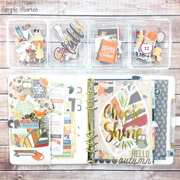
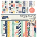
The Hello Fall collection is full of adorable seasonal designs and sweet little woodland creatures!  My favorite design is the leaf with all the colors of the collection in it. You will notice the leaf design reappears several times throughout this post!

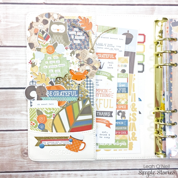
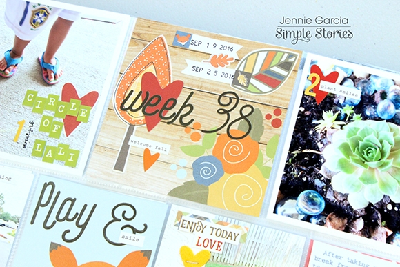
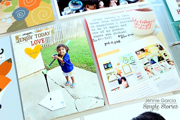
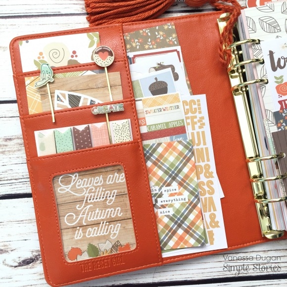
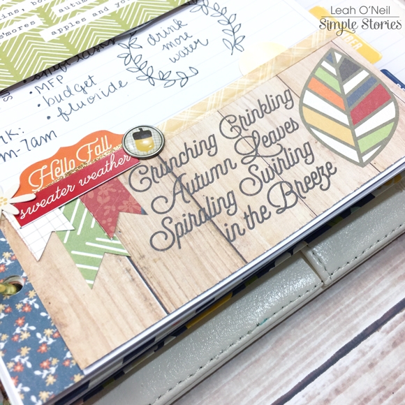
In my front pockets, I used several pieces from the SN@P! Pack: a couple of the 2x2 cards with fun fall sentiments on them, a couple of the 3x4 cards to provide patterned backgrounds, and several of the ephemera pieces from the pack. The larger leaf in the bottom pocket was cut out from a card in the pack as well. If I wanted to, I could decorate my entire planner with one SN@P! Pack because there is so much product in each one!

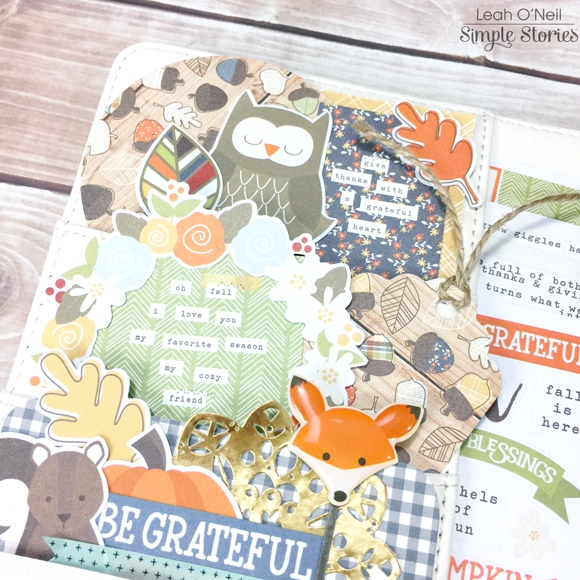
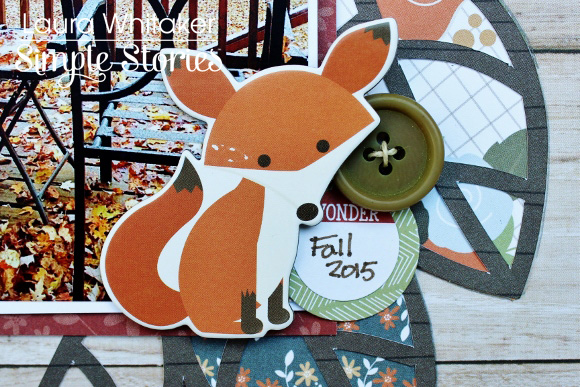
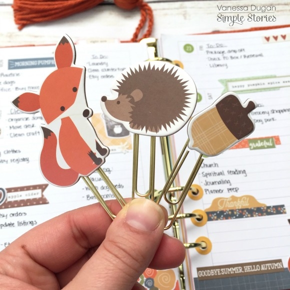
I also punched a tag and 3-inch circle from papers in the 6x6 paper pad for layering, and added some of the darling die cuts from the Hello Fall Bits and Pieces pack. How cute is that fox clip?! The decorative clips are one of my favorite products in all of the new Simple Stories collections!

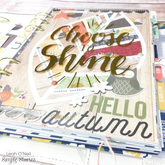
Under the clear “Choose to Shine” dashboard that came with my planner, I made a fall-themed dashboard to peek through. When I saw the “Celebrate Fall” 12x12 paper with that gorgeous leaf design on it, I KNEW I wanted to do something special with it! However, the leaf was too big to fit in my A5 planner. So I found the same page in the 6x6 paper pad and cut out the leaf so I could turn it to fit on the page. I cut down the “Falling for You” 12x12 paper to use as a background to adhere the leaf to. I added very little extra décor because I didn’t want to take away from the beautiful design, but I love how the little details turned out!

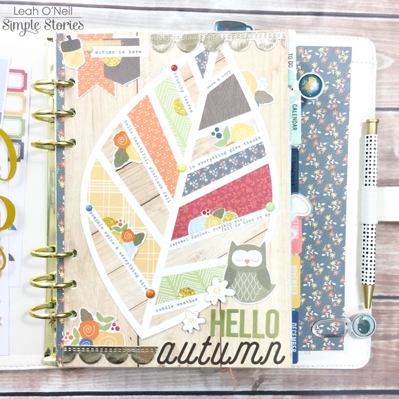
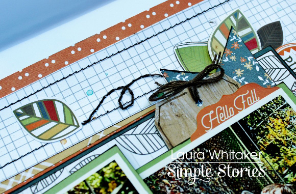
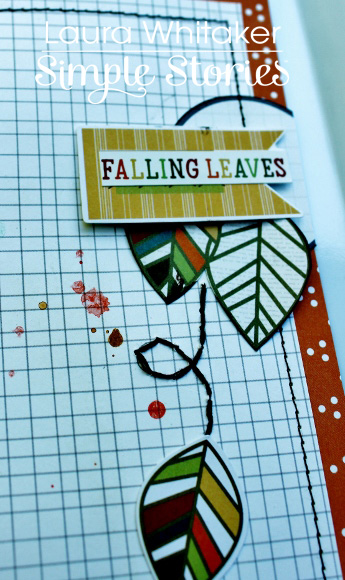
I arranged some of the word strip stickers from the Hello Fall sticker pack into the white vein areas of the leaf. All the sayings are fall-inspired! I also added some enamel dots and cut a few floral stickers in half and tucked them around the word strips for a little more interest. Up at the top of the page, I added the die cut flags from the Bits and Pieces pack and an acorn sticker. The gold scalloped ribbon is from my craft stash.

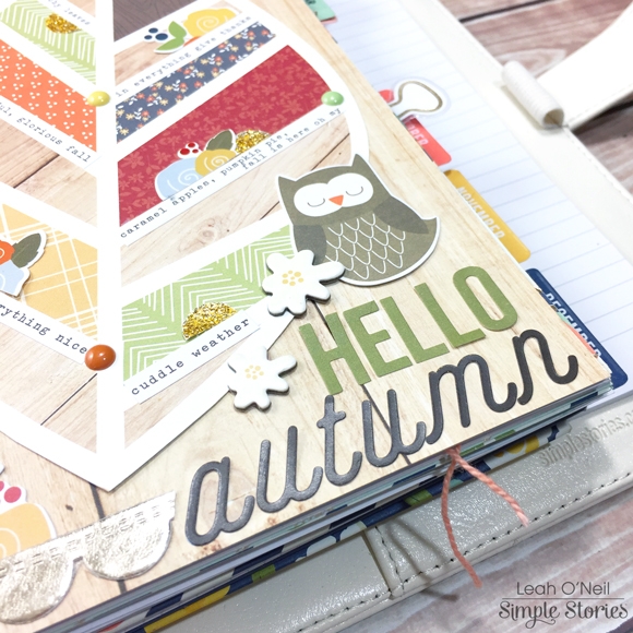
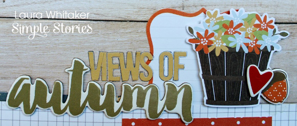
At the bottom of the dashboard, the owl is from the Bits and Pieces pack and the little white flowers are from the chipboard sticker sheet. The letters that spell out “autumn” are from the Hello Fall 12x12 cardstock sticker sheet, and the green letters that spell out “Hello” are letter stickers from the SN@P! Color Vibe collection. Whenever I stack letters like this for a title on a page, I like to combine different fonts because I think the contrast creates a bolder statement that attracts the eye.

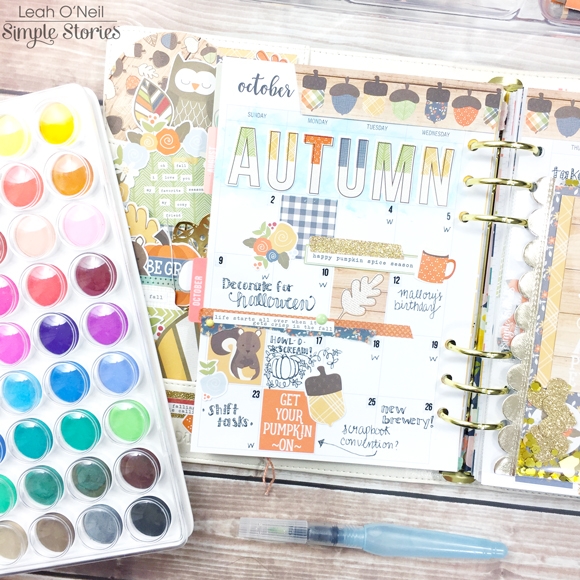
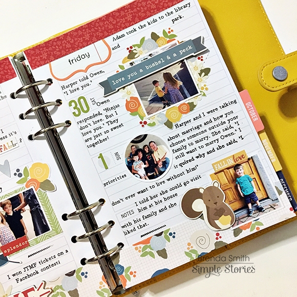
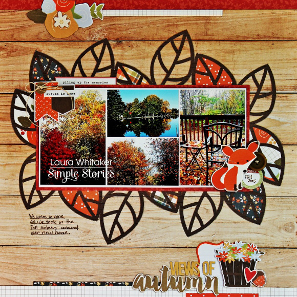
My October monthly pages were a blast to create! I love adding a little mixed media into my planner here and there. I mixed a few watercolor shades to create the light blue shade that you see under the big alphas that spell out “Autumn.” These alphas are from the 12x12 Cardstock Sticker sheet.

I decorated the rest of the layout with stickers from the Hello Fall sticker pack, the Hello Fall washi tapes, and die cuts from the Bits and Pieces pack. I brought more of the blue watercolor into the bottom right corner of the layout to create some balance. The acorns across the top of the pages are cut from one of the elements sheets in the 6x6 paper pad.

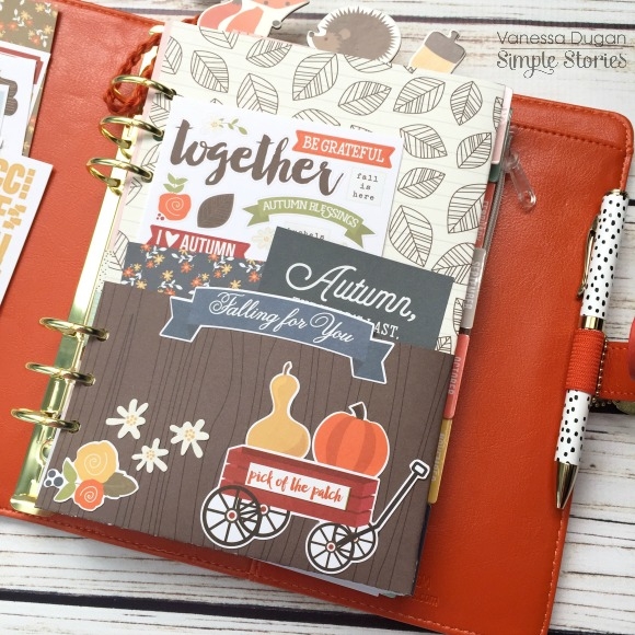
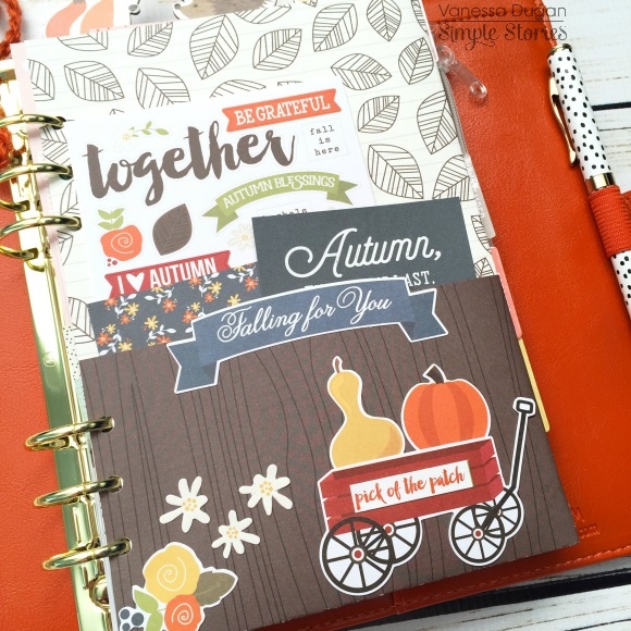
The next decorative fall element I made for my planner is a shaker pocket! It was SO easy to make! I started with a clear 4x6 pocket page, chose a few of my favorite SN@P! cards, and gathered a few sparkly things from my stash.

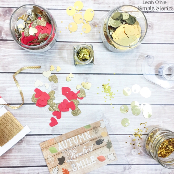
For the front side, I layered a few cards from the SN@P! Pack and just started putting various gold sequins and glittery hearts into the pocket, as well as couple of small die cuts. To seal the top, I used plain old, clear Scotch tape. I added a little more of that gold scalloped ribbon along the side as a finishing touch.

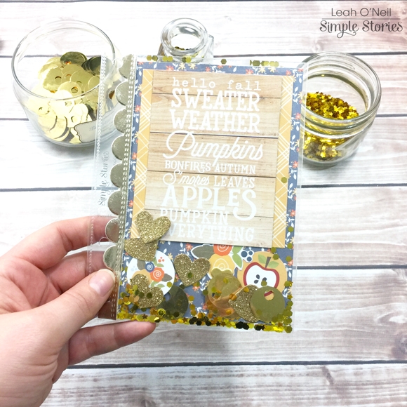
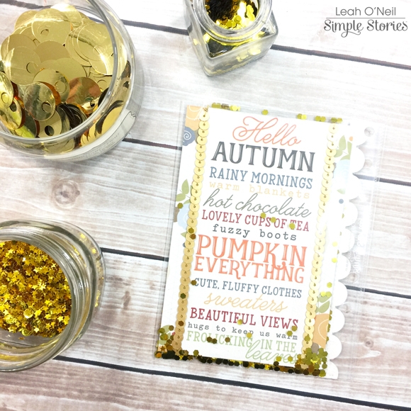
For the back of the pocket, I chose another one of my favorite 4x6 SN@P! cards and added some gold sequined string. I didn’t add any other bling into this side of the pocket, but some of the glitter came through from the other side and I love it!

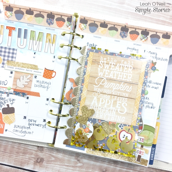
Here’s what the shaker pocket looks like in my planner! How sweet, right?! 

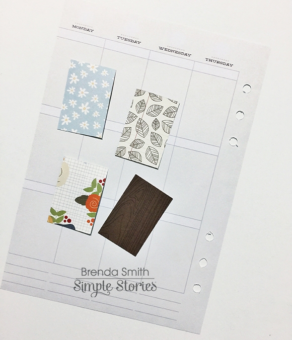
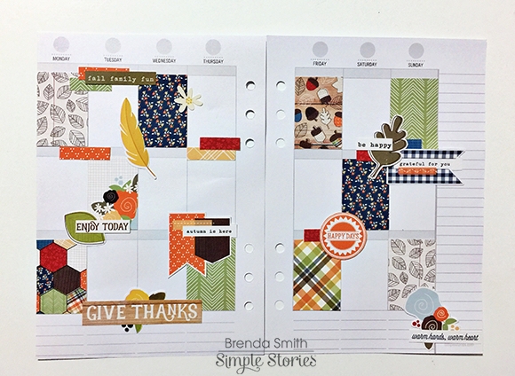
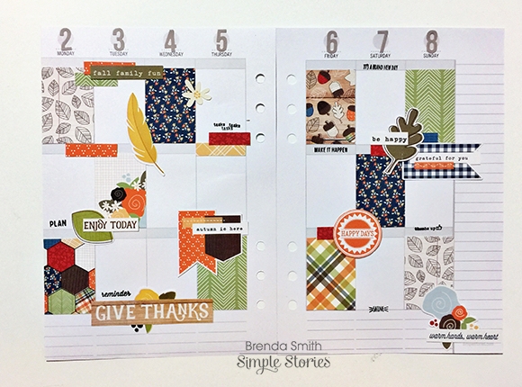
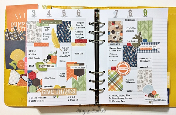
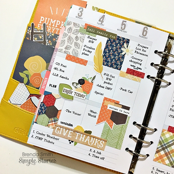
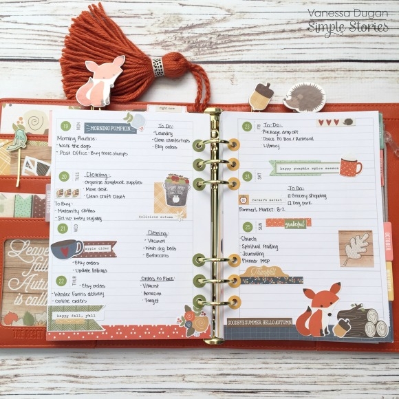
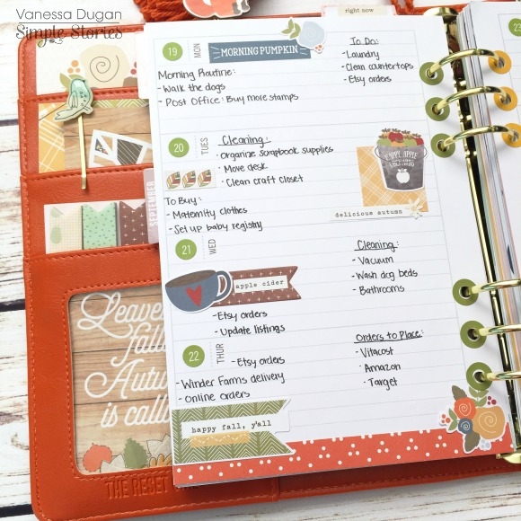
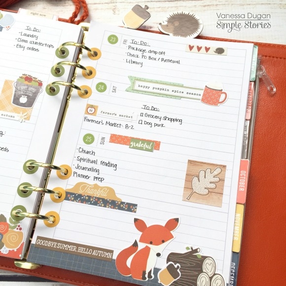
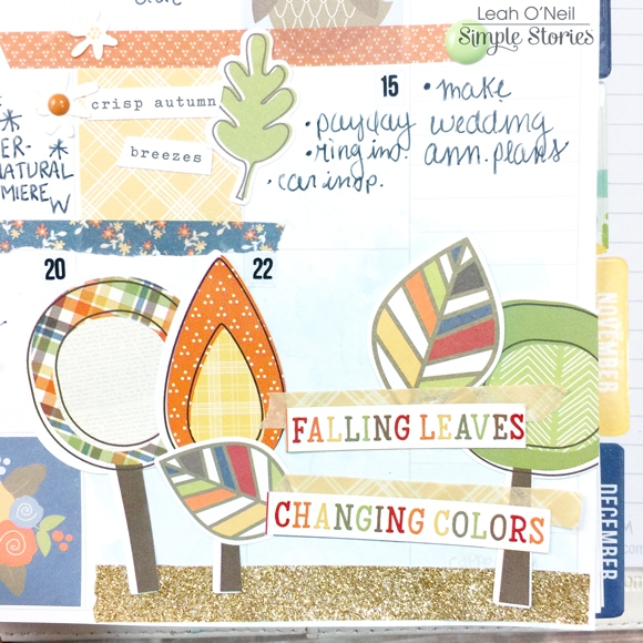
I am really feeling inspired to use the Hello Fall collection throughout the season on all my weekly layouts! For the first week of October, I used lots of Bits and Pieces die cuts and the Hello Fall washi tapes. I cut all the flags from different patterned papers in the 6x6 paper pad. The notecard on the left is from the SN@P! Pack, as is the green card on the right with the flower. The flower itself is from Heidi Swapp and sprayed with her gold Color Shine spray. I cut about half an inch off the length of the card and rounded the corners so the card became part of the layout, rather than covering half the page.

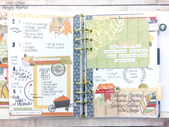
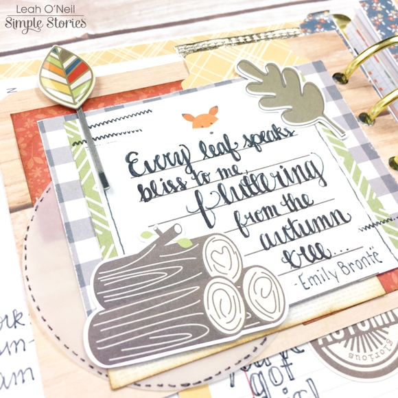
On the other side of the green card, I had a lot of fun with lots of layering! I started with a 3x4 SN@P! notecard and cut it to be slightly shorter to fit the space better. I then used several scraps from 6x6 papers I had cut earlier to start layering behind the notecard. To add some dimension, I inked the edges of the orange paper scraps. I also used a 3-inch paper punch to punch out a vellum circle to tuck into the layers, and added some faux stitching around the edge with a black sharpie pen. I added a couple of die cuts and a decorative paperclip, and stamped the stitched pattern from The Reset Girl roller stamp. I then chose a fun Fall quote I found online and lettered it onto the card.

The right side of my weekly layout has more Hello Fall stickers, die cuts and washi tape.

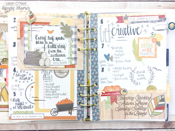
The bottom of the page is a strip cut from a paper in the 6x6 paper pad. I used some washi along the top, added a die cut tab, a decorative brad, a couple of cardstock stickers and more of the paper flags I made with paper scraps.

I really cannot get enough of this collection! I will be happily using it all season! The designs are so beautiful, and all the quotes perfectly capture the magic of autumn. If you haven’t “FALL-en in love” with this collection yet, go check out the Carpe Diem Planners Instagram for some more deliciously fall-themed planner décor! You can also check out my Instagram to see more of my Hello Fall projects coming up!

SaveSave

Supplies

Hello Friends, It’s Kristine Davidson with you today.  It’s actually Thanksgiving today in Canada as I'm creating, so this post is even that much more special! I created both of my layouts this month using the Hello Fall collection because it has wonderful fall colors and those little critters are cute too!

The first layout I'll be sharing is called "Moments Together"

These pictures are of my niece from the Spring! Yup, but I decided it was just as good for a fall themed layout. She was interested in getting a leash for her kitty. She was so excited to be taking her cat outside for a walk! They both enjoyed it very much and she still walks her today!  I used a sketch to create this page – it’s a sketch from Creative Scrappers. Using 3 photos isn’t my thing but I do enjoy the finished layout.

These little critters layered with some Bits & Pieces from the same collection are too cute! I mean a little plaid tree, some tree stumps and a little chippie! I created clusters on embellishments on both sides of my layout. Layering papers and adding cardstock behind to make the colors pop out a little more than just on the blue patterned paper was also to match the white border around my photos.

I added a small 2x2 piece of paper for my journaling –something different than my usual journal strips!

_______________________________________________________________

My Second layout for you today is called "Enjoy Today"

This layout was also created using the Hello Fall collection. It’s a cute picture of my nephew learning to tie his shoes. Quite the accomplishments for a 5 year old! I added some cute fall themed bits and pieces and well his plaid shirt is also a good focus for this page ;)

These little critters and trees also made their way to this layout. I really couldn’t help myself and add a few of them on my page.

My journaling was also handwritten on a 3x4” journal card.  

To see more of my work you can find me on Instagram at @KristineDavidson 

Thank you so much for reading and being a fan of Simple Stories!

Supplies

Hello everyone ! It is Mindi here with you today. I am so excited to be sharing some pocket pages that I recently created all about the first week of Fall. The Hello Fall collection was perfect for this particular project. The colors in this one are soooo very pretty. 
 
As I have mentioned before I typically do my pocket pages in a weekly format. This week was no different except for the fact that I added an insert to accommodate more photos from the week's activities. Here is what both pages look like minus the insert that I will get to later. It is a great mixture of everyday life and a few fun events that took place. That is what is so fabulous about pocket pages. It all can have a home together. 
 
 
One of my favorite parts about this collection are these cute trees. I chose this blue card with the trees on it for the background of my title card. This card was embellished already so it was easy for me to add my week number and the dates for the week. I also want to point out that I cut out some of the word phrases from a 3x4 card. I love all the little word strips that are throughout this collection. I knew that I wanted to use them some how so I cut some out and added them to my title card. Don't be afraid to cut up cards and use them in new and custom ways. It can really stretch your stash. 
 
 
This week turned out to be very photo heavy. One of the things I like to do when this happens is to print some smaller photos to go into the smaller pockets. Lots of fun things happened this week, even a half a day at Disneyland. I love how they decorate for Fall there at Disneyland and so I made sure I got a photo of the Mickey shaped pumpkin ears on the light post. 
 
 
The card that has the fall leaves on it is my favorite from this collection. This week I started to decorate for Fall around the house. I added a small photo of my Fall leaves and added it to the top of that card. Let's move on to the right side now. This is the insert that I mentioned earlier. I used only half a page protector to make my insert and I love how it turned out. This first page of my insert is all about our day at Disneyland. I added lots of photos and embellished a few of the cards. The colors in this collection were a great match for our Disneyland day. Lots of blues, oranges, and yellows. 


On the other side of the insert page I added one card with a photo of some sunflowers I had bought. I decided to make a little frame with washi tape to go underneath the photo. I wanted to be able to see the frame and so I did it on an angle and then embellished around the photo. The whole line of embellishments, stickers, enamel dots, ect. make it so easy to embellish your pages so beautifully. 
 
 
Here is what the bottom half of the insert looks like. I added a few photos and made a custom journaling card. I needed some more color onto this insert page so I added some patterned paper onto the top of the journaling card. On the bottom I added those adorable logs with the word CAMP on it. 
 
 
This right side of my spread is all about some fun fall events that typically happen around here. Football and Camping !! We have to wait until the weather has cooled down to go camping and Fall is always the perfect time. The boys went camping overnight on Friday and I included some photos from their adventures. I even stuck their parking pass on one of the filler cards. That will be fun to look back on and see how much they payed for a camp site. 
 
Another one of my favorite cards is the one that says Fall. I combined the F from the chipboard set with the rest of the word fall. I cut off the F from the die cut piece and it made for a fun custom card. On the bottom there is a photo of their campsite location and then a journaling card. Along the bottom corner of the journaling card I thought that would be a great space to add a cluster of embellishments. I also added the strip of washi tape. 


Thank you so much for joining me today as I walked you through my Fall themed pocket page spread. I hope you have found some inspiration to document all of your wonderful Fall moments. 

SaveSave

Hi everyone!  Theresa here sharing my October setup in my The Reset Girl Persimmon Carpe Diem planner!

I'm using the Hello Fall collection again this month.  To create some fun Fall clips, I took my Posh planner clips and used temporary adhesive to add the Hello Fall die cuts to them.  I changed the photo in the front clear pocket and added a fall embellishment to it as well.

I created a new dashboard with the patterned paper from the collection.  I added a photo of my kids at the pumpkin patch and used stickers and die cuts to embellish.  

When I think of Fall, the colors brown, orange and yellow always come to mind.  So I used those colors for my monthly layout.  I hope you're having fun adding Fall to your planners!

Hello crafters! I'm on the Simple Stories blog today with 2 layouts using the Hello Fall collection.

I am so inspired by this collection because fall is my favourite season amongst the 4 seasons! Singapore does not experience the four seasons (It is really summer all year round), so I am always enjoying the photos taken by my friends with different seasons.

The layouts I have done this time are taken by my ex-colleague and a good friend who has taken so many nice photos! I am always so inspired by his photography. These pictures are taken by JC Soo, at Liberty Memorial. Alongside with the photos, I also documented some of my favourite autumn quotes. It is a good way to store my memory of things I like at this point of time!

Be Thankful

For my first layout, I got inspired by the hexagons on the Warm & Cozy pattern paper. Love the colours in this collection; it really enhances the colours in my photo!

I started layering with the hexagons on the background. The fussy cutting of hexagons was so therapeutic; I actually cut all of the pattern paper into individual hexagons. I did not use up all of it though; I will leave the rest for another layout. The hexagons highlight one of my favourite fall quote – “Every leaf speaks bliss to me, fluttering from the autumn tree

For the title, it was easy to pick from the bits and pieces pack! Just the word I was looking for! A little stitching across the title helps to create more attention to the title.

There are so many elements in the Bits & Pieces pack that I used in this layout. The leaves and acorns are so cute! I like to use leaves as fillers – they help to reduce empty spaces and yet at the same time, do not over clutter the layout. 

More embellishments added to the layout. I like this tag – thankful - from the sticker sheet. Just paste it on, and add some more zig zag stitching to join the photo and the tag. Below the tag, I added some more layers of embellishments from the bits and pieces pack. There are simply too many goodies in this pack!

On the other end of the photo, I added this cute little chipmunk with the wooden logs. This melts my heart! Layering the embellishments one on top another creates a scene, and in this case, due to the lighter colour of wooden grain background, achieves a very good contrast!

_____________________________

Autumn

For my second layout, the main inspiration comes from the 2x12, 4x12 & 6x12 Elements pattern paper. I am really inspired by the papers in this collection! Everything else comes into place with this collection.

First, I chose a dark woodgrain as the background to serve contrast against the lighter elements I would be placing on the layout. Next, I did a fussy cut on the scroll from the 2x12, 4x12 & 6x12 Elements pattern paper. This element inspired me to create a portrait layout with vertical elements. In this layout though, I opted for hand stitching with some DMC thread. I wanted a bold contrast of stitching to enhance this layout; especially so since the background is dark, while the scroll had a lighter shade. I added the title at the top of the scroll, just above the photo. I like how the colors are concentrated at the top of the alphabet. This title came from the sticker sheet

Surrounding the scroll, I have added some fussy cuts of the beautiful florals from I {heart} Fall pattern paper. It is a continuation from the florals existing from the scroll page. I have also die cut some leaves and added them in between the papers to act as fillers. 

Some more goodies in the Bits & Pieces pack! I like to use embellishments associated with the photos. The simple yet eye catching trees in this pack works wonders!

Another cluster, backed with leaves as fillers to showcase a perfect embellishment – Autumn is here. All I needed to do was to fill up the space with another of my favourite fall quote – “How beautifully leaves grow old, how full of light and color are their last days.

I am such a Fall girl, and this collection has granted me a great journey into Autumn! Hope you have enjoyed the walk through, and thanks for dropping by today.

Supplies


Supplies

Good morning friends! Brenda Smith here with you today to share with you a couple planner spreads that I’ve been making in my Marigold Carpe Diem planner. I wanted to walk you through how I approach making my spreads. 
 
I first fell in love with the Carpe Diem planners because of the horizontal weekly format, which is PERFECT for memory planning. But a few months ago when the new Carpe Diems came with vertical weekly inserts, I couldn’t wait to give them a try! The vertical inserts have quickly become my favorite for traditional planning because I find the format works best for all the lists I have in my head.
 
 
The first thing I do is cut down some patterned paper to size to fit in the vertical boxes. The vertical boxes are 1.25” wide by 1.875” tall. I’m horrible at measuring with the little tiny lines on a ruler so I used the Pages program on my Mac to make a template (this can also be done in Microsoft Word). In pages, I chose “shape” from the top bar, and chose a square shape and filled it with a color. I resized by pulling at the edges until it was the right size. I printed out on heavy cardstock and then cut it out. I used this as a template to cut out all the rectangles for my vertical boxes.
 
 
I used the Hello Fall 6x6 pad and mixed and matched patterns to give myself a good selection. I also trimmed out tiny little pieces of patterned paper to use as layering pieces, kind of like I would use little bits of washi but paper instead. 
 
 
I took some die cut pieces from the Hello Fall Bits and Pieces and layered them atop my patterned paper boxes and paper strips. I move everything around (without gluing anything yet) until I’m satisfied with how it looks and then I start gluing things down systematically. 
 
 
Once I have everything glued down, I’ll break out my stamps keeping in mind sentiments that will work for what I have going on that week. I want there to be a little white space left after I’ve added journaling, so I make sure to use stamps that will not take up too much valuable space. The Simple Stories roller stamps (List It and Make it Happen) are perfect for this because they offer a variety of sentiments in the optimum size for planners. 
 
 
I usually use either my typewriter or my Silhouette Cameo with sketch pens to do the lists and journaling on my planner pages. I like the clean and eclectic look it gives. 
 
 
Occasionally, I will outline my die cuts or embellishments that fade into the background with a black pen just to make them stand out more. I felt like this spread didn’t need any help with that, though, so I left it as is. 
 
 
Also in my Marigold planner, I’ve got a divided section for memory planning. I do memory planning in a few different planners with the idea that maybe some day, I could hand completed memory planners to my son and daughter after they move out. So I have a planner for memory planning that is more skewed toward my daughter and things she says and does and I have one for my son, and I also have a more generic family memory planner which is this one. 
 
 
This time, I decided to add a few photos directly to my memory planning pages. They take up a lot of room on my page, but as long as I can write a few lines to remind of us of the memories, I’m not worried about it. 
 
 
Now I know this might make some orderly scrapbookers have a bit of a panic attack, but I’m going to let you in on a little secret: as long as my photos and memories happen within that week, I’m not always careful to put them on the corresponding day that the pictures were actually taken. If I took a photo on Saturday but it doesn’t really work for my design purposes to be placed on Saturday, I don’t worry about it. I put the pictures where they look best and relax about the timeline. Nobody is ever going to look back at these and say, “Hey, that actually happened 3 days earlier!” Within the week is specific enough for me. 
 
 
I hope you’ve enjoyed this peek into how I’m planning Fall in my Marigold planner. Have you transitioned into Fall in your planners? Make sure to tag Simple Stories when sharing on social media so we can enjoy all the beautiful pages you're making in your Carpe Diem!

Supplies

Hi there!

It’s Shei on the blog today. I’m so happy to be back sharing two layouts. Let’s get started!

My first layout is devoted to one of my favourite places in the world. This photo is from National Park Aigüestortes, a catalonian natural park (in Spain). This place is very special for my ‘cause it is where I spent all my childhood summers. 

So, I used the cute and fun “Hello Fall” collection. I chose the orange with white dots paper (Sweater Weather b-side) as my background. Then I cut a lot of leaves‘s contour with my Silhouette Cameo on white cardstock. But I didn’t cut completely the leaves, I only cut the half of each silhouette instead it. After that, I folded all the leaves so you can see the background paper.

Next came the embellishing! (my favorite part). I created a cluster of embellishments with flowers and leaves from chipboard stickers, bits&pieces, the combo cardstock stickers and the 4x6 stickers sheets. 

___________________________

The next layout I’m sharing with you today was again created with the beautiful “Hello Fall” collection. I started this page with a white cardstock as my background. 

My idea was to represent the withered leaves flying on a windy autumn day. So I sew three lines like when you draw the leaves movement. Then I glued a lot of embellishments around them. The flowers, feathers and leaves from the chipboard stickers, bits&pieces and 4x6 stickers and the acorns and some sentences from the combo cardstock stickers and 4x6 stickers. Furthermore, I wrote the word ”friends” with the abc from 4x6 stickers. And finally I splattered yellow and brown paint  around the lines.

Then I glued my pic on two decorated papers (Autumn Delight and Warm and Cozy b-side) and I decorated it with some of the cute pieces than you can find in bits&pieces (the heart, the word to my title or the flowers are some of them).

Thank you so much for taking the time to read my post! I hope you enjoyed my layouts! See you next month!

Never stop smiling! Kisses!!

SaveSave

Hello Everyone! This is Jennie and today I’m going to share with you how I documented the first week of fall. The perfect collection for these memories is the Hello Fall Collection.

On a few the past weeks' pages I have a few red flags on the top. These mean that I haven’t worked on these pages. Every week or two I print photos and I slip them in the page protectors. Printing photos is the most boring part so I like to do it fast and be done with it. However these pages are ready for that moment where I find the perfect products or inspiration to work on them.

In one of the pockets I included a booklet that come in Shopkins toys. My daughter is obsessed with those toys so I think it would be cool for her to pull it out and look at it.

I really like how this title card came out! The font on the Hello Fall Combo Stickers is gorgeous!

I always need to add a little something to each card, even the photos. The new 4x6 Stickers include one sheet of little words and another sheets with words and pattern rectangles. I also like to use the Posh Word Label Stickers.

 
To write my journaling I add a number to the photos and then I write the story in a journaling card. I used the numbers from thePosh Number Stickers.
 
 
The Hello Fall Collection has a washi tape set but you can also mix it with the washi tape from The Reset Girl or the Posh collections. 
 
 
I love the Photo Flips because I can always add extra memories and journaling. You can also make a shaker flip pocket on top of a photo to create a really cool effect.  
 
 
I hope you enjoyed these pages! If you want to see how I made these pages check out this process video:https://www.youtube.com/watch?v=rUqY8uL_iGU&feature=youtu.be

Supplies

As many of you know, October is Breast Cancer Awareness month, an annual campaign by the Breast Cancer Awareness Foundation to increase awareness of the disease that has directly & indirectly touched millions of women worldwide.

Earlier this year, owner and creative director Amber Crowell introduced you to our Hope Simple Set honoring the fight - 

Hope is a small collection dedicated to one of Amber's dearest friends of 30 years, Heidi, and to everyone who has been affected by breast cancer.  Last year Heidi was diagnosed with stage 3 breast cancer.  Of course this news was devastating to her, her family, and everyone that knows her.  In Amber's words, "Heidi is the toughest, most dedicated person I know and immediatley set out to kick cancer's butt!  After a year of surgeries and treatments Heidi is standing strong - she even dyed her hair pink to show her victory over cancer. Heidi's kick butt attitude is the inspiration for the new HOPE collection - all about fighting the fight and having hope for a better tomorrow.  Heidi, you're my hero in so many ways!"

While the collection was launched nearly a year ago, it's a collection we continue to produce in an effort to provide breast cancer themed product for women to document their trials, tribulations & triumphs with the disease and to increase breast cancer awareness.

For more information about National Breast Cancer Awareness Month, visit www.nationalbreastcancer.org


Hi there and thank you for stopping by today, as I share something a little leafy with you.
 
The super sweet characters and versatile neutrals in the Hello Fall collection have stolen my heart. Perfectly paired with some warm and cozy shots of a (then very little) niece of mine, it makes me wish our Autumns were a bit more dramatic here in sunny Queensland!
 
 
Over an awesome woodgrain print, I have used a cut file created by a friend of mine as a starting point for my page design. I love the way the floral cut matched so perfectly with the swirly Hello Fall blooms. It also gave me lots of open areas where I could tuck bits and pieces.
 
 
The neutral base also allowed me build up lots of interest in and around the die cut. These simple leaf illustrations from a sheet of Harvest Season must be one of my favourites. Repetitive shapes always make me happy - A sheet of this paper would give you a pile of embellishments! What’s even more fun about this paper is that it’s got both earthy tones as well as pops of colour, like these red and blue acorn shapes. How cute are the miniature floral prints on them!
 
 
The leaf shapes are balanced out with some smaller details like some enamel dots and a few speckles of coordinating mist. 
 
 
You’ll notice the second photo has been printed off inside a circular shape. I created a circular photo box with a very fine stroke, before printing off. The stroke gives me a great guide so I can cut out the shape by hand. Slow and steady is the way, hehe. It also echoes the large circular shape which ties the elements together.
Far too nice to throw out, I’ve also used the left overs from the die cut here and there, to bring in a bit more of that pretty red shade. I’ve also raised a number of elements up with foam tape. On a busy page like this, I think it’s important to add dimension, otherwise things will start to all blend in to each other. It’s also important to remember to vary the sizes of elements to create balance. If all the leaves were the same size and shape, it would overwhelm the design. Some printed phrases and word labels add a nice amount of chatter to finish off my layout.
 
 
Thank you so much for joining me today.  Until next time.. Happy creating!


Hey there, friends!  Missy here, and I have two layouts to share today using the beautiful Posh collection.  It’s such a versatile line, and I love that you can create different color schemes with it and make it look like two different collections.  There is a lot of navy blue, which I love.  But for my first layout, I challenged myself to not use any navy blue.  I wanted to create a soft and light look using a lot of the pretty floral images. 

I used a black & white photo of my daughter, and I was inspired by a 3x4 SN@P! card covered in flowers.  I love the “hello beautiful” sentiment, and I wanted to use that as my title.  I used the Choose Happy patterned paper for my background because of the floral clusters and the white space.  I wanted to place the photo in the lower left corner since she’s looking up to the right.  So my design sort of goes in a diagonal to follow her eyes.

I decided to create a fun XOXO design in the background, so I created it in my Silhouette software and then cut it.  I backed it with patterned papers and then added a bit of white gesso over some it.  I used some watercolors to add some background interest and then stitched around the letters with shiny gold thread.  I fussy cut the XO from a 4x6 Snap card and then added a fun shiny gold die cut over it.  I love using the Clear Stickers and Word Label Stickers for embellishments, too.

Here you can really see the gesso and watercolor area.  I love how that turned out!  The colors are so light and pretty, and the floral clusters are gorgeous.  I fussy cut those from Snap cards.  I added some tangled thread for extra interest, color & texture as well.  I think the stitching really gives it a finished look.

Here’s that beautiful card that I began with.  I added those fussy cut floral clusters for even more flowers…I just couldn’t get enough of them!  I added some white tissue paper and foam under the photo.

I love layering embellishments right on top of my photo if there’s room.  These flowers are perfect for that.  Plus, it looks like she’s looking at them.

Here’s one last close-up of the top right area.  I added another fussy cut floral cluster, tangled thread, stickers and a fussy cut phrase.  Those Snap cards are a great source of images and phrases to cut to use on your pages.  This one was perfect.


I was very happy with how this turned out, and it shows how you can get a soft and light page using this collection. 

______________________________

For my second layout, I did use the navy blue color, and it completely changes the look of everything.  I think by adding that one color, you can get totally different looks with your color schemes.  I decided to use lots of the Washi Tape for this layout.  There are two different washi sets, and they both include some navy blue.  I took some white cardstock and punched different sized circles.  I used all six rolls of tape to cover all the circles.  I created a vertical design with them, and I used my finger to smudge down some clear gesso all around the circles.  I used some oil pastels and gelatos to smudge some matching colors around the circles and where the photo was going to go.  It was really fun mixing and matching colors to match the colors in the tapes.  I used a small black & white photo because I wanted to use that cute 3x4 Snap card as part of my title.  The black & white really pops against all those bright colors.  I love how the navy color adds a different feel than leaving it out and going with just the light colors.

I love these colors!  Once I had my circles taped down and all the background color on, I machine stitched through all the circles in coordinating thread colors.  The stitching not only makes sure things aren’t going to move, but it also adds color & texture.  I also used a couple of the Epoxy Metal Clips as layering pieces behind two of the circles.

There are so many fun stickers in this line, and I added one under my photo.  The Clear Stickers were perfect for this because my background was mostly white.  You can really see those on a white or solid background.  I layered more thread under some of the circles & the photo.

I added some ink splatters in coordinating colors.  I also fussy cut another flower cluster (this time with navy blue included) as a little layer behind my photo.  I used my craft knife to slice around some of the petals so they would overlap onto the photo.  I added foam adhesive under the photo to give it some dimension.

This SN@P! card was just begging to be part of my title, so I layered my photo on top of it and added some of the Combo Cardstock stickers to it.  I love how it turned out even though the photo overlaps some of the letters.  I love that cute little clear camera sticker!

Here’s another angle of the top area.  I used a tiny circle punch to get a few smaller circles in the mix, and I also added more Clear Stickers as well as another Epoxy Metal Clip.  I love using those as a layering embellishment, or you can break off the clip part and use those like you would a brad.

I can’t believe both of these pages came from the same collection!  I love how different they look, and you know you have a great collection when you can make girly color schemes AND not-so-girly color schemes.  I hope you challenge yourself to try to get some different looks out of it.

Have a great day!

Supplies

Hey planner girls!

Meka here today, excited to share how I dressed up my Robin’s Egg Carpe Diem planner with Simple Stories’ Hello Fall collection.

My planner pockets are a place for inspiration and joy. I use motivational journaling card elements for words of wisdom.  For more fun and functional décor, I used epoxy metal clips and chipboard stickers with paper clips attached.

To create the pocket insert, I used the I {Heart} Fall and Sweater Weather 12x12 scrapbook papers as the base. Then I embellished with Bits & Pieces and scraps of larger papers.

These dividers and tabs were so simple to put together!

After cutting more papers from the Hello Fall Collection Kit to page size, I punched tabs using a tab punch. If you don’t have a tab punch, you can just cut rectangles about 2x3 inches. From there I used tiny scraps, stickers from the 4x6 pack, and cardstock stickers  to embellish the labels.

I spread the tabs and dividers out, and mixed and matched contrasting colors and patterns to make everything pop.

An extra tab was added to the top of my completed calendar divider for quick access.

For the week’s planning layout, I started with a wash of what turned out to be way too much yellow watercolor!  I used washi tape and clear number stickers for the header, then embellished with Bits & Pieces and stickers. By the end of the week, I’ll add more writing, doodles, and stickers to tone down the excessive paint.

I uncovered some mini clothespins, and couldn’t resist another clip diy. I glued a few Hello Fall paper scraps onto the clothespins. I left some simple, and adorned another with fall bouquet.

Changing out my planner décor for the season is really motivating me to jump in and play with my planner more. Come visit me here on Instagram and let me know how you’re decorating your planner for fall.

Supplies

Hello friends!

Summer has crept away and we are now a week into our Fall season, I must say that I am a summer gal at heart and always find it bittersweet to say good bye to hot sunny days.  That said, oh how I love the colours and scents that Autumn brings.  Warm sweaters, comfort food and crunchy leaves are all happy things, but you can bet I will still be sporting flip flops for a while to come!

Today I am sharing two layouts that I have created with the gorgeous Hello Fall collection, and as we have come to expect Simple Stories, it does not disappoint.  It definitely elicits all of those warm and cozy feelings of fall.
 

I AM READY FOR THE LEAVES TO FALL
 
I began this page by adding a few sprinkles of water colour paints to my background to mimic the falling leaves and colours in  my photos, then I stitched it onto the orange patterned paper.
 

I placed my photo on top of a few pieces of patterned paper after matting them with some cut apart cards. Then I tucked a few die cuts and hand cut elements into my layers.
 

I love these multi coloured leaf die cuts from the "Bits and Pieces" package and used several of them on my layout, I did some hand-stitching to add the suggestion that a couple of these leaves were falling.
 

I also loved this quote, cut from a cut apart card, so much that I knew it needed to be my title.  I paired it with a die cut for more impact.
 

Always happy to add more embellishments, I took the opportunity to create a cluster to adorn the right hand side of my layout.
 

I finished off this page by creating a little Fall scene beside my photos.
 
VIEWS OF AUTUMN
 
I am a sucker for all things wood-grained and so this patterned paper definitely had to be used as a background piece for full impact! I added a few strips of other patterns to the top and bottom of my page for colour.

I created this cut file to anchor my photo collage and backed parts of it with patterned papers.
 

Combining alpha stickers and a chipboard piece I created my title, which was adhered beside a cluster with die cuts, stickers and more chipboard accents.
 

How sweet is this little fox?  He definitely need to be in the spotlight!
 

I love these little banner elements for adorning my photos.
 

To balance my title, which sits low on my layout, I added a small cluster of fall coloured flowers to the top of my page.
 
Thank you so much for visiting today!


Good morning friends! Brenda Smith here with you this morning to share some pocket pages using Hello Fall. I live in the Southern California desert so we don't have much in the way of traditional Falls here, but this line is perfectly versatile enough to be used with non-specific Fall imagery. 

I strayed away from a lot of the more specific Fall embellishments like bushels and pumpkins, but the vast majority of embellishments are usable for everyday pictures. 

I used a mix of full-sized photos and smaller ones to fit atop my 3x4 cards. I find this creates a good balance of color from the embellishments and cards but still gives plenty of focus to the pictures. 

I made good use of the 6x6 pad for layering under smaller photos. The patterns of the papers are perfectly scaled down for a smaller format such as this. I find I can add more pattern when it's at a smaller scale. 

I used a bit of foam dimensional adhesive to make the various layers stand out a little more. I buy the thinnest foam adhesive I can find for the purpose of pocket pages so I can add dimension without too much bulk. 

Whenever I'm struggling with layering, I often turn to a doily as the bottom-most layer. I find that adds enough visual interest but since it's lacy, it doesn't overwhelm the photos. I'm a label-lover so I was really excited to see how many there were included in the Bits and Pieces pack. They are perfect for adding journaling to layered cards. 

 
I used a lot of the little white flowers from the 12x12 Cardstock Stickers all around the spread. I like to find a small, unobtrusive embellishment that I can place all around the spread as a unifying element. 
 

I loved the sentiments on this card so much that I wanted to add very minimal elements on top to keep the focus on the words. I added a sunset photo and a couple of embellishments from the cardstock stickers. 

As you can see, you do not have to have pumpkin patch or apple-picking photos to go with this collection. The colors are a gorgeous combination not often seen in scrapbooking collections so the uniqueness is fun and refreshing and perfect for your Fall photos, wherever you are!
 
 
Hi planner friends, Vanessa here! Now that the Fall season is in full swing, it’s time to update our planners and have fun with the new Hello Fall collection!
 
 
The Hello Fall collection is full of pumpkin spice, cozy prints, and adorable woodland creatures.  I just simply switched out my stickers and journaling cards to match The Reset Girl’s Persimmon Carpe Diem planner.
 
 
I used the Piles of Smiles cardstock to make a pocket page and added a few of the Bits & Pieces from the same collection to store any extra planner stickers and journaling cards.


For my weekly spread, I used mostly the 4x6 sticker sheets from the Hello Fall collection to break up the blank spaces and to add a seasonal touch.
 
 
The trim along the bottom is from small strips of cardstock I had cut and I used a few Bits & Pieces cover up the edges.


I love making new paper clips for each month and the Hello Fall chipboard stickers are sturdy enough for paper clips.  I just picked a few of my favorites and used a strong adhesive to attach to the clips.  
 
 
I hope you enjoyed this quick and easy update inside of my planner for Fall and I look forward to sharing my next set up for October!
Hello!  It's Jennifer on the blog today to share pages I created with the new Happy Haunting Simple Set! September is coming to a close and Halloween is right around the corner!  Happy Haunting is perfect for all of your spooky creations!   Truth be told, Halloween is my favorite holiday and I am in love with the colors of this collection!
 
My first layout, "Happy Halloween", I started with the wood grain print of All Hallow's Eve as my background.  I dabbed a bit of black and white ink to my paper using a hexagon stencil before embellishing.  I added strips of both sides of Trick or Treat to the top and bottom of my page; I think the plaid print is my favorite!
 
 
The set includes a double sided page of 3x4 and 4x6 Journaling Card Elements that are perfect for accented your photos or as a layer underneath your embellishments!  I love this adorable "SPOOK" bingo card!

 
At the top corner of my page, I added the spider web/spiders from the coordinating 6x12 Sticker Sheet!  There are many cute Halloween shapes as well as small sentiments, and squares.  I had some coordinating enamels dots as well as wood veneer stars in my stash to add to the web!  
 
 
You can also create your own embellishments using a favorite paper punch or your die cut machine.  I created my tag using a hand punch and one of the 3x4 Journaling Cards! I then affixed some black/white ribbon with a staple! 

________________________________

For my next layout "Oct 31", I used black cardstock  and a cut file with my Silhouette to create a grid pattern. I then cut square patterns from the different sheets and stitched them onto my page.   I am loving the ombre effect of the B side of All Hallows Eve!  

Did you know Simple Stories has a large variety of cut files available in the Silhouette shop here? I used the "Oct 31" file with white cardstock which I lightly misted with gold spray ink.  I then affixed it to one of of the squares.  

Showing another one of my squares which I included more of the adorable stickers!  The stars are tiny but oh so cute! 

I love the little ghost sticker...I paired him with the "Keep Calm and Boo" square sentiment sticker.  I used a couple pop dots under the ghost to give it some dimension.  

Thank you for stopping by the blog today!  Visit the Simple Stories Products page to see this collection as well as the rest of the new releases! Have a great day!

Supplies

Pages