Hey Everyone! This is Jennie with today’s pocket pages using the Sunshine & Happiness Collection. This week had a little bit of everything including some photos that daughter took. My daughters always take my cell phone to take random photos and sometimes they get good shots.

The journaling cards from this layout are from the Sn@p Pack.

This week I only used the typewriter for my journaling. Normally I mix it but I needed to journal a lot and my handwriting is pretty big.

Every week I stamp the dates on labels and the labels from the 4x6 Stickers are perfect for my title card.

The most common kid’s photos on my phones are from the TV, toys or their messy rooms. I always make a note of which girl took the photos, in case I forget in the future. In the middle of collages I like to use Adhesive Bradz.

The Fundamental Cardstock Stickers are great when for typing because they are flat and once I’m done typing I can add a few around to embellish.

I hope you enjoyed these pages! Summer is almost over and I bet you’ve made gorgeous projects with the Sunshine & Happiness Collection. Make sure you share them with us on Social Media, tag @simplestories_ on Instagram!

Hi there!

It’s Shei here today. I’m so happy to be back on the blog sharing two layouts. Let’s get started!

For my first layout I used the FA-BU-LO-US “Carpe Diem” collection. This line is so fun and colorful!

I made a very simple layout. Only a cardstock, a colorful paper and a few embellishments I used to make this project. As a starter point, I chose white cardstock as my background ‘cause I like the brightness that the white color brings to the whole project. 

For this layout I used one of my favorite photo of my cat, so I decided to cut the silhouette of a cat with the paper "Pencil It In (b-side)". Actually, I copied the cat's silhouette in this collection  (it’s so cute!!). Then I pasted it in the middle of the white cardboard and I sewed with black thread the cat shape.

To highlight the pic, I made a thin frame with the "Black Dot paper" and I pasted the photo on the project. Below the photo I put the title "Look cat me" (play on words with “cat” instead “at”) with black and pink letters from Expressions Cardstock Stickers.

Finally, I decorated the project with some embellishments from "Total Chaos paper" (the lovely cat in the world!) and "Fundamentals Cardstock Stickers" like the hearts and the arrows.

______________________________

The next layout I’m sharing with you today was created with the beautiful “Sunshine&Happiness” collection. 

As is usual with me, I started this page with a white cardstock as background. Then I used some of the journaling cards of the 4x4/4x6 Vertical Elements, 4x6 Horizontal Journaling Card Elements and 3x4 Journaling Card Elements papers. I pasted the pic in the middle of the cardstock and around it I glued the journaling cards I chose.

Next came my favorite part: the embellishing! For that I used some stickers from the Fundamentals Cardstock Stickers, some elements from the Chipboard Stickers and some sentences and lime letters from the Expressions Cardstock Stickers. I also added a few enamel dots and the self-adhesive brads to give dimension to my layout.

Thank you so much for taking the time to read my post! I hope you enjoyed my layouts! See you next month!

Never stop smiling! Kisses!!

Supplies

Hey there, planner girls! Meka here today sharing a bit of my robin’s egg Carpe Diem planner decorated with totally gorgeous Posh planner goodies.

I’ve added a few Posh pocket card inserts and Epoxy Metal Clips to liven up my front pockets. The gold foiled “Choose to Shine” clear dashboard provides continued inspiration, shown here backed by the striped floral front side of the August monthly spread.

One of my favorite Simple Stories products is the clear sticker pack.

It includes a variety of both monochromatic and colored transparent stickers. While they’re great for planning layouts, they also make an unexpected addition to the planner itself.

I’ve used some on the front and back cover, pockets, and strap. They’re super easy to remove when I’m ready for a change.

Here I combined them with the Clear Label Stickers

For the weekly layout, I started out with a simple watercolor treatment on a Vertical Appointment Weekly Insert, as well as a Vertical Format Weekly Insert.  They’re so simple to create, and it’s nice to have a variety to choose from when I’m ready to complete a layout. I ultimately went with a vertical layout this week.

Across the top I wanted to use a strip of thin washi layered beneath the dates. Since I love the pattern of the standard-width High Style floral washi, I sliced it in half using a craft knife and a cutting mat.

After that, the Make It Happen roller stamp was just what I needed to create a row of headers for each section of the vertical layout.

Posh Page Flags, Planner Basics stickers, and gold foiled Designer Stickers were then layered to further embellish the headers.

From there, I added components of my week with the help of Calendar and Weekly Stickers, plus a few hand-drawn in elements.  Another week made beautiful with the help of Simple Stories and the lovely Posh planner collection!

Hello dear Friends! Alexandra here! I'm so happy to revisit my "big" album. Here is what our WEEK 23 looked like with the beautiful Sunshine & Happiness collection

I added two stickers on the 6x8" photo (can be found on the Fundamentals Cardstock Sticker sheet) I like how the black of the HELLO sticker echoes the black found on the top picture. The pink of the peonies is picked up throughout the left page.

I didn't have that many photos for that week so for the right page, I trimmed a regular 12x12" Pocket Page so that I would have three 6x4" pockets and here too, I used the cards found in the the SN@P! Pack Sunshine & Happiness.

I always enjoying incorporating a bit about the news so included a photo of the New York Times and did a collage about the EuroCup with pictures I found on the net. I also included pictures of two postcards I received that week. Thank You!

SaveSave

Hello scrappers!  Laura Whitaker here with you today sharing two more layouts using the fun and fabulous Sunshine and Happiness collection! I love every little thing about this collection and just had to keep on using it, I am down to the bare bones, but hope to get another page out of it at least!

My first page is called "Hello SONshine"
 

This page was created to document a big event for this youngest boy of mine. July 5th was the 11th anniversary of his adoption day!  We always celebrate this day with a special dinner out, but since his dad was out of town this year we postponed dinner and he and I made up some fancy drinks (Shirley Temples) and had a fun night celebrating with just the two of us!

I am totally happy to use pink in a bold way on a boys page, I love to use papers and embellishment that suits the mood of my photo over the gender of the subject.  And hot pink is just plain fun!
 

I used a sticker, alpha stickers and part of a die cut to create my "HELLO Sonshine" title and I just love the way that it turned out!  I added a bit of machine stitching just for fun!
 

There were so many embellishments in this collection that made it very simple to  accent my page, like this pop bottle and a variety of fruit stickers.
 

I added a small cluster of embellishments to the top left of my page, which starts my visual triangle and draws the eye to my photo on the right.
 

I really wanted to use this 4x12 cut-a-part on my page as I do not typically put these pieces to good use.  I layered on a few phrase stickers and doodled around them with a black felt tip pen for a bit of pop.
 

The last point in my triangle is this small cluster at the bottom left of my page, with is highlighted by a triangle of patterned paper.

My second layout is called "There are so many beautiful reasons to be happy"
 

Yes that title is a mouthful!  But so very perfect!  As I mentioned, I had challenged myself to use up the large cut-a-parts in this collection and when I pinched this photo off of my son's Facebook page I knew this particular cut-a-part would be exactly right!

I layered it over the yellow patterned paper and added a bit of striped paper to the right side of my layout to tie in all of the colours.
 

This butterfly was fussy cut from another cut-a-part; to the Native Americans butterflies symbolize change, joy and colour which made it perfect for my layout which celebrates these three special people that have become a little family as my son and his new fiance recently got engaged.
 

This phrase was also cut from a cut-a-part card which pretty much acted as perfect journaling on my page.
 

I have been simplifying my embellishment clusters lately and this little one at the top of my page is indicative of that.

Supplies

Hey planner friends!  It's Vanessa & I’m back again to show you how I am using some of the goodies from Carpe Diem Reset Girl and Posh planner collections in my Robin’s Egg Carpe Diem planner. 
 
 
For the monthly pages, I like to keep them functional with lots of space, but still have some decorative stickers and ephemera to dress up the pages.
 
 
Most of the stickers here come from the Planner Basics Stickers pack from The Reset Girl and I love how this set is full of mini page flags, ring reinforcers, and box stickers that coordinate and fit inside of the boxes.
 
 
On my weekly pages, I used the number stickers from the Icon Stickers set to date the first week of August, a few of the page flags from the Posh Collection, and the Planner Basic Stickers for layering.  I love how there’s a mix of prints and colors, but they all go together beautifully.


Some of my favorite stickers from the Planner Basics set are the box stickers that not only fit perfectly in the Vertical Format inserts, but they can also be used in your horizontal inserts to add some color and break up the large white space.
 
 
My absolute favorite item from The Reset Girl collection are the Bits & Pieces.  They’re so adorable and I love how they like look classic stationery items from the past and present.  I picked four of my favorite pieces and made them into paperclips to separate some pages that I want to find easily.  I also added a small stack of the sticky notes to my bookmark so they’re readily available.  


Thanks for stopping by today to check out my planner set up and I hope you have fun with the collection from The Reset Girl.  It’s a beautiful collection that I will enjoy using during August and will look even more beautiful in the Fall as well.
Good morning lovelies! Brenda Smith here with you today to share a pocket page spread I made with the fun and vibrant Sunshine & Happiness.
 
 
One of my favorite things about pocket pages is that they can be made quickly if desired; simply print your photos and pop in some filler and filled-out journaling cards and you're good. I often take an approach similar to this one, with maybe a little extra embellishing tacked on to the end (I like my embellishments!). But today, I wanted to spend a little more time with my pictures and supplies and decided to print up photos at odd sizes to place on top of the cards and patterned paper. 
 
 
I use photoshop to resize my photos but this can be done in any number of programs you may already have including Silhouette Studio and Microsoft Word (you can google more thorough tutorials but essentially you drag the photos onto your canvas in your program, pull at the corners to resize, and print). I usually print them somewhere around 2.5"-2.75" square. Sometimes I'll alter this to make more or less space on the card. 
 
 
I try to keep my embellishing to a minimum when making the photos smaller. I want the photos to remain the focus of the page. I usually layer a few die cuts on top of and under the photos and add a little journaling and call that card done. 
 
 
I am typically a heavy journaler and am always worried that my pages will look like a big block of text. I used my computer for the journaling this time and I made sure to include ample line space between my journaling lines. I find that by adding the little bit extra space, it instantly makes the page seem less heavy. 
 
 
I needed a few embellishments to be a bit smaller for my purposes so I coordinated the paper collection with the digital Sunshine & Happiness collection and resized certain embellishments in Photoshop before printing out. Again, this is something that could be done in free programs as well. Don't be afraid to make both digital and physical work together for you. Resizing and printing out digital elements is way easier than you might fear. 

Supplies

Once upon a time, my layout started with one sheet of paper and a pair of sharp scissors. The 'High Five' paper from Sunshine & Happiness was screaming chop me up!  lol.  


That is exactly what I did!  Then I separated the colors and lined them into rainbow form.  


Tucking them behind my photo was the challenge.  


They keep moving on me!  Using a wet fine tip adhesive helped lock them in place. I felt this color combo looked best on the amazing woodgrain paper 'Dig it" from Bloom & Grow.  


___________________________


For my second layout I pulled out the Life in Color collection.  


YES!  It is important to have fun in life and these two kids know how to do just that when they are together.  


I loved the blacks and whites with the Life in Color collection.  At first, I attempted to keep it black white and turquoise.  That did not last long.  Slowly red and yellow crept in, but I did keep those minimal.  I think my favorite is the Expressions Sticker letters.  Combining them can really make fun titles.  I started this layout by cutting a big triangle out of the polka dot paper, raising it with foam tape and backing it with a basic white cardstock.  I used the Washi Papers along the seams to help make the white on white pop a bit.  


I think it is fun to play with paper and layer ephemera!  What do you find fun?  

SaveSave

Supplies

Hi everyone, it's me Violet. I am on the blog today to share the new Reset Girl Ballerina pink Carpe Diem Planner. I planned out my whole week, 'before the pen', using The Reset Girls Stickers. What an awesome collection it is. 

Here are a few close ups of my weekly vertical layout. I am so excited about the box stickers that fit perfectly in the layout and makes it perfect for breaking up your days. Let's talk about the way to a planner girl's heart, washi tape! OMG! 

I absolutely love all the vintage flair of The Reset Girl stickers. The browns, yellows, pink and mint green are so yummy. And can we all just take a minute to admire how adorable the little scissors and camera, roller stamp and pencil stickers are! The quotes are my favorite and add that extra special uniqueness to my planner spreads. 

I am so super excited about all the new goodies that come in the boxed kits and folders. It allows me customize my planner how I like it. Pockets are my fave, I love to store ephemera and stickers for that little extra planning that goes on throughout the week.

As you noticed in all of my planner spreads I love to use paperclips and was super duper happy to see that they are added to the collection and decided to use some of the stickers and ephemera to make larger ones too. 

There was so many photos that I took and I wish I had the time and pages to show all of you how awesome the new collections and planners are. They are even more beautiful in person. Simple Stories definitely had us planner girls in mind. Thank you to everyone who took the time to stop by the blog.

SaveSave

Hello Simple Stories friends. Marcia back today sharing a couple of fun summer layouts with you.

The first one, Sangria & Summer Serenades, I created with the bright and fun Sunshine & Happiness collection. With Summer in full swing I couldn't help myself! One of my favorite things about summer is just enjoying outdoor cafes where you can people watch and be serenaded by a couple tall, dark and handsome guys. These guys found me enjoying tapas and my first Sangria in Barcelona when I was there on a business trip a few years ago. I wish there had been more time to explore this beautiful city ... hopefully I can return one day.


This chipboard lady looks like she could be people watching in an outdoor cafe too! You can see some of the fussy cut flowers here, a decorative bradz, and some bright yellow enamel dots. I created a little border here to separate my photos from my title and journaling.

 
I used the sticker alpha sheet and chipboard letters to create my colorful title. I just love these chipboard letters.
 
 
The floral paper was just begging to be fussy cut. I arranged the flowers in clusters around my main photo. By using foam adhesive behind some of the flowers I was able to create some dimension.
 
 
______________________________
 
For my second layout, Hello Sunshine ... This is Paradise, I used the beautiful You Are Here! collection to document a vacation day just relaxing by a fabulous pool. 


I added a wood veneer word , stickers, and a few phrases from the washi paper tape down the side to embellish the words already there.


 A chipboard frame was the perfect spot for my journaling. I added some palm leaves and a tropical drink that I cut with my Silhouette Cameo. Enamel dots and decorative bradz are my go to embellishments for all my layouts.


Thanks for stopping by today! Look for the Sunshine & Happiness collection and the You Are Here! collection at your local scrapbook store. I know you will love them both!

Supplies

Today I have two new layouts to share with you using the Sunshine & Happiness collection! I never get tired of the bright and summery colors.

For my first layout, I used the "I Love This Place" cut file by Simple Stories. I cut it repeatedly from white cardstock, and used it to create a background. I love the look of white on white for backgrounds!

 
After I created my background, I used the SN@P! Pack to create my layers. Next, I added stickers and embellishments! I stitched down my title with a sewing machine.
 
 
I love the triangle-filled heart! I cut it out from the horizontal elements sheet. Some of my favorite ephemera-style embellishments come from cutting the element sheets!
 
 
___________________________________

I used a heart punch to create this next layout. I punched from multiple different patterns and scattered them across the page. I focused more at the top, so they looked like they were scattering down.


Next, I placed my strip of photos and added my title. I wanted to focus on using the marquee-type letters included in this collection, so I added as long of a title as I could!


Thanks for joining me today. I had a great time creating these Summer layouts, and I hope you're enjoying scrapping Summer memories as much as I am!

Supplies

Hello! It's Jennifer and I'm happy to share two layouts I created using the very fun and colorful Let's Party collection!  I love all of the prints of this collection because it goes with just about any theme!  Of course, its perfect for your birthday photos!
 
For my first layout, I wanted to scrap a special photo of my daughter on her 10th birthday (double digits!).  I placed a 11x11 sheet of white card stock over the green and white dot print of Yippee! I then cut different sized stars with my die cut machine using a few of my favorite prints!  I layered them diagonally across my page and stitched the edges of a few with my sewing machine.
 
 
I used this cute die cut sentiment from the Bits and Pieces for my title! I used a few pop dots to give it some dimension over the stars, as well!
 
 
I thought this Numbers background would be cute under my photo! You can find it in the Silhouette shop for Simple Stories here.  I used the teal color of the Make A Wish sheet which is great contrast with additional bright colors of the collection. 
 
 
I layered a few of the die cuts from the Bits and Pieces over my stars, as well as added Bradz, Enamel Dots, and some wooden veneer stars from my stash. 
 
 
Using a star as a template and embroidery thread, I stitched two stars into my background! I love how they turned out! 
 
 
​The Bits and Pieces pack has a few colorful journaling tags which are great for documenting about your photo! 
 
 
_____________________________
 
I know I'm guilty of not doing enough pages that are solely about me!  For my second layout, "43", I scrapped about my last birthday! I love layering the different patterns and embellishments across my page!  
 
 
I used one of the cards from the 3x4 Journaling Card Elements to document about my day! I added number letter stickers from the Expressions Cardstock Sticker  Sheet as well as added a cute chipboard candle. I also layered a colorful banner sticker underneath, as well as added more fun embellishments! 
 
 
​I am a huge fan of the Chipboard Frames and love incorporating them into my pages! I used one of the smaller yellow/white stripe frame along with die cuts from the Bits and Pieces and a cute banner Bradz.  
 
 
​How fun is this star banner die cut!?  You receive four in the Bits and Pieces pack; I thought one would look cute stapled above my journaling! 
 
 
​The Fundamental Cardstock Sticker Sheet has many fun birthday themed shapes to choose from including this cute "let's party" tag!  
 
 
​Thank you for stopping by today! I hope you enjoyed my pages and it inspires you to do some creating with Simple Stories! Have a great day!

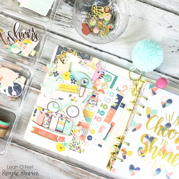
Hello Carpe Diem planner lovers! This is Leah again, and I want to show you how I’ve set up my brand new Ivory Carpe Diem planner!

We are over halfway through 2016… the exciting time when all the new planners start coming out! For me, with a new planner came my urge to refresh and reorganize my planner setup. My planner setup for the first half of the year worked very well for me, but toward the end of June, I found myself not using my planner very much. I was just making to do lists and working with blank paper – which is okay! That was working really well for me because I think when I was feeling extra busy, it was nice to start with a completely blank page and then brain dump all my “to do’s” on it. There are so many things I love about the new planner products being released by Simple Stories, that I became inspired to revamp my planner setup to make it more functional for my current needs.

As a disclaimer, I want to say my new planner setup is in its rough draft stage. I plan to use it frequently over the next month and I might tweak things depending on how well they work or don’t work – I will keep you updated!  Future changes to my planner sections will be SUPER easy thanks to the new clear label stickers from the Planner Essentials collection. When I started brainstorming what sections I needed in my planner, I picked the labels I wanted for my dividers. The label stickers are really easy to remove and there are TONS of words, so I can easily switch up the labels later.

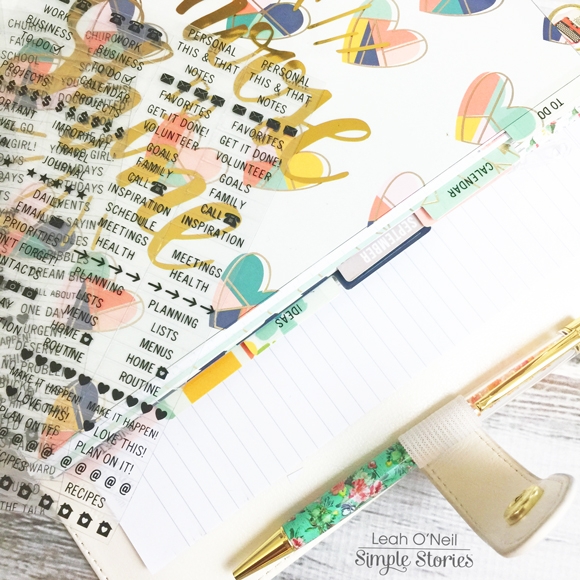
Currently, I am using the Dividers from the Posh collection; there are 6 dividers. For now, I have decided to divide them up into the following categories: To Do, Calendar, Schedule, Ideas, and Budget. I have one divider left that I have not assigned a category to yet. In each section, I am using different inserts and I want to show you how I’m using them. By the way, ALL of the new inserts from the Spring release are 140gsm. Maybe I get a little too excited about stationary, but the weight of the new inserts is a paper lover’s DREAM!  My favorite pens are felt tip and I usually can’t use them in planners because of bleed-through. However, I have been using them on the new inserts with zero bleed-through or shadowing! I am really excited to try painting with watercolor on them later!

The first section of my planner is the “To Do” section. I have this at the front because it is where I plan to jot down quick lists: to do lists, grocery lists, reminders…lists that I need to access quickly.  I am using the plain lined inserts in this section, which come in the Basic Inserts.

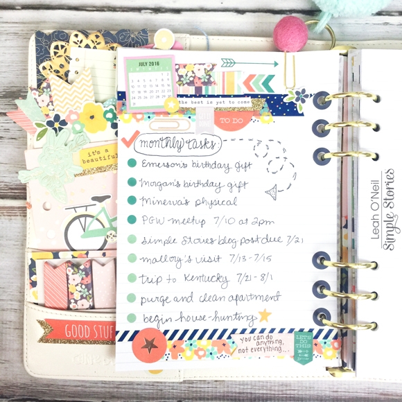
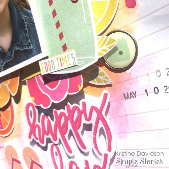
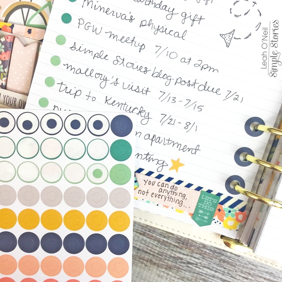
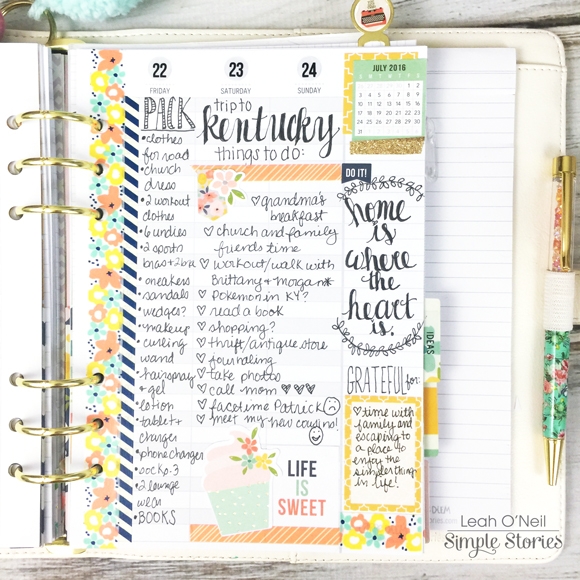
This is a list of my important tasks and events for July. I had a lot of fun layering all of these washi tapes and stickers from the Posh collection! How cool is the mini July calendar sticker? 

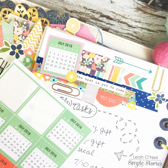
The pack of Mini Monthly Calendar Stickers has 18 months, from July 2016-December 2017 (6 calendars per month), so these stickers are going to last a long time! There are enough to add one to all of your weekly inserts for each month, and a couple extra for projects like the one above. Another idea I have for using these is to make a year-at-a-glance calendar for the front of my planner. Pictures of that project will be coming up on my Instagram!

I also like the colorful ring reinforcements that come in the Planner Basics Sticker pack, which add a pop of color to the page. Instead of throwing away the middle portion of the ring stickers, I used them as bullet points for my list.

The next section of my planner is the Calendar section. I currently have the new horizontal inserts in here (not shown) – usually horizontal layouts are what I prefer. However, the following “Schedule” section has the Vertical Appointment Weekly inserts. I am still deciding which inserts I want to use for daily planning so I want to spend the next month using both. This will be the first time I’ve ever tried hourly inserts. What I like about these is that I can use the hourly time slots to plan out my day in more detail. I am hoping this will help me become more intentional and efficient with my time. Plus, there is always the option to cover up the times on days that I just need to make lists – like this week, since I am traveling and don’t have a detailed schedule. I just covered up the times with a thin piece of washi tape.

If these inserts work out, I may convert to hourly for my daily planning and use my horizontal inserts for memory-keeping and journaling. If they do not work for my daily planning, then I will move them to another planner I am setting up as my Business Planner.

All of the inserts being released this summer fit the different stickers from both Planner collections REALLY well. I love that Simple Stories thought about those little details.

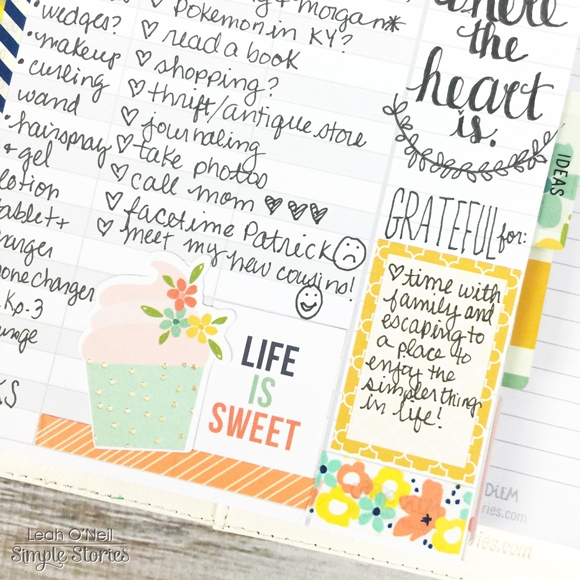
For example, the square “Life is Sweet” sticker and yellow rectangular box I wrote in above, would both fit within the lines of the hourly (same width). The rectangular one fits exactly into the boxes on the Vertical Weekly Inserts, and it is also just the right height to fit the Horizontal Weekly Inserts too (pictured below).

I fully expect that I will be mixing and matching inserts in my planner, and I love that all of the stickers from the new collections are going to work on all of them.

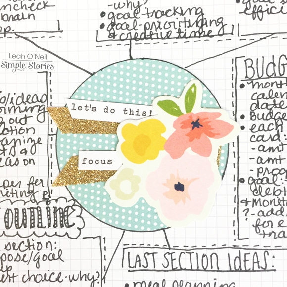
The next section of my planner is for “Ideas.” I have the graph paper inserts from the Basic Inserts pack in this section. I plan to use this part of my planner for project planning, brainstorming ideas and sketching out plans of action to achieve my goals. Below, you can see where I sketched out some ideas for this blog post. I laid out the sections I wanted in my planner and then wrote down ideas for how I plan to use each.  I also jotted down some ideas for how I can use the unassigned divider, but truthfully, I think 5 sections are plenty for one planner. I may end up designating an entirely separate planner for some of those other ideas.

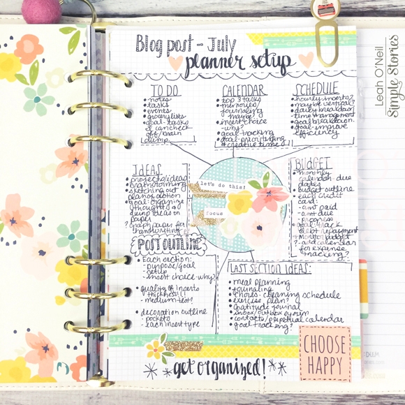
At the center of the brainstorming “web” I created on this page, I just punched out a circle of patterned paper and added gold glitter washi tape with word strip stickers, and a beautiful floral from the Bits and Pieces pack. 

The next section of my planner is the Budget portion. In this section, I have our household monthly budget broken down, debt repayment details, a savings plan, and a monthly calendar to mark bill due dates. I don’t have any pictures of this section because it has a lot of personal information.

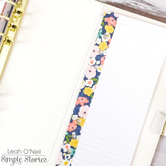
In the back of my planner, I have this Bookmark Tablet notepad from the Posh collection that slides into the top pocket. I also love that there is a larger pocket that could hold a traveler’s notebook if I decide to do my journaling/memory-keeping that way.

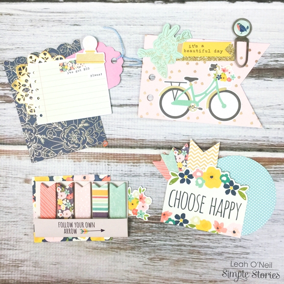
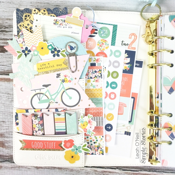
Last but certainly not least, my planner just wouldn’t feel right without decorated front pockets! I put together a few elements from the Posh collection Bits and Pieces Pack and Dashboards and Pocket Cards pack. I also added a set of Page Flags and a Decorative Clip!

I can’t wait to see how this setup works out for me! It is slightly different than my last setup but I find that as our lives and goals change, our needs for a planner change. It is important to revisit your setup if it stops working for you – even if certain inserts have worked for you in the past, it may be time to try something new if you realize you have not been using your planner regularly. Fortunately, Simple Stories now has lots of choices for you to pick from, so hopefully everyone will be able to find inserts that work with their planning style! Check out the Carpe Diem Planners Instagram for more Creative Team inspiration using all of the inserts that will be available in August!

Hi there Simple Stories fans! It’s Chantalle back with you today to share some projects I have created recently. I had the pleasure of being immersed on a retreat last month and I came back with renewed passion! There is so much out there for us to explore and that’s what I absolutely love about this craft of ours - we can try out new things and mix it up a bit. There are no rights or wrongs, just what feels right to us!
 
Hello, Open Wide
 
On this page I have experimented with some watercolour paint and texture. I will admit that I really like the way it turned out. This adorable photo has been waiting to be scrapped for quite a few years now! My little girl and I were playing out in the yard and she was trying to convince me to try her tasty dessert. We both couldn’t stop laughing as I dodged her spoon of mud pie! Bloom & Grow couldn’t be more perfect to capture this memory.
 
 
There is lots of layering going on here. I started with the watercolour over the top of a sheet of ‘Bee Happy’ to add a bit more of a pattern to the left corner of the paper. I then popped some texture paste over the top through a stencil to tone it down a bit, so both sides matched a bit better.
 
 
What followed was a happy mix of elements to help tell my story. You’ll notice that I have added some stitching in parts. I really love the subtle texture it can bring and in this case also adds a bit of rustic charm to the page. (Plus, stitching holds your embellies on over tricky texture!)
 
 
One of my favourite things to do when scrapping with a collection, is to go through all the different elements, papers, stickers, die cuts and chipboard and then use similar shapes in different weights to build up my layers. I usually start with a lightweight item at the bottom and then add the chipboard higher up.
 
 
Add a big title to create a play on words! I initially wanted to really space out the word ‘wide’ but I felt it was just too busy overall. If there were less elements on the page, it could’ve been fun.
 
 
________________________________
 
 
Miss You With My Whole Heart
 
This page remembers my Mum who we lost to breast cancer back in 1995. What’s so wonderful about the Heart Simple Set is that it is so versatile. I have seen heaps of gorgeous layouts with themes from love and loss to vacations. I absolutely loved this starry print and joined the stars to create constellations of love in that beautiful night sky.
 
I started with looking at the stars on the sheet and working out whether a heart shape could actually be created. I then pierced the paper in a few spots which would be the guides for my stitching.
 
 
Using backstitch, I used some very pale blue embroidery thread to connect some stars in a heart shape. This shape provided me with an outline along which I could run my title. I’ve kept the lettering very subtle as it’s already a busy print and I didn’t want it to be too full-on.
 
To further emphasise the constellation theme, I have used a white Uni-ball Signo pen to connect more stars. This is an excellent white pen to have in your stash. I used a ruler which took longer, but the lines needed to be straight to look correct.
 
 
I’ve added a few splashes of white and gold mist as well as highlighted a few areas with my clear Wink of Stella brush pen. 
 
 
Use stitched areas to tuck bits and pieces in to. Check out my chubby baby cheeks!
 
 
Thank you so much for visiting the blog today. 
 
Wishing your heart happiness and lots of creative play!
 
Chantalle


Supplies

Hello Friends, It’s Kristine Davidson with you today.  I will share 2 of my latest layouts with you today and my love of Sunshine & Happiness! This collection is one of my favourites and I have almost exhausted every. single. piece. of paper in this kit. This collection is full of bright sunny papers, pinks, orange, yellow and the bits and pieces make creating so much fun.

The first layout is called " Hello Sunshine "

This picture was taken of my niece in the month of May as she was playing outside and enjoying the sunshine. I wanted to add some fun embellishments to this page and included flowers, fruit, sunshine, and my favourite journal strips.

To start my page I created a cut file with my Silhouette Cameo. I love pages that allow me to use a cut file because I find I can add more colors and use up some smaller pieces of papers too.  I left the top part white and just concentrated on the bottom for an assortment of colors.  I added layers of chipboard, bits and pieces and even a bit of thread to add more texture.

In this picture you can so many elements but for some reason with layers and overlapping it doesn't feel like too much. It creates a beautiful cluster.  You can also see I used a few 3x4 cards behind my photo to add more layers and added dimensional adhesive to create elevation.

I didn't fuss over a title for this layout. I simply used a piece from the Bits & Pieces package and selected Hello Sunshine for my title. Nice and Easy!

_______________________________________________________________

My Second layout for you today is called "Happy Day"

Ok. So I will admit this was a test. I often create layouts and try to remain " clean " but this layout took a life of it's own.  I have been drooling over Missy Whidden's work and wanted to try something different. I grabbed some watercolour paints and went to town ;)

Sometimes we have to step out of our element and try something new and this was one of those times.  Yes my background paper is warped, yes I have some paint splatters that aren't perfect but that's okay. This collection allowed me to create something different. It gave me tons of color to work with, some great summer die cuts and really made this layout come together.

For my title, I created with the same technique - selecting a few Bits & Pieces, adding dimensional adhesive and making it my focal point for my page title.

This is such as great way to use supplies and match it with your layout.

I hope you enjoyed my layouts today and enjoy making your own with this fabulous Sunshine & Happiness collection! 

If you are interested in seeing more of my work you can find me on instagram with user name @KristineDavidson. 

Thank you so much for reading and being a fan of Simple Stories!

Supplies

Hello everyone ! It's Mindi here on the blog today sharing some pocket pages using the Sunshine & Happiness collection. Oh how I love this line, it is perfect for everything summer. The colors really go with just about anything and the little touches of summer are fabulous. 
 
 
I usually do my pocket pages weekly and this one is all about week 25. I wanted to do something fun for my title card this week. So I punched a 3 " circle  out of a 4x6 journaling card and added some patterned paper, a chipboard piece and a washi tape sticker strip. 
 
 
One of my favorite things to do when I get new scrapbooking supplies to get them all out and go through each one. As I go through the cards I set some aside that I want to use first or at least use for sure. This sun filler card was one of them that caught my eye. I knew that I wanted to use this card and decided to add some of my journaling onto a piece of vellum. I made sure to leave space for the summer sticker and made the sticker part of the journaling. I find that when I use word stickers like this it adds some interest and fun to my cards. It is one of my favorite things to do. You can also use letter stickers and the word strips for the same effect. 
 
 
There is a popular saying that is going around that says - Every summer has a story. This summer for us it's been all about pajama days. My kids always are asking if we are going to have pajama days and rarely want to get dressed. So I thought it would be fitting to have a mini pajama photo shoot. This bottom corner photo is the best photo from the 20 that we took ! It was so fun and silly. 
 
 
This first journaling card is a little story about how Katelyn dragged me out of bed one morning to go check out her corn. The corn photo that was in the last photo I shared is from that week. I wanted to remember this and how excited she is getting about her corn. She planted it back in April. The journaling card itself has a few layered pieces with the hashtag #happy sticker. I made a little banner to add underneath it. I finished it off by adding the date and a star sticker. 
 
This particular week we took Maddie in to get her eyes checked. Turns out she needs glasses. So she tried on a bunch of frames and found one that she liked. I took a photo of her glasses and case to remember this moment. I did decide to add a few embellishments to the photo and to spell out "hers". 
 
 
Let's move onto the right side of my spread. This top left photo was from our trip to the beach on Saturday. I added in some extra journaling onto the top of my photo. It is one of my favorite things to look for when taking photos is to leave some white space for extra journaling or embellishments. Once my photo was printed out I added some embellishments, one cluster on each corner so to speak. I spelled the word RUN because the kids play a game where they try to outrun the waves. Waiting until the last minute to turn and run. I used a word strip sticker underneath the word for a more finished look.
 
 
I added in some stickers and letters onto this photo. The edge of the pool made a natural perfect line for my stickers to sit upon. 
 
 
Aren't these sun glasses adorable ! I thought they were a perfect embellishment for my journaling about Maddie getting glasses. Her glasses are also sunglasses when she goes outside. So I added them to this journaling card and added a few word strips to the top right. I am obsessed with these little word strips right now. I want to use them all ! 
 
 
The middle 3x4 photo is of Maddie trying on her frames. She asked me to take a photo in the mirror and I was happy to do so. The bottom photo is from our Harry Potter night at Barnes & Nobles. 
 
 
This is the last journaling card for my spread. I wanted to tell the story about the photo of the two kids in the pool that is above it. I thought the two birds on this card were so cute and perfect. I also added the letter and number U2. It represents the two of them. I left the rest of it pretty plain but I did add a few items on the top using a label sticker, a die cut pice and enamel dots. The photo of these two in the water at the beach was a favorite from our beach trip so I added a few embellishments and a stamp that says favorite. 
 
 
I have one more photo from our beach trip. I added a little embellishment cluster down on the bottom. I first punched a half of a circle out of the photo with my circle punch. I wanted to pop it up for a little dimension and added some patterned paper underneath. I wanted to add a few word strips as well on the bottom. 


I hope you have enjoyed todays blog post and have found some summer inspiration. Be sure to look for this Sunshine & Happiness collection for all of your summer scrapping projects. Have a fabulous rest of your summer. 

I am in love with the new Marigold Carpe Diem Planner!  I couldn't wait to 'posh' it out for July with Carpe Diem Posh accessories!  

With the kids out of school for the Summer and a lot of activities scheduled, I decided to switch up my inserts this month and use the new Planner Essentials Vertical Appointment Weekly inserts.  The layout makes it easy to see exactly what you have going on each day and how much free time you have in between activities.

I used sticker strips to block out how much time each activity will take to give me an better visual of the day.  I used the same pattern stickers for the same activities throughout the week.

Since the vertical layout didn't give much room for my to do's and lists, I turned the Doc-It Journal into a bullet journal.  I used number stickers to mark the dates and embellished with die cuts, stickers and washi tape. 


I love that this journal fits right into the large pockets in my planner and I can pull it out and just take it with me for quick trips out.   I can't wait to see what everyone does with the fun new collections!  Happy planning!

Hello crafters! It’s me Stacy here on the Simple Stories blog today with 2 layouts. This time, I am inspired by the wedding photoshoot taken recently for my traditional wedding. I thought I would like to document some thoughts that went in my mind during the photoshoot and it would be a good memento when hubs and I grow old! This time round, I made use of 2 Simple Stories collection which matches both of the photos I intended to craft on.

 The first layout is titled "My Heart is Yours" and I made use of the Heart Simple Set. This collection houses my favorite colors and I absolutely adore the paper elements in the pack! I had made 2 layouts previously using this collection, now another, and I still have enough for another layout!

To highlight the paper elements which I would like to showcase, I first cut them in squares of 2 sizes. Then I started planning where they would go, before finally stitching the edges of all the squares. Then I picked out the elements which I would like to use in order to highlight my photo.

Here, I have used a heart sticker and popped it over a pattern paper. This helps to highlight the embellishments pretty much! 

Adding Wood Veneer from “Life in Color” collection here! I love to add wood veneer to showcase my subtitles. Easy way to create layering for my layouts! I also did fussy cutting of the heart shape there, it was originally meant for my journalling but I changed my mind afterwards! It is okay to make changes along the way, most importantly, go with the flow of creating and have fun!

Then, I used the more stickers to help with my title. Matting the little alpha stickers help to enhance the title. I did some fussy cutting of the rosette in order to place it below the title to help encase it. 

_________________________

My next layout features another wedding gown and I thought it would look best with the Bloom & Grow collection. I titled it “Happy Moments” and it came from the sticker sheet as well as the Bits and Pieces pack. How apt! I love it totally when pieces like that come to place easily!

More stitching here! I added some simple tacketing to the background in order to break the vertical flow of the layout. Simple stitch but I love that it creates sort of a fence which highlights the entire theme well! To add on to the garden feel, I also added some die-cut floral pieces, highlighted by the bradz and embellished with the bits and pieces pack! Not forgetting some sentiments along the way!

Another use of the sticker pack here. I layered then randomly then stitched up the entire row. Simple and effective!

There is so much fun and variations to achieve with the Simple Stories collections! Hope you get some inspiration from the layouts! Thanks for stopping by today!

Supplies

Pages