Morning!  Have you ever been to a crop with a bunch of your crafty friends?  Well, last year was my first.  I meet up with some fellow scrapbookers on Cape Cod.  One of them even traveled from The Netherlands!!  It was so much fun and inspiring being with other crafty folks.  


Today, I used The Reset Girl collection for my layout.  I pondered over what to do with those classy girl dies cuts.  Finally, I decided to add them on this project.  I layered them like they were just a group of girls, hanging around gossiping!  I think they worked perfect for this, helping to add a little class to our silliness.  


For the base paper, I used the 'You Got This' paper.  I cut off the polka dot side, flipped it over and used the pink side.  I attached this all to a scrap piece of white cardstock.  I then began layering my papers to the left and added my journaling along with a strip of washi.  


I felt as though this corner of the paper layering needed a touch of decor.  This brought in a little floral clump to match the bottom right, helping your eye travel around the busy page.


Here I used foam to layer the floral clump directly on top of the existing flowers that were printed on the paper.  


The sticker sheet and the chipboards already provided most of my title.  All I needed was an 'S'.  I found one that was similar in size in the SN@P! Pack and fussy cut it to complete my title!  It is a little larger but it works!


_____________________________


I may be a little embarrassed by this layout!  1 -  Because of the silly photos and 2 - because I had never used Snapchat before and needed to be schooled by a 12 year old!  Ignore the photos and lets take a look at my page!


I used The Reset Girl collection in a completely different way than my first layout.  The collection tends to lead you towards scrapping about paper projects or planning, but can be used in so many other was as well, if you pick out the perfect items.  


I used a cut file to create my title with a delicate green paper from the 'Simple Basic Kit' peeking from behind.  


I decided to use a Library Pocket for this layout.  I wanted some of my journaling to be hidden, so tucking the pocket behind the layered papers helped do that.  (I may need to retype that journaling with a crisp new ribbon!)  


Because the photos are silly, the clump of glasses towards the bottom of the page help emphasis the changes on our crazy faces.  


Empty corners just beg for a little embellishment.  I used a few word strips from the 'Word Label Stickers' to convey some of the feeling I had towards the photos.  

Supplies

Hello dear Friends! Alexandra here. I finished the first album documenting the first six month of our life in 2016 and I'm thrilled to be starting the second one using the beautiful The Reset Girl collection. 

The first page is a trimmed pocket page. This is a "trick" I do when I don't have too many photos to document the week. I also enjoy the look of such a page as an opener. As always, I included some of the world event which took place that second week of July.

We spent a couple of days in Sedona, Arizona on WEEK 28 and I just love how the earthy tones of The Reset Girl collection match the photos.

I added some stickers and a piece of washi tape, Modern Meadow, to one of the journaling cards.

Here is a look at the two pages on top of each other.

Thank You!

Supplies

Hello friends! Today I'm excited to be sharing two layouts using the new Posh and The Reset Girl collections! I couldn't decide between the collections, so I decided to make layouts with each of them!

My first layout uses The Reset Girl collection. I love the beautiful touches of gold foil!

 
I started with the fun You Got This patterned paper and flipped it on its side, I noticed that the "Amazing" phrase from the 24/Seven sheet of patterned paper matched the background perfectly, so I cut each letter out. I also cut out some flowers from the Lookin' Good paper that matched the floral on the background sheet.

Once I had my title, I arranged it on the sheet and added my photo and layers around it. The Library Pockets are too cute! They are perfect for journaling and/or layering pieces. I added one underneath the title for extra dimension.

 
One of  my favorite parts of the whole layout are those cute little glasses from the Bits & Pieces. My husband and I both wear glasses so I thought it was the perfect accents! I tried to keep it more simple on the top to focus on that beautiful flower. There are so many beautiful elements in this collection that I could have kept adding more and more!
 
 
For my next layout, I used the fabulous Posh collection! I was instantly inspired by the 2x12, 4x12, & 6x12 Elements patterned paper, and used almost the entire sheet on my page.
 
 
Like in my previous layout, I did quite a bit of hand cutting. I cut the banner out and placed it on my page over the other vertical elements from that sheet of patterned paper. I also cut out "Love" and the geometric hearts. The shiny silver foil is beautiful!
 
 
 I was very excited about the yellows in the collection perfectly matching these shots from our anniversary shoot. I used stickers for the title, then added die cuts and chipboard to finish the look!
 
 
Thank you for joining me today, I hope you feel inspired to use these two gorgeous collections!

SaveSave

SaveSave

SaveSave

Happy Fall, y'all!   Fall is my one of my favorite times of the year.  I couldn't wait to play around with the new Hello Fall collection and the Gather Together Simple Set. With all the oranges, yellow, blues, and florals, it makes it a perfect match for the Marigold Carpe Diem planner. 

I made a dashboard and planner bookmark. I took one of the word stickers and attached it to the top and laminated them. I really enjoy doing this because it peaks out from the top of the planner and I don't have to worry about it getting ruined. 

What I love most about fall are the leaves falling, pumpkin everything, family, cozy nights, boots, sweaters, scarves, hot drinks and woodland creatures. The changes of color and season makes me happy and is a beautiful reminder that change is ok and is needed. I believe I was able to add a little fall into my planner. 

Thank you to all those that continue to stop by the blog and take time to read our posts. Wishing everyone a wonderful new season - may it be filled with pumpkin spice and everything nice!4660

SaveSave

Supplies

Hello Simple Stories friends! Marcia here today with some fabulous Reset Girl scrapbook layout inspiration. I really love the vintage elements. With the pinks and greens it's definitely perfect for scrapping your favorite girls. This collection really suits my daughter at the moment. She is in the process of resetting her life having just filed for divorce. This was not an easy decision for her to make and I have watched her struggle as she tries to find herself again. Slowly her confidence is coming back. She almost never takes selfies of herself but lately that has also been changing. I couldn't resist scrapping this one .... Back On The Market ...


I created my background by combining several different pattern papers. What is a girl to do when she can't make up her mind with so many beautiful pattern papers to choose from, I used a circle leaf frame cut file from JustNick Studios to frame my photo and then clustered embellishments all around it. Those birds are a definite favorite!

 
On the other side of the photo I placed a Library Pocket. These pockets are so fabulous for adding little journaling tidbits. You can also see a Reset Girl Metal Clip here. I added lots of machine stitching on this layout, some in brown and some in white.
 
 
I used the Sticker Alphas to create my title. I love that they look like typewriter keys. A little Washi Tape draws your eye to the title.
 
 
In the lower corner I layered Chipboard Stickers with some Bits and Pieces die cuts. I used the Reset Girl Roller Stamp for the "hey gorgeous" and the faux stitching.
 
 
I really love how this layout turned out.

 
My second layout also features this same daughter, only this photo was taken almost 10 years ago as she was having her hair done for her Senior Prom. I wanted to create a large title that once again showcased all the lovely pattern papers in the Reset Girl collection. Here is You Look Fabuous...

 
I created a quilted look on the background of this layout using another JustNick Studios digital cut file to create my quilt pieces and I machine stitched over the top ... lots of machine stitching! I strategically positioned patterned paper underneath in a few spots first.
 
 
The title was created using some of the Sticker Alphas, the Chipboard Sticker eyeglasses for the "oo" in Look, and by backing different pattern papers underneath the large digital die cut outline alphas. Some of the pattern papers I used come from The Reset Girl Simple Basics Kit. I could not resist using another of those fabulous birds to embellish with! 


Once again a Library Pocket holds my journalling. To highlight my photo I used more Washi Tape to frame it and another Metal Clip. The Word Label Stickers work so well on the tab Bits and Pieces die cuts.
 
 
Thanks so much for stopping by today!
 

Supplies

I’m sure you will agree with me when I say that there are some pretty strong views in the scrapbooking community when it comes to journalling.

Now I might be wrong, but personally, I enjoy both the pleasure of creating a beautiful visual memory and capturing the details, but not always at the same time. Am I ‘wrong’ to think like that? Well that is up to personal preference, but I will say, that I feel incredibly lucky to have this creative outlet. We are able to express ourselves with beautiful and functional products that help us capture exactly what we need, depending on how we are feeling at the time. I’m a firm believer in there not being any rules in scrapbooking. If it makes sense to you, that is what is important. They are your memories, in your albums. If you want to paint today and fussy cut tomorrow, go for it! If a project turns out to have more artwork than documentation, does it really matter? This beautiful life hands us fresh starts and new experiences every day. How wonderful to be able to capture them all.

Dear Jaime

I knew from the start that I wanted to tell a story with this project. The photo of my beautiful niece taken on holiday recently, really made me realise just how quickly time passes. It feels like it was just the other day that I was holding a bouncing baby J in my arms! The tones of The Reset Girl collection were a perfect match to boot!

I started off by feeding a 12x12 sheet of ‘Get Your Crafty On’ into my typewriter. I already had the design sort of worked out in my head, so I typed my journalling where I thought it would work best. I then went about creatine some soft detail with the help of some texture paste and stencil. This bird detail serves to strengthen the them as well as serve as a branchy base for my fine feathered friends.
 
 
I warned in my little highlights video that I had the urge to fussy cut aaalllll the birdies out of a sheet of Ready, Set, Reset! hehe. I just love them!
 
 
I’ve arranged them on a ‘wire’ of sorts. Growing and spreading their wings, just like my niece.
 
 
That cute paper airplane is from a pack of So Rad Clear Stickers.
 
 
One of my many favourites from The Reset Girl collection are the Library Pockets. How fabulously nostalgic they are! Took me straight back to my primary school borrowing days. I’ve popped my photo inside the pocket and then punched a little hole in the top right corner. For a bit of youthful fun, I’ve threaded a small ball chain through the hole and connected it to a die cut shape from the Bits & Pieces pack.
 
 
____________________________
 
By comparison, this next page has very little journalling. Instead, I have chosen some very fitting word labels from the new Carpe Diem Posh collection, to convey my story.
There is LOTS to love about Posh. The gold foil detail, script elements… the pops of yellow. I also love the feather shapes, which turned out to be the main design element in this project.
 
To begin with, I cut some feather elements using a metal die and Posh 6x6 pad. The leftovers were too pretty so waste, so I used them as a stencil! Using some double thick cardstock (which is great for wet media) I went over the shapes loosely with a water brush pen and some watercolours. 
 
 
I focused the watercolour feathers in a vertical line through the centre of my page. This allowed me to build up more and more elements around them, using the same shape but in different weights and media.
 
 
Some vellum feathers added lots of interest to the background, without overwhelming the eye. I think they add a good sense of movement to the page too - like the many thoughts we have in our heads sometimes.
 
 
Another feathery element I added were some washi tape feathers. These are super quick to create yourself. Simply lay a length of washi along some fine beading/floristry wire. (Make sure you have enough so that when it’s folded over in half, your feather is not too short.) Then cut a leaflike shape using some scissors. Finally, cut in at an angle to create the barbs.
 
 
TIP: Bend your wire a bit so it’s not perfectly flat and fluff your feather up so you can see the details. 
 
 
This large stitched feather on the RHS also adds some texture and interest to the page while keeping a low profile in muted tones.
 
 
These word labels say it all at the moment!
 
 
Thank you so much for stopping by today and allowing me to share my thought-to-page projects. Wishing you many hours of happy  crafting.


Hello everyone! Leah here with you today to show you how I’m using my planner to organize my finances. I know what you’re thinking…what a boring topic, right? Finances can be very overwhelming to talk about. There are tons of useful tools available to manage your finances electronically, but for those of you like me, who also like working on paper, I want to show you how I have set up my Financial Planner.

At the beginning of the year when I was writing out my goals for 2016, two of the biggest ones were relating to money, mainly paying down as much debt as possible and saving up a down payment for our first home. I always had the intention of setting up a separate planner specifically for managing my budget and debt repayment. I have spent several months deliberating how I would organize this planner and what components were necessary to help me accomplish my goals.

I would like to be very candid with you all. When I got married, my husband and I both brought significant debt to the table. Between school loans and credit card debt accrued during trying times when we were less financially stable, I had to accept that the financial goals I had for our future were going to take time and unwavering diligence to achieve. The last several months, we have made several cut backs so that we could aggressively pay down our debt. However, it did not take long for me to realize how much little purchases can add up. We were living so frugally, or so I thought, but our debt did not seem to be decreasing. I decided it was time to finally sit down and set up a tangible resource that would allow me to organize a budget, closely monitor spending, and create visual incentives to keep me encouraged and on track. As I started setting up this planner and tracking our spending and debt repayment, I realized a few things: 1) We had actually made quite a lot of progress in the last few months, but 2) our total debt was much larger than I originally thought, and 3) we were still wasting quite a bit of money on frivolous spending. At this point, I was feeling very overwhelmed. However, I was looking forward to getting everything down on paper.

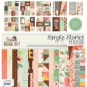
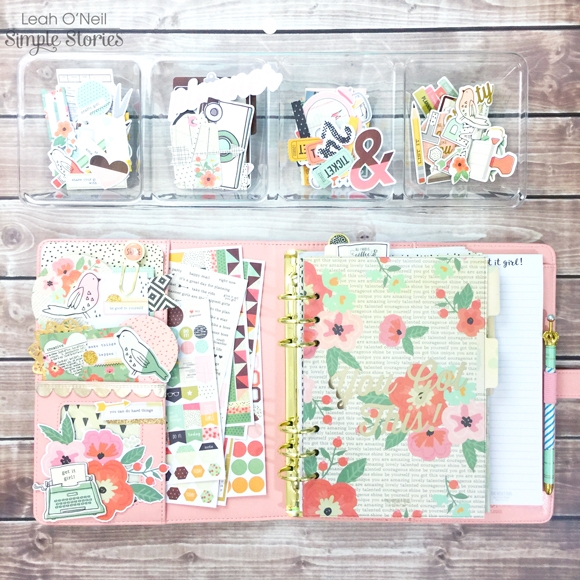
To make this planner feel a little less daunting, I started by creating some decoration. The pockets of my Ballerina Pink Carpe Diem planner were clearly WAITING to be decorated. How could I deny them? The Reset Girl collection has SO much ephemera (my favorite thing)! I used pieces from the Bits and Pieces pack, the Big Bits and Pieces pack, the SN@P! pack, and patterned paper shapes punched from the 6x6 paper pad.  I loaded up the larger secretarial pocket with sticker sheets from the collection that I thought would be most useful in this planner, mainly the more functional stickers. Fortunately, Simple Stories makes super cute functional stickers so no need to sacrifice prettiness for function!

The 12x12 patterned papers available in The Reset Girl collection have such beautiful florals and patterns! I used some of my favorites to create a few dividers.

I ordered the clear laminating stickers for my file tabs online and am still waiting for them to come in, so I cannot label my tabs quite yet. If you’d like to see how I make my dividers, including how I create my tabs and label them, you can check out this older blog post for details.

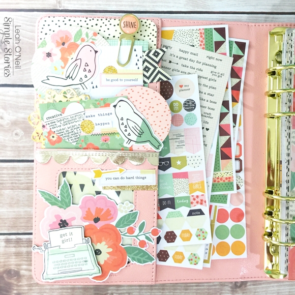
Even though my tabs aren’t labeled yet, I will walk you through my setup. I put my favorite divider up front and center. The first section will be titled “Inbox.”

This section has a folder that will hold receipts and important papers/notes that need to be filed away later.

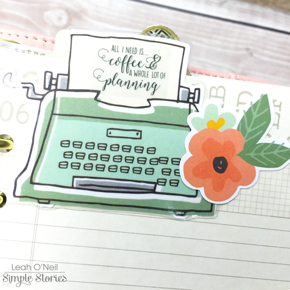
I love this big typewriter from the Big Bits & Pieces so much that I laminated it for protection so it can peek out at the top of my planner. The clear sticker quote fits perfectly on the typewriter page. How pretty is that font?! I also added a little floral die cut.

On the bottom of the folder, I layered some washi tape under a pencil die cut and word strip sticker, and embellished with a chipboard flower. I also punched a banner out of a patterned paper from the 6x6 paper pad.

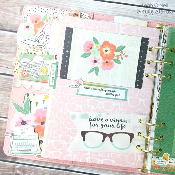
Below is an insert that came in the planner and it has a vision board design on the other side. I actually flipped this page upside down so that the spotted pattern was on the front and the vision board was on the back. I laminated this page so it can act as a dashboard. I can change out the card on the front easily or add sticky notes if I want.

The page below originally had text on it (it was upside down since I flipped it over), so I covered up the words with the pink planner die cut. I decided to turn this page into a vision board for my financial goals. Because the page is laminated, I can change out my goals if they change. Most of them are long term for now, but I might change them to be shorter term goals at some point. I added all the décor after I laminated the page, so most of it is removable if I want to change it up later as well. I love having so much flexibility!  All the décor I used is either The Reset Girl washi tape or ephemera from the Bits and Pieces packs.

The next section in my planner will be titled “Spending.” This section has the monthly calendar and vertical weekly inserts included in the Ballerina planner. At the front of each month, there is a habit tracker that I am using as a “no spend” chart for September. I get a gold circle on the days where I spend less than $20 on “extra expenses” I do not need (not including re-occurring payments like subscriptions and membership fees).

I added minimal decoration on this page and the page next to it. I used a card from the SN@P! pack, a couple stickers and some washi. The flag with the glasses came in the Reset Girl Dashboards set.

As we get further into this section, you will see less and less decoration. The calendar inserts are where I start getting into the nitty gritty of my budget and spending. Crunching numbers and maintaining discipline in tracking this area of my life is difficult enough without adding pressure to decorate. Plus, I want to keep these pages neat and tidy.

On the monthly inserts, I used a ruler to draw a diagonal line through each day. The number highlighted in mint is the total amount of money I had to spend on rent, bills, groceries and other necessary expenses. The number highlighted in pink is total money spent on things I do not need for the day. At the end of the month, I will add up the amount spent on “needs” versus “wants,” and my goal is to show a decrease in money spent on “wants” each month. In the notes column, I have a list of upcoming expenses I am expecting this month. I also have an area where I will record the total amount paid towards credit cards and the total remaining balance left on all credit cards. At the bottom of the column, I have drawn a jar where I plan to record how much I am saving throughout the month – the goal being to save $50 a week.

I am pretty excited about this next idea I’m going to show you. I am using a 4x6 clear pocket insert to hold receipts accumulated throughout the month. I will be using the receipts as well as online banking to track my spending in detail on the weekly inserts, so I needed somewhere to store these receipts. I used a couple of 4x6 cards from the SN@P! pack to make the receipts less of an eye sore. The coolest part about using a clear pocket here is that the slick surface allows me to stick things to it easily. On one side, I used some washi tape to hold a picture in place, which I can change out anytime. I stuck a few sticky notes onto the other side.

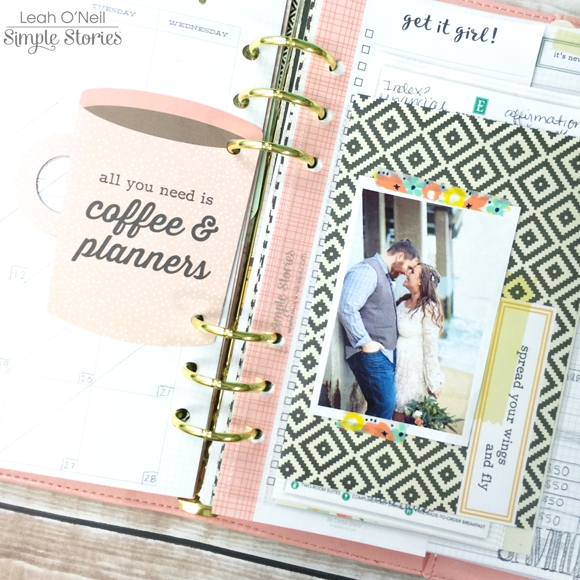
The cute pink coffee mug is from the Reset Girl Dashboards set. I also added a page from the bookmark tablet for notes/lists.

Moving onto the vertical weekly inserts, this is where I am tracking itemized spending in detail. The vertical inserts are perfect for this because I have divided my spending into 3 categories. The top box is for priorities, things I HAVE to pay. I labeled this box using the roller stamp from the Planner Essentials collection.

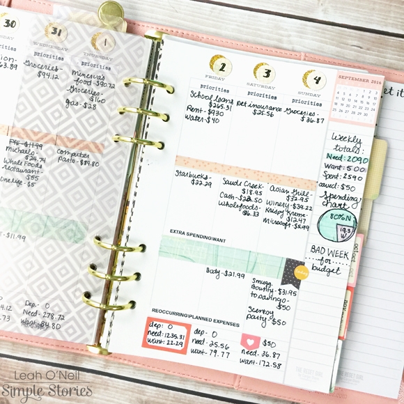
The middle section is for “extra spending/wants,” things I do NOT need. Sadly, I am off to a bad start for this month due to a weekend spent with friends and family and eating out. The bottom section is for re-occurring payments like subscriptions and membership fees. This is also where I will list planned extra expenses, like birthdays or other situations that might call for extra spending. This section will also be classified as “wants.” I love the few lines at the bottom of each day because it gives me a place to calculate totals. The first line is where I note total deposits to checking/savings accounts. The second line is the total spent on “needs,” the sum of expenses in the Priorities box. The bottom line is the sum of the expenses in the middle and last box for each day, the “wants.” These daily totals are the numbers I carry over to the monthly calendar each day.

In the notes column on the right, I have totaled up the numbers for the whole week. I created a visual demonstration using a pie chart to illustrate percent of spending on needs versus wants for the whole week. Ideally, the percent spent on “wants” would be much less. This planner is still a work in progress. 

For now, I am just tracking spending for September. At the end of the month, I am going to use those numbers to generate a monthly budget and savings plan. Once I have a budget set, I will report whether I stayed in budget or went over budget in the bottom of the notes column each week. The last section in my planner is dedicated to Debt Repayment tracking. I did not take pictures of that because it has too much personal account information.

Below is a peek at my essentials for daily financial planning: a good cup of coffee, a bag of erasable pens and highlighters, a couple washi tapes, my planner, and my phone. I use my phone for a calculator and to view my online banking.

When I started this process, I felt so overwhelmed. Now that I have this planner set up, I feel like I have a plan of action and am actively working towards reaching my financial goals. The most important thing to remember in achieving any difficult goal is that it’s a journey that takes time and commitment. My mantra right now is “One day at a time.” I can do this! What is your biggest goal for 2016? Have you considered setting up a planner specifically for helping you accomplish that goal? I love being able to take out this planner and dedicate intentional time working towards specific goals. If you have any questions about my financial planner setup, please ask here in the comments or hop over to my Instagram. I will be happy to give more details!

SaveSave

Supplies

Hello Friends, It’s Kristine Davidson with you today.  I was lucky enough to get to play with the NEW Posh collection this month. Those colors are so fabulous and all these papers in the collection match together creating a fabulous page!  I am going to show you 2 of my latest layouts created using the Posh Collection.  

The first layout I'll be sharing is called " Everyday"

I started this page with a piece of white cardstock and then used a cut file for the background details. I thought having a white background would make all these wonderful colors in this collection POP just a little more.

I cut up strips of paper with a variety in width and all measuring 12". I placed them one on top of each other and did a little bit of sewing. 

I didn't use that many bits and pieces on this layout because my intention was to use more patterned papers. I didn't want to make the page too busy by having tons of embellishments. I did use some but I didn't over do it. At least I don't think so ;)

I added journal strips again on my layout. Those strips are kind of my easy way to add journaling and I enjoy seeing them on my pages.

_______________________________________________________________

My Second layout for you today is called "Shine and Sparkle"

This Posh collection has such a variety of pattern and one of my favorites is the one called Live Simply.

If you take a look at this page it contains 4 colors and all match with the Posh collection obviously.  This paper is so versatile, you can cut strips, cut all 4 blocks, or perhaps like I did just sew each color.  It has so many possibilities as a full piece or a background.

I added my strips, and cluster of chipboard with Bits & Pieces from the collection. I used the gold coloured chipboard pieces Shine and also Sparkle to create my title. Simple and Effective!

To see more of my work you can find me on instagram @KristineDavidson.  Thank you so much for reading and being a fan of Simple Stories!

Supplies

Hi everybody ! It's Mindi here with you today. I am excited to share a few Halloween themed pocket pages that I created. Last year our neighborhood blocked off a street and held a Halloween Festival. The new collection called Happy Haunting was perfect for this project. The colors are amazing, not to light and not to dark. The sticker sheet is perfect and now I am going to need a few more for all of my Halloween pages. 
 
 
One of the things that I love to do is to print a photo onto vellum for a different look. I had this photo of the street view where the festival was being held. The quality was not so great so I decided to print it out onto some vellum. Then I added the year and put in front of the this 4x6 filler card. 
 
 
This collection has a variety of journaling cards that I used to help me create these pages. One more thing that I did this time is to use stickers to make your own journaling cards. I used the spider web and a few other stickers to create a journaling card. 


One of my daughters dressed up as Harry Potter last year. The black cauldron filler card was perfect for this page. I added a few embellishments and the letter K for my daughters name and there you have it. 


Let's talk about the right side of my spread. I wanted to do something different. I used a design 7 pocket page to have a little bit more room to be creative. This pocket page has 3 4x6 pockets and a 6x12 pocket. With the 6x12 pocket I treated it like a traditional page and it was a fun change. Since I used some vellum on the left side of my spread I wanted to use it on the right side as well. I added some vellum on top of the Happy Haunting journaling card that I cut down to fit under the chipboard frame. I finished this page off with a few more embellishments. 
 
 
On the bottom of the 6x12 page I layered some patterned paper and some embellishments underneath my journaling.
 
 
Yes, I did it again. I printed off another photo onto some vellum. The great thing about vellum is that you don't need a photo printer to do it. A simple inkjet printer will do, printing on the lowest quality setting and letting it dry for a few minutes. So go ahead and try it one of these days.
 
I started out this 4x6 pocket with adding two smaller photos onto a 4x6 sheet. I printed one of them on the photo paper and one of them onto vellum.  I decided to add some journaling underneath the photo. 
 
 
Thanks for coming by today ! Being able to create these pages totally has me craving cooler weather, everything pumpkin, and Halloween candy. I hope that you have found some inspiration for all those Halloween photos that I know you have. 
 

Supplies

Hi everyone!  Theresa here with a look into my Carpe Diem planner for September.  I couldn't be more ready for Fall to come and the Hello Fall collection is perfect for welcoming the season.   I used the wood grain patterned paper to place behind the clear "Choose to Shine" dashboard.  A simple way to change up the look of your planner every month.

I chose a flower pattern from the collection to cover the existing September divider.

I love all the warm colors, and they go perfect  with my Marigold planner!  

I decided to try out the daily inserts this month.  I love having the hourly schedule and still having plenty of space for to do's, lists, notes and fun fall embellishments!  Who's ready for pumpkin everything?!?!

Hi crafters! I'm on the Simple Stories blog today with 2 layouts using Posh collection. This collection simply took my breath away! The colors and theme rhymes with my new hairstyle!

I have had long hair for at least 10 years now. Through the years, I've changed some styles in between, but my hair was always below my shoulders. Before I made the dive to cut my hair really short, my hair length was at my waist.

Here's how much I really cut off -14 inches (possibly more since the hair stylist had to do some trimming). Yes. That is quite a move!

Therefore, I decided to document this journey with the Posh collection! It's the best collection to go with the new look!

For my first layout "Sparkle", I added some stitches to the background of this layout. I found that it added another layer to the entire layout, and helps to enhance the pattern papers on top of them. 

I also like to use basic shapes on layouts to highlight the beautiful pattern papers in the collection! Basic shapes are ever lasting details which you can add to layouts but not overbearing them. Here, I have selected pieces from the 6x6 pad and cut them into triangular shapes.

To add some fun details, I added some simple machine stitch on each triangle to outline it. Not only does it further define the triangle shape, it also helps to create focus for the embellishments on top of it! Here I have used elements from the bits and pieces pack. I must say, this pack packs a POW! Totally in love with every single piece!

Don't forget to add some journaling to your layout! I realised that I have already forgotten much details on earlier layouts which I had not done any journaling. It is always good to document and highlight it with pretty embellishments!

There are so many useful and pretty elements in this bits and pieces pack! It was a breeze working on this layout!

A little more detail on the stitching and my favorite element in this layout - the chipboard "sparkle". Well, as the word says so indeed! I love that shine of foil! It gives a subdued shine, good enough not to steal the limelight of my photo! It is the perfect piece!

_________________________

For the next layout, I had to document the start of my new look and the support from my husband. While creating this layout, I started thinking about the support from my husband and the fact that he was my pillar in times of good or bad. Then I decided to create a vertical background where the vertical strip denotes pillar and timeline. It might sound wierd, but i get ideas like that to start my layout!

 I had a lot of fun with the decorating, you can say I was spoilt for choices! 

I did not have to look too hard to find the title, the 4x4 & 4x6 Vertical Journaling elements was sitting right in front of me with the exact title I needed! Some fussy cutting, and then sewing it onto the layout. Then, just because I am in love with the foiled elements, i decided to add another just below my title! The foil "today" is from the Posh - Bits & Pieces pack too!

Seriously, I am having too much fun with the foiled embellishments. Here are some more from the bits and pieces pack! The chipboard stickers have also foiled bits, like the heart I have used below.

Throughout the layout, I have also added some stitching to the "pillar" to create some added interest.

Using the chipboard frame from Life in Color collection for my main photo together with the pretty POSH elements!

This bird element is perfect! I wanted to give it a glow so I went ahead to do some fussy cutting on the 3x4 Journaling Card elements. It is the one with the word shine. I decided to save the word for future use, but just using the lines to create a glow for a beautiful element!

Similarly, i added the glow to Winston! Did you participate in the earlier naming contest in Simple Stories instagram? Winston is such an apt name for it, and I am so fond of it!

I have also layered another 3x4 Journaling Card element here. It is so simple to add layers with the journaling cards! 

So there! I hope you have enjoyed the walk through of these 2 layouts and hope they inspire you to do something creative!

Supplies

Hey Friends!  It’s Vicki here with a project near and dear to my heart!  When The Reset Girl collection was revealed it quickly became a favorite!!!  I knew immediately that I would want to make a minibook using this line.  So that is what I have done!
 
Take a look this fun 4x6 SN@P! album I created with The Reset Girl SN@P! Pack, Chipboard, Combo Stickers, a few papers and some inks and paints!
 
 
Here is how I created the inked and painted base…
 
 
The tools I used.
 
 
Add the paint to a stamping block, mist with a little water and swirl around.  Stamp the paint on to the cover. Allow to dry.
 
 
Ink the cover with Mustard Seed Distress Ink and then stencil with Mowed Lawn Distress Ink.  The Distress Paint will resist the ink!
 
 
The finished cover.
 
 
A peek at the inside cover.


I made a few top flaps with the 3x4 cards from the SN@P! Set.
 
 
And a pocket!
 
 
This set has great “month” cards.
 
 
Here is a peek at the awesome vintage fashion girls in The Reset girl line.
 
I have lots of work ahead of me to finish this project up.  It will be a great album to share my story, thoughts and favorite things.  I might even turn it into a class, I love it so much!!!  It is amazing what you can create from Simple Stories SN@P! Packs and a 4x6 SN@P! album.
 
Thanks for joining me here on the Simple Stories blog!  If you haven’t tried creating a little magic with a SN@P! Pack yet, give it a try!


SaveSave

Good morning friends! Brenda Smith here with you today to share with you how I've set up my marigold Carpe Diem planner for fall.  

I broke out my Hello Fall and started filling my pockets with 3x4 cards from the Sn@p Pack and die cut ephemera from the Bits and Pieces pack. I cut down the Warm & Cozy 12x12 paper to put behind the "Choose to Shine."

I keep my stickers stored in the large pocket because they are primarily what I'll use to decorate for this month in this planner.

I fussy cut a strip of the hexagons from the paper called Warm & Cozy to go along the top of my calendar. Because I covered up the days of the week, I made a label border using label stickers from the 4x6 sticker pack. 

 
For this week, I decided to go all out with the fall theme even though it's still over 100 degrees here. I can dream, right? The "Fall" on the right side is from 6x12 chipboard pack. The chipboard pieces are perfect for planner pages because they add a little dimension without making things too bulky. 
 
 
I used my Silhouette Cameo and its sketch pen feature to get all the "typed" words on my pages. 
 
 
I used a little foam dimensional adhesive to pop up some of the embellishments, just to give the page a little depth. I like to use the thinnest foam adhesive I can find on planner pages. 
 
 
I made a pocket page insert to go in between the pages of this spread. I used the 6x8 page protectors and punched extra holes with a single-hole punch to make it fit in the 6-ring binder. 
 
 
I've been doing my full scale pocket pages a lot less consistently so I like including pictures and stories in my planner whenever possible. Adding a page protector gives me enough space to have a full week planned AND have my stories documented as well. 
 
 
I printed up my photos at smaller sizes using Photoshop and picked out patterned backgrounds to place them on top of. The Bits and Pieces pack provides plenty of options for layering and embellishing. 
 
 
I used foam dimensional adhesive in some spots on these cards. I find that when struggling to layer embellishments, it helps to add depth and dimension to give each embellishment a little bit more definition. 

Supplies

Hi there!  It’s Shei here today. I’m so happy to be back on the blog sharing two layouts.  Let’s get started!

For my first layout I decided to work with the amazing “Reset Girl” collection.

First of all I cut the word “remember” (the title) with my Silhouette Cameo in a white cardstock and then I glued it in the Lookin’ good (b-side) paper.

I love the Library Pockets of this collection, so I decide to use them as the real protagonist. I glued six of them in the white cardstock

But you may say… “where are the pics?”

Well, this is the point. This layout is interactive, so you can put into the pockets your photos.

I really enjoy playing with all the product trying to do different and original projects. I think this is the most original project I’ve ever done.

Furthermore, you can use the pockets to put your journaling inside them.

I use this project to keep a few Instax pics. They’re taken during our last summer trip with a vintage van. It was very funny and I love keep this memories in the better way I know. 

To finish the layout, I added different elements to decorate the pockets. I used embellishments from the Combo Stickers and the 6x12 Chipboard: the arrow, the cutest bird in the world, the pencil, the sentence or this wonderful typewriter. 

___________________________

For my second layout I chose the cute “Posh” collection. I’m totally in love with this line!!

I started with “Live simple” b-side paper as a background. As you can see I used 4 black and white photos for this project, so I want a colorful paper that contrasts with them. So I used “Choose happy” b-side paper as a big frame for these 4 pics.

I have titled my project “Dream dig” combining the blue abc from Combo Sticker and the word “dream” from the 6x12 Chipboard.

Then comes the funniest part: add embellishments!  I used some elements from Combo Sticker and 6x12 Chipboard: a very cute heart, some sentences, arrows, the balloons, etc.

At the bottom of the page I added a tag (from de Bits&Pieces) that I cut in two parts. Then I glued an arrow from the 6x12 Chipboard. I like all Simple Stories’s embellishments but I love the chipboard stickers ‘cause they add more dimension to the projects.

Finally, I used one of the new metal clips. It’s so cute that I couldn’t avoid and I look for a place to add it! Hahaha!

Thank you so much for taking the time to read my post! I hope you enjoyed my layouts! See you next month!

Never stop smiling! Kisses!!

SaveSave

Hey Everyone! This is Jennie with today’s extra crafty pocket pages. The Reset Girl Collection is a mix of everything I love, specially crafting, reading and stationery! My daughters enjoy crafting too and this week they got crafty so it was the perfect opportunity to use this collection.

My go to product is always the Sn@p Pack but this collection also has a pack of 3x4 cards3x4 Journaling Cards and the Library Pockets.

For the weekly card I used a 4x4 card from the Sn@p PackCombo Stickersthe Icon StickersWord Label Stickers and the List It Roller Stamp.

 
Sometimes I print 3x3 photos to put them in 3x4 pockets, that way I can embellish it a little bit more. I like to put washi and the top and bottom like they are holding the photo. 
 
 
The card on the right is from the 4x4 & 4x6 Vertical Elements Paper. The strip on the bottom is not really part of the card is the strip with the brand name but I liked how it looked so I cut ½ from the top.
 
 
Next to a few of my photos in these pages I put a number and in the journaling card I wrote the number and journaling about the photo.
 
 
I always pick “sprinkles” in a collection that I spread all around the layout. Word Label Stickers are a must but I’m also loving these cute cameras from the Icon Stickers. These stickers are a favorite for planner peeps but I feel like pocket pages and planners are neighbors in the cute documenting village.
 
 
This is my favorite part in these pages! There are 8 different Library Pockets in a pack and they are all gorgeous! They come with a library card inside where I wrote a quick review of the book and why I wanted to read it. I also trimmed a bit of a 3x4 Journaling Card and wrote my favorite quotes from the book.
 
 
I hope you enjoyed these pages! If you want to see how I made them check out this process video.

https://www.youtube.com/watch?v=NCj9EwgEySg&feature=youtu.be

Hey there, friends!  Missy back with you, and I’m so excited to share my first two layouts using the gorgeous The Reset Girl scrapbook collection!  The colors are just delicious, and there are so many fun embellishments to choose from.  I had a blast creating these two pages using photos of my oldest daughter.  They are both everyday moment photos, which are my favorite to scrap. 

For my first layout, I decided to create a fun background using a cut file and go big with my title and floral embellishment.  I used the new Cheeky Chevron cut file from The Cut Shoppe which cuts just one side of the shape and you fold the other side back.  I used this fun Speckle patterned paper with a black backside, so when the chevrons were folded back, you see the black.  I backed the open spots with papers from the 6x6 Paper Pad and then stitched through all the rows of chevrons.  I used a lot of white gesso to fade out some of the colors & patterns as well as prime the paper from some watercolors.  I used lots of Shimmerz watercolors to create all those pretty pink tones behind everything.  I love creating a messy look behind my photos & embellishments.

Here you can see how the gesso faded out some of the color, and doing that helps strengthen the paper as well as allow the paint to be true to color.  The white base of the gesso helps the color not to just fade into the color of the paper.  For my title, I fussy cut AMAZING from the 24/Seven paper.  I love the gold outlining!  I decided to stack the letters around my photo strip.

I am in love with these floral elements!  I pulled this gorgeous die cut from the Big Pieces pack and tucked it under the photos along with some coordinating tangled thread from my stash.  I love how the thread blends in, yet it stands out as a fun textural element against the background.

Here’s a good look at how neat this cut file is.  You could do this same thing and not do the stitching.  The chevrons pop off the page and created some really cool dimension.  I opted to stitch them down so I could do the mixed media.  I completed my title with some of the adorable chipboard pieces and then added some of the Word Label Stickers.  Those worked great for my journaling since they said pretty much what I wanted to say.

Here’s one more close-up.  I layered in more thread and added a floral clear sticker on top of the photo.  Those Clear Stickers make fabulous accents!

_______________________________

For my second layout, I was immediately drawn to this gorgeous geometric patterned paper.  I have seen lots of fun geometric designs on layouts recently, so I decided to cut these squares up and create a big heart out of them.  I usually don’t use dark brown as a main color in my pages, but the brown in these squares just jumped out at me.  I pulled the dark brown patterned paper as my background, and I just love how those bright colors pop right off of it.  I was also excited to use this photo because of the coordinating colors.  It matches so well, I think.  I arranged all the squares how I wanted them and then glued them all down.  I machine stitched around it a few times and did a little bit of gesso & watercolor work behind the photo and behind the small photo cluster on the upper left.  I didn’t want to cover up those beautiful squares too much!

Again, I cut my title from patterned paper.  This collection has several large words that are great for fussy cut titles.  I layered in a fun floral sticker and some of the Clear Stickers.  There were SO many pieces in this collection to choose from.  It was so difficult to pick and choose which cute pieces to use!

I fussy cut another big floral cluster to layer under the photo along with some thread.  I used four patterned papers behind my photo.  I love how the gesso & watercolor is just peeking from behind the photo and die cut. 

I think my favorite part of this whole page is the flipped up edges of some of these squares.  I love that dimension!  I added a cute circle sticker here and a small fussy cut flower.  There is a whole sheet of brown Clear Stickers in this line, and they look so good.  I used a few of them and the black ones around the layout.

To create a cluster in the upper left area of the big heart, I punched a few more hearts.  I stitched around the edges with gold thread and layered some thread under them.  I added a punch circle and more of the Clear Stickers. 

I hope these layouts give you some ideas on what you can do with this collection.  It truly is gorgeous and so colorful  & fun!  Thanks for stopping by today!

SaveSave

Supplies

Hey, planner friends! Meka here today. I’m easing my Carpe Diem planner into the fall season!  The Posh collection of scrapbooking ad planner goodies mixes well with Simple Stories’ Hello Fall scrapbooking yummies.

My front pockets are stuffed with the good stuff – pocket card inserts, page flags, and a special note-to-self decorated with Bits and Pieces. The yellows and oranges in Posh are perfect for autumn.

This Pocket Insert makes a great dashboard. You can clip notes onto the front, and place important documents or essential planning supplies inside.

Sturdy chipboard stickers are the perfect embellishment for DIY paperclips.  Don’t you just adore this Hello Fall fox? And did you catch Winston above? He’s Simple Stories’ pretty pooch mascot. Too cute!

I love these metal clips. The Reset Girl clips have gold hardware that matches my robin’s egg planner. To disassemble them, I carefully inserted a craft knife under the epoxy images to lift them up, and then combined the images I wanted to use with the coordinating gold hardware. They’ll be easy to swap out again when I’m ready for a change.

As an overview for the month, I’ve decorated a “this month” planner insert. This “September”  pocket card from the Posh Sn@p pack combines with a monthly calendar sticker to make the perfect heading.

This week I used the horizontal weekly layout included in the Carpe Diem Posh boxed set. A light wash of watercolor in the background, Posh washi tape, stickers from Posh and Hello Fall, and stamping with the Make It Happen roller stamp add fun elements to my week.

Thanks for taking a look at my almost-autumn planner décor. I hope you grab your Hello Fall scrapbooking supplies and deck out your planner in the weeks ahead!

Supplies

Hello friends!  Laura here with you and I am super excited to share today's projects with you!  I am playing with a new Simple Stories collection called The Reset Girl, and boy am I smitten!

I am not a planner girl, technically, but I am a long time list maker and pretty office supply lover!  So I thought it would be super fun to document my love of lists with this collection!  But first I decided to doll up my mini binder that I use to keep track of my design team and scrappy lists with some of the goodies from this collection!  I mean how could I resist, really!
 

My little binder has a clear pocket to insert a cover page into and I used the Aztec/Typeset patterned paper to create one.
 

I used a few die cuts to decorate the front of my book.
 

As well as some alpha stickers to add my initials.
 

And then I added an extra strip of paper to the spine.

Once I was finished decorating my binder, I stacked up all of my list books and snapped a few pictures.
 

I even added some of the Washi tape from The Reset Girl collection to the spines of a few of my more basic list books.
 

I love how pretty they look now!

But I am seriously digressing, so back to my layout shares today...
 

List Obsessed
 
Oh I had so much fun with this page! How awesome is it that my photo and layout totally coordinate!
 

I began with a die cut heart and stitched it to my patterned paper background using three colours of floss pulled from the colours in the patterned paper.
 

And then I set to work creating two focal areas, one for my photo and the second for my title.  I fussy cut flowers from the "Like a Boss" patterned paper to tuck in behind both focal areas.  To the right of my photo I also added in some die cuts and stickers, plus a few enamel dots (from the Life in Color collection). How adorable is that little pink coffee mug with gold foil spots!  We all know the best lists are created over a good coffee!
 

The left side of my photo received a similar but more minimal treatment.
 

The top of my photo also got a special treatment of Sticky Notes, Epoxy Metal Clips, Chipboard Stickers and clear stickers.   Because I used two focal areas on my layout I wanted to be sure to create a visual triangle around my photo.  And let's face it, it meant I could play with more goodies! ha!
 

My second focal area, my title, was layered above and below this sweet library pocket - boy am I in love with these! I die cut the word "list" and misted it with gold Heidi Swapp color shine to mimic the gold foil in this collection.  I used chipboard, cardstock and clear stickers as well as die cuts to adorn this section of my layout.

After creating this page and decorating my list book, I am seriously thinking I need to become a planner girl; Simple Stories has THE best goodies for planners!
 

---
 

My youngest son is heading back to school in a few days, so that inspired me to create a layout using the photos that I took this time last year.
 

7th Grade

Library pockets and graph paper, oh my!  Did I mention that I also have a thing for school supplies.  I may hoard them, for no apparent reason! So as you can imagine, this collection spoke to me for so many reasons!
 

I had fun, decorating another library pocket on this page, with a slightly more masculine look.
 

To create my title, I modified an "L" sticker from the word "GIRL" to be a 7, and then fussy cut a "GR" from the 24/Seven patterned paper.
 

I used Washi tape, clear stickers, die cuts and enamel dots (from the Sunshine & Happiness collection) to adorn the bottom of my page.


I also added a couple of stickers to the upper right side of my layout and then added a few splotches of Mr. Huey's mist.  I hope you are as inspired by this amazing collection as I am!

Thanks so much for visiting today! xo

Supplies

Pages