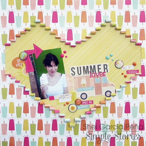
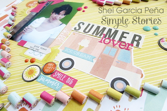
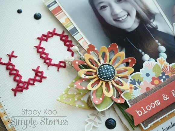
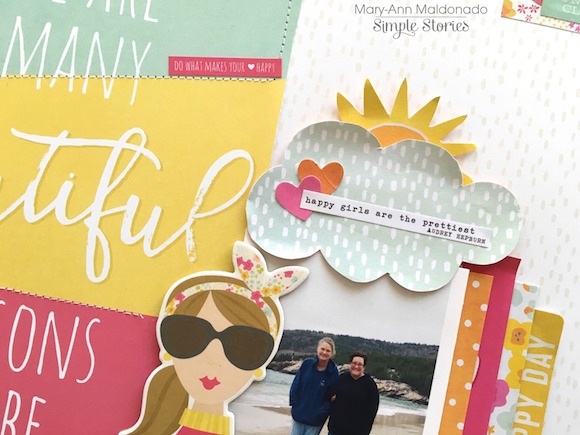
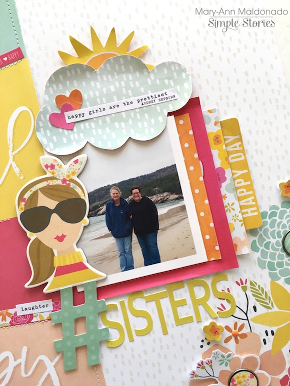
Hey there!  Missy here today, and I have two layouts to share with you.  I can’t get enough of the new Sunshine & Happiness collection!  I love scrapping with bright summer colors, and this collection is right up my alley.  I chose a sweet photo of my daughter for this page, and her pink shirt coordinated very nicely with everything.  I used a lot of yellow, orange and pink from the collection, so I used some aqua and turquoise acrylic paint and ink spray to create a big color swatch on my background.  I love how the other colors contrast against it.  I found a fun loopy cut file from the Silhouette Store and cut several of them out on my Cameo to use as a background design.  I wanted this layout to feel fun and festive, and I think it definitely turned out that way.

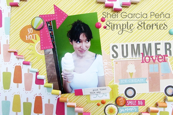
I knew I wanted to use the “Sunshine” sticker as part of my title.  I created the rest of the title in my Silhouette software using the Luna font and then cut the letters with different patterned papers.  I arranged the letters and then used a metallic gold pen to trace around parts of them.  I also used a pencil to make them stand out a little more.  I created a fun little cluster over on the right using some of the Bits & Pieces and some stickers. 

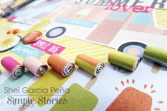
Here is a close-up of the loopy cut files.  I love how they turned out!  I used some shiny gold thread to machine stitch through them for some extra interest, texture and shine.  I added some white tissue paper behind my photo for an extra layer and raised it up with pop dots.  I added a few more die cuts & stickers as well as some tangled thread.

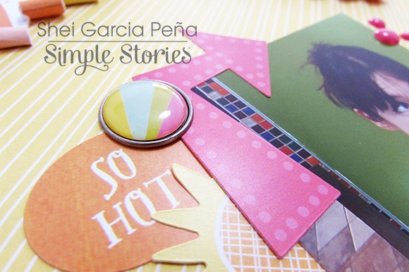
I fussy cut this cute sun & cloud from one of the patterned papers and used it as a background element.  One of my daughter’s nicknames is “Sunshine” so I can’t resist all these adorable sunshines in this collection!  It’s so fitting.

These balloons were the perfect embellishment for this area by the photo, plus the colors were spot on.  I also used a bit of blue spray ink and my small paint brush to give the edge of the cloud a light blue tint to make it stand out a bit more.  I finished it all off by tucking in more tangled thread for extra pops of color.

______________________________

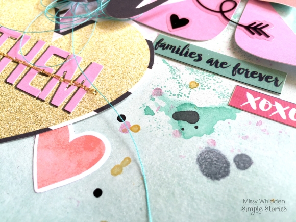
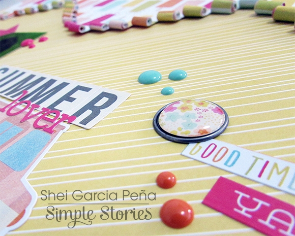
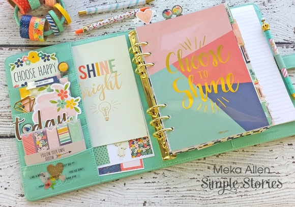
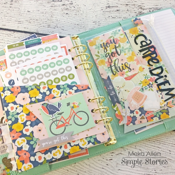
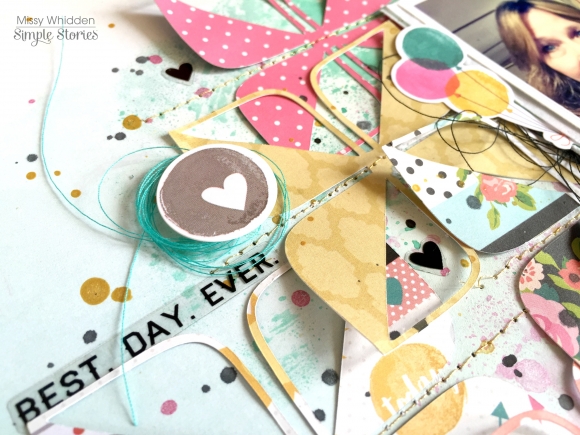
For my second layout, I challenged myself to combine two collections to create a unique look.  I used pieces from Heart and Carpe Diem.  I was surprised at how pretty the two looked mixed together.  I highly recommend pulling two collections out and try to mix and match.  I love how this turned out.  My background paper is from Heart, and it is so pretty!  The ombre look was perfect for a background.  I chose a fun cut file from The Cut Shoppe and used papers from both collections to cut lots of those fun shapes.  I scattered and layered them on the background and then stitched them down with some shiny gold thread.  I did add a bit of gesso and blue and aqua spray inks and some gold paint to the background to give a little watercolor effect.  I wanted the mixed media to peek through all the cut file designs.

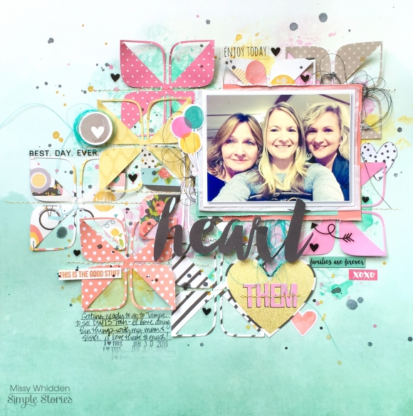
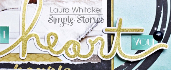
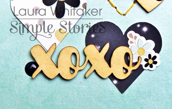
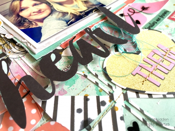
I knew right away that I wanted to fussy cut the “heart” from one of the Heart patterned papers and use it as my title.  I love how it looks raised up.  I also fussy cut that gold heart from paper.  I pulled a few alpha stickers from the Light Snap Stickers to finish the title and used gold thread to stitch through it.  I love the pops of black in these papers, and the Carpe Diem Clear Stickers made the perfect little additions for that.

I added a few of the stickers from Carpe Diem, and I also used more balloons my page.  Balloons are a happy embellishment, and I think they can work on so many pages!  Since my mom, my sister and I were about to go out together in this photo, it seemed like the balloons symbolize a celebration.  And that’s what it was!

Here’s one more look.  I used a few stickers from both collections here and added some black and gold paint splatters.  All those fun die cuts in the background made this layout come together fairly quickly.  Once your background is filled up, all you have left to do is embellish.

Good morning all. Brenda Smith here with you today to share a few pages in the my new Marigold Carpe Diem I'm using as a memory planner. 

First, I've packed my pockets full of the pocket cards from the Dashboards and Pocket Cards pack. I stored some of my most often used sticker sets in the larger pocket. I used the Carpe Diem pouch to add a bit of whimsy and sparkle to my planner and filled it with some gold sequins that I recently rescued from my boss's trash can. Who could throw away something that pretty?!

I used the backside of a dashboard insert to add some gold foil stickers from the Designer Stickers pack. The sequins won't be a forever fixture in that pouch but they're a fun addition for now! 

 
This memory planner spread covering the last week in June spilling into July was inspired by the fun angles in the Posh collection. Since I do not yet have the Posh scrapbook papers in my possession, I turned to past Simple Stories collections for my paper choices. The aqua and white is from Sunshine & Happiness and the navy and white polka dot is from Bloom & Grow. 
 
 
I decided to use some of my gold sequins from the pouch in the front to decorate these spreads. I find they add the perfect amount of detail with little effort. 
 
 
Sometimes I opt to share a cute story about my kids or sometimes I just talk about the everyday minutiae that makes our life what it is right now. I feel both types of memories are valuable and will mix and match on each spread without worrying about congruency. 
 
 
When working in my memory planner, I always do my month-at-a-glance at the end of the month. That way I can fill in the little squares with pictures from the corresponding days. I resized my photos in Photoshop but the same can be done in Word by simply dragging and dropping photos onto your document and resizing. 
 
 
I chose not to put any text on this month at a glance because I thought the pictures mostly spoke for themselves and I thoroughly documented our adventures this month through my weekly spreads (not to mention my pocket pages in my 12x12 album). The Instaquote Stickers are a quick and easy way to add pattern, color, and interest to your monthly page. 
 
The planners & accessories will be in stores before you know it, I can't wait for you guys to see how many improvements have been made to these planners!

Supplies

Hi there! It’s Shei on the blog today. I’m so happy to be back sharing two layouts.  Let’s get started!

I used the Sunshine & Hapiness collection for my first layout. I chose a recent photo of me eating an XXL ice cream. I just love ice cream and for me summer begins when I eat my first ice cream. So this line is perfect to document this moment, ‘cause it's a very happy and colorful collection, perfect for summer pictures. 

I used “Oh Yeah!” b-side paper as my background. I really like all these popsicles! I cut some stripes and I rolled them creating a heart and showing the “Lime Stripe” paper that I pasted on the back of the “Oh Yeah!” paper.

Then I glued my picture and I began with the embellishing. I used some stickers from Fundamentals Cardstock Stickers like the pink arrow, the sun or this super cute ice cream truck and some phrases from Expressions Cardstock Stickers. 

I combine letters from Fundamentals Cardstock Stickers and from Expressions Cardstock Stickers to make my title “Summer lover”.

I also added some of the self-adhesive brads (one of my favorite Simple Stories’ embellishment) and some colorful enamel dots.

________________________________

The next layout I’m sharing with you today was created with the “You are Here” collection, perfect for our summer travel projects. 

I started this page with the “Here We Go!” paper as my background. The pictures in this layout were two photos of our trip to Las Vegas (the funniest travel we’ve ever done!). So I decided to added a hand-stiched simple contour map from Nevada with orange thread to combine it with the colors of the paper.

Then, I used some elements from Fundamentals Cardstock Stickers for the embellishments like the stars and this lovely desktop globe. Also, I added some Wood Veneer to complete my layout. 

Thank you so much for taking the time to read my post! I hope you enjoyed my layouts! See you next month!

Never stop smiling! Kisses!!

Hi Everyone! This is Jennie and this week I was inspired by the red and blue colors and the outdoorsy fun photos to use the Bloom & Grow Collection.  

This week I had a lot of photos which for some people mean less embellishing but I can’t help myself and I went sticker crazy. I specially love the 4x6 Stickers and the phrases stickers! I just need to a little something extra to my photos.

The 4x6 Stickers also include labels which are perfect for stamping my weekly card. For the title and other details I used theExpressions Cardstock Stickers. The Expressions Cardstock Stickers come with 4 types of alphas and a bunch of phrase stickers.

The Photo Flips are becoming a staple on my pages. I just love the possibility of having a little extra room for photos or journaling.

This side was super fun! For the first time I used the Design 8 Pocket Pages. I used to be a traditional scrapbooker, but with pocket pages I get to document so much that I abandoned 12x12s. Once in a while it’s fun to do a mini layout like the one I made in the 6x8 pocket. In that 6x8 pocket you could also do a photo collage.

Embellishments clusters make me super happy. In this layout I used a lot of stickers, die cuts and enamel dots.

If you want to see how I put this page together check out the process video - https://www.youtube.com/watch?v=wXFIxQ97yqs

Thanks for checking out the post!

Supplies

Hello! This is Alexandra and today I'd like to share the pocket pages I made about our week in France. There were so many pictures I wanted to include I had to use several pocket pages and I used Simple Stories' Bloom & Grow collection.


★★★


First, let's take a look at the pages as they appear in the album...


★★★


and now, the pages one by one...


A page dedicated to our visit of Monet's house and garden in Giverny. I added a Photo Flip...


The second page is about the Louis Vuitton Foundation and was trimmed down.


The other side is about meeting my friend Sylvie in front of the Rodin Museum in Paris.


We visited a fabulous exhibit about the Impressionists in Normandy. I bought this postcard and added a few important points on the back of it.


The last page is mostly about our last three days in Paris and meeting up with my BFF Virginie and her family.


Thank You! 

Hey, planner friends! Meka with you today to share my July Carpe Diem planner setup. I’m using the lovely revamped Robin’s Egg planner with matching insides and gold hardware, decorated with accessories from the absolutely beautiful new Posh Carpe Diem planner collection.  Posh has lots of totally new products, like fun Pocket Cards - they make decorating the front pockets super simple!

I’ve removed most of the months included in the Posh boxed set to make room for the coordinating A5 dividers. The Clear Stickers fit just right, and I added a few of my own (created with a label maker) to suit my needs.

Behind the “Inserts” divider, I’ve added a few sheets of each of the different Planner Essentials Basic Inserts available - grid and lined paper - as well as several different planning layout options.  The new Page Flags are just right as temporary tabs for the various inserts.

Pocket Inserts and the Pouch are great places to house stickers, Bits & Pieces, and mini dashboards.

The Sunday-start July monthly layout has been transformed to Monday-start by first covering the horizontal weekday bar with thin washi from the Totally Chic Posh washi set. Then I cut apart a days of the week sticker from the Weekly Stickers pack, and adhered the individual days on top. Stickers from the Planner Essentials Clear Numbers pack worked great for the dates.

For last week’s layout, I couldn’t wait to play with the new Vertical Weekly Inserts. I dove deep into Posh embellishments -- Bits & Pieces, stickers, and washi galore! Doodles and hand-lettering, gave the layout a personal touch. The new 140gsm weight of these inserts hold up well to marker and watercolor accents, with no bleeding through to the back. 

For this week’s layout, I chose the Weekly Horizontal Inserts (with the same 140gsm weight). After applying watercolor as a base layer, I added the details of my week with more Posh embellishments. Did you notice the redesigned horizontal format? These are undated like all Carpe Diem inserts, but the new circle space for the date matches up perfectly with the Clear Number Stickers.

My favorite part of this week was getting to use the new Planner Essentials roller stamp. July 4th was a fabulous day, so I went to town stamping “best. day. ever.” all over it!

The last little nugget of goodness is the new set up for the back of the planner. There’s now a large pocket that’s great for housing extra sticker sheets, the new Carpe Diem Doc-It journal (not pictured), or loose papers. The smaller pocket accommodates the Posh bookmark tablet for quick notes and lists.

You gotta agree with me that Simple Stories knocked it out of the park with their latest launch! So many beautiful accessories, décor, planner upgrades and the drop-dead gorgeous Posh planner collection—what’s not to love? Be sure to visit me on Instagram (Instagram.com/yespleaseplanning) to share more Carpe Diem planner love!

Hello scrappy friends!  Laura here with you today sharing two new layouts using two fabulous collections!
 

I Heart You

I used the Heart collection for my first layout.  I just love the colours and sweet theme of this collection and couldn't resist pairing it with a photo of our puppy.
 

I started my page by die cutting hearts from a variety of patterns and adhered them to my background, to mix things up a bit I used one of the hearts as a stitching template and added in some hand-stitched hearts. I really love the water-colour look of this patterned paper and so I liked being able to leave more of it visible through the open hearts.

From there I layered my photo onto a couple of layers of patterned paper, and some die cut circles.
 

I focused on a title next, which is something that I often "wing" as I finish my page, but this time I really wanted to used the "heart" sticker, I love that it looks glittery.  I flanked it with another sticker that I cut up to finish off my title.
 

I kept my embellishing to a minimum (well for me anyway, lol) adding a small cluster to the top left of the photo.
 

I also added in these great wood veneer hearts, from the "Life in Color" collection to each of my stitched hearts, and then topped them off with a navy enamel dot from the "Bloom and Grow" collection.
 

I also added a small cluster to the lower right side of my layout, I really love the way the colour of the wood veneer meshes with the gold-yellow colour of the Heart collection.


Take me to the BEACH
 

This layout is a little "more", more pasterns and embellishments and much more vibrant and was so super fun to create! I started by cutting a few circles from this fun orange polka dot paper and stitching them to my background.  Then I layered up my photo with a few of the cut apart cards and some foam dots.
 

I just loved the Washi tape from this collection and wanted to find a way to use it all! Ha!  I created this cut file to use as a large focal point on my page.  I covered the insides of each letter (the part that you might discard) with a variety of Washi tape patterns.  I so love how it looks!
 

And then I added in my embellishments.  This time going bold with these fabulous summery colours! I adorned the left side of my photo  with a large cluster.
 

A more modest cluster sits atop my photo.
 

And a smaller cluster adorns the bottom of my title.
 

Wanting to add a bit of journalling necessitated another small cluster. Simple Stories always has fabulous stickers and "bit and pieces" for their collection that are so perfect layered together, and make this fan of clusters so happy!

Supplies

Good morning friends! If you haven't yet seen the planner collaboration happening between The Reset Girl and Simple Stories, you're going to want to check this out.  Go ahead. I'll wait. Now, isn't all that stuff GORGEOUS and so different from everything you're seeing on the market today? But you might be saying, "I'm not a planner. I don't need that stuff." Not so fast! You might change your tune when you see how versatile these supplies really are! 

I created a pocket page using only The Reset Girl supplies that will be shipping with the planner release at the end of July, early August. The base of my page is made using a set of 12 pocket cards  intended for the 3x4 window pockets of the TRG Carpe Diem planners. 

Combined with the 6x6 Sn@p Basics Pad, I transformed the cards to fit my needs. I trimmed down some graph paper to 2"x3" from the pad to serve as journaling spots on patterned cards. I used some die cuts from the Bits and Pieces pack to cover up some parts that were too planner-specific for my everyday pocket page. 

The card with the ladies on it actually says "Planner Girl" but I covered it up with the graph paper and word art. The pennant and "happy happy happy" card are covering up another planner-specific phrase. 

I knew I wanted to keep this pages simple and fairly straight-forward since I didn't have many dimensional embellishments to work with so I added visual interest and texture with some machine stitching in pink thread. I find that I can take a "meh" page and transform it into something I really like just by adding stitching. 

The Planner Basics StickersIcon Stickers, and Word Label Stickers are the perfect embellishments for photos and cards. I found that there were plenty of phrases and icons applicable to everyday life, including the "finding my happy" sticker on the 4x6 photo. 

The rolls of washi tape that coordinate with this line are perhaps one of my favorite things from this release. You can never have too much washi tape! I just tear off small pieces and use as part of my layering embellishments. I commandeered some tags from the Bits and Pieces pack to use under my photos for journaling. When I ran out of those, I cut more small bits from the 6x6 Basics pad. The Clear Stickers make great faux stamps for your photos (the "SMILE" camera sticker seen here). 

 
Don't be afraid to think outside of the box with your supplies and repurpose them to make them work for you!
Hi planner friends!  Vanessa here with you today to show you how I am using the new Posh planner collection and the new Robin’s Egg Carpe Diem planner with gold binder rings!  
 
 
The entire Posh collection is so beautiful, rich in color, and will go with any of the Carpe Diem planners.  Robin’s Egg is one of my favorite colors, so naturally I went with the same color binder, but now the lining matches the exterior and has beautiful gold binder rings.  I stocked all of the pockets with the new page flags, bits & pieces, planner stickers, and journaling cards.


The Posh collection also has a new set of pocket folders that come in really beautiful prints and are double sided.  I always use one to store extra sticker sheets, journaling cards, and they’re also great for keeping receipts.


For the monthly spread, I used a few of the Insta Quote stickers, washi tape to trim along the edges, and the birds and floral stickers from the designer sticker set.


Some of my favorite stickers that are new in the Posh collection are these really cute weekly stickers that fit perfectly in the Vertical Format Weekly inserts.  The mini flags in the middle are part of the Planner Basics pack and they’re just small enough to fit in the boxes, without taking up too much space.


Using vertical planner inserts is my preferred way to plan and I love these Vertical Format inserts for the Carpe Diem planners.  The boxes have plenty of space to write in and the new Posh weekly stickers and Insta Quote stickers are sized to fit perfectly.


A few of my favorite accessories that are new to the Carpe Diem planners are the set of bookmarks, page flags, and plastic zip pouch.  I love to carry a small amount of page flags in my planner, so I took a few of the page flags in each print and stuck them to one of the bookmarks.  It’s less bulk in the planner and a easier to way to take them with you.


I hope you’re excited about the new Posh collection and planners as much as I am and enjoy using any of the new stickers and accessories in which ever Carpe Diem planner you choose.  The new collection will be available in late July or early August and I look forward to using this versatile collection for months to come.
 

Happy 4th of July!!  

Who says that the Hero Simple Set  has to be used just for our deserving military or 4th of July?  My husband is a retired Marine, I have ample photos that this collection could be used for.  However, I decided to document my son's accomplishments instead.  Just recently he bridged from Cub Scouts to Boy Scouts.  The colors of the uniform and ceremony itself worked perfectly with this collection.  I picked the sentiments that worked and focused on the blues, reds and grays!


I wanted a larger badge to use on the layout so instead of using the smaller sticker in the collection,  I fussy cut the badge from a 4x6 block, backed it with foam and layered the honor sticker over the top.
 
 
_________________________
 
For my second layout, I documented my son again.  When he was younger, he dressed up in something every single day.  It could be a superhero costume or a mini version of his dads USMC uniform. Regardless, he had tons of fun.  We were grateful for his dedication to protect our home and our pets.  Let's take a look at how the Hero collection works for this layout.
 
 
Was there any other choice than the camouflage paper?  NO!!!  The problem was, I loved the back too.  I folded over the corner to see the stripes and decided to use the empty space for my title!  (see below)
 
 
The addition of stars was natural because the collection had stars.  I almost went with hearts but I decided to keep the layout 'tough!'  I didn't want anyone mad at me:o)
 
 
Again, I chose the perfect sentiment to go along with the theme of my layout.  There are so many different directions this collection can go.  
 
 
Thanks for joining us this week as we celebrated all thing patriotic!

Supplies

Hello, everyone! Independence Day, Boom, Boom, Boom is what most of us will be hearing. Fireworks, blasting away,  it's a reminder of our freedom! It is a time to be grateful for those who have sacrificed their freedom so that we can have ours. This is what 4th of July means to me. This month I have used the Hero Simple Set along with pocket pages in my Carpe Diem planner.

The Elements with all the Red White and blue were perfect for this patriotic page. The elements cards are a perfect fit for my pocket pages. Below you will find the front and back decorated with Fundemental stickers and Expression stickers. They added just the right amount of color and decor.

Let me introduce you to my heroes, my Father-in-Law Tom and my Brother George. They  both have taken time out of their lives to ensure we have a life of our own. I am so very proud to call them my heroes.

Next you will find pockets full of patriotic goodness. I grabbed some of the stickers and ran them through a laminator, trimmed them and hot glued them to a paperclip and secured the back with a piece of felt. I measured and trimmed the paper to fit in the pockets and also used some of the cut apart elements. 

The Heroes collection kit is a blast. I am so blessed to be able to live in the United States of America. I want to take this time to say thank to everyone who has fought for and defended our freedom. You all are true heroes! 

Supplies

Hello Simple Stories friends. Marcia here today.

With the 4th of July right around the corner, our focus on the blog this week is on the Hero Simple Set.  My first layout features my husband. He is a former Marine and now volunteers his time with fellow police officers from the Minneapolis St Paul Airport Police Department on their Honor Guard. They attend funerals of police officers around the state, but they also volunteer to stand guard over our fallen soldiers coming back from overseas to their final resting place. I used the Bits and Pieces Star Background digital cut file from JustNick Studios.
 

Instead of backing each of those tiny squares with different pattern papers, I opted to selectively fill portions of the negative space with pattern papers from the Simple Stories Hero Collection Simple Set to mimic our American flag ... with the colors reversed. There are a few embellishments thrown in from other Simple Stories collections as well. Then I added some stars scattered across my layout with modeling paste.


I love the overall look. I didn't want to ruin the star focus, so my journaling was done around the edge of the die cuts.


For my second layout I wanted to show how the Hero Simple Set is not just for your military photos. You can use the pattern papers for vacation photos of patriotic places too. I scrapped a photo from our trip to Pearl Harbor this past winter. To add interest, I added lots of banners with a variety of pattern papers from the Hero Simple Set.
 

I used the alpha stickers from the collection to create my title which I placed at the bottom of my layout so it wouldn't get lost among the busy banners. More star stickers and enamel dots are scattered across the page very similar to my first layout.


I used my computer to journal directly onto the pattern paper.


Thanks for stopping by today! Look for the Hero Simple Set at your local scrapbook store or favorite online retailer. I know you will love it.


Supplies

Hello everyone! Leah here again, ready to show you how I have decorated my planner for July using the Hero Simple Set! The Fourth of July is one of my FAVORITE holidays. I try to remember to be grateful every day, but on this holiday especially, I am reminded of the strong appreciation I have for how far we have come as a nation, for all the people who have brought us here, and the heroes that continue to protect our freedom every day. I love all the traditions we have to celebrate this holiday… spending time with family, enjoying the summer weather, the fireworks and sparklers, the cookouts! The sense of celebration and patriotism really brings the American people closer together, even during times when the nation has felt the most divided. Because the month of July always makes me feel extra Patriotic, I decided to use the Hero Simple Set to add some U.S.A. themed décor to my planner!

One of my favorite papers in the Hero collection kit is the one titled “Brave.” I love the shadow of the Continental U.S. map in the background. I wanted to find a way to incorporate this page into my planner so I decided to cut it in half and create a two-page decorative “dashboard” for the month of July. I chose to highlight the map by tracing all the states with a stitched white line, using a white Uni-Ball Signo gel pen. I really love the sewn effect it created!

To dress up the left page, I started with a red watercolor cardstock tag that I picked up in a pack at Michaels awhile back. I layered different colored paper strips and word phrases from the Hero 12x12 papers (using the title strips that many people trim off and throw away). I added a chipboard sticker from the Sunshine and Happiness collection (the girl with sunglasses) to make the page feel more fun and summery. I also added a gold glitter chipboard star I had in my stash (from Michaels), and used the white gel pen to draw in more of the white stitched lines.

At the top of the page, I added a title using a few more items from my craft stash. The yellow frames around the words are cut out of a card from the Life in Color SN@P! Pack. The letter stickers that spell out “America the Beautiful” are from the Sunshine and Happiness 12x12 Expressions cardstock sticker sheet. I added a couple small pieces of gold glitter washi tape, red-and-white string, and a sticker from the Hero 6x12 Fundamental Stickers sheet.

On the right side of my July dashboard, I used a blue watercolor tag as a base and added strips of yellow and gold glitter washi tape. I cut out the words from a 12x12 Elements sheet and arranged them how I wanted on the tag. I added some star stickers from the Fundamentals Sticker sheet and tied red-and-white string to the tag. I laid out the string how I wanted it on the page and then glued it in place.

The “July 2016” at the top of the page was created using more letter and number stickers from the Sunshine and Happiness 12x12 Expressions Sticker sheet. I also added more star stickers from the Hero sticker sheet and a wood veneer star from my stash (from the Life and Color collection).

For my July monthly layout, I used a 3-inch circle punch and banner punch to cut out a few shapes from the 12x12 papers in the Kit. All of the other pieces are cut out of the 12x12 Elements sheets or are stickers from the 6x12 sticker sheets.

Some more layered paper strips and words are in the center – I arranged them in a way that reminds me of a firework.  In the bottom right corner, I used another blue watercolor tag and added a red United States sticker from the Fundamentals sticker sheet, blue glitter washi tape and some words printed using my label maker. I put the white star sticker over VA since that’s my home! I used a marker to draw a stitched line around the edge of the tag and added some red string for a finishing touch.

My favorite part of this whole layout is the part with the red plane sticker. I got the idea to use the red-and-white string to create a flight path that ends with a blue star sticker, which is supposed to represent a “destination.” Using my label maker, I typed out the words “My love spans across the miles.” This part of the layout has special meaning to me because it reminds me of all the love my dad expressed across the miles during his many deployments as I was growing up.

I loved making my planner Patriotic for July! It can be so fun to let yourself run away with a theme in your layouts! I may have also gone a little crazy in the Target dollar spot and bought a few red, white and blue sticky notes and pens to use in my planner as well…

Happy Independence Day everyone!

SaveSave

Supplies

Hello crafters! It’s me, Stacy here today with 2 layouts using the Bloom & Grow Collection! This collection has taken my breath away with the gorgeous colors and elements!

For the first layout, it came together pretty quickly. It must be the fastest layout I have completed so far! The idea was generated from one of the pattern paper in the collection – 2x12, 4x12 & 6x12 Elements. I am in awe with the cross stitched element, and being an avid book binder, stitching is my absolute favourite thing to do! The picture in this layout was a recent photo of me and my handmade clay bead necklace. It tells me how much I loved making handmade items, and I wanted to document this!

I added the cross stitch title “Love” directly to the background of this layout.

Topping up layers onto the layout is simple! I used some elements from the Bits & Pieces pack, including the sun, gnome, flowers, circular leaf, bird and bird cage. Instead of using the circular leaf element as a note card, I did some fussy cutting to eliminate the white areas and used it as a layering element. I have also die-cut some flowers and leaves to layer below the bird. There are also many elements in the 4x6 sticker pack! I used some phrases in this layout as well. 

I sewed 3 pieces of pattern paper on the background, in order to highlight the 2 photos. Then, I added some floral die-cuts topped with the adhesive brads. Of course, the main highlight must be the gnomes!

Next, the cross stitch of the letters LOVE. I love the blend of the cross stitch with the floral elements! Lastly, I covered the photos and sprinkled some mists randomly across the layout.

_________________________

On the second layout, I decided to use some photos which I found from some old photo album. This is one of my favourite childhood photos taken by my grandfather, and it showed me how innocent and carefree I was then.

I call this layout “Lovely Blooms”.

For this layout, I sewed some rosette looking circle elements using blanket stitch as a highlight. I varied the sizes used across the entire page, inspired by the blooms in this collection. 

The title is sewn onto the layout. I love the cursive font used. These pieces can be found the Bits & Pieces pack. Totally useful pieces! Here and there I have used some enamel dots from the same collection. Enamel dots are small pieces which help to highlight important portions of the layout!

Here’s a closer look with the stitched rosette element and topped with the adhesive brads. They look so pretty! I have also diecut some leaf pieces and twigs as background to highlight the main element – the gnome! I am totally in love with these gnomes! Ain’t they cute!

Here’s a look at the layering of the other side of the layout. The layering of the mushroom pieces gave me much joy! Love how the greens work so well with the elements! There is another of the stitched rosette piece which I added the adhesive brads to. I am just too hooked on it!

There is much joy associated with this layout. I like how the nature elements complement with the photo!

Hope you enjoyed these layouts and get some inspiration! Thanks for stopping by today!


Good morning! Brenda Smith here with you today and I am so excited because I have in my hot little hands a gorgeous ballerina pink Carpe Diem planner. First, look at the new pocket set up (for The Reset Girl planners only)!

The window is perfectly-sized for peek-a-boo 3x4 cards. This card came included with The Reset Girl boxed set but any 3x4 card you have in your stash (or one you make yourself) will work. 

Because The Reset girl dashboards and dividers and accessories are all very motivational and encouraging toward achieving goals, I decided to set up this planner as my creative goals planner. I used this monthly log page to set myself some very basic goals that I can check off as the month goes by. When the month is over, I'll fill out that circle with a pie chart of how I spent my time. 

On my goal tracker (one included in TRG boxed set for each month of the year), I set up a more broad goal and am keeping track of how often I achieve that goal throughout the month. 

Not many know this about me, but I did some graphic design stuff several years ago when I first started college. I've been yearning to get back to designing, so I am setting goals to make myself get back into it. This is a pocket insert that I'm using to hold some little bits and pieces that I've found on Pinterest and elsewhere. 

I have a theme in mind and chose a color scheme and then imagery or composition that sparked an idea. I also found some simple sayings or phrases that would fit well with my theme. 

I tried out the new 140 GSM vertical weekly inserts and they are AMAZING! They are relatively colorless with only a light grey and black so they can be fully customizable to your needs. And the paper weight is just everything I had hoped for and more. The past CD inserts had some ghosting problems, but I am happy to report that my trusty old Versafine Onyx Black does not show through on the other side of the insert! And do you spy those peach floral and black WASHI TAPES?! Hooray! 

The sheer number of coordinating sticker packs for this line had me so excited to add more and more and more to this page. I think The Reset Girl and the Planner Essentials roller stamps have quickly gone to top the list of my favorite roller stamps. They're just so versatile and usable and exactly the right size for planners and pocket pages, my two favorites. 

The new planners & accessories will be shipping to retailers late July, early August. The quality of the binder and the rings and the weight of the inserts and the dashboards/dividers is absolutely impeccable and you can believe that I'll be rounding out my planner collection with more of the gorgeous colors available. 

Supplies

There is nothing better than stealing your sister away, for a day of exploring and family fun.  We live 4 hours from each other and don't get to see each other often.  The bright pinks and yellows in the Sunshine & Happiness collection, help make this cold, drizzly day in Bar Harbor, Maine a little brighter.   I knew they fresh 'girl' head had to play a role somewhere.  'She' is how this entire layout got started!  She is on stickers, cards, chipboard, everywhere!!!
 
I loved the 6x12 section of the elements paper that says "there are so many beautiful...."  I used that as half of my page!  I focused on the lower right corner of 'Total Crush' too!
 
 
Using such large and intricate papers made my layout come together rather quickly.   Lets take a look at the smaller details.
 
 
I embellished the corner of the patterned paper with stickers, brands and enamels for dimension.
 
 
The cloud and sun came from the SN@P! Pack.   It was a 4x4 card that I fussy cut.  Because it was a dreary day, I removed the sun and tucked it further behind the cloud.  I didn't want it to come off as a really sunny day!
 
 
I added a bit of SN@P! Pack 3x4  and 4x4 cards as layers behind my photo too.  
 
I hope you have your inspired to used the larger sheets of patterned paper to your advantage!
 
___________________________________
 
Traditionally I am not a bird fan.  We have a pool so bird poop is not cool - LOL!  However, when a mama bird builds a nest on a grapevine wreath on your shed door, you treat them like your own.  I watched these babies go from eggs to flying away in just 3 short weeks.  I checked on them a minimum of 4 times a day.  Every time I looked, they changed.  It is amazing how quickly they morph from little raw turkey looking things to feathery birds!  I was really intrigued.  What better collection to document MY birds than Bloom & Grow, right?
 
I print my own photos through my Silhouette.  That way, I  can print the size and shape I want.  


Obviously the chipboard and sticker birds had to play a role in my layout but so did the gnomes.  They serve no purpose here, other than being so darn cute!  
 
 
I layered mushrooms, birdhouse and an umbrella!! I felt like my little vignettes needed some sort of grounding as opposed to just floating on my page, so I trimmed a strip of green paper to replicate grass.
 
 
Look how tiny my baby birds started out.  I am glad children don't grow that fast!
 
Thank you for stopping by.  I can not wait to see how you create with this collection.


Supplies

Hello there! Allie here today, and I have two new layouts to share with you today, using the two newest collections--Sunshine & Happiness and Bloom & Grow.

For the first layout, I used Bloom & Grow to create a quilt pattern across the page. I was inspired by this image on Pinterest!


To create the quilt pieces, I used a square punch and cut them in half from corner to corner. I started in the middle, and just copied the quilt design until my background was complete. I stitched the triangles down to add to the quilt look, and give dimension to my page. Once I was done with the background, I added my photos, title, and embellishments!


For my second layout, my goal was to mix Sunshine & Happiness with You Are Here!
 

I cut strips from the patterned papers of both collections, and varied them in size and length. I arranged them on my page, and then sewed them down. I left the ends of the thread dangling for a messier look. The theme of the page was Disneyland, so I kept the colors bright and cheery. I used the You Are Here! frames for my photos, as well as a cute phrase from Sunshine & Happiness.


 I loved the travel themed wood veneers, and added them to my page. The colors from the two collections coordinate so well!


Thanks for stopping by today. I hope you are having a great summer and that you feel inspired to create!

Supplies

Hello Friends, It’s Kristine Davidson with you today.  I am going to show you 2 of my latest layouts created using the new Bloom & Grow Collection.  This collection is super cute and fun.  Imagine little gnomes in the garden, or flying a kite.   I love the navy blue with a touch of yellow and red in this collection. I really couldn't wait to use it.

The first layout I'll be sharing is called " Bloom & Grow "

My mother is a great gardener and her thumbs are certainly green!  She does an amazing job at planters, her garden beds and has a way to make her garden look amazing. My dad certainly helps her out but it's mostly done by my mom. This layout is just to showcase some of my mom's garden and her love for greenery.

I created this page similar to a pocket page page. It's not in a page protector but it is on a piece of cardstock. I cut out the 3x4 cards in the SN@P! Pack and trimmed them to 2.75x3.75 just to leave enough white space between cards and pictures.

This little SN@P! Pack has everything you need to create a page similar to this. Of course you can add extras with the Expressions and Fundamentals Stickers. You can add or use as little as you wish based on your photos. If you aren't into pocket page scrapbooking why not try this form of layout? You can add several pictures and of course lots of color to these pages.

I love creating dimensional images on my pages and this was no exception. I added foam adhesive in the back of the photos to bring them out a bit from the pattern papers that are around it. It just makes the image pop a bit.

You can see again in this picture how the photos are elevated as well as some stickers. You can also do this on a layout. Instead of having your picture flat on the paper why not add some dimensional adhesive to make it stand out from the rest.

_______________________________________________________________

My Second layout for you today is called "Let's Play Outside"

This photo was perfect for this paper. Don't you love that when it happens? It just fits!  I also like that his tshirt says Play ;) Nope that wasn't planned!

I wanted to create layers and a fun page using some cute chipboard pieces and of course little Gnomes. OMG aren't those cute or what?! Some find them spooky and I must admit I don't think I would have them in my garden, but on a scrapbook page I'm all for it !

I added sewing to this layout and of course a cluster of embellishments on the left of the photo.  This doesn't distract from the photo and adds lots of dimension and texture to my page. I wanted to add several pieces of paper so I created a circle and added another smaller sized circle on top of it to create a border around it.  I again added foam adhesive to my photo to make it pop off the page a bit and placed some of the bits & pieces under it to create dimension.

The title I created using a silhouette cut file " play" and the alphas from the Expressions Sticker Sheet. You could add more alphas instead of a cut file but I think this looks great and matches the page quite well.

Here is a close up of the layout. You can see I used some chipboard pieces and layered them on top of one another. I also created some journal strips instead of a journal block.  Aren't these colors so fun together ?  

I hope you enjoyed my layouts today and enjoy making your own layouts with this fabulous collection! If you are interested in seeing more of my work you can find me on instagram with user name @KristineDavidson. 

Thank you so much for reading and being a fan of Simple Stories!


Supplies

Pages