Hello everyone, Marcia here! I am so excited to share some Carpe Diem layouts with you today. This collection is gorgeous with those bright colors mixed with the black and white pattern papers. 


For my first layout, I really wanted to make a pretty, girlie scrapbook page that showcased the beautiful floral pattern paper. The title for this layout Make Today Ridiculously Amazing comes from one of the Bits & Pieces elements. It really goes with the theme of this collection, Seize the Day. Take a look ...


I used a piece of black cardstock as my background and used the diagonal pattern paper as a border. I think the black really makes those bright colors pop. I softened the look with a white die cut doily and also some white die cut leaves and flowers, Sprinkled amongst the die cuts are some Carpe Diem Bits & Pieces, Bradz and Enamel Dots.


A Chipboard Frame tucked in under the lower right of the photo helps to frame it. There are lots more Bits & Pieces here along with more Bradz, Enamel Dots, and a sweet little twine bow.
 
 
With so much layering at the top, I left the bottom half of my layout clear of embellishments so you can really appreciate that pretty floral pattern.
 
 
************
 
For my second layout I wanted to showcase the fun side of the Carpe Diem collection and I mixed in a piece of yellow from the Life in Color collection. This one is titled Shine Bright. What could shine more than the sun? so I added a big die cut sun on my layout.
 
 
I love adding machine stitching on my layouts. Here I stitched the sun rays.
 
 
A Chipboard Frame made a nice frame for my photo. Look how fun this chipboard lightbulb is!
 
 
I love layering the 4x6 Element pattern paper pieces. This one had an adorable quote choose to Shine. My title Shine Bright is a combination of a Silhouette die cut and the Carpe Diem alpha stickers. 
 
 
Thanks for stopping by today. I had so much fun playing with this collection. I know you will love it too. 


This month I wanted to incorporate the new Heart Simple Set into my Carpe Diem planner.  Although the line was made to document our loved ones that have passed, the patterned papers and some of the stickers are versatile enough to use on other projects as well.

I wanted my monthly divider to match my layouts for the month.  I cut down one of the patterned papers and adhered it on the top of the existing April divider.

Then I added a recent photo and embellished with stickers.

I carried the same color combination from my monthly divider over to my monthly layout.  The weather is warming up where I am so I loved that the flowers gave this layout a little bit of Spring!

The first week of April was a busy one.  There were a few days that we didn't have any set plans, so I filled in the empty space with journaling afterwards.  I also added a few of my favorite photos with chipboard frames to finish my layout.

Hello scrappy friends!  It's Laura here today sharing two layouts using the super fun and whimsical Let's Party collection!
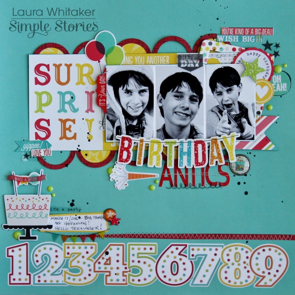
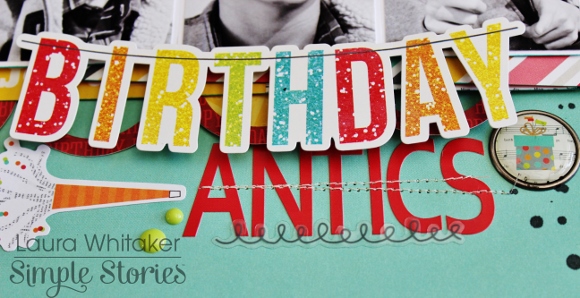
 

BIRTHDAY ANTICS

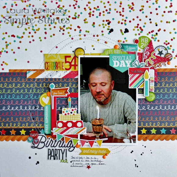
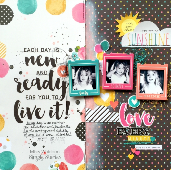
My first layout documents my youngest son's most recent birthday, he became a teenager last month!  He is my last teenager, and therefore he was my last little kid - that is just a little sad for this mom.

I can't tell you how much fun I had playing with this collection!  I let the playfulness of the patterned papers and embellishments guide me through the creating process.
 

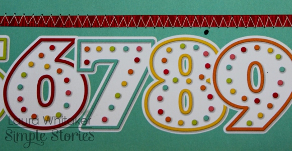
I love graphic look of this patterned paper and wanted to be sure to highlight the numbers that run across the bottom of it, so I stitched a scrap of red paper above it to frame it in.
 

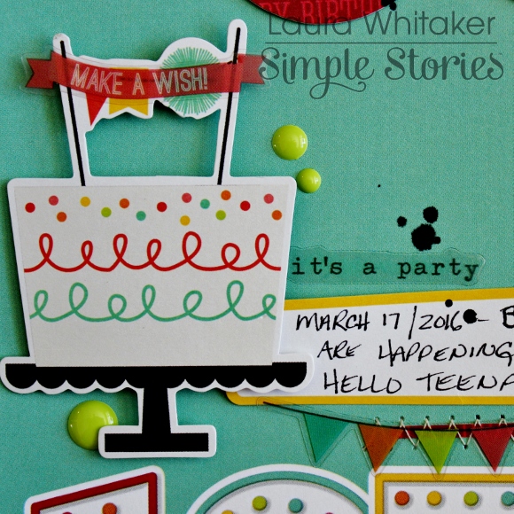
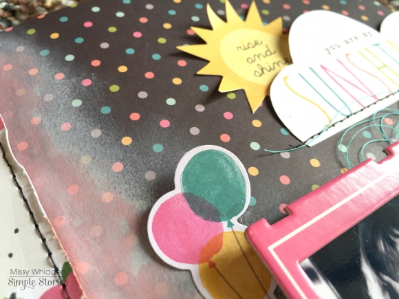
Which created a great spot for this embellishment cluster and my journalling.
 

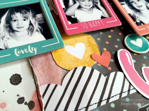
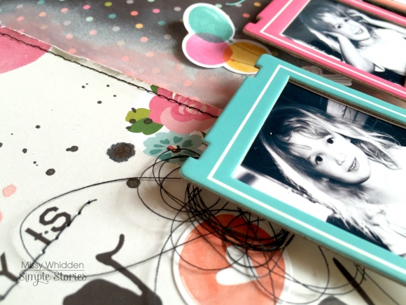
Once that was done, I worked on creating some layers to frame my photos, front and centre.  I started by die cutting this circle element.  I kept some of the circles to flip and adhere into every second opening.  These colour play so nicely off of one another and are so perfect with my black and white photos!
 

On top of the circle element I added a strip of 3x4 cut-a-part card to anchor my trio of photos, which were popped up a bit so that I could nestle some embellishments behind them.
 

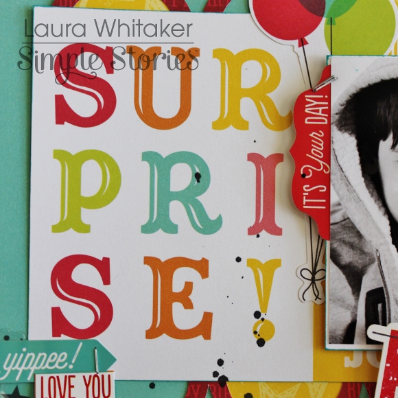
I love that some of the elements look as if they are glittery, and the clear stickers with black graphics help to anchor my black and white photos.
 

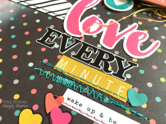
I layered a large sticker element with some alpha stickers to create my title, then I did some more machine stitching to add texture to my page, of course another embellishment or two helps as well! The very last step on this page was to sprinkle on some black Mr. Huey's mist.
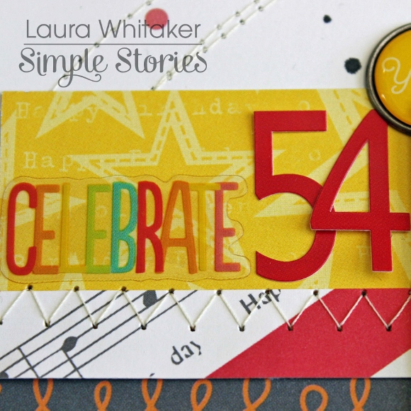
 

CELEBRATE 54
My second page is all about my husband, he was so excited to turn 54, which put him one year away from retirement and now the countdown is officially on!
 
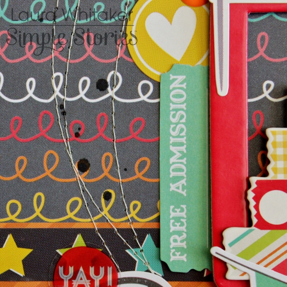
Again I kept my patterned paper layers pretty simple, choosing to pull the grey tones from the collection for a bit more of a grown up look, while still maintaining the playful nature of the collection via my embellishing.

After running some strips of patterned papers in a variety of sizes, vertically across my page,I machine stitched some messy circles. This created the perfect focal area for my photo.

 
I used some chipboard frames to "catch" some embellishments.
I have created text in three areas so I suppose any of them really could have been the title for this page, but I am going with this clear sticker combined with number stickers as my official title.  I just love the variety of fonts and styles of these products, and the clear stickers are magic layered over patterns.
 
The cardstock stickers, clear stickers , and chipboard stickers layer up so nicely with each other and the ephemera pack.  There is something for everyone in this collection, or if you are like me you might just have to play with it all! 
 

Thank you for visiting!

Good morning and thank you so much for stopping by here today. My name is Brenda Smith and I wanted to share with you the first half of my year-end review I made for my 2015 pocket page album. 

Life in Color is absolutely perfect for this spread because of those watercolor month cards from the SN@P! Pack. How could I not use them? I also used some alphabet stamps from my stash to reiterate the month. 

This spread is obviously a double page 12x12 spread but what might not be as noticeable is that there is also a 6x12 insert in the middle of the two larger pages. I made this insert from Simple Stories 12x12 protectors by simply trimming of the unwanted pockets using my paper trimmer. 

 
The middle insert holds the journaling cards that correspond with each month. So the top card of the insert is the journaling for January, the middle is for February, and so on. Placing the journal cards like this really gives the spread continual horizontal movement. 
 
 
For my journaling, I didn't worry about going into too much detail because all the details are already in the rest of the album. I wanted this to be primarily a recap but also a place to store cute little snippets the kids did or said that didn't get a place in the album otherwise. 
 
 
The photo collages were made in Photoshop. I left one blank spot in the collage, saving that spot for embellishment. I chose to make most photos black and white so as not to overwhelm the spread with too much color. But I did colorize the photos that I thought were best representative of the month to make them stand out a little more.
 
 
The 2x2 Life in Color chipboard frames were the perfect accessories to the photo collages. They add a little dimension but are not too bulky. The labels with the month names are fussy cut from a 4x6 card in the Life in Color Sn@p pack. One of my favorite techniques is to look at journal/filler cards for embellishments that can be cut out. You can stretch your supplies quite a bit in this way. 
 
Thank you again for taking a look. Have you ever made a year-end review in your pocket page albums? Link us up in the comments! 

Hey there!  It’s Vicki here just popping in with a quick look at a DIY Stamp class I'll be teaching in New Zealand later this month using the oh so lovely Carpe Diem collection!!!

I love the teal, yellow, salmon and black color palette in this line.  Actually…I love anything with black in it.  And text…I love patterned paper with text!!!

Take a closer look at the fabulous icons in this line.  I loved them when they were introduced with the Carpe Diem planners and I think they are awesome for layouts!!  I used a mix of the Carpe Diem Fundamental Stickers and the Chipboard.

These are some of the stamps we will be creating out of craft foam in the workshop out … aren't they so much fun?  And super easy to make, too!  They complement the flowers you see in the Carpe Diem collection and those that I pulled from the stickers and the chipboard embellishments on the layout.

Thanks for joining me today!

Hello! Jennifer on the blog today to share two layouts I created using the Hero Simple Set. I have to say I do love using the simple sets because you have everything you need to create your project!  Of course I adore the bigger collections with more embellishments but the simple sets are a lot of fun.  I also really wanted to create layouts with Hero because of my military background!  
 
For my first layout, "Battle Buddies"  I cut the striped edges from the B-side of "Brave" and adhered to three sides of my white cardstock. I then lined the bottom of the page with pieces from "Loyalty" and "Courage. I love that the colors of Hero are the traditional red, white and blue along with grey and camo mixed in!   
 
 
I used the camouflage letter stickers from the 6x12 Expression Stickers for my title as well as accented with tiny heart and star stickers from the same sheet. 
 
 
Using my Silhouette, I cut different pennant shapes from the patterned papers and adhere under my photo. I love the star/circle stickers and they make a great accent! Here, I adhere a light blue sticker with a staple over two of the pennants. 
 
 
I'm a huge fan of creating banners so I continued with the theme across the top of my page. I stitched through with my sewing machine as well as added brads from my stash to create some depth.  Also, the cute little star stickers from the 6x12 Fundamental Stickers make cute accents!  
 
 
The Fundamental Stickers also include many fitting sentiments such as this "Basic Training" sticker. I also used a small amount of washi tape and wood veneer stars from my stash.  Lastly,  I added a few ink splatters to my background.  
 
 
____________

For my second layout, "Honor",  I adhered an 11x11 piece of the dark blue "Brave" onto the B-side of "Loyalty".  I also added a strip of the B-side of "Courage" as well.  And my layouts aren't complete without stitching and you can see I stitched around the edges. 


For this layout I wanted to utilize the Journaling Cards of Elements 1 and 2. I layered two of the 4x6 cards underneath my photo as well as a 3x4 card for my title and journaling.  I used the "honor" sentiment sticker from the 6x12 Fundamental Stickers over the heart as well as added a sentiment from the 6x12 Expression Stickers. At the top of my journal card, I added a star/circle sticker and secured with a staple. 
 
 
I also added two additional star/circle stickers to the edge of my photo as well as some bakers twine to accent.  
 
I typed my journaling on my electric typewriter and adhered it just inside my photo so that only three edges are shown.  Again, I added washi tape as well as a a wooden veneer star.  
 
 
​Underneath my photo, I used a star cut file from my Silhouette using white card stock as well a more ink splatters to accent.  
 
 
Thank you for stopping by today! I hope you will be inspired to document a patriotic event or even a loved one's military career! The Hero collection is perfect for both!  


Supplies

Good Morning!  It's Mary-Ann with a couple layouts to share with you.  Both are created with Life in Color.  It is pretty amazing how one collection can take you in so many different ways when creating.  

My first layout, I call it it Stop! Wait a Minute.... makes me sing that song!  Unfortunately, that is all I know of the song so lets just leave it at that!  My title on the page varies just a little but it is important to make people stop so you can document the moment.  The photos on this layout look so similar but if you look close, the expressions are completely different!  After you tell grown ups and boys to "say booger," they tend to smile.  It can totally change everything!


You can see from the photos below that I used the Chipboard Frames as design behind my photos.  These added texture, color and depth all at once.  I also cut up the Here & Now paper and used the polaroid sections for the base across my page.  They are layered and covered a bit, but they added quite a bit of color as well.


For my second layout, I used Life in Color as well.  I started with the photo on the lower center and went from there.  I added until I had the section down the middle.  I imagined this in my mind and it actually came out a little better than I thought originally!  I love it.  
 
 
Below you can see that I cut my title.  I did this because when it was across the page, it was a bit wide.  I cut it where you would in a sentence.  So it still made sense.  


It was a ton of fun to create this layout.  There are so many items that help decorate this collection.  The Bits & Pieces are my fave but I also adore the brads and Decorative Clips.  
 
Thank you for taking time to stop in today.  See you again really soon!


Howdy!  Today on the blog we're sharing a fun 4x6 SN@P! Binder created by in house designer Sue Kendall using our Let's Party collection.   

Sue created this fun project to document one of her son's birthdays, but the collection is neutral enough to document either a boy's or a girl's birthday -

The collection has lots of great traditional birthday icons and fun glitter accents.  Even better - the glitter is just part of the paper design, so you have all the fun look of glitter without all of the mess!  

The 2x2 pockets in the 4x6 SN@P! Binders are some of our favorites!  Sue made great use of them in this spread - mixing 2x2 cards to spell 'happy' alonge with different chipboard pieces, die cuts, and tickets - such a fun look!  

The cow that makes an appearance in the Let's Party collection - he's one of our favorites!!  :)

When working with our SN@P! Binders, dont forget about decorating the backs!  Sue made great use of the 12x12 sticker found on the Element Sticker sheet - she started it on the inside of the back cover and wrapped it around to the back cover; the birthday candles sticker is the perfect accent!

Hello there, it's Allie here today! Today I have two layouts to share, one using the Life in Color Collection and one with the Heart Collection. These collections are both so beautiful and versatile, and they are great for mixing and matching with each other!

For my first layout, I used the Life in Color collection. I love the string-art printed "LOVE" and wanted to use it for my title. There are lots of fun quotes and phrases about living life in this collection, and so I built my layout around the theme of loving life.


To create this layout, I cut the Happy Little Moments paper at an angle and placed it on the teal watercolor paper. I used a black and white photo to match some of the black and white elements throughout the collection, and placed it in the middle of the layout. I kept adding embellishments and bits and pieces until I could add no more!


One of my favorite parts of this layout are the beautiful butterflies! I used chipboard, wood veneer, and metallic die-cut butterflies.


Finally, I finished the layout with some splatters of black mist! For my next project, I used the Heart collection. It is a truly lovely collection, and unique in that many elements are specific to a loved one you have lost. It isn't, however, limited to that, and can be used for a variety of themes! I created a layout about my pup and husband using the beautiful love elements.
 
 
I used my Silhouette Cameo to cut out the background for this layout, then backed each opening with a patterned paper. Next, I used a doily to anchor my photo and title. I embellished using the Heart Fundamental Stickers, as well as a few items from Life in Color!


I love the giant "LOVE" stickers!


I finished the layout with mist splatters and heart stickers throughout the page. I had so much fun using these collections, and I hope this inspires you! Thank you for joining me today!

Supplies

Hello dear Friends! Alexandra here with a new pocket page spread for Simple Stories and I am continuing with the Life in Color collection. 

I like how the touches of primary colors make me think of Spring...

I included the public library receipt of the books miss Lily borrowed. That is fun and priceless info right there! 

And speaking of the Miss, she was kind enough to draw me this little frog as a marker of the leap year.

This page is mostly about the weekend. I did not witness the Polar Plunge (although every year, I think to myself "that is something I would love to do once!") but I enjoy documenting it with pictures found on the internet. Lady Gaga and her fiancé did it for the second time in a row. I didn't do the plunge because I was busy eating doughnuts! No, not really, but we did have a little get-together for the miss and her girlfriends at Glazed & Infused

Beside the photos of what is blooming in the kitchen, a cool mural in Lincoln Park and two dishes I made in the slow-cooker (Seafood Chowder and Moroccan Lamb) I made a pocket with two pieces of printed papers. I can add more journaling this way or more receipts which are a great source of information. I also included a picture of "moi" with the new spex because, why not, and one day maybe I will look at it and think "Gee, I was still so young!". Thanks for visiting and taking the time to leave a comment. I really appreciate it!

Hi planner friends!  Vanessa here with you today to show you how I set my Robin’s Egg Carpe Diem planner for April and a couple of new accessories from the Life in Color and Carpe Diem collection.  In my last blog post for March, I showed a very easy tutorial on how to make a pocket folder for your planner, but I wanted to try one of the Carpe Diem A5 Pocket Inserts since all of the work was already done! 
 
 
I really like all three of the pocket inserts in the A5 Pocket Insert pack and the floral one stood out the most for my April set up.  The folder is very sturdy and it’s perfect for storing the number cardstock stickers I always use and a quick place to store receipts.  You could definitely use more than one of the pocket inserts throughout your planner as a divider or place it in the back if you’d rather see your dashboard first.  I decided to keep mine in front and added one of the cute Carpe Diem dashboard inserts to dress it up.


For my first weekly spread, I like to keep it simple at the beginning of week and decorate using of mix of patterns and bright colors.
 
 
I included a few of the Life In Color Expressions Cardstock stickers for a little motivation throughout the week.  The stickers are not too thick and won’t bulk up your planner.  To make the number cardstock stickers stand out, I made little flags from the Life In Color washi paper tape.
 
 
One of my favorite Carpe Diem planner accessories is the Sticky Notes Bookmark.  It’s so convenient to have, but for April I wanted to make my own with the Life In Color cardstock.  I simply traced around the Sticky Notes Bookmark, punched it with a paper punch, and cut small notches into the holes.  I added a small number of the sticky notes to the bookmark and and dressed it up with some adhesive Bradz and Bits & Pieces from the Life In Color collection.  
 
 
If you want to make the bookmark stand out more, you can glue a small ephemera piece like I did using the Carpe Diem planner ephemera pieces. 
 
 
To me, paperclips are always a staple in my planner and the Carpe Diem Planner Bits & Pieces make super cute planner clips.  I took a couple of my favorite pieces and used a strong adhesive to attach to the paperclip and that’s it!  They look cute peeking out of your planner and make it easy to find the page your looking for. 
 
 
I hope you have fun making your planner clips and bookmarks from any of the Simple Stories collections and have a happy Spring decorating in your planner! 

Hello, planner friends!  A super excited Meka here with you today  to share my spring Carpe Diem planner makeover! But first, a minor disclaimer—I may have gone slightly overboard with florals this time around. Spring is in the air and I just couldn’t resist!


Just about every Simple Stories collection out right now has florals or light-hearted colors that I picked to springify my #teampink planner. From stickers and washi paper tape, to scrapbook paper and enamel dots, it’s all in here! Collections I used: You and Me, Carpe Diem, Life in Color, Hope, plus tiny bits of both Heart and You are Here.


My planner pockets have come to life with paper flowers adorned with Decorative Bradz and chipboard stickers. A You are Here camera, Life in Color butterfly, and Carpe Diem floral bouquet will make dreamy paperclips this month.


To make this fun washi sampler, I used a Life in Color Bits and Pieces tag as the base. A scrap of thin cardstock glued to the back made it sturdy enough to wrap with some of my favorite washi tapes. The tag would have looked just as sweet with the top adorned with ribbon, a Decorative Brad, or one of the many flower stickers in the Simple Stories collections, but I chose a resin cabochon for variety.


My “It’s a Brand New Day” dashboard got a lift with stickers and word phrases. They should peel off the plastic without too much fuss whenever I’m ready.


Underneath the clear dashboard, I sandwiched a translucent vellum sheet in front of the floral explosion that is the Believe patterned paper from the Hope Kit. This way the title stands out from the background, but you still get a good dose of spring pretty.


I’ll tell you something about myself that I’ve heard many other planner girls say, too: I have the hardest time writing on the first page of any notebook. I can never even write my name in my planners! But, this Carpe Diem floral bouquet and these bright alphas from You Are Here gave me just the push I needed to make this planner officially me!


The “Kiss the Girl” floral paper from the You and Me collection is beyond adorable. So I reused a pocket I made from it a couple of months ago.. To make it feel new again, I added this inspirational card cut from "Elements #2" 12x12 scrapbook paper from the Hope kit. Adhering it with removable washi tape means I can swap out inspirational cards anytime.
 
The next pocket page required some scrap love.  The floral bouquet on the pocket itself was just what I wanted, but the teal stripes on the backing were too bold for my spring mood. So I tucked a piece of “So Much Happiness” floral paper from Life in Color inside the pocket to cover the stripes . I accidentally cut the page too narrow, but a thin strip of the coordinating pink from the back of the same 12x12 sheet hid my mistake and added an extra detail. 


Of course, I used my removable washi tape trick again so I can reuse the pocket for future décor. I just love it!  

My favorite part of the spring makeover is all the little details I added to the Life in Color monthly tabs. Bits of floral washi paper tape and a few tiny stickers give the tabs such a pretty feel.  I created the “planning” tab by tracing around one of the other tabs as a template, and adhering a clear label sticker from the Carpe Diem basic dividers pack.


For my April monthly spread, I covered the Sunday-start weekday headers with washi paper tape. The skinny strips are the perfect height! The You Are Here collection had cute pink mini alphas to re-label the days into Monday-start. I used stickers, fussy cuts from Elements papers, and word phrases to embellish the monthly pages.

Cheery, hand-picked Simple Stories florals and embellishments—well that says springtime all the way!  I hope you find some time to give your Carpe Diem a spring makeover, too!

Supplies

Hello Friends, It's Kristine here today! I will be sharing with you 2 layouts that I created using the gorgeous travel collection called ' You Are Here ' . I have so many great travel pics but sometimes I find it hard to scrapbook them. Having this great collection seems to make it easier for me .. perhaps it's the pink flamingos? the palm trees? or maybe the cute cameras? Whatever it is I really enjoyed creating these 2 pages for you. 


My First Layout is called " Explore, Dream, Discover " I got the title from one of the stickers from the Expressions sticker sheet. Genius right?! ;-) 

I wanted to add more than one picture so i started digging thru my pictures and found a set from a Las Vegas trip my sister and I took in July 2014. It was so hot and dry, My goodness we did so much walking and had a great time. I had one photo that was the weather forecast that i screen captured with my iphone. I thought this would be pretty neat to have on a page. I have added them to mini albums and life documented pages, but never on a layout. Cool!


I wasn't sure what to journal on this page.  I wanted it to be more of a fun - You are Here page than a page about who what where and when. So i took some journal strips found on the horizontal elements page.
 

 This was perfect to add the simple touch of journaling that I wanted. I added a date and of course the weather forecast tells the story that we were in Las Vegas.  Adding some pop dots underneath these journal strips also gave them more dimension and definition. 


You can see in this next photo that I layered and layered so many Bits & Pieces. I really love the look of layers and this just brought more details that I enjoy in a page.


Have you used the cute Simple Stories Wood Veneers yet? Did you know you can altered these quite easily with paint, ink, nail polish?!

 
Yes! I used the word " travel " and wanted to add something to it so I painted half of it. I used a piece of scrap paper to cover half of it and the rest I painted using some Glimmer Glaze. It's exactly the thickness of nail polish. It only took a few minutes to paint and SUPER CUTE! 


************************


My second layout for you today is a pie chart page! I used my Silhouette Cameo to cut out a pie chart and then simply cut out some pattern papers to fill in the empty spots and created an easy peasy page! 


This layout is called - Go See Do as per the DieCut from the Bits and Pieces package. I didn't stress too much on these titles because sometimes the title is already done for you .  To give the white background some details, i sewed around the pie chart and inside.  I knew I was doing to layer again with some stickers, and diecuts so i didn't make the background papers too busy. It was color coordinated so easy to mix and match with other patterns from this collection. 


I did the same " trick " as I did in the previous layout. I used some journal strips already done for me and added some pop dots for dimension. 


I also added some Glaze to the background of this page and used the same color to paint that cute little wood veneer heart on the palm tree. It's really so easy to alter those pieces - you should try! 


I hope you enjoyed my layouts today and enjoy creating your own pages with Simple Stories products ! Interested in seeing more of my work? please come visit me on Instagram @KristineDavidson. 


Thank you so much for reading and being a fan of Simple Stories!


Hello everyone ! I am so excited to be here with you today. I am going to be sharing some pocket pages I created using the Carpe Diem collection. The colors and soft, watercolor look that is spread throughout is simply amazing. 
 
 
I decided to use this collection for my week 11 photos. The little hint of green here and there was perfect for my photos during St. Patrick's day week. When I first start a pocket page spread I begin by looking over my photos and scanning for common colors. Usually there is a common color scheme and then I can coordinate the photos with the journaling cards and embellishments. That way the whole spread has a cohesive look. Here is a look at the left side of my spread. 
 
 
When planning my title cards I usually like to create my own. Although this fun 4x6 journaling card was too fun to pass up. It was already embellished for me with the fun watercolored circles and the Carpe Diem quote. I added the dates and called it good. 
 
 
This white journaling card was perfect for a funny and random quote my daughter said. I used a chipboard frame to make more of a statement. I also liked that the card was white and it balanced out all the photos and the other creme colored cards. 
 
 
Spring tulips are among my favorites. March was kind of shaping up to be not my favorite so I added a little pep talk to myself onto the photo and added some sticker letters to finish it off. 
 
 
I decided to add some journaling onto some small strips of papers for this journaling card. It makes the journaling stand out more than printing the journaling directly onto the journaling card. 
 
 
I have one more close up for this left side. 
 
 
The right side of my spread continues with the same colors and is a little more photo heavy that the left. 
 
 
One of the things I have been recently trying to work on and improve is seeking out those little but meaningful stories of my families lives to document in my album. This week it was our lunch dates. (My husband and I) I snapped a photo of our meal and added some journaling directly onto the photo. 
 
 
This heart card was perfect to tell a small story from our trip to the American Girl Store. I added a clear heart on top and added a sticker on the heart for a fun and simple embellishment. 
 
 
The minute I saw this circle card I knew that I had to use it somehow. I decided to add some journaling to the bottom corner and use what was already pre embellished as a jumping off point. I mixed and matched some stickers, die cuts, and chipboard pieces to finish off the card. 
 
 
I hope that you have enjoyed visiting the blog today. Thanks for coming and Happy Spring to you all ! 

Hello and thank you all for visiting today! I hope you and your families are enjoying your time together over these special holidays. Chantalle (Instagram @chantallemcdaniel) with you, sharing some pages I have created with the stunning new You are here! and one of my favourite collections from last year, So Rad. 

This page was inspired by the sense of absolute joy that my son was clearly experiencing during the long school holidays last year. On one occasion we visited a theme park, where a trip down the lazy river cooled us down and brought some very big smiles to little faces. A rainbow of colour and elements sure bring a smile to my face now too!

The fabulous variety found in the Bits & Pieces pack were perfect to help me tell the story… a weather report, a fun report… flamingos - what more could I ask for in Tropical Queensland! I arranged the elements that I thought would work and then I built up the combination, starting with some of my favourite product in the form of photo stickers. They are just so wonderful - put them on your photos, your projects and your planners. I just love them!

The happy jumble, arranged in all their colourful glory draw the eye down and unify the page. It’s all finished off with a bit of machine stitching and few bright pops of coordinating enamel dots.

************

#Sorad
 
My DS made the coaches list after a recent rugby game, winning Player of the Match. I loved the clipboard image found on the So Rad 6x12 elements and decided to fussy cut it out and use it as the main focus of my page. 

By cutting a little slit just under the silver bulldog clip and sliding my photo underneath, it has added even more realism to the element. I love punching holes into notepad images, then ruffing up the edges to give them a realistic effect.

This 3x4 Sn@p card has been framed with a So Rad chipboard frame to highlight the text. While it might not be a rugby union ball, the cute football die cut element will do the job!!

To create a sense of flow between the two paper jet stickers, I’ve used some embroidery thread and hand stitched a flight path. The colour matched perfectly with the hue of the arrow that is already printed on the clipboard element.

Draw attention to a pattern by multiplying it, like these stars. I’ve added a couple more cute little star stamps as well as some die cuts created by our very own Nicole Nowosad.

Hi crafty friends! Stacy here today with 2 layouts inspired by the theme of love - the love for the other half.

I had some old photo shoot pictures and it was coordinating very nicely with the Simple Stories Carpe Diem Collection! It is one of my favorite collections so far because of its vibrant and beautiful embellishments! 

The first layout is titled "Love without Words". Sometimes, all it takes is a smile or a hug, and you will just know what the other half is thinking!

I first did some diamond stitching on the background of the layout, and started layering random size pattern paper from the Carpe Diem Collection. The vibrant colors help to bring out the photo and create a good focus. Next I layered with fussy cuttings of the flowers, and topped it up with other embellishments. I personally loved the clip! In addition, I could not help it but also added the candy machine. It is a symbolic figure of the epic sweet smiles on our faces.

The title portion was the area of most fun! Try adding washi strips behind the journaling or stickers, it helps create a subtle attention to the words! The clear heart sticker is also a useful tool to fill up the empty spaces and give a good flow to the entire look of the layout.

On the other end, i used the cloud cut-out as a background on top of the stitching. Adding layers is easy with the sticker and chipboard sheets!

For the other layout, I used one of my favourite photos - us with the colorful umbrella! I titled this layout "Rain or Shine". Using the alphabets from the sticker sheet, i stuck them to a translucent paper before adhering to the layout. Not only does it create focus, it also allows me to give it a lift with the 3d foam dots. See where the enamel dots are? I hid the 3d foam dots just below them! 

The umbrella on the chipboard sheet is a must for this layout! How can i forget the fun we had with the umbrella? I remembered that it was a hot shiny day and we were sweating a lot from the humid heat. The umbrella was not only a beautiful prop but also helped us shade from the strong sunshine! 

I could not help it but layered some clouds on the top portion of the layout. It reminds me of the few clouds and the bright blue sky that day. Let your layout embellishments help you document a particular memory of the photo!

Hope you get some inspiration from the layouts! Thanks for stopping by today!

Hello, Violet, here. I wanted to share with you my  monthly Carpediem planner spread and how I  utilized the Heart collection kit. I made a Dashboard and decorated my planner with this wonderful design filled with mint green florals, Navy blue and Gold. Perfect for March.

I created a dashboard and planner bookmark by simply tracing around the original inserts. I embellished them with stickers and punched out hearts to create clovers on the dashboard. I really enjoyed using the Simple Stories Heart Collection it had everything  I needed to make such a beautiful planner bookmark.

My main focus this month was to begin creating a spread that screamed March. I wanted it to remind me of days when the sun shines hot and the wind blows cold. I believe I accomplished that by applying tons of green in all shades, navy blue , yellow flowers and gold accents.  I made strips out of the Heart scrapbook paper to go on top and on the sides of my planner pages. The Life in Color washi paper tape, enamel, icon stickers and Heart collection kit stickers, worked perfectly to add some character to the spread. It's also a creative and adorable way to track your appointments and obligations.

I absolutely love the way my monthly view turned out. Thank you once again to everyone who took the time to stop by the blog. 

Supplies

Hey there, friends!  Missy back with you today.  I couldn’t wait to dig into the Carpe Diem collection and create some fun and bright layouts with it!  For my first layout, I focused on the theme of the collection, which is Seize the Day.  My youngest daughter comes to mind when I hear this phrase, so I used these two adorable pictures of her doing just that.  I used my Silhouette Cameo software to create a large title on some white cardstock.  I backed all the open letters with various patterned papers and had so much fun embellishing around them and the photos.  I love every piece of this collection!

Creating this big title gave me a lot of opportunity to use lots of patterns and colors without being overwhelming.  I used the 6x6 Paper Pad to fill in the letters and then went over parts of the page with white gesso.  I like to apply that first before adding watercolor to give the background a textured barrier.  This helps the watercolor blend better.  Here, I combined a few of the Chipboard Stickers, Expressions Cardstock Stickers, Clear Stickers, Illustrated Life Stickers and a Brad. 

Here you can see some of the watercolor and ink splatters.  I fussy cut that gorgeous floral cluster from the Brand New Day paper.  I just couldn’t resist using it as layering piece under my photos.  I also layered in more chipboard and stickers here and stitched through them with my sewing machine.

Here’s a close-up of that gorgeous floral piece.  Isn’t it just gorgeous?  I love how it looks against the pretty watercolor background.  Sometimes fussy cutting something from patterned paper gives you a fabulous embellishment.

************

For my second layout, I was inspired to use one of the 6x12 page elements.  I love the quote on this piece and I simply cut it in half and adhered it to the black polka dotted Total Chaos paper. I was also itching to use some of the adorable Chipboard Frames!  I pulled three of the small ones and printed out three small photos of my daughter.  I printed them in black and white to really allow them and the bright colors to pop.  I smudged some white gesso with my finger along the center edge of the black paper.  Once it was dry, I used some watercolor paint to create a fun colored smoky look.  I stitched down the center and then began arranging the frames on the right side.  Once they were in place I went through all of the fun embellishments and did a bit of fussy cutting again.

Although the quote could certainly serve as my title, I decided to add another title on the right.  I combined a die cut from the Snap Pack with alpha stickers from the Expressions Cardstock Stickers.  I stitched through the Illustrated Life Sticker and added cute little hearts from the Word Label Stickers.  These bright colors look amazing on a dark background!

Here you can see some of the texture created by the gesso and paint.  These frames are so fun!  I added pop dots under them to give them dimension.  I fussy cut the striped cloud and yellow circle from a card in the Snap Pack.  I added this so there would be some yellow in that area.  I try and get all the main colors equally around the page.

By adding pop dots under the frames, I was able to add some tangled thread very easily underneath them.  I love the messy look this gives.  I also added those cute balloons from the Word Label Stickers.  They were the perfect colors!

Here’s another fussy cut cloud paired with a cute sun die cut from the Bits & Pieces.  I couldn’t have clouds without a sun! 

I hope these layouts inspire you in some way!  Be sure to check out this amazing Carpe Diem collection.  It has something for everyone!

Pages