Happy (inter)National Scrapbook Day, friends!  

In celebration of this fabulous, fun-filled day devoted to all things scrapbooking, TODAY ONLY, get a whopping 50% off in our Digital Store!  

With more than 65 collections in digital format, you're sure to find just what you need for your digital crafting needs!  Whether you're a digital scrapbooker, a hybrid crafter, or just looking for designs you can print and include in your scrapbooks, cards or your planner, we've got it for you in our digital store!

Visit our digital store here and enter code NSD2016 during checkout.

We hope you have a FABULOUS day!!

CLICK HERE TO WATCH THE VIDEO

Hello! It's Jennifer on the blog today and I'm so excited to share my layouts using the new Sunshine & Happiness collection!  I am so in love with the bright, fun colors of this line!   Since I'm ready for the warm sunny days of summer, both of my layouts are summer themed!  However, Sunshine & Happiness can be used for pretty much any project!  
 
My first layout, "Sweet Summer Days", I captured my nephew having a cool summer treat!  (My sister graciously gives me photos of my niece and nephew to scrap since my kids are at that age where they dislike having their picture taken!)  I layered the bright orange, yellows, and blues of the collection under my photos. 
 
 
One of the many things I appreciate about Simple Stories is that there are always a variety of embellishments to choose from!  How cute are the Bits and Pieces die cuts?  And of course, there are always coordinating Enamel Dots!  For my title, I used a combination of letter stickers from the Expressions Cardstock Stickers and the multi-colored chipboard "Summer" from the 6x12 Chipboard sheet.  
 
 
I layered one of the Bits and Pieces cards with a label and sentiment sticker from the 4x6 Sticker Sheets.  To accent, I added my favorite embellishments: Bradz and Enamel Dots!  
 
 
Layering smaller Bits and Pieces and stickers is one of my favorites ways to accent my page!  I love the bright sun from the Bits and Pieces, as well as the sentiment phrases!  
 
 
************
 
For my second layout, "Hello Summer" I knew I wanted to use this favorite photo with this collection!  I layered the many patterns of Sunshine & Happiness as well as utilized one of the journaling cards from the 3x4 Journaling Card Elements.
 
 
My title is cut from the Lemon Stripe pattern and the Simple Stories "Hello Summer" cut file from the Silhouette online design store.  I also added stickers from the Expressions and Fundamentals Cardstock Sticker Sheets!  
 
 
Again with more layering..... I love adding clusters of embellishments on a corner of my photo! I love the colorful bird from the 6x12 Chipboard Sheet, as well pieces of the border stickers from the Fundamentals Cardstock Stickers.  No layout is complete without a few Enamel Dots and Bradz!  
 
 
I used a piece of a border sticker as you would washi tape on the bottom of my 3x4 Journaling Card and a Bradz to accent. I thought a little bit of stitching would complete the look; I love using my sewing machine on my pages!
 
 
I used another Simple Stories cut file, "Stars Card" with the Lime Stripe patterned paper and layered it under my journaling card. I also added a cute tab stickers from the Fundamental Cardstock Sticker sheet, as well as a circle/heart journaling spot from the 4x6 Stickers.
 
 
Thank you for stopping by today!  Which is your favorite pattern from Sunshine & Happiness?  Check out all of the collection in its entirety by clicking here! Have a wonderful day!  

39

Good morning!  It's Mary-Ann here with you today :)
 
Finally, my son learned how to count and discovered my real age so now, all the photos document my real age!  Boo.  I adore the Let's Party collection.  I don't think it matters how old you are, this line is very versatile.  I have nearly used every little piece of it!
 
For this layout, I decided to focus on the numbers....
 
 
I used the Pocket Pieces for '39'.  They're large die cuts designed to fit in 3x4 pockets, but I thought they would be perfect as a design element on my page.  I love the size & how they look just like the birthday candles on my cake :)
 
 
I added stars and brads on top of the balloons for dimension.  
 
 
The birthday candles/number strip from the Fundamentals Cardstock stickers made the perfect border for my photos!


Hello dear Friends! Alexandra here. I'm excited to share our week in Barcelona with you. To document our week in Catalonia's capital, I have used Simple Stories' Sunshine & Happiness collection

First, let's take a look at the pages as they appear in the 12x12 SN@P!Faux-Leather Album

The week is composed of 4 spreads plus two postcards glued back to back and two Photo-Flips

Now, here are the pages one by one.

As you can see, each page is "packed" with photos, alternating between photo-collages (made under Picasa) and regular pictures (either 6x4 or 3x4") 

I'm a big fan of Photo-Flips and the various ways they can be used. Here for instance, I used one essentially to be able to include our train ticket and the restaurant's business card. I didn't want them to appear on the front so I included them on the back of the photo-flip.

The second spread is a 12x12 page pocket trimmed down to 8x12". The front is about the Sagrada Familia and the back about two famous houses Gaudí designed, the Battló and the Pedrera whose brochure I taped on top of the pocket page. This way, it can easily be read.

These are the two postcards I glued back to back. They are held in the album by a hole.

The last 12x12" page has more cards from the SN@P! Pack Sunshine & Happiness

And another photo-flip. This time it allowed me to include more pictures and more journaling!  I hope you have enjoyed this post. Hopefully, I have convinced you that Simple Stories' Sunshine & Happiness collection also works perfectly to document a week of traveling. Thank You!


Supplies

Hi planner friends!  Vanessa here with you today to show you how I used the new Bloom & Grow collection in my Robin’s Egg Carpe Diem planner.  The collection is perfect for Spring and the little garden gnomes are just too cute!
 
 
I like to have everything match, so I gave my planner pockets a quick clean up and restocked them with new journaling cards and Bits & Pieces from the Bloom & Grow collection.  I love to use the Bits & Pieces as decor in my planner, but also attach them to paperclips with a little adhesive.


My planner would not be complete without a new pocket folder from the beautiful Bloom & Grow cardstock.  To make it extra cute, I glued a few ephemera pieces and stored some planner stickers for later use.  


For the monthly spread, I dressed up the top of the pages with a small strip of  Red Dot cardstock from the Bloom & Grow collection and the SN@P! Color Vibe alphabet stickers.  
 
 
On the second half of the monthly spread, I used more Bits & Pieces to dress it up with more color.  Don’t be afraid to have ephemera pieces peeking up from the top of your pages.  Your Carpe Diem planner still protects it and it makes your page easier to find.  I also glued some the adorable Bloom & Grow Bradz onto paperclips to section off pages in my planner.
 
 
Don’t limit yourself to just using planner stickers on your weekly spread!  I love using the Bits & Pieces on my pages to give it a pop of color and to make planning more fun.
 
 
I always save the trim along the bottom the cardstock that shows the reverse side of the paper and use it as a washi tape or border, as I did with the little garden gnomes.  


I hope you have fun creating beautiful planner accessories and pages with the Bloom & Grow collection.  The vibrant colors, florals, and adorable garden gnomes make my planner more cheerful and brighten my day!
Hello Scrapbook Friends, It’s Kristine Davidson with you today. It’s a nice sunny day this morning but I am still on the east Coast and definitely not on some tropical Island where I’d love to be!
 
I sat down at my desk last Wednesday night and felt like creating something with lots of colour and something that would take me back to that warm breeze and the sounds of the ocean. 
 
I opened up my ziplock bag of left over pieces from the You Are Here collection and started creating. I had no plan except use up some Bits & Pieces and add lots of fun elements to my pages. I created 2 layouts in the span of 3 hours and had a blast!   This is one collection that makes me happy ;) 
 
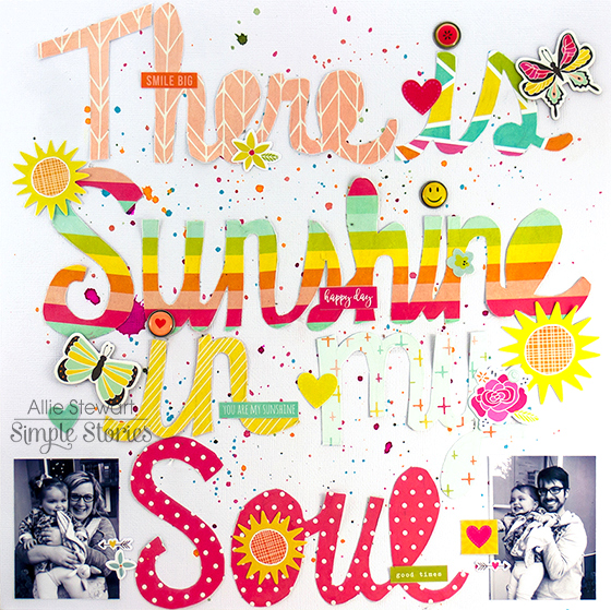
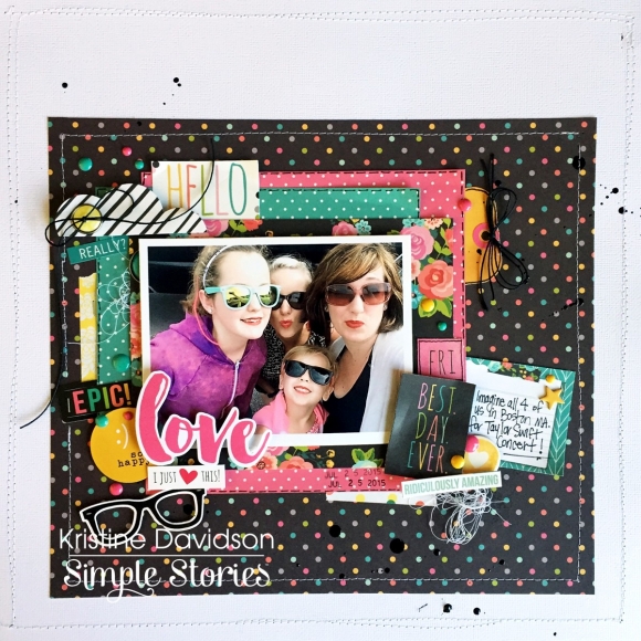
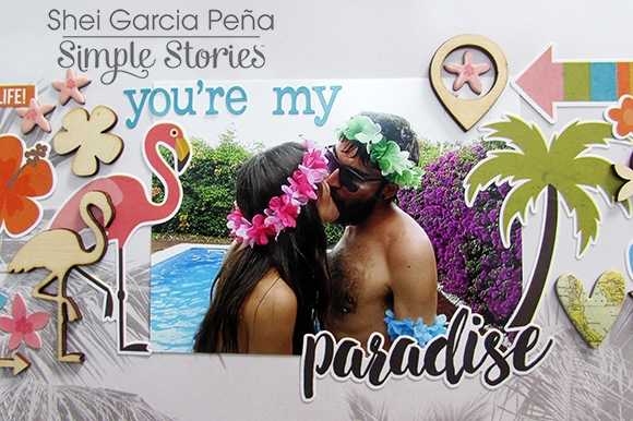
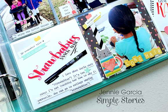
Alright, I am done blabbing.. Here is the first layout I will share with you today; Paradise. 
 
 
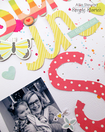
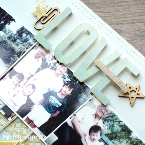
It’s actually a photo of my cousin and she’s sitting on a log in the Atlantic Ocean. No palm trees or flamingos here folks!! I still used this collection and it fit perfectly with that orange hat, right? 
 
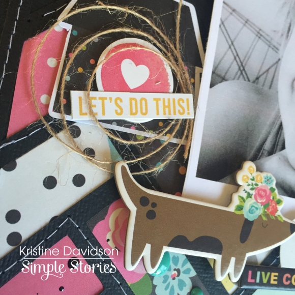
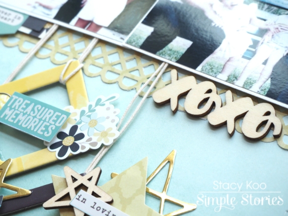
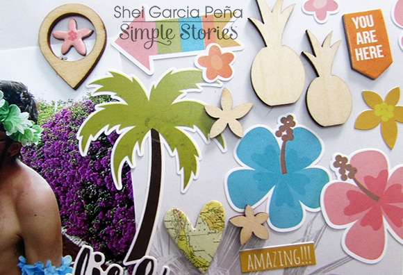
I first added some acrylic paint in the background. I wanted to add some colour but I had no 12x12 sheet left from this collection. So to add colour, paint was my choice. I then started adding left over pieces of patterned paper behind  my photo and added some dimensional adhesives behind my photo. This gave me the options of adding die cuts under my picture and also allowing me to create layers around the photo. 
 
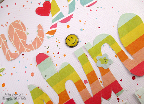
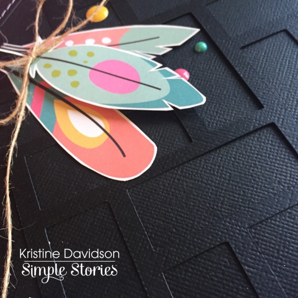
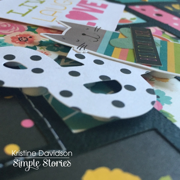
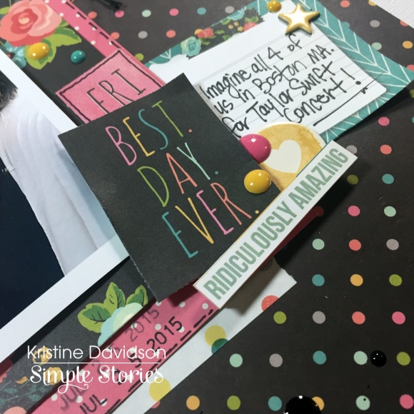
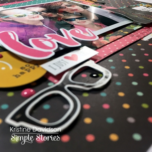
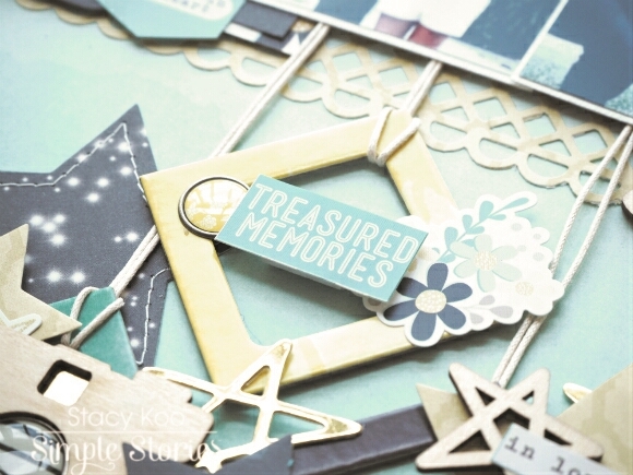
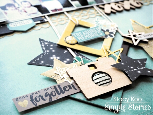
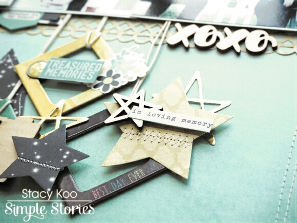
Adding chipboard, stickers and die cuts adds extra details, but then adding dimensional adhesive makes it even more detailed. 
 
 
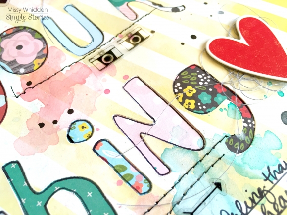
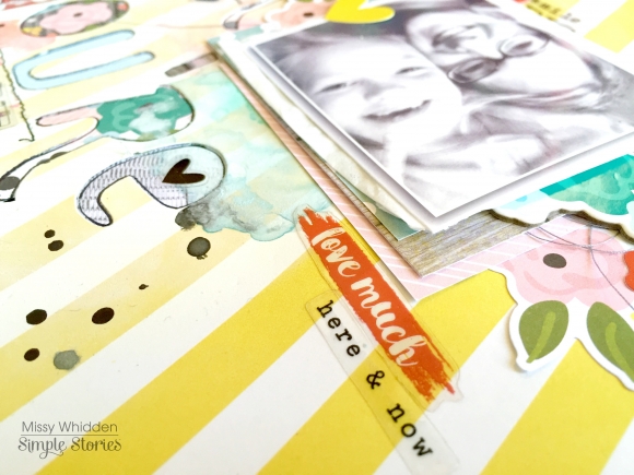
If you want to add layers to your project you can also cut out pieces from a page or journal card. Cutting out leaves and  flowers is something I do on several of my pages. I didn’t add a fancy title or journaling on this page, a simple piece of chipboard and journal strips from a piece of paper from the collection. 
 
 
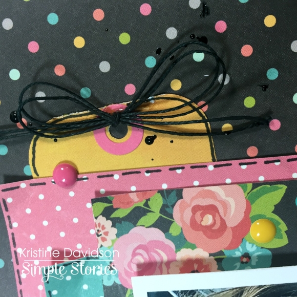
Adding details such as sewing or paint droplets will also gives your pages texture. A small piece of twine or ribbon is also a great way to add something extra to your page. I find that people always love touching layouts. They look for texture, for dimension and that often gives your project that WOW factor! 
 
-------------------------
 
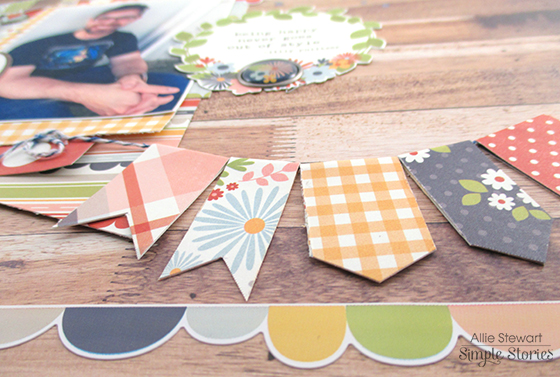
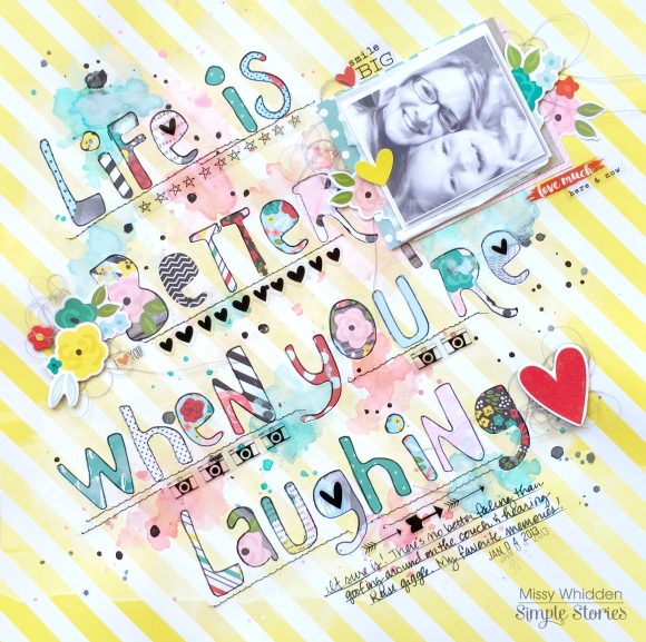
The second layout is called CA. (Short for California!).  This is a picture I took in January 2015 at Huntington Beach. It was a beautiful sunny day, surfers, and no one was swimming but it was so peaceful and relaxing. Perfect day to spend watching the waves, reading a book, or journaling  in your planner!
 
 
My goal with this layout was to use up some leftover papers. I had small pieces left and wanted to use them so I started with this cut file from Just Nick Studio. I have been using lots of background files to create layouts lately and I find that also helps during a scrap slump and helps me get my mojo back ;) 
 
So to create this, I cut up my leftover pieces in 2” squares to fit behind the + signs. It was very colourful!!! I was thinking of adding a black and white photo which would have been ok, but instead I opted for some contrasting colours. That blue in my picture really stands out among all those colours, and It isn’t overshadowed at all with the mix of patterns.
 
 
Placing my photo again with dimensional adhesive, and again allowing me to layer elements on top and bottom of the picture gave my page a 3D look. This is something I have been doing and love the look it gives my pages. It is also very addicting because I really don’t think I could create a page without these little pop dots! 
 
 
I added some wood veneers, some enamel dots as well as a few drops of paint on my page to add some texture. I did a small title of CA with some alpha stickers with some glossy accents and a  journal spot with the date. It reads; California Beaches-I will return soon! 
 
I hope you enjoyed my layouts today and enjoy creating your own pages with Simple Stories products!  Interested in seeing more of my work? I started a hashtag called #Ilovediecutsandpopdots (seriously)  come visit me on Instagram @KristineDavidson. 
 
Thank you so much for reading and being a fan of Simple Stories!

Supplies

Hello friends! Allie here today, sharing two layouts using the brand new Sunshine & Happiness and Bloom & Grow collections! They are both absolutely gorgeous, but very different. I couldn't wait to play with them! My first layout uses the beautiful colors of Sunshine & Happiness.


I created this layout based on an image I found on Pinterest. I loved the handwritten script look and the quote it used, and decided to create my page around it.
 
 
I used my own handwriting to draw out the words onto different patterns. I lightly sketched with a pencil and played around until I was happy with it, then cut them out. I aligned them on my page, glued them down, and then erased the pencil marks. Gluing them down first prevented me from tearing the smaller parts with the eraser.


I dotted my "i's" with Bradz and added lots of stickers, chipboard, and die cuts!
 
 
My only regret is that my letters were too big to fit more product on the page--I just love it all and wanted to use every bit!
 
For my next layout I used the Bloom & Grow collection! 
 
 
As soon as I saw the "You Make My Heart Happy" strip, I knew I wanted to make my layout about my husband! I started by gluing it to the top and building my layout below it. I also loved the banner on the Fundamentals Sticker sheet, and decided to replicate it with twine and patterned paper.
 
 
I also love all the cute flowers throughout this collection! The wood grain balances out the floral and keeps a masculine layout from looking too girly. Gathering inspiration from the title, I added a few more "Happy" elements to the page.
 
 
I am crazy about these two new collections, and I hope you will enjoy using them as much as I am! Thank you for joining me today!

Hey, planner friends!

Meka here today to welcome you to Sunshine & Happiness!  It’s one of Simple Stories’ newest scrapbook collections, and it’s just perfect for color-loving planner decorators like us!  I’m still very much in spring mode, so I’m thrilled that this collection has tons of goodies to keep my "team pink" Carpe Diem planner looking good for the rest of spring and into summer.

I started my setup by spreading out the entire collection in front of me, and then picking out my favs. I love the Chipboard Stickers and Decorative Bradz because they’re so versatile. I’ve used them as stickers, planner charms, page embellishments, page toppers, paper clips, and more. 

And since I love them so much, I only adhere them with strong washi tape on the back, instead of committing to glue. 

The adhesive behind the Bradz is pretty strong, so they always stay put on my planner charms. But whenever I’m ready to change them out, a little prying apart makes them pop right off.

The pretty floral Shine Bright 12x12 paper adds a simple but super cute accent behind my “It’s a Brand New Day” dashboard.  

Another quick décor idea is to cover the cardboard backing of the Carpe Diem Planner Bookmark Tablet with pretty paper. I kept it simple by just gluing on a slice of a 6x12 Element, but you could add stickers or word labels for more interest.

I finished my set up by decorating my May calendar inserts from the Life in Color collection. I admittedly went overboard on my “May – Yay!” front cover. But this journaling card got me excited thinking about all the good times I’ll be able to list here, and the Happy Day 12x12 floral paper is really the perfect name, isn’t it?

On the May spread, the Sunday to Monday labels were covered with a thin stripe sticker from the Fundamentals Cardstock Sticker sheet. Then I relabeled the days to start with Monday using alphas from the Expressions Cardstock Stickers sheet. 

The daily boxes on these inserts are a bit wider than on the standard Carpe Diem inserts, so the 4x6 sticker sheet date boxes don't quite fill the space.  That’s not a huge problem at all, but sometimes I like to punch them into circle shapes to add a curvy element to the straight lined-pages. 

Various stickers, word labels, Bits & Pieces, Enamel Dots, and paper fussy cuts make this monthly layout bright and festive.

Thanks for walking with me through Sunshine & Happiness in my Carpe Diem planner. I can’t wait to see how you use your kit in your planner and scrapbook pages!

Supplies

Hello Scrapbook Friends, It’s Kristine Davidson with you today. It’s a beautiful day here on the East Coast of Canada and as you can tell by my bright  layouts it’s a great time to use those vibrant colors from the Carpe Diem Scrapbook Collection.

I have literally used up almost every single piece and inch of this collection. I LOVE IT! One of my all time favourite collections.  Today I will be sharing 2 layouts with you that were created with this kit and I’ll be showing you how you can add some fun elements, clusters, and layers to your pages.

This first layout is called “ Dream Big” . I added Bits & Pieces close to the photo and one of them is a cloud with Dream Big on it. I decided to use that as the title for my page. Sometimes you  don’t need a huge title or something that stands out too much to make your title. On this layout I wanted to focus more on the patterns on the papers, the colors and of course the great background diecut

If you find yourself with just scraps of a collection and really want to use it but unsure for what... try a background file or piece together bits of scraps to create a background.  It’s super easy to piece together and you can use up that great paper collection you’ve been hoarding!

I added clusters of elements on my page without overshadowing my photo.  I didn’t want to add a coloured photo because I thought it would be too busy. A black and white picture was a great choice for this page and paper collection.

Adding clusters can be done by simply grouping a few pieces of chipboard, stickers, diecuts and so much more “ stuff “ to create that focal point. I also added a few twine details to add more texture to my page.

You can see from this photo that by adding popdots underneath the sticker it creates a dimensional look . This is a great way to use up extra stickers and adding more fun details. I think I say this with every single layout I create! I cannot do a page without adding dimensional adhesive.

************

The Second Layout I have for you today was really created in about an hour.  My husband was fast asleep, it was about 11o’clock at night and I had a burst of energy after the bowl of ice cream! This layout is called Best Day Ever.

I created this layout by adding pieces of 6x6 papers cut into 4x6" and placed behind my photo. My photo was glued with dimensional adhesive ( again!) and I was able to place several layers behind it and on top of it.

The picture was really my inspiration and this paper collection was perfect for that purple sweatshirt and fun sunglasses.  The girls were in Boston for a Taylor Swift concert last summer. So lots of fun was had and the little piece of paper with BEST DAY EVER was a great title! Again nothing fancy just a piece of paper adhered to my page created a great title.

I made this little tag out of 1” of yellow pattern paper. I rounded the
corners, punched a hole and added a sticker from the Hole Reinforcer Stickers.

Another close up photo of the layers I created and clusters of embellishments to add focus towards my photo 


I hope you enjoyed my layouts today and enjoy creating your own pages with Simple Stories products ! Interested in seeing more of my work? please come visit me on Instagram @KristineDavidson.  Thank you so much for reading and being a fan of Simple Stories!

Supplies

Hi everyone ! It's Mindi here with you today. I am going to be sharing a few pocket pages with you using the Carpe Diem collection. The Carpe Diem collection was really a perfect fit for this particular week I have created. As you will see below half of my spread is from a day trip to the beach and the rest is a mix of our every day life. The colors were perfect and I loved all the cards and embellishments that came in this collection. 
 
 
The title card is rather simple this week. I loved this fun camera card and decided to use it as my title card. I added the week # using some letter and number stickers. I created a few custom journaling cards/filler cards on this left side of my spread. The first card has journaling about our Monday adventure to the beach. I used the car sticker and the word strip below.
 
 
On the top photo here I added a cluster of embellishments using a digital word, a star sticker, and the stickers '16 for the year. When I am putting together my spreads I try to keep a common color scheme. It allows for a cohesive look from left to right and it keeps me happy. One other thing is that I try to spread out the different colors as evenly as possible. 
 
 
On our way back from the beach we stopped at the fruit stand. Although it was more like a big market. I snapped a photo of my big box of oranges. I was already out of space on this left side and so I added my journaling directly onto the photo. Included in the bits and pieces package there are these great tags that have sayings at the top. I cut the top part off and used it as an embellishment on the top of my journaling. 
 
 
The right side of my spread is all about our everyday life. I left the two top photos alone because the 3x4 cards are very busy. I felt like I didn't need anything on the photos. Usually I try to spread out the embellishments a bit more but this time I added a lot to the journaling cards. The picture of us mini golfing was on Friday so I cut out the saying from one of the 2x2 cards. Once the Friday saying was cut out I added it to my photo, right above my journaling. It was another way to stretch my supplies. Love it ! 
 
 
The girls and I stayed outside one night and were playing with each other, riding bikes, ect. until the sun went down. I set up a timer on my phone and snapped a silhouette photo of the 3 of us. I wanted to use the larger pink letters somewhere on this right side. Mostly to match the other side and it made sense to spell out "US" on that photo. 
 
 
Every once in a while I like to add some journaling diagonally onto my photo for a different look. Here is a look at how it turned out all finished and embellished. I wanted to take some time and walk you through how you can create this same look. See the next couple of photos and tips. 
 
 
I printed out this fun photo of the girls practicing with their light sabers as the sun was going down. I also printed out my journaling onto some white cardstock. I made sure that my journaling was spaced smaller than my 3 inch wide photo, and also left some white space for embellishing. Once my journaling was printed out I trimmed it down to what I wanted the top and the bottom of it to be. I knew ahead of time that i wanted to add a combination of stickers, enamel dots, ect. 
 
 
The next step is very simple. I adhered my journaling onto my photo on a diagonal. You can go super diagonal or not so much, it's up to you. Once you have your journaling in place simply trim off the sides and your done. Super simple, I hope that you try this technique soon. 
 
 
That is a wrap for me today. Thanks for visiting the blog and I hope you have found some inspiration to help you scrap your pocket pages. Happy Spring everyone ! 
Hello again! Chantalle with you today and I’m so glad to be back, sharing some of my latest projects with you all. Do you sometimes look at all of your lovely scrappy goodies and wonder what you can do ‘differently’ with them? I’ve created two pages which share a similar theme - both working around specific colours. Pulling out coordinates has the potential to look at our supplies in a fresh light.
 
What is Inside Red?
 
This page captures the moment when my Daughter used her new glasses to read a book for the first time. It was an i-spy book and she came running to me in the bathroom, amazed at all the little details she had never noticed before!
 
 
As you can see, I have pulled out some pinks, red and blacks from the Life in Color collection.
 
 
I don’t know what it is about this stunning collection that begs me to get a little messy! I’ve used one of my favourite stencils with some matt black mist. Over the top of that, I’ve added a bit more detail with some red stamping. The pops of red on the left really balance out the elements on the right. You’ll notice I’ve snipped a part of the silver foiled paperclip from the Bits & Pieces pack and used it to mimic a real paperclip. The light isn’t working in my favour in this close up but that butterfly is gorgeous silver foil too!
 
 
I love using bits and pieces to further tell a story. See a number in a pack of ephemera? Could it be used to show an age of a person? The phrases in the Life in Color 4x6 stickers are so useful for so many day-to-day situations. I love adding them to my pages for a bit of extra info.
 
 
************
 
My next page, 'Best Day Ever’ focuses on the reds and a smattering of orange from the Let’s Party collection. This line is bursting at the seams with vibrance and fun! Narrowing the colour palette has brought a softness to it where we can appreciate the subtle details like the pretty sparkle of the glitter print.
 
 
I’ve turned to my ever-faithful SN@P! Pack for a selection of red cards in various sizes. I’m sure you’ve heard me go on about how much I adore SN@P! Packs. They really pack a punch when it comes to value for money!
 
 
I’ve tried to create a sense of movement by loosely arranging the cards across the horizon and then working on filling the spaces in between, with my photos and some chipboard frames. The little fan was sneaked from a sheet of Summer Vibes Fundamentals stickers. I love the way it makes it look as if it’s blowing my crazy little boy across the page.
 
 
Check out the runaway balloon! Another favourite technique I like to incorporate, is to mimic patterns. In this case I’ve jazzed up some plain cardstock with a dotted embossing folder. I initially thought about doing the whole piece of paper but it would’ve been too dotty! This way, there are just enough to echo the shape without going overboard.
 
 
Thank you so much for stopping by today. Wishing you a fantastic weekend!


Hello! Stacy here today with 2 layouts using the ‘Heart’ Simple Set. I love this collection. It is especially so because of the colors and the theme inspired – Family.

Family to me is a very important aspect in my heart. I shared some close moments with my paternal relatives, and I was lucky to spend some great times with both my grandparents. This collection inspired me to create some layouts with my old but greatly treasured family photos! Hence, I started with restoring the photos. Most of the old photos I had were taken by a film camera, hence the colors on the photographs had faded over time.

For the first layout, I used a photo when I was probably 3 years old. It was a huge family joke about this photo, since I was holding hands with my cousin who was 2 months older. I spent part of my childhood with him and this was one of those cute photos which I hold dearly to my heart!

The first layout is titled “Childhood”.

I started with punching out numerous circles on different pattern papers in the ‘Heart’ collection. I am in love with the designs of this collection pack. So I thought, why not display the pattern papers as a background? I added kraft cardstock circles behind the pattern papers and sewed them to the background.

The folded edges remind me of the diamond pieces which I have seen on the fundamental sticker sheet. I decided to add them to the edges so as to fill up some empty spaces. I also paired it with some wood embellishments from the ‘Life in Color’ Collection.


I added some embellishments in between the background to break the regular shape at the background. It is easy to do it with the sticker sheets!


Next, I decided that I would do some hidden journaling on my thoughts about this photo. Hence, I did some fussy cutting to add some hearts on the corner of my layout. Since the photo is raised slightly, it allows some space for my tag to slide in and hang onto the photo mat with a heart embellishment.


************
 

The next layout, “Love” is a very special layout for me. These photos were taken during an outing to the Botanical garden with my grandparents. My aunt used to tell me how much my grandfather used to dote on me, and always carrying me around all the time. How treasured are these photos of my grandparents’ love for us? 


I wanted to keep this simple with just key words/phrases and star-themed. I chose the star element because I was told that my grandparents had gone to a better place and the brightest stars in the skies are them looking out for me. Although I know that it may be scientifically untrue, I still find solace looking out for them in the skies.


I also added some stitching to the star die-cuts in order to highlight them. It is especially helpful with the pattern papers from the ‘Heart’ collection because they blend nicely with the pattern papers. I also used the chipboard frames from ‘Life in Color’ Collection. These were tilted and hung from below the photos, each containing a simple sentiment and embellished. I love how easily I could mix the embellishments from different collections!

In addition, I used a border punch for a strip below the photos, as well as tags and wooden embellishment in order to create emphasis on the photos.


Creating these layouts have taken me on a memory recap and I loved all the emotions accompanying these layouts. Stop today for a while and reminisce on the old times! These can really bring back a big smile to your face! Thanks for stopping by today!


Supplies

Violet here, I want to share how I created planner inserts for my Carpe Diem Planner. I used the Carpe diem basic dividers as a base for my inserts.

I began with cutting up rectangular shapes from the Carpe Diem collection kit paper. I then taped it down by using the washi paper tape.  What I used to embellish the inserts was the Carpe Diem dashboard inserts. 

Here is what the finished results look like. I absolutely love the vibrant colors and all the variety of layering different items. 

The reason I love creating new planner inserts is that it brings a new freshness to my planner and gives me that extra motivation to get things done. Thank you once again for everyone who took time to stop by the blog.

Supplies

Hey there, friends!  Missy back with you today.  I have two fun layouts to share, and I used the Life in Color collection for both of them.  I love the mix of black with all the bright reds, yellows and teals, and my first page shows how using black cardstock as a background really makes those bright colors pop.  I love scrapping everyday moments, and these photos are of my daughter and her Papa.  She has always loved for him to swing her around, and she just laughs and wants him to keep doing it.  These simple things are such a joy to watch!  I began by using an old gift card to smudge some light blue acrylic paint on the black cardstock.  It made a nice base for my photos and paper frames.  It also added another pop of that gorgeous blue!  You can see how the dark background really enhances the colors.

To create the word “snapshots,” I used lots of the Washi Paper Tape.  I adhered strips all the way across a sheet of white cardstock and then ran it through my Cameo.  It cut right through the paper and the tape.  I love how it turned out!  I paired this muli-colored and multi-patterned title with some of the smaller alpha stickers and some fussy cut letters that I cut from patterned paper.  I stitched through them with my sewing machine for added interest and texture.

I also added in lots of tangled thread and used a few die cuts as well.  I fussy cut this cute frame with the camera from patterned paper and added a brad to the center.  The floral die cuts look so cute layered with the paint strokes.

Here you can see how cool the paint looks on the background.  I added a bit more interest with some stitching.  The great thing about using a card to smudge paint is that it dries pretty quickly.  I added some pop dots to this XOXO to create some depth.

Here is the bottom of the page.  I created a cluster using paint, paper, washi tape, fussy cut flowers & leaves and thread.  I wanted to bring all the colors & elements down to the bottom of the page, and creating a cluster like this is a great way to do that.

************

One of my favorite techniques is backing a cut file with patterned papers.  I have done this technique before, and I love it so much that I keep coming back to it.  I read this fun quote on one of the patterned papers in this collection, and I decided to make it my title.  I chose a fun font in my Silhouette software and created a really big title that took up most of my page.  I cut it out and backed it with a lot of the 6x6 Paper pad.  I love the variety of smaller patterns, and there are so many fun colors and designs to choose from.  I got such a fun look from doing this!  I smudged some white gesso down over a lot of the page and then came in with a few watercolors to create a messy look.  I love this beautiful yellow & white striped paper, and it made a wonderful light background for all those bold colors.

Here you can see a lot of the detail of the layout.  The watercolor is a fun touch to add, and I had lots of fun getting messy with the paint.  After it dried, I traced each letter with a black pen to make them stand out a little more.  I also used several of the clear stickers on this page.  They are the perfect touches in between my title words.  I also combined some chipboard pieces with stickers and die cuts.  They layer together very well.

Here’s another shot of the background.  This lighter background paper (plus the white gesso) really makes the paints and the papers jump right off the page.  The striped paper is still neutral enough to be a background without being overly busy.  Simple Stories always has such a great variety of papers; they do a great job of mixing solids with patterns.

I used a few Snap! Cards as layers behind my photo as well as some tangled grey thread.  I added some stickers here, too.  I think adding stickers or small die cuts on top of the photo can create a great effect, especially if the photo has white space.  My photo really doesn’t, so I just layered this heart on the edge so it doesn’t cover up anything important.

I think I could use these awesome clear stickers on every layout!  They are so versatile, and they show up so nicely on just about every color paper.  They make great accents.  I finished this layout off with some black in splatters.

Thank you so much for stopping by today!  I hope these projects have given you some fun ideas to try!

Hi there!  It’s Shei here today. I’m so happy to be back on the blog sharing two layouts.  Let’s get started!

For my first layout I decided to work with the tropical “You Are Here!” collection.

I started with “Paradise” paper as a background. I really love to use light papers as my background and add color with the embellishments. So… I did it!

I used a colorful pic that contrasts with the background. It was taken during the birthday pool party of my friend Anna. It was a very happy celebration and, as you can see at the picture, we ended up wearing as authentic Hawaiian Hula dancers. 

Then, I added different elements forming a diagonal strip in the center part of the paper. I used embellishments from the Fundamentals Cardstock Stickers and some Woods Veneers: flowers, arrows, hearts, palm tree, pineapples, flamingos, camera… Simple Stories gives a lovely variety of embellishments and them bring colorful to this area of my project. I love all of them! So, I’ve repeated this process at the top and bottom.

Finally, I have titled my project “You’re my Paradise” using the blue abc and the word “paradise” from the Expressions Cardstock Stickers.

************

For my second layout I chose the fun and coloful “Carpe Diem” collection. I’m totally in love with this line!!  I’ve started to sew a heart with red thread in the middle of a white cardboard.

I’ve used a cool photo of me, drinking delicious cherry lemonade. Yummy!! I titled this layout “ready to go live it up” using the pink alpha from expressions cardstock stickers. 

Simple Stories’s embellishments are so cute that it’s very difficult to choose from… So I added many embellishments from the chipboard stickers and the fundamentals cardstock stickers. There are also many fun and cute models, different shapes and bright colors to choose from. My layout includes: colorful feathers, hearts, dots, flowers, stars, a great donut, a sun and the lovely cat and dog... I love all of them!! Finally, to give a bit more dimension to my project, I added some enamel dots of different colors, and that's all!

Thank you so much for taking the time to read my post! I hope you enjoyed my layouts! See you next month!

Never stop smiling! Kisses!!

Supplies

Hi Everyone! This is Jennie and today I’m sharing some pocket pages using the super gorgeous Carpe Diem Collection! As you can see in these pages I like to write and embellish directly on my photos. Many documenters use apps (which I use once in a while too) but I prefer things that I can touch.

I’ve been very into lettering lately so I’m documenting my progress. I change hobbies very often so it’s good to document my latest obsession. They are also good fillers for slow weeks.

This doggie from the Carpe Diem Sn@p Pack is my spirit animal. I also love that this card has a space for a title. The Icon Stickers are geared towards planners but I can stop using them! I love small elements like this to add to my layout. I’m the kind of scrapper who loves clusters and sometimes I go overboard but tiny stickers like these make me feel like I added enough without looking too cluttered. The labels in this pack are also good for stamping on the dates.

My daughter got a sticker at school for being student of the week. She loved it so I slipped it in my pocket pages so I could add it to the album later. When I opened the album I noticed how nice it looked on the back of that card from the Let’s Party SN@P! Pack so I decided to use the back of that card from the previous week. You can see it HERE if you want to see that layout.

I often have to control myself so I don’t put 20 stickers in one photo. My favorite ones to use are the Word Label Stickers! There are so many phrases that are perfect for my photos! You could also use them in your planner or cards.

Have your tried the Photo Flips? They are AMAZING! Now you don’t have to leave a photo or that cool card you wanted to add to your layout because you ran out of space! I really wanted to journal about that day so I used a 3x4 Photo Flip.

I like to use my typewriter to type directly on my photos but some days my brain won’t help and I make a bunch of mistakes so I typed my journaling on a piece of cardstock and cut out the strips to glue onto the photo. Since I can’t seem to place my alphas straight I always bounce them like these, one up and one down so I don’t have to worry too much about them being perfect. I love that the Expressions Cardstock Stickers have different sizes. The bigger ones are great for titles and the smaller ones for photos of to add interest to your title.

This week my daughter was student of the week and she came home with a little book of drawings and notes her classmates wrote about her. For my girls’ drawings most of the times I take a photo and I add the photo to the pocket. These were too special and I honestly couldn’t pick my favorites from 20something so I cut a 12x12 sleeve and put it there. Since I want to embellish all the things I added a little cluster to the sleeve.

That strip of washi from the Fundamental Cardstock Stickers came handy because when I was sealing the sleeve I kind of ruined that side so I hid it behind the stripe.

I hope you enjoyed these pages and found some tips that will help you document your life in a fun and easy way!

Supplies

Hello again! Leah here to show you how I have revamped my Carpe Diem planner for the Spring season! Despite the persistent cold weather that keeps popping up in Virginia, I find that the calendar start of a new season always inspires a fresh start/change, especially Spring. I have been using the Carpe Diem collection in my planner the last few months but in the spirit of the changing season, I felt compelled to give my planner a Spring makeover. The Life in Color collection is one of my favorites by Simple Stories right now! I have been hoarding this gorgeous collection, but it is time to put it to good use. Something about the bold colors and woodgrain and florals just feels so right to transition my planner into Spring!

First things first, I need to update the front pockets! I used pieces from the Life in Color SN@P! Pack, a couple tags and other ephemera from the Bits and Pieces pack, as well as a few stickers from the 12x12 Fundamentals cardstock stickers sheet. If you are curious how I get the large decorative piece to sit over the top of the bottom pocket like that, you can see how I did it here in a previous blog post. 

Next, I wanted to create a custom dashboard for the front of my planner. I recently received some of my wedding photos from our photographer and I am so smitten with them! So I decided to incorporate some memory-keeping into my planner. I cannot put into words how happy it makes me to open up my planner and see such a special memory in my life highlighted front and center.

For this dashboard, I used the 12x12 “Here and Now” paper from the Life in Color collection. It has these darling picture frames on it that were so fun to decorate and perfectly framed the photos I wanted to display. I chose a couple of my favorite black and white wedding photos, resized them to 2x2” and printed them out onto photo paper. I then trimmed them down to size, leaving a very thin white border to help them pop out against the colored backgrounds within the frames. I purposely chose black and white photos so that the bold colors of the Life and Color collection would provide a contrast that allowed the photos to really stand out.

Zooming in, above you can see where I have pasted the photo within the left frame. I punched out a file tab and stamped my wedding date on it and added a few stickers to embellish the photo. In the frame on the right, I glued down a 2x2” square piece from the Life in Color SN@P! Pack, added a floral sticker, a strip of washi paper tape, and a lovely ampersand from the Bits and Pieces Pack.

On the bottom half of the layout, the camera and star in the left frame are also from the Bits and Pieces ephemera pack. The Scrabble letters are stickers from the 12x12 Fundamentals Sticker sheet. I mounted the letters onto colored squares so that they popped off the page a little more. In the right frame, I glued down another square piece from the SN@P! Pack behind my photo. I like how the typed text pattern compliments the other romantic details of this layout, like the wood veneer heart and the washi paper tape with hearts.

I carried the collection further into my planner by dressing up my April monthly inserts. The Life in Color collection has a Planner Set that is made to fit a 6x8 binder, but I trimmed the inserts down (on the side with the holes) to fit into my Carpe Diem planner and then punched new holes. I trimmed off a decent chunk of these inserts so I will not be using the calendar sides of the pages. I glued the sides with the calendar together so that now, just the images are showing on each side. I basically created a sturdy monthly divider. I like the monthly tabs that come on the Life in Color inserts, so although I am still using the monthly inserts that came with my Carpe Diem planner to plan out my month, I cut the monthly tab off the Carpe Diem insert so I did not have two April tabs.

Of course I had to add some decoration to the new divider. So I added a 3x4 card from the SN@P! Pack, some washi paper tape, a floral sticker and a couple wood veneer stars.

At the beginning of every month in your Carpe Diem planners, there is a monthly planning sheet. I want to show you how I use mine. You can see here where I have pre-decorated this page so that I can go back later and add some journaling and memory-keeping for April. The SN@P! Pack cards fit perfectly in the sections of this sheet and I have retitled a few sections by simply covering up the titles that were there previously with embellishments and word strip stickers. I also used washi paper tape, enamel dots and several Life in Color stickers.

I have enjoyed walking you through my Spring planner setup using the Life in Color collection! Check out my Instagram for more details and photos of how I am using these products. Stay tuned here on the Simple Stories blog and social media to catch a glimpse of all the exciting new products coming soon!

XoXo

Pages