04.30.16
Layouts and Layers with You Are Here!
Hello Scrapbook Friends, It’s Kristine Davidson with you today. It’s a nice sunny day this morning but I am still on the east Coast and definitely not on some tropical Island where I’d love to be!
I sat down at my desk last Wednesday night and felt like creating something with lots of colour and something that would take me back to that warm breeze and the sounds of the ocean.
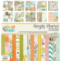
I opened up my ziplock bag of left over pieces from the You Are Here collection and started creating. I had no plan except use up some Bits & Pieces and add lots of fun elements to my pages. I created 2 layouts in the span of 3 hours and had a blast! This is one collection that makes me happy ;)
Alright, I am done blabbing.. Here is the first layout I will share with you today; Paradise.
It’s actually a photo of my cousin and she’s sitting on a log in the Atlantic Ocean. No palm trees or flamingos here folks!! I still used this collection and it fit perfectly with that orange hat, right?
I first added some acrylic paint in the background. I wanted to add some colour but I had no 12x12 sheet left from this collection. So to add colour, paint was my choice. I then started adding left over pieces of patterned paper behind my photo and added some dimensional adhesives behind my photo. This gave me the options of adding die cuts under my picture and also allowing me to create layers around the photo.
Adding chipboard, stickers and die cuts adds extra details, but then adding dimensional adhesive makes it even more detailed.
If you want to add layers to your project you can also cut out pieces from a page or journal card. Cutting out leaves and flowers is something I do on several of my pages. I didn’t add a fancy title or journaling on this page, a simple piece of chipboard and journal strips from a piece of paper from the collection.
Adding details such as sewing or paint droplets will also gives your pages texture. A small piece of twine or ribbon is also a great way to add something extra to your page. I find that people always love touching layouts. They look for texture, for dimension and that often gives your project that WOW factor!
-------------------------
The second layout is called CA. (Short for California!). This is a picture I took in January 2015 at Huntington Beach. It was a beautiful sunny day, surfers, and no one was swimming but it was so peaceful and relaxing. Perfect day to spend watching the waves, reading a book, or journaling in your planner!
My goal with this layout was to use up some leftover papers. I had small pieces left and wanted to use them so I started with this cut file from Just Nick Studio. I have been using lots of background files to create layouts lately and I find that also helps during a scrap slump and helps me get my mojo back ;)
So to create this, I cut up my leftover pieces in 2” squares to fit behind the + signs. It was very colourful!!! I was thinking of adding a black and white photo which would have been ok, but instead I opted for some contrasting colours. That blue in my picture really stands out among all those colours, and It isn’t overshadowed at all with the mix of patterns.
Placing my photo again with dimensional adhesive, and again allowing me to layer elements on top and bottom of the picture gave my page a 3D look. This is something I have been doing and love the look it gives my pages. It is also very addicting because I really don’t think I could create a page without these little pop dots!
I added some wood veneers, some enamel dots as well as a few drops of paint on my page to add some texture. I did a small title of CA with some alpha stickers with some glossy accents and a journal spot with the date. It reads; California Beaches-I will return soon!
I hope you enjoyed my layouts today and enjoy creating your own pages with Simple Stories products! Interested in seeing more of my work? I started a hashtag called #Ilovediecutsandpopdots (seriously) come visit me on Instagram @KristineDavidson.
Thank you so much for reading and being a fan of Simple Stories!


