Hi there!  It’s Shei here today. I’m so happy to be back on the blog sharing two layouts.  Let’s get started!

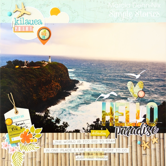
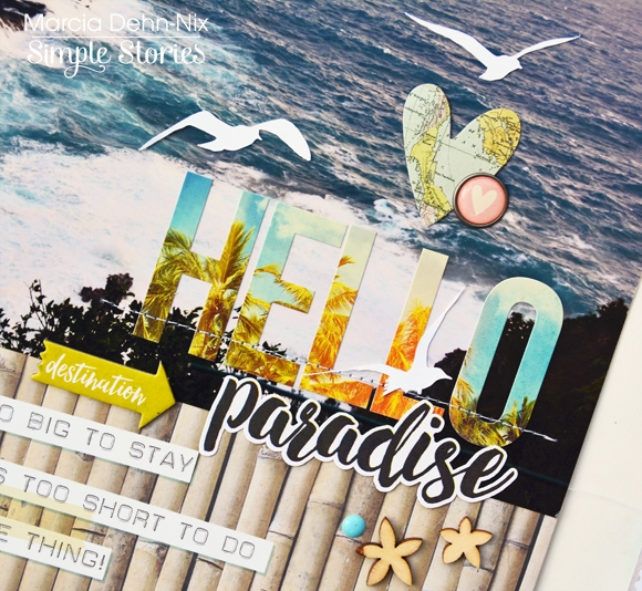
For my first layout I used the great “You are Here!” collection. I really like this line ‘cause it’s very nice and colorful. This is the perfect collection for people who loves to travel. You can use it to document your trips, especially to highlight your tropical travel memories.

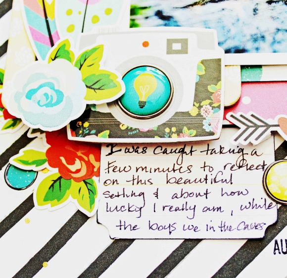
To create this layout I was inspired by the Desktop Globe included in the Chipboard Stickers. These chipboard stickers are so lovely.  I started with a white cardstock as a background. I cut a circle in the middle of it with my Cameo Silhouette. This circle will be the globe. Behind the circle I used the “Pink Map” paper, as a background. Next, I glued a photo from our holidays in Mexico.

Then, I added different elements covering all the pink paper. I used embellishments from the cardstock stickers, chipboards and some woods veneers: flowers, arrows, hearts, palm tree, pineapple, flamingo, camera, suitcase, sunglasses and some words (love all them!!).


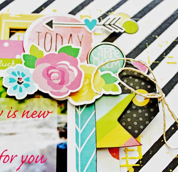
The layout is called "Hello Mexico" and for the title I used the orange ABC from Expression Cardstock Stickers. In addition, I glued a flower from the fundamentals cardstock stickers on each side of the title.


Next, I cut with my Cameo Silhouette the cool green paper “Happy Place” (b-side part) to make the base and the bracket of the desk globe. To finish the layout, I glued at the bottom corner a green chipboard sticker with the word “destination”.

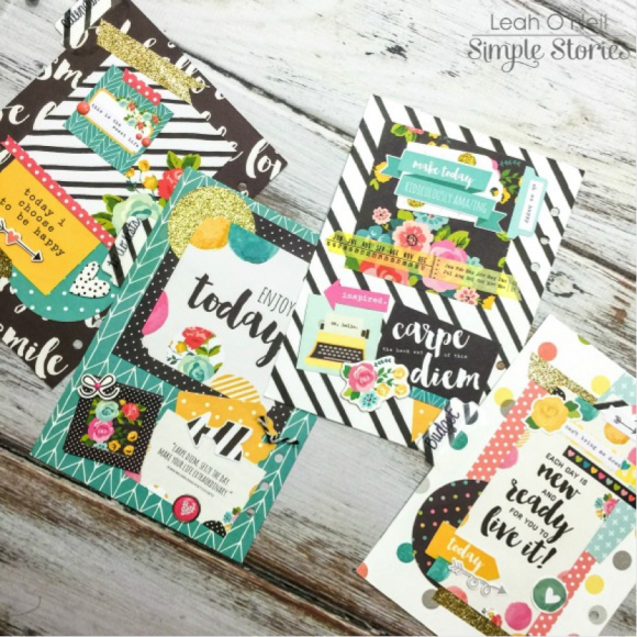
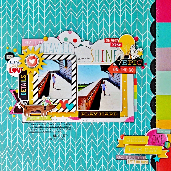
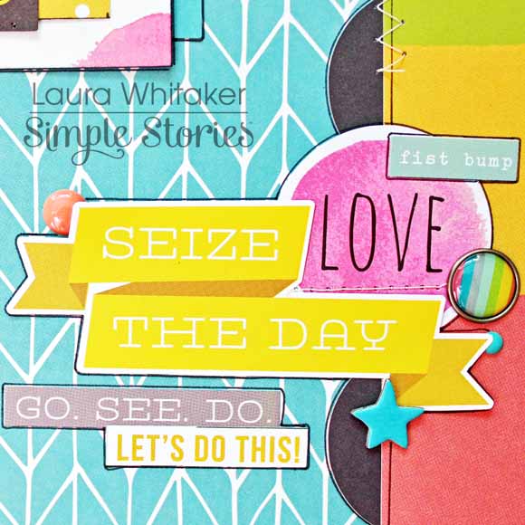
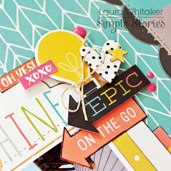
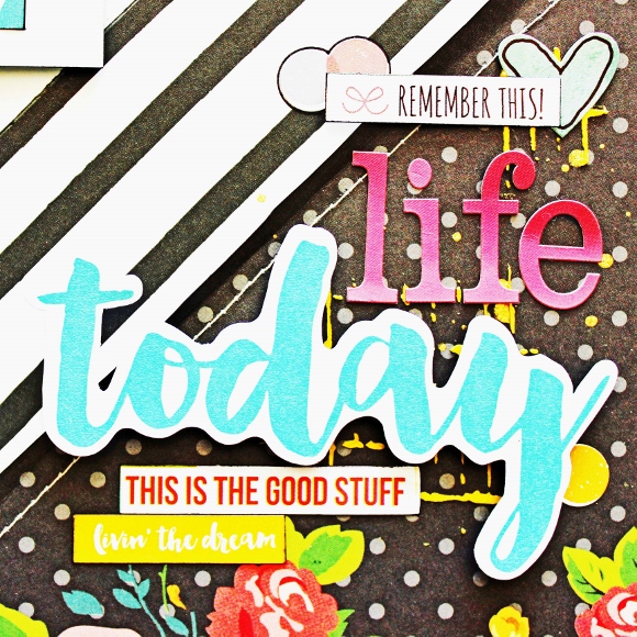
My second layout is called “Family brunch”. This photo is from a saturday’s brunch with the most important people in my life: my family. They’re my boyfriend, my sister and my brother-in-law, who is my sister’s boyfriend and my boyfriend’s brother at the same time… I’ts a funny story to explain. People always say: “Wow, all in the family!”.  So, I went with them to a cool restaurant in Barcelona and we took this photo, which makes me remember the happy ordinary moments I spend with persons I love. So, I want to document it.  For this layout I used the fun and vibrant Carpe Diem line. I like the vivid colors of the collection and that you can use it for any themed.

I really love all the papers of the line so I wanted to use most of them for my layout. For that reason I though in create my background with different papers. I cut 2x2 inch squares of many papers (you can see all the papers I used down below) and glued them at white cardstock. I enjoyed mixing different patterns!


Then, I glued my photo at the left side. Next, I used the letter stickers to make my title. I love this color!! Pink Power! Ha, ha, ha!!


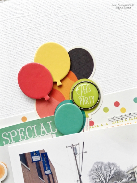
It’s time to the funnest moment: embellishing! I added some elements from fundamental and expressions cardstock stickers sheets all around the layout. Did you see this donut?? It’s so cute!


I also added some enamel dots to give dimension to my layout. The colors of these enamel dots are perfect. Don’t you think?!

Thank you so much for taking the time to read my post! I hope you enjoyed my layouts! See you next month!

Never stop smiling! Kisses!!

Hi Simple Stories Fans! I’m Jennie and today I’m going to share with you how I used the “Let’s Party” Collection for every day pages!

The Let’s Party Collection is geared towards birthday parties but it can be used for any fun and happy days!  In these pages I used it to document part of my week and a trip we had to The Playroom.

When I printed my photos I knew that I had to use this collection! The colors match perfectly!

I am obsessed with Chipboard Frames! However, I never seem to use them for photos. My favorite way to use them is for making my weekly title card but I also like to put QR Codes on them or journaling.

I like to mix and match my journaling. I use my typewriter on photos or cards that don’t have lines in them and I use my handwriting for cards that do have lines. I’m not the biggest fan of my handwriting but it takes a little bit less time and future generations can see what it looked like.

My daughter’s favorite activity at this place was the ball pit so when I saw the “Having A Ball” die cut I knew I had to use it!

Whenever I have a few extra photos I like to use the 6x8 Pocket Pages as inserts - the 2 holes on the 6x8 pages line up perfectly with the holes on the 12x12 album!

I love the fact that the Expressions Cardstock Stickers sheet comes with 4 different fonts. It’s nice to mix the sizes and styles to make it look more interesting but also because sometimes we can’t use the biggest font to make a complete title, at least in pocket pages. You can also sprinkle the alphas in photos and other cards.

I LOVE Confetti pockets so so much! I like to add flair buttons inside but the bad thing about a flair is that is too bulky and the back is plain. Even if you punch a circle or put a sticker on it, it won’t look the same in both sides. I had a sudden lightbulb moment looking at the Bradz because they are pretty flat so even when you put them back to back it won’t be bulky. They're also self adheisve so you don’t have to look for the adhesive that will hold them perfectly.

I saw the banners in the Bits and Pieces Pack and decided that they were be perfect to add on the outside of the pocket pages.

I also glued back to back the stars in the Bits and Pieces pack. There are multiples from each size so you can pair them.

I hope you enjoyed these pocket pages. They have a few of my favorite items and ideas. Let me know which one you will try next! Take Care!

Hello there Carpe Diem Planner lovers! It is hard to believe that we are already nearing the end of March! It took me awhile, but I feel like I am finally getting settled into my planner. I have it set up in a way that is really working for all of my needs. I only carry 2-3 months at one time, but I still manage to keep my planner pretty chunky! Today I want to show you how I have created my own custom dividers and the dashboard you see below, using products from the Carpe Diem Collection.

I selected four of my favorite 12x12 Carpe Diem scrapbook papers and took the March insert out of my planner to trace the shape onto each piece of paper twice. I did not bother tracing the tab because I am making tabs later. Since I like my dividers to be thicker, I cut out the two traced shapes with my paper trimmer and then glued them together with a glue stick to make one divider. To make my dividers even sturdier, I placed them under a heavy book for a few minutes while the glue dried and then punched the holes for the rings that I had marked earlier.

I punched some tabs using a paper punch from We R Memory Keepers, and laminated them with clear tab stickers. I prefer not to laminate my dividers because I really love the feel of paper, but I do like to laminate my tabs. It makes them extremely durable which is important because the tabs get the most “wear and tear.” Also, the lamination allows me to re-label the tabs later if I want. If you use stickers or a label maker to title your tabs, the slick surface should allow you to peel off the sticker later. Personally, I use a black Sharpie to label my tabs. The writing does not smudge until I am ready to remove it. You can remove Sharpie from a laminated surface by scribbling over the writing completely with a dry erase marker and then simply wiping away with a cloth or paper towel. My dividers are currently labeled as “Calendar,” “To Do Lists” and “Budget.”

The Carpe Diem 12x12 scrapbook papers have such beautiful patterns that I did not do anything to decorate the front side of the dashboard or the three dividers. I just wanted to let the lovely designs shine!

However, the back sides were feeling a little plain, so I decided to add some decorative flair to each one. I love having the little something extra when I flip the dividers over in my planner!

I want to show you each one closer up, starting with the one on the top left. That one has no tab because it is a dashboard that is just being used to decorate the front of my planner.

I used a few different sized pieces from the Carpe Diem SN@P! Pack as well as some ephemera from the Bits and Pieces pack. I dressed things up a bit with a little washi tape and a floral chipboard sticker from the Carpe Diem 6x12 Chipboard Sticker set.

Here is what the divider looks like in my planner. On the right side, I have one of the Carpe Diem Pocket Inserts stuffed with the Carpe Diem Insta Quote Stickers. I embellished the pocket insert with one of the decorative pieces I made for my blog post last month.

The “Calendar” divider below is being used to mark the first section of my planner where I currently keep 3 months of calendar inserts.

For this one, I used more embellishments from the SN@P! Pack, some washi paper tape and enamel dots. The arrow and heart are from the same 6x12 Chipboard Sticker set mentioned before.

Below is the “To Do Lists” divider which marks the section of my planner where I keep plain lined paper for my excessive list-making and a few daily inserts for creating detailed lists on especially busy days.

More SN@P! Pack pieces were used here (there is a LOT in that pack!), with a chipboard frame and bow, and a decorative brad. Below is what the divider looks like inside my planner next to another Carpe Diem Pocket Insert holding some Word Label Stickers. I also decided to add one of these adorable Carpe Diem magnetic clips!

Lastly, I have a divider to mark the “Budget” section of my planner. This is an important section for me because my husband and I have a lot of financial goals this year, such as paying down our credit card debt and hopefully buying our first home! This section is where I keep our monthly household budget breakdown, our debt repayment plan, and a calendar insert to mark due dates for bills. Budget/finance information is not very exciting, so dressing up this divider really makes this section feel more welcoming!

This one is my favorite! I used different paper punches to cut out a bunch of shapes from the 6x6 Paper Pad that I layered behind this pretty 6x12 element from this piece of 12x12 paper. Additionally, I used several stickers from the Fundamental Cardstock Sticker sheet.

In my planner, this divider is sitting next to a third Carpe Diem Pocket Insert. These pocket inserts have been SO handy in housing supplies for on-the-go planning!

I had so much fun decorating these dividers! I just love how they make each important section of my planner feel like it has a “home.” If you would like to know more about my planner setup, please feel free to ask here in the comments or over on my Instagram

Thank you for stopping by the blog today! I hope you all are starting to feel more settled into your Carpe Diem planners as well and are using them to reach for your goals!

Hello everyone!  Marcia here today with some travel layout inspiration for you. My husband and I recently returned from out first vacation in Hawaii and I could not wait to dig into the Simple Stories You Are Here collection to start scrapping my favorite photos. The first half of our trip we stayed on the island of Oahu. One of the places we visited was the Polynesian Cultural Center ... a must if you are ever on Oahu!! These awesome dancers performed on huge canoes in the river and were so much fun to watch. My layout is bright and energetic, just like the dancers.

I used a few Chipboard Frames to add dimension and frame some of the Bits and Pieces die cuts. This flamingo was a hands down favorite of mine. Layering palm leaves behind adds a tropical flair and keeps the flamingo from blending into the background.

 
 I also used a chipboard frame that I cut in half at the top and bottom of my layout and layered more die cuts here too.
 
 
 I love the variety of alpha stickers on the sticker sheets. They are perfect for long titles like this one where I can mix the fonts...
 
 
************
My second layout features my favorite photo from our stay on the island of Kauai. I caught the morning sunrise colors still in the sky. Since this photo was a favorite, I decided to use a large print. The Simple Stories papers are  perfect to frame larger photo. This layout is much more serene...
 
 
I used the alpha stickers to document the name of the lighthouse and created clusters by layering die cuts, wood veneers, enamel dots, and brads. I love adding a little texture on my layouts by machine stitching on them.
 
 
This title came from the Fundamentals Cardstock Sticker Sheet. I love that "HELLO" with the palm trees! 
 
 
Thanks for stopping by today. I hope I inspired you to put the You Are Here collection on your must have list!

Hello planners!  Theresa here with a couple of my March layouts in my Carpe Diem planner.  This month I decided to use the Carpe Diem scrapbook line and planner line.  I added some of the fun and bright colored stickers, washi tape, die cuts and clips to my pockets.  

As usual, I use photos on my monthly layouts to mark birthdays, and this month we are celebrating my daughter's 8th birthday!  I used washi tape to block out days that we would be on trips and labeled them with alphabet stickers so they stand out. 
 
I used dot stickers from the scrapbook collection to mark tasks that I needed to get done on my weekly layout
 

I used the blank lined sheets from the paper pad in the back of the planner to do party planning.  I cut the sheets down to 7 3/4"x4, leaving all six holes in the page.  I decorated them with washi and stickers, and labeled the top with alphabet stickers.  
 
By cutting the sheets down, I was able to add them to the week of her birthday party without having them cover the weekly pages entirely.
 
Are you planning any special events this month? 

Hello Crafty friends!  I am so lucky to have been able to play with Simple Stories'  Carpe Diem scrapbooking collection! If you are a "planner girl" you will already be loving the planner version of this collection - speaking for us scrapbookers, I am super thrilled that the scrapbooking version of the collection was revealed at this past CHA!

I created two pages documenting small aspects from a couple of day trips our family made.  Sometimes when you are not looking, you can find stories within the stories.  I have sort of scrapbooked both of these events, but not these smaller details from either of these days.
 

My first page is called "Seize the day", I chose to use two photos with a central focal area and framed one of the photos with a pretty little chipboard frame.  This page documents a day trip that my husband, our youngest son and I went on to a (then) local town and took a winery tour while we were there.  My son enjoyed learning about the process and the science-y parts of the tour; he even asked loads of great questions.  He is really a good boy when we do these grown up things with him.
 

Later when my husband and I were participating in the tasting portion of the tour, I glanced over to see our son running up and down a large ramp just enjoying the moment, the sunshine and the extra speed that he could pick up by running downhill.  
 

Sometimes little opportunities are presented to seize happy moments and memories. Like running down a sunny ramp with wind in your hair and happy parents at the bottom!
 

Don't you love all of the bits and pieces in this collection?  I think I could have layered these sweet elements forever!
 

I used loads of patterned papers, and even fussy cut some clouds from one of them!
 

I added some machine stitching and freehand "doodling" to accent the patterns on this page.  Oh and the colours, oh the colours!  So perfect for happy pages!
 

*****


My second layout documents a photo taken of me.  This is unusual since I am most often the one holding the camera.  I know I am not alone in this!  The phrase that I added onto my photo prior to printing it is from one of the patterned papers in this collection. I really loved it, it spoke to me.  However, I wanted to use the other side of the paper so this is how I incorporated the quote onto my page.  I also blurred out everything but myself in the photo prior to adding the text, so that it would "pop" a little more.
 

My husband and three boys were exploring some caves at a Provincial Park, while I sat in the sun and reflected on life as I waited.  I have a habit of zoning out / daydreaming.  So I was unaware that my husband had taken a few photos of me, or else I may have altered my poor posture ;)!


I love this bold black and white diagonal striped paper and NEEDED to use it for my background.  I added a bit of texture paste here and there that I coloured with a yellow Gelato and some gold Color Shine.  I also cut some triangles from the polka dot / floral paper to adorn two of the corners of my page.  I am in serious heart with the bold patterns this collection offers!


You can see I am still working hard to remember to add journaling to my pages, and this collection has perfect little die cuts for that very purpose!
 

As I am wont to do, I added a few embellishments clusters to this page, as well!

Thank you for visiting today!

Good morning! Brenda Smith (hyperlink to my Instagram: www.instagram.com/idocumentlife) here with you today to share a pocket page spread made using the Carpe Diem collection. I love how fun and vibrant the colors are in this collection and I couldn't wait to make it work with some photos from early March. 
 
 
I was inspired to find a use for the Simple Stories panorama page protectors and decided to create a collage modeled after a watercolored polka dot paper included in the Carpe Diem collection. 
 
 
I made the panorama collage in Photoshop, adding my photos and leaving placeholder circles where I would punch circles from the 6x6 Carpe Diem pad. I decided to make the photos in the collage black and white so they'd pop with the bright colors of the Carpe Diem collection. 
 
 
I picked out cards that mimicked the watercolor feel of my collage. I tried to keep things light and airy by choosing cards with white backgrounds. Because I do type so much journaling, I often find that the dark block of text can be too heavy for my taste without offsetting it with something much brighter (like the white cards). 
 
 
I hand-stitched the outsides of all the circles in my panoramic collage. I used variegated embroidery floss so that it would create an ombre effect. This was a long and tedious process as I am a painfully-slow hand-stitcher, but I think the final effect is quite the statement.
 
 
I repeated the floral embellishments and the watercolor effects throughout the spread. While I love the artistic part of this craft, my main focus is usually on the storytelling. I make sure to include ample spaces to tell our stories. When I go to journal on my cards, I like to look at the photos for a few moments to think about what emotions and words come to mind when recalling this moment. I often find this lends to deeper journaling than just the who, what where, why of it all. 
 
Thank you so much for stopping by the blog today. I do hope I've inspired you to fill those panorama pockets with something fun and unique! 


Hello! Jennifer on the blog today to share layouts I created using the Heart Simple Set. I am so in love with this line! The colors are bold without being overwhelming; the sentiments are heartfelt and perfect for honoring a loved one! I will admit there were tears shed while making these pages!  It's not always easy scrapping about my mom, but it is definitely therapeutic.  I miss her so much and I cherish photos of her even more now that she is gone.  
 
For my first layout, "Forever In My Heart", I utilized the journaling cards of Elements #1 and #2 layering them under and around my photo strip.  The 3x4 and 2x2 sized cards are the perfect size to accent your photos. Over Christmas, my dad had surprised me with old pictures that I thought were destroyed in a basement flood.  This old photo strip was included and its absolutely a gem. 
 
 
I used the letter stickers from the 6x12 Expression Sticker sheet and a sentiment from the Fundamental Stickers for my title. The navy and gold look classy together!  Also included in the Fundamental Stickers are cute hand drawn star stickers! I used a cluster next to my title.  
 
 
​I also used the number stickers to document the year the photos were taken, as well as added a few sentiments from the Expression Stickers. 
 
 
I love adding a little dimension to my pages so I used a wooden veneer ampersand from the Life in Color collection.  
 
 
Showing one of the 3x4 Journaling Cards from the Elements #1 sheet. This saying can't be more true and I'm glad it is included in the collection.  
 
 
The plaid print is one of my favorites of this line! I used a 2x2 plaid heart element from the Element #2 sheet and stitched with my sewing machine.  
 
 
************
For my second layout, " Always Remember", I used both side of Forever In My Heartcutting 6x12 sheets to split the page.  I also cut a strip of the grey/white dot of the B-side of Never Forget.   For my title, I used the letter stickers from the Expression Sticker sheet as well as the "Remember" Simple Stories Silhouette cut file.
 
 
I love the Circle Hearts Cut File designed by Simple Stories for the Silhouette shop! I used the celestial print of the B-side of  Love You and layered coordinating stickers over the top.  


I typed my journaling on my typewriter using the bold yellow of Never Forget and then accent with coordinating stickers.  
 
 
​Thank you for stopping by today!  I hope this inspires you to document about a loved one you have lost!  I think creating special pages is a wonderful way to honor someone who has passed.  

Supplies

Hey lovely planner addicts! Today I wanted to show you how to make the most of your planner with Simple Stories accessories as well as some everyday common accessories that you see in the planner community. Simple Stories has such bright, vibrant beautiful products that it's so fun to accessorize and really utilize your planner to its full capacity. 
 
 
Everything that you see in my planner pockets are solely based off of the robin's egg blue color of the planner and also the adorable little 'Today" magnetic clip you see on my Carpe Diem cloud card. The front of the card had a beautiful pattern, but I wanted to use the pretty clouds since spring weather is in the air. It also matches the planner nicely. As you can see, everything that I have added tends to have a pretty blue hue or a contrasting color. I am a person who likes my planner to be "matchy matchy" and I'm loving the way this look turned out. 
 
 
I've always been a huge fan of the Carpe Diem Pocket inserts. I'm using them here since I like to transfer my things from one planner to another. That's what I love about ring bound planners! I have stuffed the folder with lots of goodies including the bright, vibrant Carpe Diem Icon Stickers.  I also took a Pocket from a past summer collection and glued it to the folder for extra storage! They are perfect for storing mini sticky notes. I am going on vacation next week, so I really wanted to stuff my planner to the fullest since I won't be taking any extra planner goodies with me. And of course, the folder matches beautifully with my robins egg blue theme. 
 
 
Another thing I wanted to show off was one of the beautiful inserts included in the planners. I just love having them in my planner to look at, but you could easily attach a cute pocket to it to stuff even more goodies in. You could even laminate it and add sticky notes as well. 
 
 
One last thing I wanted to show you was the adorable charms.  In addition to the camera charm included with the planner, you can purchase more fun ball chain charms as well.  I've been using 3 or 4 lately on each planner because I love the extra look it gives my planner. They are super cute and easy to put on!


That's it for today! Thank you for taking the time to read my post. Make sure you check out the website for some beautiful planners and accessories. Again, I love the colors of the Carpe Diem items so everything you saw in my photos was based off of the gorgeous planner color. Please let me know if you have any questions! Thanks for stopping by! 

Good Morning!  It's Mary-Ann with you here today on the blog with 2 layouts featuring the Let's Party collection.
 
As we celebrate my boy's 11th birthday, I realize that I never documented last year's party!  When seeing this photo, it is hard for me to see how much he has grown in the last year.  He is now as tall as I am, which isn't saying much!  WHAT!  
 
 
NOTE:  That cow.  I just had to.  Isn't he adorable?  
 
For this layout, I focused on using the 3 x 4 cards from the SN@P! Pack.  I aligned them across my page to highlight the photo in the center.  When picking through, I chose the lighter colored papers.  Ones that would help enhance the photos and help the balloon clump pop.  I would have loved about three more clumps of balloons.  It is bright and beautiful.  
 
 
You can see from this close up that I added the chipboard balloons to the top of the coordinating colored balloon and added a cute brad to the green one.  Go back and take a look at the entire layout, doesn't the cluster just pop off the page?
 
 
The Pocket Pieces are perfect for documenting any age.  The package contained two of each number so I could coordinate my colors.   I could even document a photo of my Great Grandmother who lived to 107!  True story!
 
 
If you were blessed with a girl, you are certainly not going to be left out.  You could change the boy out for the girl and still create the same page!  Adding the ice-cream to the the boy just added dimension.  
 
************
Ever have an idea in your head for a layout and the photos don't allow you to do exactly what you want?  Well, that happened to me on this layout. I wanted to use a standard shape balloon but my photos were too wide for that.  So I opened the balloon file in my Silhouette, and stretched it out of proportion to create funky balloons that would work with my idea (see tip below on how I did it).  


I layered and layered.  Combining Chipboard, Bits and Pieces, enamels and brads all together to create my adapted idea.


Take a look at the crazy background at the bowling center.  Perfect for party photos and perfect colors for this Let's Party Collection!
 
TIP for creating the balloons - Upload your photos on a separate page in your Silhouette Cameo.  Copy the balloon file and place it over your photo.  Stretch the balloon and manipulate your photo so they will work together.  Then remove the balloon from the top of the photo.  Cut that exact balloon, print that exact photo.  Place the cut balloon on top of the printed photo.  Trace with a pencil and cut the picture with scissors and you have your photo in the shape of a balloon!
 
Thank you stopping by today to see my colorful layouts.  I hope you will give shaped photos a try!


Hello dear Friends! This is Alexandra waving from Chicago and I have a brand new double-spread I would like to share with you. 

For these pocket pages I have used the beautiful collection called: Life in Color which I think is perfect to showcase indoor and outdoor pictures of our daily life.

★★★


I have noticed that in the dead of winter,  pictures taken outside become rare so I made a point in taking more pictures of the outdoors even if that meant including grey skies and lots of bare trees. They are part of what we see daily in Chicago after all! I also think it is important to include other family members' pictures (my husband sent me an aerial picture of North Carolina).  I took a picture of my order from Thistle Farms. I love their products, especially their Lavender liquid soap and their mission is very noble. The big news is that I finally had my eyes checked and surprise, surprise, I needed glasses! Got myself my first pair of Progressive Lenses!


On the above close-up,  one can see a tag with the date printed on it. Adding a title and an embellishment directly onto a landscape photo serves two purposes: it adds a little color and gives an important piece of information.

★★★


Another thing I often do when I place my pictures in the pocket pages is that I place close-ups at the bottom of the pages and landscape pictures with a piece of the sky all the way to the top. It is not a rule by any means but I think it helps achieve a good sense of scale.


The clear stickers can be used in so many different ways, directly placed on a picture, added to a card (see left page) or like here, adhered to the center of a butterfly embellishment. 


Hi planner friends!  Vanessa here with you today to show you how I used the beautiful Life In Color collection in my Carpe Diem planner.  With Spring just around the corner, this collection definitely added some color to my Robin’s Egg planner and it may even motivate me to do some Spring cleaning!
 
 
For the inside pockets of the planner,  I like to switch things out according to the season and theme of my planner.   I decided to add in some of the Life In Color Ephemera Bits and Pieces, along with the coordinating journaling cards from the same collection.  These not only add a pop of color and look pretty, but they can also be added throughout your monthly or weekly pages.  I like use the journaling cards for memory keeping and events I don’t want to forget.


Instead of a dashboard for March, I made a really simple planner folder using one Life In Color “So Much Happiness” cardstock.  I use the folder to store my Carpe Diem stickers, journaling cards, and receipts.  I also dressed up the folder with a few Life In Color bradz and ephemera.


The folder is simple to make and it does not require any adhesives.  I only needed one 12x12 cardstock, paper trimmer or scissors, and a single hole punch or an A5 hole punch.
 
 
Take the 12x12 paper and fold the bottom up about 3.5”.  Then fold the sheet in half, vertically.  Take one of the planner inserts to trim down to size and the folder should measure 5.75” x 8.5” when folded.  Punch in your holes and that’s it!  If the paper is double-sided, you can reverse it as well.
 
 
For the monthly pages, I decorated them again using Expressions cardstock stickers, washi tape, and the ephemera bits and pieces from the Life In Color collection.
 
 
To add a little decorative piece, I punched in a Snap vertical 4x6 pocket page and inserted some of the Life In Color 3x4 journaling cards and ephemera bits and pieces.  You can definitely use these pocket pages for photos, journaling and memory keeping. 
 
 
I used the Carpe Diem number stickers to add a pop of color and to give the pages a cleaner look.  The number stickers come in a variety of colors, but of course I had to use green for March!
 
 
 I hope you enjoy using the Life In Color collection in your planner and be sure to try out the folder and the SN@P! vertical pocket pages.  Be sure to follow me on my blog and happy planning!

Hey there!  Vicki here to share two of my favourite Simple Stories products…SN@P! Packs and 4x6 SN@P! Binders!  I love that these items allow me to make an awesome project in no time flat!!!  I chose the We R…Family Sn@p! Pack and the yellow 4x6 SN@P! binder along with some Bits & Pieces to create this fun album.

Love how colourful this line is and this album will be the perfect place for random family photos.  Here is a closer look…

Here I created a pocket by adhering the bottom and sides of a 4x6 card to one of the pages included in the book & then added 3x4 cards inside.

I layered a few 4x6 cards to create flaps on this page.

And another pocket page.

Minibooks are one of my absolute favourite things to create and these 4x6 Binders are compact and fun!  The SN@P! Packs offer a great sampling of the Simple Stories lines and the addition of diecuts are perfect for embellishing!  If you haven’t grabbed these items yet make sure to consider them the next time you need to put together a quick mini!  You won’t be disappointed!!!!

Hello there! Allie here today, sharing two layouts using the fun and cheerful Carpe Diem Scrapbooking collection! The colors are so lovely and springy, and they make me so happy. I also love how versatile this collection is! There are lots of different elements that could be used for a variety of themes.


One of my favorite techniques is fussy cutting designs from patterned paper, and the Brand New Day pattern is perfect for it! I used my trusty scissors and cut out as many flowers as I could. Next, I added flower elements from the chipboard and sticker sheets, to add variety and dimension. I arranged the flowers so they looked like they were cascading down the page.


I used the fun watercolor hearts as another accent, just because I love them so much! Another one of my favorite embellishments from this collection are the frames. They're just the perfect thickness and I love the patterns they come in. I used two of them to highlight my photos.
 
 
Since this layout had a lot going on, I decided to make it "distressed" by crinkling the edges of the layers and adding a watercolor background with gelatos.
 
************
 
 
For this next layout, I wanted to highlight the coffee themed elements, which are my absolute favorite thing about this collection. I used a heart die cut and added different patterns behind each heart using the 6"x6" paper pad. I grabbed the coffee cups (LOVE them), and added them to either side of the page.  Next, I used the letter stickers to make my title!
 
 
Embellishing was so fun! I added mist, enamel dots, stickers, and various hearts from the chipboard, wood veneers, and paper clips.
 
 
To finish this layout, I sewed around the edges. I'm still learning to sew, so my sewing is anything but straight. I passed it off as messy and added corners to cover up where I tried to transition. Luckily there are no mistakes in scrapbooking!
 
I had so much fun creating with this collection, I hope it inspired you!

Hey planner loves! Meka (instagram.com/yespleaseplanning) here with you today, sharing how I mixed elements from Life in Color and the Carpe Diem scrapbook and planner collections for my March Carpe Diem planner  setup. I gave myself permission to use what I love, even if there’s no clear-cut theme.  The fact that I adore the pieces makes me super motivated to pick up my #teamaqua and get my plan on!

My front pockets are filled with decorative clips, washi paper tape, and a few quick-grab notes off the Sticky Notes Bookmark. Bradz and chipboard stickers were transformed into paperclips in seconds—my stickiest washi tape keeps them attached to standard paperclips, but I can remove and repurpose them whenever I’m ready. I cut down 12x12 inch Expressions Cardstock Sticker sheets, stuffing the mini alphas and word strips inside my secretarial pocket with my other planning essentials.

This cheery patterned cloud “Fist Bump” scrapbook paper from the Carpe Diem line is right at home in my planner. It kinda hurt me to cut into it, but the cloud cut outs layered on top of the transparent dashboard adds unexpected dimension that’s just perfect.

March means luck and green, green, green!  I transformed a Sn@p binder page from the Life in Color Planner Set into a lucky inspiration piece, and adhered it to my March cover. My own handlettering, paint splatters, and doodles make this page totally me.


For the monthly layout, the bold March green gets softened up with florals, hearts, and polka dots.


Saturday and Sunday are where the action is, and I think of them as a unit. So, I covered the original Sunday to Saturday headers with washi paper tape, and gave them new days with cardstock flower stickers and alphas.

The Easter eggs were cut from Carpe Diem scrapbook paper, and strips of washi paper tape.

Meal planning has always been a struggle for me, but this month I’m putting more effort into it—gotta love on myself, right!? This week-on-one-page Life in Color  insert will be perfect for listing meal ideas.

I think these gorgeous Life in Color cardstock stickers will make it hard to ignore my healthy plans.  

Remember to use what you love in your planner. Mix and match and make it your own— and that’s super easy to do with the Life in Color and Carpe Diem collections!

Hello Friends! 

It's Kristine Davidson and today and I am going to share a few projects I created using the new Heart Simple Set. When I saw this collection I first fell in love with the gorgeous colors and once I really took a few minutes to read the sentiments I realized it wasn't necessarily a collection about love but more a collection of documeting the loss of a loved one.  I decided instead of using this collection for what it was meant for - I was going to use it to document the everyday love.   

My first layout is called Love Today.

I created this layout using a white background and also a white die cut background from the silhouette store. Adding a bit of gold to my cardstock was something I did to showcase the hints of gold in this collection.

Here are a few close up photos and you'll be able to see more details and what I did to create dimension with the Fundamental Sticker sheet that comes with the "Heart" collection.   

I do have another layout that I created using this collection but it's 'top secret' as it's being published this summer, so I'll show you 3 cards that I created using the same collection and a sneak peek of my layout that I'll be able to show you later in the year :)

Here are a few sneak peeks of my second layout -

You can tell that I loved creating with the Fundamental Stickers and I really did use this entire collection kit on 2 layouts and 3 cards.

The cards I created are for those special moments of remembering a loved one. We always create cards that are happy, birthday themed, or for anniversaries. This SImple Set is really perfect for those compassionate moments in our lives. 

I used a pieces from every sheet of paper on this card. Isn't that navy blue with green and yellow amazing? I added Kraft tags to my cards and of course a project wouldn't be complete without some twine ;-) 

This next card is simple - created with a little sentiment for those dear to us. 

My last card was created with leftovers from my patterned papers. I cut up some pieces and sewed them on a piece of Kraft cardstock. I made some messy sewing and added a Kraft tag for my sentiment. 

I guarantee you will enjoy creating with this collection regardless if it's for sentimental reasons or everyday love stories.  I hope you enjoyed my projects today and enjoy creating with Simple Stories!

You can find more of my work on instagram @KristineDavidson

Supplies

Hello everyone ! It's Mindi here with you today.  I am excited to be sharing some pocket pages here on the blog. They are all about a fun weekend getaway last year. When the new collection,You Are Here, came out I knew it would be perfect for this project. I was right ! 
 
Last summer we made an impromptu weekend away down at the coast. There were lots of stories, photos, and then more photos that I wanted to include. I added in an insert by cutting a page protector in half and sandwiched it in the middle of the two 12x12 pages. Here is a look at all three pages layered together.  
 
 
The left side of my spread includes stories and photos from Day 1 of our trip. This collection has some great colors that lend themselves to match a number of travel photos. As I went along with my pages I made sure that I tried to spread the colors all throughout. 
 
 
I always like to create a title card. For this one I didn't need much in the way of journaling so I added the date using stickers. I decided to go a step further and add in some embellishments, the chipboard frame and a few stickers throughout. 
 
I used a few journaling cards to remember all the little details of our trip. The weather die cut piece was perfect for adding to the fact that we got rained out on Day 1. 
 
One of my favorite products to use and embellish with are the clear photo stickers. They are simply awesome and are easy to add that person touch to any photo or journaling cards.
 
 
Here is an example of using the clear photo stickers. I added the word Wander to the empty space in my photo for a great look. 
 
 
Moving on to the insert now. Ever since moving to California I have developed a love for Palm Trees. So as you can probably guess I loved all the palm trees in this collection. I added a chipboard sticker onto my photo. 
 
 
I created this filler card by adding the wood veneer palm tree onto the filler card. To make sure we always remembered where we went I added in the city and state name onto the card using some stickers and stamps. Here is a close up.
 
 
Here is a look at the back side of the insert and the right side of my spread. 
 
 
During our beach stay we rented a family sized bike. That pink scooter was to cute not to use, it was perfect. I stayed a little simple with that journaling card by only using the scooter die cut and a clear photo sticker layered on top. 
 
 
I used a couple different pocket pieces throughout but this creme colored tag was one of my favorites. By using a combination of different elements to embellish it making it a great substitute for a journaling card. 
 
 
By using some acrylic paint I transformed this wooden veneer piece. It was easy to complete. I used a ruler and made a line from one corner to the opposite corner. Then brushed on some paint and there you have it. A simple, easy, and great way to add a fun look to any wood veneer piece. You should give it a try. 
 
 
One last close up for you. I combined a few different elements for this card. I started out by adding in a photo to the 4x6 journaling card. To complete this look I cut the journaling area out and added the journaling card on top of my photo. The fun camera pocket piece was so fun to layer on top. I added more layers Iby adding some other die cut pieces. 
 
 
Thanks for coming to the blog today. I am so happy to have this fun weekend documented now. It was so fun to play with this great collection. I hope you might have found some inspiration and can go and create some projects for yourself. This collection can be used for any number of themes so be sure to be on the look for it. 
 
Hello everyone! Chantalle with you with today. It’s great to be back on the blog with two pages, which both have one of my favourite family photos. It’s so rare that we get a good one of all of us (I’m usually the one behind the lens!) but it inspires me to just grab a passerby to snap a quick shot - you never know, it could be a gem! As you will see below, it’s amazing how a simple colour scheme can influence the feel of a photo.
 
In my first page, titled ’Live, Life, Love’  I’ve used the gorgeous Life in Color. I am continually surprised by this collection. Each time I look at all the elements, I find something new to drool over! I’ve really embraced the artistic side to this line, drawn to just creating freely, knowing it will all coordinate perfectly.
 
 
At a very busy time in our family’s life, I am being reminded that we need to hold on tight to each other. The circle of life goes on and on! I’ve used the letters in the Bits & Pieces pack to spell out the word ‘life’ and then reiterated the idea with a chipboard sticker with the same word. 
 
 
Lots of layering is contained within some machine stitching. Sn@p! cards are an easy way to create a stack with minimal effort as they are pre-cut and ready to go. I’ve used some rainbow thread which is so striking against the black card. Tip: Makes your chipboard frames literally stretch further by snipping them in half.
 
 
The heart is fashioned out of some thin flexible wire. I’m loving this textile at the moment! It adds a sense of delicate grunginess to the page.
 
 
One heart-shaped wood veneer has been painted white so the two don’t blend in to each other too much. It’s tricky to see in this pic, but the happiness tag, with its lush silver foil, co-ordinates perfectly with the black and white photo.
 
 
************
In this page you can see what a difference it has made by removing the dark frame and focusing more on the lighter areas of the photo! Carpe Diem was a great choice for something fun and vibrant. I keep seeing lots of large letters around at the moment and they look fabulous! I had to try it out for myself, so I cut the title out using my Silhouette Cameo. Behind the letters, I have filled the spaces with different elements, trying not to take away from the words themselves too much.
 
 
Behind the word ‘My’ we have some super cute ‘Fist Bump’ paper. I’ve played with the dot pattern, popping some circular cardstock and chipboard stickers over a few of them. I’ve also applied a good dose of Glossy Accents over some of them so give them a nice pop of height and shine.
 
 
Inside the ‘F’ of Family, I have gathered lots of hearts from the collection. Tip: It’s always a good idea to add a bit of extra adhesive to chipboard stickers, just in case.
 
 
Inside the ‘M’, I have used some alphabet stickers from the Expressions cardstock sticker sheet to spell out the word ‘family’ repeatedly.
 
 
Bits & Pieces are also tucked inside the letter, with a bright sun topping it off. This was hand cut from a sheet of ’Total Chaos’.
 
 
For the ‘L’ I have used lots of little phrases, also from the Expressions cardstock sticker sheet. I really loved the mixed up effect of all the different letters and their contents but I felt it needed something to bring it all together. Enter a very slow and painstaking backstitch! It really was worth the effort I think, adding a bit of texture and unifying the elements.
 
 
Thank you so much for stopping by today. I look forward to sharing more with you again soon!

Pages