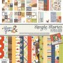
Creating Layouts with Bloom & Grow
Hello Friends, It’s Kristine Davidson with you today. I am going to show you 2 of my latest layouts created using the new Bloom & Grow Collection. This collection is super cute and fun. Imagine little gnomes in the garden, or flying a kite. I love the navy blue with a touch of yellow and red in this collection. I really couldn't wait to use it.
The first layout I'll be sharing is called " Bloom & Grow "
My mother is a great gardener and her thumbs are certainly green! She does an amazing job at planters, her garden beds and has a way to make her garden look amazing. My dad certainly helps her out but it's mostly done by my mom. This layout is just to showcase some of my mom's garden and her love for greenery.
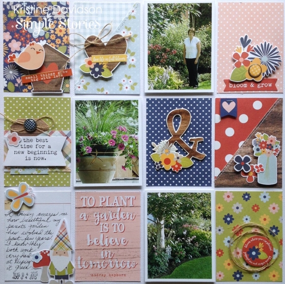
I created this page similar to a pocket page page. It's not in a page protector but it is on a piece of cardstock. I cut out the 3x4 cards in the SN@P! Pack and trimmed them to 2.75x3.75 just to leave enough white space between cards and pictures.
This little SN@P! Pack has everything you need to create a page similar to this. Of course you can add extras with the Expressions and Fundamentals Stickers. You can add or use as little as you wish based on your photos. If you aren't into pocket page scrapbooking why not try this form of layout? You can add several pictures and of course lots of color to these pages.

I love creating dimensional images on my pages and this was no exception. I added foam adhesive in the back of the photos to bring them out a bit from the pattern papers that are around it. It just makes the image pop a bit.
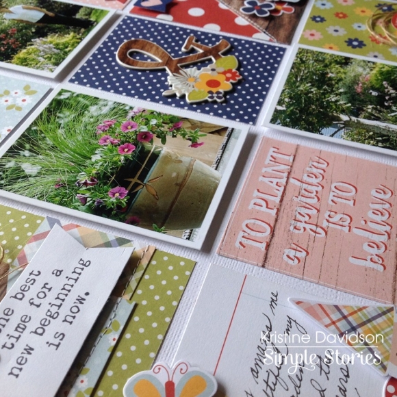
You can see again in this picture how the photos are elevated as well as some stickers. You can also do this on a layout. Instead of having your picture flat on the paper why not add some dimensional adhesive to make it stand out from the rest.
_______________________________________________________________
My Second layout for you today is called "Let's Play Outside"
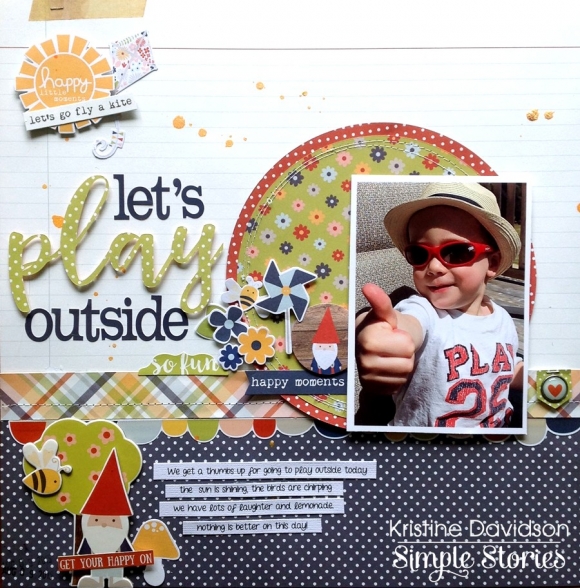
This photo was perfect for this paper. Don't you love that when it happens? It just fits! I also like that his tshirt says Play ;) Nope that wasn't planned!
I wanted to create layers and a fun page using some cute chipboard pieces and of course little Gnomes. OMG aren't those cute or what?! Some find them spooky and I must admit I don't think I would have them in my garden, but on a scrapbook page I'm all for it !
I added sewing to this layout and of course a cluster of embellishments on the left of the photo. This doesn't distract from the photo and adds lots of dimension and texture to my page. I wanted to add several pieces of paper so I created a circle and added another smaller sized circle on top of it to create a border around it. I again added foam adhesive to my photo to make it pop off the page a bit and placed some of the bits & pieces under it to create dimension.
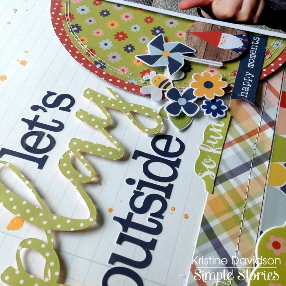
The title I created using a silhouette cut file " play" and the alphas from the Expressions Sticker Sheet. You could add more alphas instead of a cut file but I think this looks great and matches the page quite well.
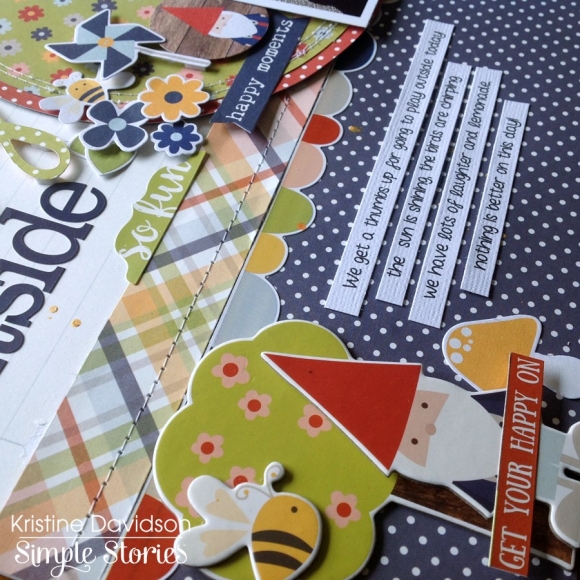
Here is a close up of the layout. You can see I used some chipboard pieces and layered them on top of one another. I also created some journal strips instead of a journal block. Aren't these colors so fun together ?
I hope you enjoyed my layouts today and enjoy making your own layouts with this fabulous collection! If you are interested in seeing more of my work you can find me on instagram with user name @KristineDavidson.
Thank you so much for reading and being a fan of Simple Stories!


