Hello Everyone! It's Kristine Davidson with you today for day 2 of the Designer Team Up with the Simple Stories & the Kerri Bradford Studio design teams. Kerri's team will be working with our collections and we'll be working with her fabulous cut files. We'll be doing some fun giveaways, sharing a discount code to Kerri's store and offering a freebie cut file, so keep reading and make sure to visit Kerri's blog as well as join us again here each day this week to parcitipate in the fun!
I couldn't be more excited to be working with Kerri's cut files this month. I love Kerri's work and all her cut files are so fun and easy to use! In my previous posts I shared with you that I would document 2012 and today I'm sharing the month of July 2012. I still haven't been able to find any photos of 2012 so I'm very thankful that I have some photos on Instagram. If it wasn't that I really wouldn't have any photos of the year 2012 and I'm also glad this LIFE Documented series has allowed me to save some of those memories ;-)
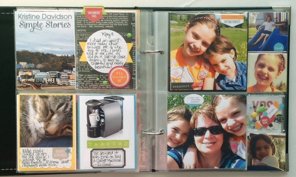
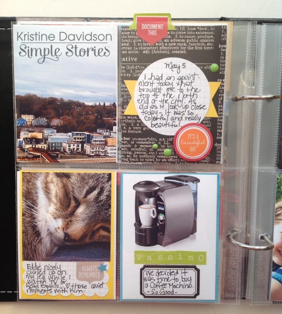
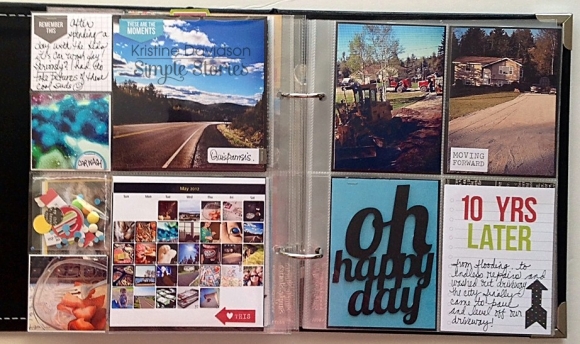
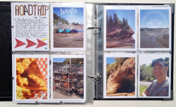
I am still using the 6x8" album and I'm including all formats of pocket pages. I haven't limited myself to the standard 4 (3x4) but instead including 2x2, 4x6, etc. It makes my album that much more versatile and I'm not limited to the standard size photos - that works for me.
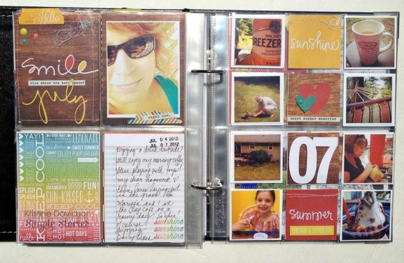
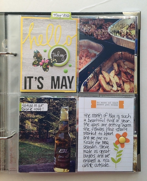
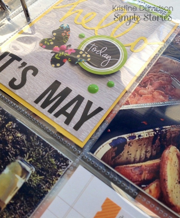
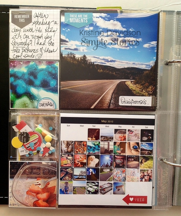
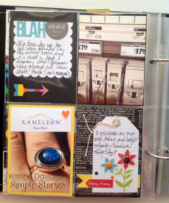
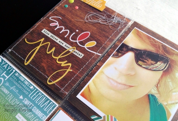
Left Side - I have 4 (3x4) photos. I used one of the 3x4 SN@P Cards to create my starting point for this month's spread. A photo of myself to see the changes in my wrinkles and hair color -- although I wear my sunglasses most of the time but still it's a selfie right?! I cut 'july' from the Monthlies kit.
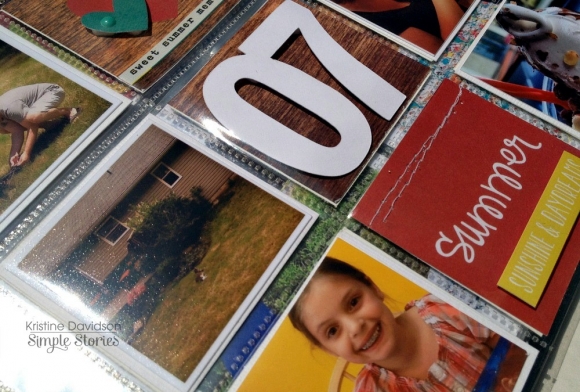
Right Side- I have added mini 2x2 pictures to kind of showcase what my month of July was like in 2012. I love the mini format cause i can include so many small pictures that I really don't need to add in the corresponding pages. I used the 07 from the Life Additions: Weeklies to reflect the month of the year, and it could even be 07 July - that works too!
I loved adding Kerri Bradford's Silhouette cuts in this months Life Documented Project. Kerri's online store has been my go to place for great silhouette cuts and I her classes on how to use they cameo is fantastic!
Spending time with my nieces was a big part of my summer last year. I tried to visit as much as i could. We did lots of crafts, scrapbooking, painting and playing outside. The Left Side has a 6x8 photo of my nieces in their paint shirts and large canvas that we created. I decided I wanted to add this 6x8 photo and cut it into small 2x2 pieces to fit behind the previous photo display. I love doing this to larger photos and it's a great way to add a " fun" photo of the girls.
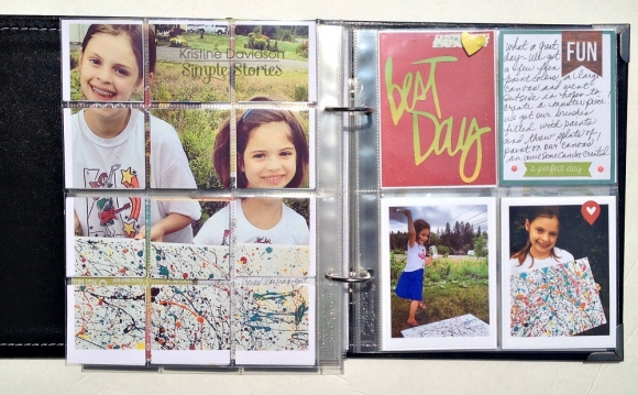
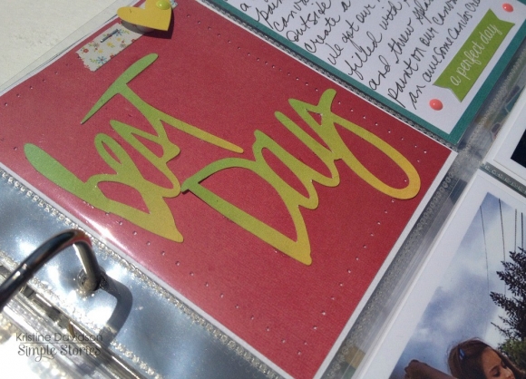
The Right Side of my spread has another awesome Kerri Bradford file - Best Day from the Let's Go kit. I added some journaling on a card and also added two more photos of the girls playing with paint. I still have this canvas that we created together - I have it hanging in my scrapbook room. It reminds me of how much fun we had that day !
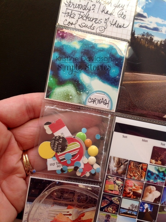
Another weekend in July we took a day trip to one of our favorite places - St. Martins which is only 45 minutes away from our house. It is always nice to visit and explore the caves, the seafood, the wharf and yes the peace and quiet. It's called ROAD TRIP! - I used Kerri's arrow cut files from the Need Directions kit on this page as well as the word Discover (from the Well Traveled kit) and the Love This overlay (from the Click kit) as a png image on top of my photo as a layer. I LOVE that feature of her png images.
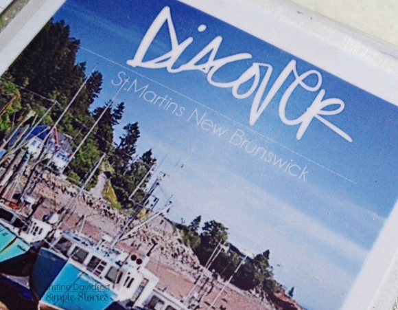
This transparent layer can be done with any of Kerri's png images. I use an old program to create this effect on my photos but i know if you use photoshop you can certainly do this. Wanna know how ? visit Kerri's tutorial here on you tube.
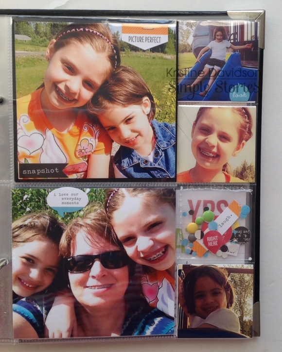
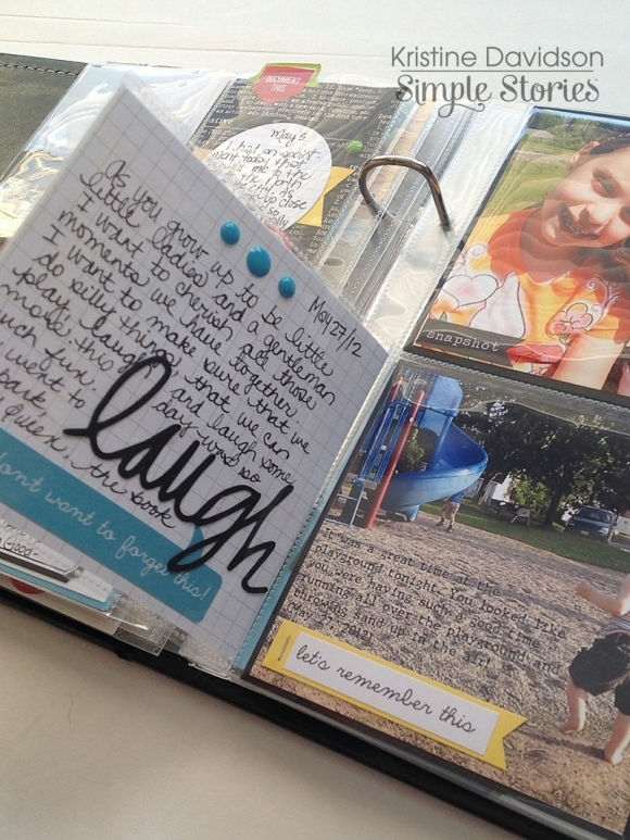
My sister came to visit with her two kids for a weekend and we played with some fun photo props - HOT LIPS! They were a hit, even with my sister being included in the photo!
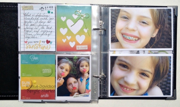
I sometimes have to bribe my nieces for photos so giving them a prop always makes this fun and a bit easier for me to take their picture. I added some journaling and larger 4x6 photos on the right hand side. I love these pictures of them, especially when Marissa had her braces!
The Final Details -
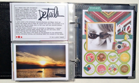
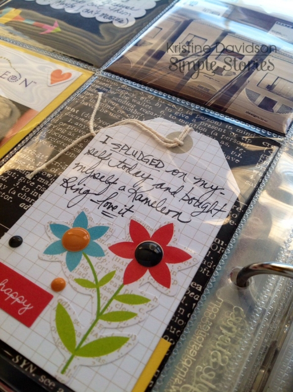
I added a Kerri Bradford png image (Details from the Happy Stuff kit) image to my 4x6 journal card. I also used a typewriter font to add some thoughts on the months' activities and a few more memories. This also has a beautiful picture of a sunset that happens almost nightly on the Kennebecasis River in our town. It's beautiful! I added nothing on top of this photo although I could have.
The Final Page of July 2012 has a 6x8 layout of me. ( it was later in 2012 when I realized my husband should be part of my Life Documented spreads! I promise he's coming in the album soon! )
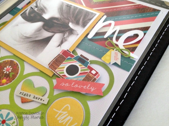
I created a small circle mat for my background from the Life Additions: Backgrounds kit and LOVE this! I will be doing this again in a larger format for sure. The title Me is also from the Well Traveled kit.
I'm using the 6x8 SN@P! faux leather album in black for my Life Documented 2012 album. The sturdiness, metal corner accents, and stitch details are fantastic features to this album but I really like the fact that it's timeless and because they are so well built and will endure the many years to come. This Sn@p! album is so far the best I've been using.
I used a variety of inserts for this monthly spread - in the 6x8" size featuring 2x2" , 3x4" to 4x6 and also a full 6x8. The Sn@p pocket pages come in a variety that you can add to your album. PERFECT for any project!
Now for some fun! This week we'll be giving 3 random lucky winners a $25 Spending Spree to Kerri's store!

Hop on over to her site, check out what her design team did today with our products, then check out her store. Come back and leave a comment here telling us what you saw and loved and you'll be entered in the giveaway. Even better, when you find some things there that you just can't live without, you can save 15% off on orders over $20. And hey, she's giving away some fun new Simple Stories product on her site as well, so head on over!