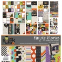
Frankie and Friends + Say Cheese
Hi everyone! Nancy here with a couple of Simple Stories projects that I’ve been working on. With Halloween season in full gear, I was looking forward to creating with the whimsical Frankie and Friends collection. The first icon that caught my eye was the green jar of googly eyes and that piece was the jumpstart for this layout design:

I lined up all of the text, photo, and chipboard on the right side of the page to create a clean, linear design.

The border of half circles mimics the eyeball jar and repeats that shape.

A few splatters of mist, a few swishes of watercolor paint and some real googly eyes add special little details that keep this page from being anything but flat!
I also used the new Say Cheese SN@P! Set to create this quick and simple layout.

Here I centered all of the elements (just about) and framed the most important part – the photos!

The page title is sewn down the center to add texture and ‘underline’ the word Magic.

Some splatters of mist and layers of die cut add a pop of color and texture to the top of the page. Lining up photos and centering all of the embellishments is a quick and easy way to create a bold page!


