July 2020 Blog Posts

Hello friends! Anya here today and it's my turn to share a portion of inspiration with you using the Bro & Co paper collection! There are so many different things I like to create and layered tags are one of them for sure!

I like to cut a bunch of tags from different patterned papers in the line using tag dies and then simply play with all the die cut pieces to create a nice balance in color and design. It's fun and relaxing at the same time. Sometimes I feel like making tags is the best way to get into scrapping mood!

Here I made four tags, which now can be used as is, or you can use them on layouts, gift bags, create cards with them or add them to other fun projects. My teenage nephew's birthday is coming up and I am sure these will come to a good use. 

Nothing adds a more perfect finishing touch to masculine project as brads do! Simply adore that shiny dot with a metal rim, which usually becomes the star of any finished project!

Supplies

Do you ever use really big photos on a layout?  As I looked through the Simple vintage Great Escape collection I was inspired to try printing a really big photo to use with it.  I knew the rich colors from my outdoor photograph would really pop amidst the colors in this collection.  Christine joining you today to showcase a big photo on an outdoors themed layout!

As you can already see, the colors in this were a perfect match.  I cut the picture out in a circular shape allowing one part of the circle to be filled with this gorgeous green patterned paper.  That paper was the perfect match for bringing out all the greens in my photograph! The plaid paper plays nicely off all the colors as well.  I didn't want quite so much of a contrast with the white background, so to soften that I used some of the map washi tape.  I tore it in half to give it an even softer look.

I don't often put my title in a different orientation from my photograph - usually for designs sake - the title is horizontal.  But for today's layout, I really liked the way the chipboard word "wander" looked sitting on the border between the picture and patterned paper. The eyes sometimes like something unexpected and you run with it!

The ephemera in this collection is to die for.  I loved the foliage pack especially and as you can see, I used it to create a giant fern cluster on one side of my photo and used it a second time as anchors for my title work.

My final big design choice involved how to add more colorful to this very green layout.  I opted to bring in some of the butterflies from the ephemera packs alongside the brads.  Both of these brought in some additional pops of color and dimension without being too overwhelming.

If you want to check out how this whole layout came together, you can catch all of the details on my <a href="youtube.com/cameyer71">YouTube Channel</a>!

Supplies

Hi! Odessa back with some more SN@P! pages. This time I’m using the fun and a little snarky Bro and Co collection. With two tween boys at home, this was just what I needed for all their non-adventures hiding out with video games and generally being cool guys.

I kept it simple with a SN@P! Binder with a black spine which goes well with the darker tones in the kit. I had some trouble deciding which cardstock to use on the cover because there were a few I really liked, but the bold directional print of So Rad! won out because I knew it would have big impact.

Then I started embellishing the cover of the SN@P! Binder. Instead of a bold title, I decided to go one of my favourite routes, matching the colours of the wide stripes on the cardstock with all kinds of embellishments. Chipboard stickers, Combo stickers, Bits and Pieces and Enamel Dots all from Bro and Co. It was also a fun way to use a few things I liked that didn’t make it into my pockets like the funny yellow shirt.

Bold colour, so much snark and nerdy vibes is my life with 2 boys and Bro and Co really worked well with the photos I was documenting. On this spread I’ve got a fun brother photo next to my older son’s final school assignment, a quarantine time capsule. I used lots of the 3x4 journal cards from the 3x4 Elements Cardstock on this page and So Rad! under the Epic title Bits and Pieces. I also used a handful of the 2x2 Elements with Bro in the centre to make a tiled 3x4 journal card. The Colour Vibe Bolds Alpha Sticker Book was full of just the right coloured alpha stickers to add to my titles and add numbers to the list card.

I love a good embellishment cluster so I used this adorable cold drink Chipboard Sticker with some brads, enamel dots and stars. That checker print is on point!

This layout has some more general life stuff like listing what the boys have been up to along with some photos. I used the fun mixtape from the Bro and Co 4x6 Elements with a phrase from the Foam Stickers over the label which was an easy and impactful way to fill up that 4x6 pocket.

The 3x4 Elements from Bro and Co are just so funny, I liked this one next to a pic of some shopping requests the kids made.

I used the Bro and Co Stamp set here to stamp on a mix tape to make the boys’ current “playlist” along with more of the Colour Vibe Bold Alpha Stickers. I also loved that little bear and stuck him on the cool checkerboard Killin’ It Cardstock with a speech bubble. Adorable and cool! It’s nice to have such a vibrant collection to go with photos of my guys. If you’ve got hours of at-home video games to document I highly recommend Bro and Co!

Supplies

The idea of a pajama party may be the furthest thing from anyone's mind right now, but when the time comes (or make them now for the people in your household) these will surely be a hit!  

I took the idea from "loaded pockets" or "loaded envelopes" that are very popular snail mail or exchange gifts.  The folding of this design will be shown on my YouTube channel; I've explained it below, but it can be confusing if you don't have a visual. 

To start: Cut your favorite "Kate & Ash" patterned paper to 12"X11".  Place the 12" edge onto a score board and score at 3.25" and 8.75".  Turn the paper and score at 8".  Keep in mind that the backside pattern will fold up, so make sure the design isn't upside down!

Working below the 8" score mark: make cuts along the 3.25" and 8.75" marks UP TO the 8" mark; trim away the rectangle flap on both sides.  The flap that remains at the bottom: cut away a small section in the middle, leaving a 1/2" border around the sides and top; this will be the flaps to glue down and make the pocket.  

For the folds: Fold the two side folds in towards the front (the 3.25" and 8.75" sides).  The folds will overlap; glue them in place.   Fold the flaps at the bottom and bring up to adhere to the top.  

Now for the decorating!  After corner-rounding all of the sides, I aded pom trim around the "collar" and then added a bow and embellished metal rimmed tag.

I used another patterned paper and cut to create cards for the top pocket.  I made three in different sizes and then added tabs to the tops.  In the bottom pocket, I cut apart the 3X4 cards and tucked them inside.

Jumbo clips were embellished with a die-cut banner and fun embellishments.  I also topped a clothespin with a couple of chipboard pieces and decorative brad.

The tags in the top would make a great place for pictures.  Set up a little printer station and let everyone print pictures from their phones or computer!  Have each slumber partier write little notes and share inside the pocket :)

Don't forget, I'll have a quick video of how the pocket is constructed on my YouTube Channel!  

Thanks for stopping by!
Shellye

Supplies

Hey everyone! It’s Jen today with a project using the amazing Simple Vintage Great Escape collection. Recently, my son embarked on a camping trip with his girlfriend to nearby Mt. Rainier. Because my love of memory keeping is no secret with our friends and family, they took tons of great photos and shared them with me. What a gift!

I was really drawn to the Wild & Free patterned paper and used it for the background – the illustration of the old book pages is gorgeous. Before adding any embellishments, I used the stamp set to add more fern leaves in brown and a few more birds in gray.

To add more depth, I cut apart another of the same background paper, distressed the edges of what I’d cut, and layered the pieces on top of their identical counterparts along the left edge. Doing this really made the background look as if it’s made of pages from a book.

Next, I moved to the right side of the layout where I added a cardstock banner sticker in the upper corner. I used foam squares to adhere the Great Escape sentiment sticker with a die cut butterfly on top of the banner for more texture.

The title, which is a quote, uses Color Vibe Bold alphas with wording created on my manual typewriter.

In the bottom-right corner, I used die cuts and chipboard to add more color to the project. The embellishments in this collection use such deep, rich hues that are absolutely stunning.

To complete the layout, I added more embellishments around the photo as well as within the layers of “pages” along the border.

I love this photo of my son and can’t wait to use this collection with the remaining photos from his trip.

Thank you so much for stopping by today!

Supplies

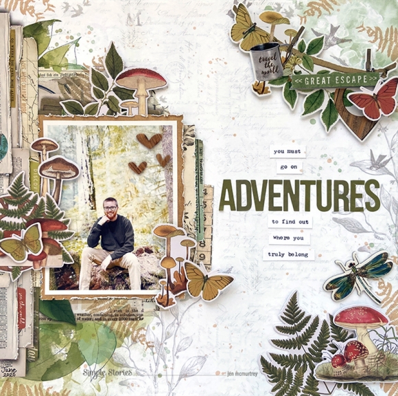
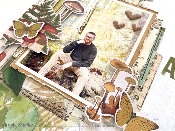
Hi there friends! It’s Tya, and it’s my turn up on the blog today to share with you my latest handmade card creations! This time around I got the pleasure of using the gorgeous “Simple Vintage Great Escape” collection. Full of earthy tones, stunning patterns and lovely flora and fauna themed icons – this collection had me wanting to get out into nature!

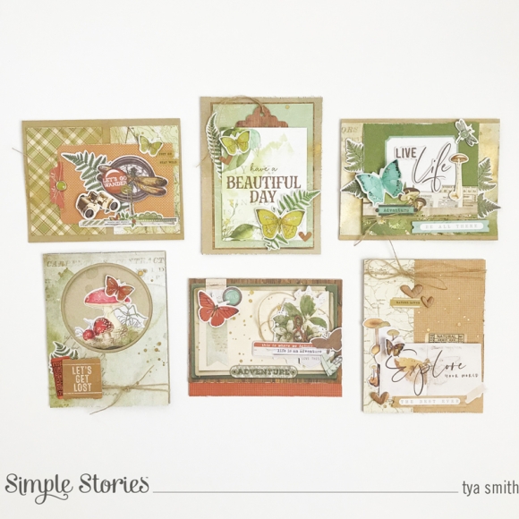
All of my cards are A2 size (4 ¼ x 5 ½ inches) and were made using kraft cardstock for the card base. I also used some gold paint mist on the background of the cards. It was fun to get a little messy – something I like to do with the more vintage-y themed collections.  I created six cards and I’d love to give you a closer look at all of them! Here we go!

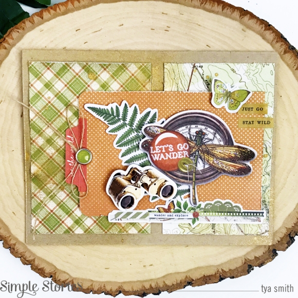
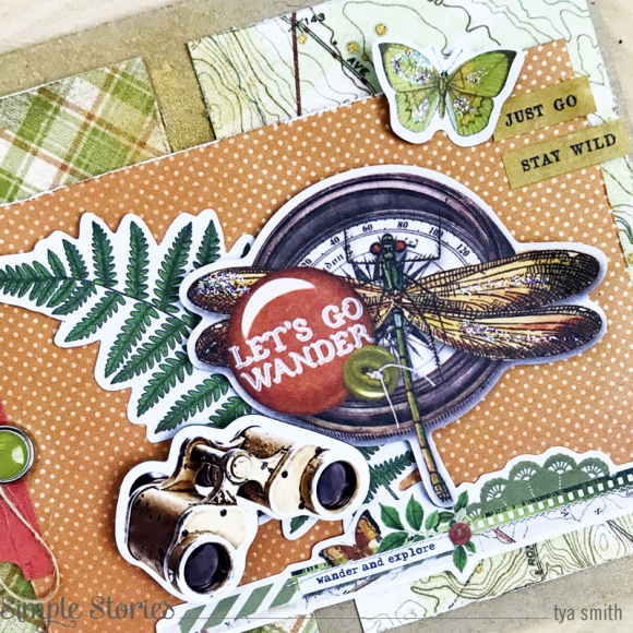
Card 1 starts us off and one of my favorite parts of the Simple Vintage collections is that they have the most beautiful ephemera! A lot of times when I made my cards, I like to start out by making little clusters of ephemera and then decorate further with other embellishments like the Decorative Brads, twine, stickers etc.  This card is a great example of how I do that as you can how I layered several different products to make this card.

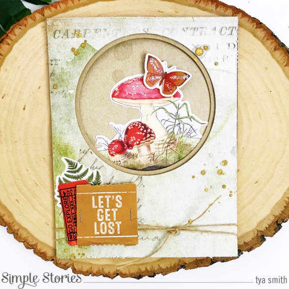
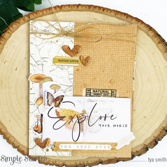
Card 2 was a fun one to create! Here I cut out a couple of circles using some metal circle dies and a manual die cutting machine to get circle shaped window in the top portion of my card. I decorate the inside of the card with one of the cute mushroom themed ephemera pieces. On the outside of the card I added more ephemera, stickers, staples and some twine to decorate.

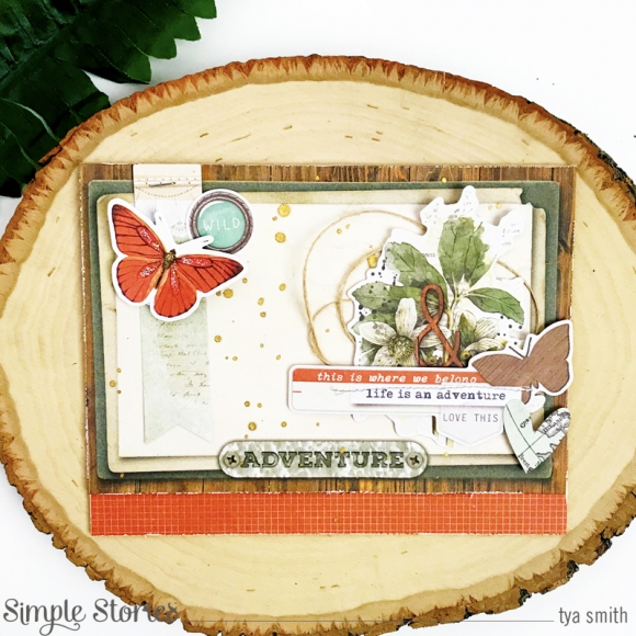
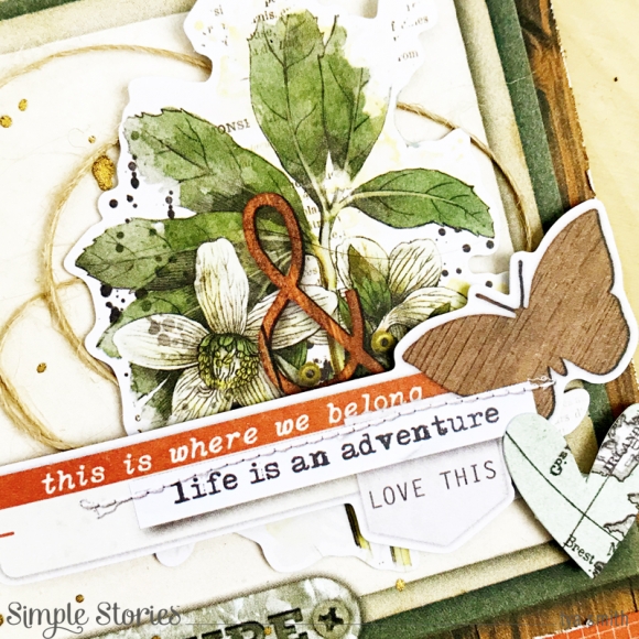
Card 3 shows of more layering of the ephemera in the collection. I had the most fun doing this! And if you’ll notice – each of my cards features a butterfly. I just couldn’t help it! There were so many of these beautiful shapes that I added them to each card. I added some of Stickles on each of their wings also for some shimmer. Lots of texture on these cards! Isn’t that rusty orange color in this collection just stunning? I love how bright and vibrant it made this card.

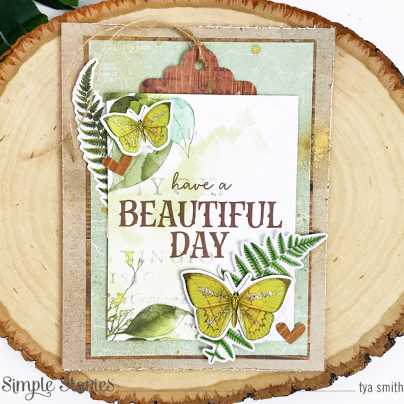
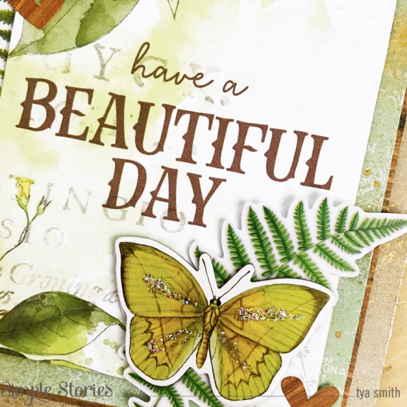
Card 4 is probably my favorite of the bunch, I don’t know if it’s the butterflies, the wood grain pattern or the dreamy soft blues and greens found in this collection. This one came together quickly and I loved that also!

Card 5 is one that I did and created a sort of monochromatic color scheme with the creams and the browns in the collection. This type of technique is also fun to do. Monochromatic is very pleasing to the eye and I found this card really soothing to look at.

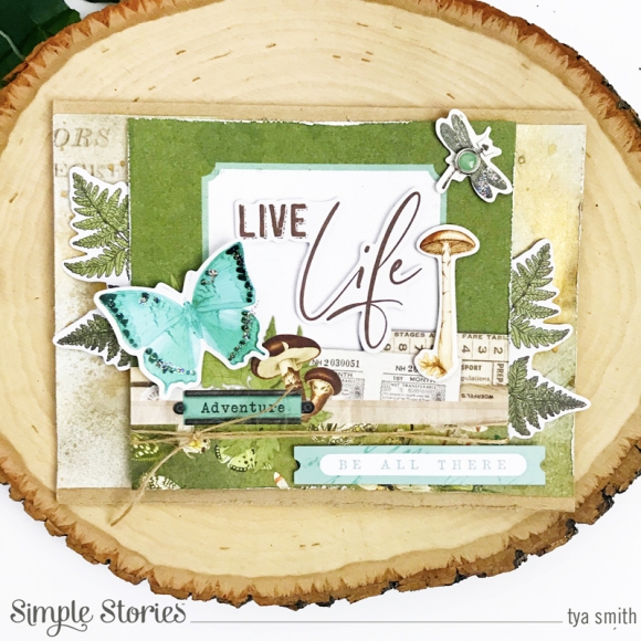
Card 6 is our last one of the bunch. I used one of the 4x4 Elements as the base of my card. It already had some lovely layering going on so I was able to add just a few more of my own to finish off this card. I love that big aqua butterfly and the cute dragonfly brad!  The title was made with one of the ephemera pieces as well. A few big leaf clusters from the Foliage Bits peek out from the two sides of the card.  These pieces were a really fun way to finish off my card.

Here’s a group shot of all the cards that I created:

Well, that’s all I have to share with you today. If you are looking at doing some card making using some of the most beautiful botanical themed products you MUST pick this collection up. It was a joy being able to work with it! Thank you for stopping by today – Happy Crafting friends!

Supplies

Hi there friends. It’s Kylie with you all today sharing a fun new layout I created with the divine ‘Kate and Ash’ collection. This range is oh so cool with lots of fun ‘girly’ elements included. I can see my self scrapbooking lots of fun pages of my daughter with this collection. For my layout today, I went with a white cardstock background for something different, as usually I like to layer lots of various printed papers together to form my background page.

Honestly, when I sat down to create this page, I could not decide on what papers to use as they are all so vibrant and lovely. I decided to create my own patterned background using a simple hexagon punch. Several papers were selected and I punched a whole bunch of the shapes out. Using a distress tool I textured each side of the hexagons and placed them in random assortment over my white background. Once I was happy with the placement of them, I adhered them with some foam tape, so that they sat ‘lifted’ up from the background. This height gives a lovely sense of dimension.

Once in place the hexagons cascaded on a diagonal from the top left to lower right of my page. My photo was printed to a smaller scale and added through the middle of my background.

I must say, I am totally obsessed with the ‘Foam Stickers’! So many fun title options can be created with these and I love the vibrancy it adds to your completed page. It was tough choosing from them as I love them all, but I decided to add ‘Hello Beautiful’ and the ‘XOXO’ stickers as main titles.

To finish my page, I added some of the gorgeous ‘Bits & Pieces’ in and around my photo for balance as well as several decorative stickers from the cardstock and combo sticker sheets.

Thanks so much for stopping by and taking a look at my layout today!

Until next time,

Kylie.

Supplies

Hello friends! It’s Mik here from Papermiks on the blog today! I'm super excited to share this fun flipbook with the fantastic Bro&Co Collection.

At the moment I saw this collection, I knew that my cover would be a cassette tape! I had so many cassettes in my teens and I loved them! To make this mini album I decided to use a black 4x6 flipbook, I thought it would be perfect to be my cassette tape. For the cover I used an Alla K’s cut file “pocket insert - card cassette tape”.

The file is all organized by parts, so I just chose which papers to use, adjusted the size to fit and put my silhouette to work. To make my tape I used 7”3/8 x 3” ¾ from Killin' It! paper, 6” ¼ x 2”  Totally Legit! paper and 6” ¾ x 3” ¼  plus 1”3/8 x 4” ½  from Charcoal paper - color vibe cardstock kit basic.

To make the pages to my album I used the background of the tape cut file. In this way I standardized the pages so I can have all the pages in the same format of cassette tape.

I mixed the paper pages with the pocket pages that come with the flipbook which gives me more space to fill my album with lots of pictures. It’s important to say that all the internal paper pages has 7” 7/8 x 6” 1/8.

As you know I love to use pocket pages and some flap pages. This gives my album an interactive touch and I love it!

Another thing I love to do is create pockets.

Here I added a pocket to place tags in. I had a lot of fun creating this album. The Bro & Co collection is a super fun! I’m sure that will help you to document your boys in a happy and easy way. I hope you’ve got some inspiration from this idea and enjoyed it! Thanks for stopping by and have a creative day!

Supplies

Pages