02.28.15
I AM...My Own Kind of Beautiful
Good Morning everyone, Wendy here today to share some layouts I created with the gorgeous I AM collection.
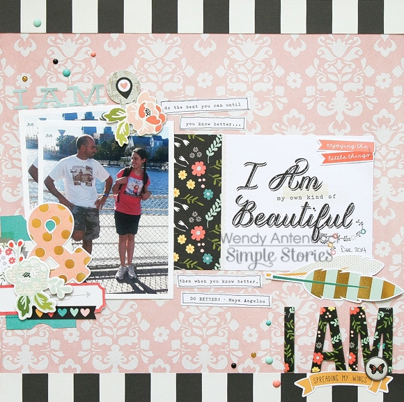
My Own Kind of Beautiful, was created to help my 'soon to be' teenage daughter know who she is. This collection is perfect for building up our children to become all they can be with affirming words. Sometimes our children might not be acting like what we hoped, but we can call forth who they really are by our choice of words. The words I wanted to convey to my daughter were on the SN@P! Card, "I am my own kind of beautiful" and that is where this layout began. I pulled a picture of my daughter to pair with the saying and from there I began to embellish the pink background I chose.
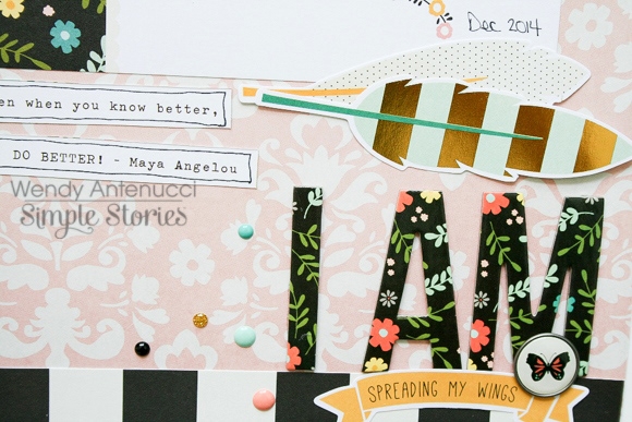
I chose to keep my design simple with the rectangle at the center of the page and then I built three embellishment/title clusters around the page to guide the eyes. My first was the chipboard I AM piece that I used to bring a boldness to my message and the page. A bradz (got to love those new kinds with no prongs!), a few die-cut pieces, and some sprinkling of dots finished that cluster.
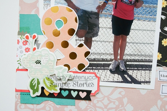
My next embellishment cluster was really just a pretty grouping of some of my favorite pieces, again a pop of black and an area to write something (which I forgot at the time).
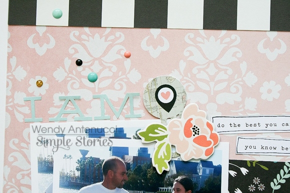
My last cluster was a softer I AM with a location clip to mark that this is where we are right now and it is good! I finished the page with strips of black and white paper at the top and the bottom to keep the black visual triangle going and I feel it keeps my pieces on my page by providing a boundary.
My next layout, I AM Enough was my thoughts on 2014 and where they year had taken me.
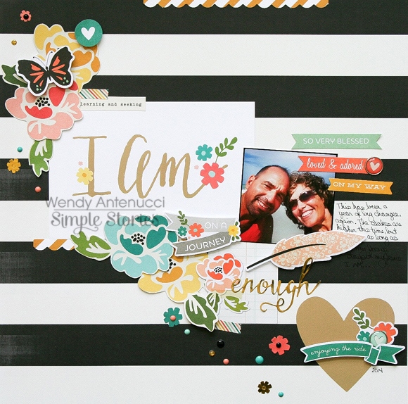
I love flowers and I love fussy cutting so you see a trail of flowers on a diagonal which is one of my favorite design ideas based around another 4x6 card that became my title. I also added in a sticker with a word that summed up the year for me.
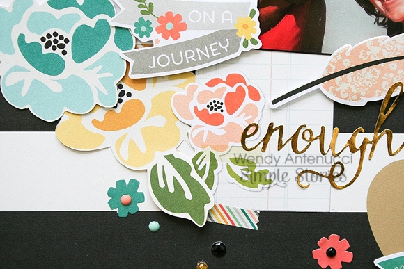
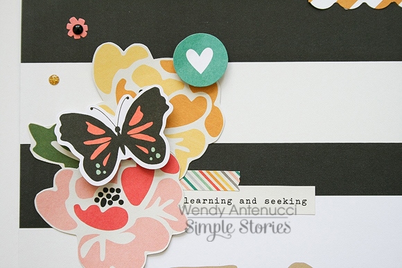
Even though I was working with a diagonal, as the previous layout, I also have three embellishment clusters. The first had part of my title with my word. The next included flowers and die-cut pieces with sayings that gave more depth to my thoughts of the year. A butterfly to show change and a sprinkling of dots to further embellish the group.
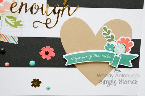
And my last cluster, dressed up the heart that came on my background paper. I always allow my paper to help me build my clusters, it takes less thinking and more going with the flow :)
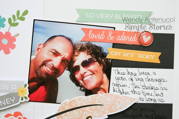
My last piece was a picture of me and my hubby. As the page was not built around a picture, I chose a small picture that I liked. I added a few more die-cut phrases, a bradz, and my thoughts to finish documenting 2014.
Thanks for joining me today, I have another I am layout, Dreaming Big on my blog if you'd like more inspiration with this collection. Have a great weekend, and remember I AM is enough!

