I Heart You
Hello scrappy friends! Laura here with you today sharing two new layouts using two fabulous collections!
I used the Heart collection for my first layout. I just love the colours and sweet theme of this collection and couldn't resist pairing it with a photo of our puppy.
I started my page by die cutting hearts from a variety of patterns and adhered them to my background, to mix things up a bit I used one of the hearts as a stitching template and added in some hand-stitched hearts. I really love the water-colour look of this patterned paper and so I liked being able to leave more of it visible through the open hearts.
From there I layered my photo onto a couple of layers of patterned paper, and some die cut circles.
I focused on a title next, which is something that I often "wing" as I finish my page, but this time I really wanted to used the "heart" sticker, I love that it looks glittery. I flanked it with another sticker that I cut up to finish off my title.
I kept my embellishing to a minimum (well for me anyway, lol) adding a small cluster to the top left of the photo.
I also added in these great wood veneer hearts, from the "Life in Color" collection to each of my stitched hearts, and then topped them off with a navy enamel dot from the "Bloom and Grow" collection.
I also added a small cluster to the lower right side of my layout, I really love the way the colour of the wood veneer meshes with the gold-yellow colour of the Heart collection.
This layout is a little "more", more pasterns and embellishments and much more vibrant and was so super fun to create! I started by cutting a few circles from this fun orange polka dot paper and stitching them to my background. Then I layered up my photo with a few of the cut apart cards and some foam dots.
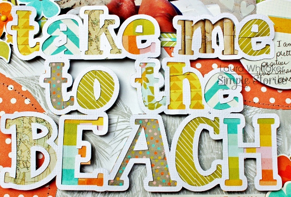
I just loved the Washi tape from this collection and wanted to find a way to use it all! Ha! I created this cut file to use as a large focal point on my page. I covered the insides of each letter (the part that you might discard) with a variety of Washi tape patterns. I so love how it looks!
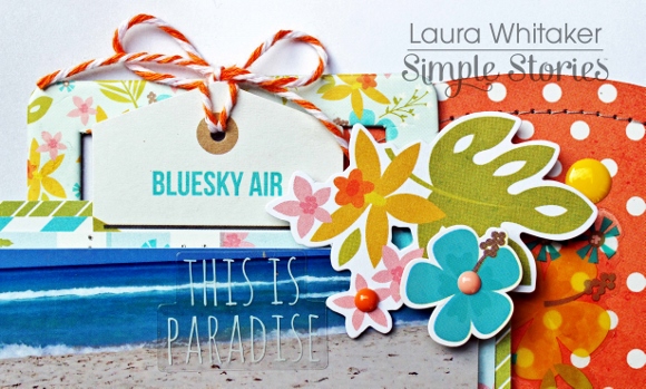
And then I added in my embellishments. This time going bold with these fabulous summery colours! I adorned the left side of my photo with a large cluster.
A more modest cluster sits atop my photo.
And a smaller cluster adorns the bottom of my title.
Wanting to add a bit of journalling necessitated another small cluster. Simple Stories always has fabulous stickers and "bit and pieces" for their collection that are so perfect layered together, and make this fan of clusters so happy!


