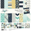
I Thank My Lucky Stars For You!
Hi! Odessa here with some SN@P! pages using the Heart collection. The colours and papers are so nice in this collection, I was so inspired!
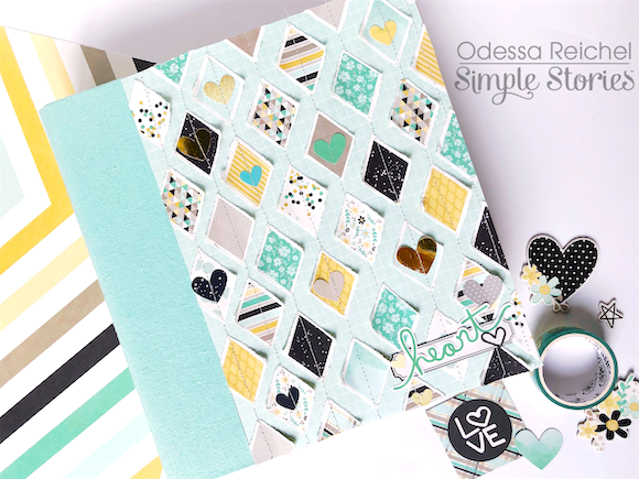
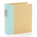
I used a Robin’s Egg SN@P! binder which went well with Heart. I was really inspired by all the diamonds so I covered the binder in them! I cut down a piece of cardstock to fit and then tore the diamond shapes by hand from the Missing You Cardstock and stuck them down to the cardstock. I added in a few hearts around the page to add some more dimension.
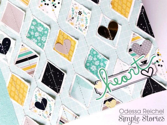
The diamonds really reminded me of quilts so I pulled out my sewing machine and stitched up the rows of diamonds before I attached the cover to my binder. I added some simple stickers in the corner and it was all done! I love the homey cozy quilt feel of this.
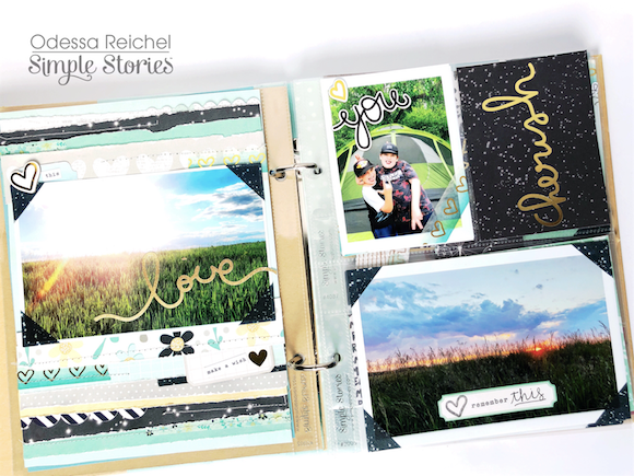
For my layouts I used some recent family photos from a few days away that were special to me. On the right I did a single page layout using one of my favourite phots and on the left a SN@P! page with some more photos, journal cards and stickers. I just adore the gold foil throughout Heart!
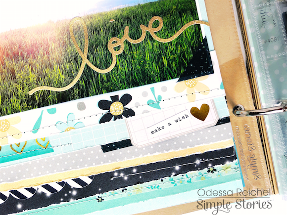
I decided to bring the torn and stitched paper feel from the cover to the inside so for my single page layout I tore strips from various Heart collection cardstock and layered them around my photo. I also added in some strips of washi here and there to add more dimensions before I stitched a few rows across the page. The Heart collection is full of great handwritten style word stickers so I added one to my photo.
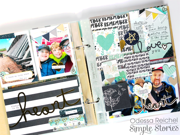
I had some more photos to get in my binder so I did a second page with Heart. This spread is full of things in pockets with a cute 4x6 vertical protector in the middle full of SN@P! cards, stickers and more. Throughout the layouts I folded washi over corners of photos to give it a vintage photo album feel.
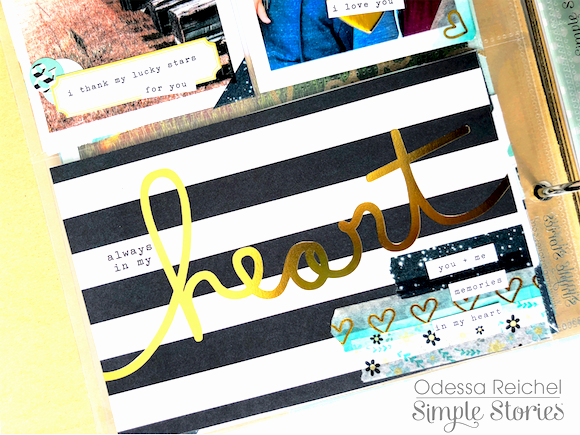
On this card I layered some of the gorgeous Heart washi tape to personalize the journal card a little more. Throughout my layout layering is a major theme! The colours and patterns lend themselves so well to oodles of layers and mixing and matching.
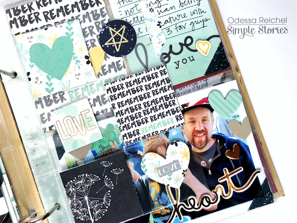
These vertical SN@P! protectors are one of my fav things. Sometimes I’ll fill them up with photos and sometimes I’ll fill them up with bits of ephemera and cardstock from the collection I am working with like I did with Heart here. It’s a great way to add dimension to a layout and sneak in some extra pieces that didn’t quite make it to my layout.
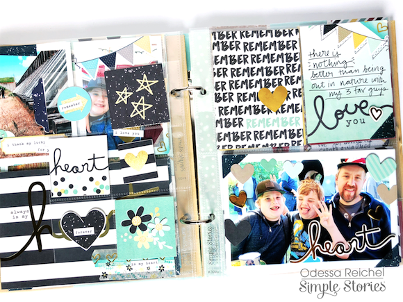
When you flip over the vertical protector my last page pops out. I added in some journalling, stamping, stickers and more to keep it all together. There were a lot of background people in my bottom photo so I used various hearts from the collection to create a boarder around my family and hide all that. I hope this peek into my pages has inspired you!

