Let's Cruise!
Hello Friends!
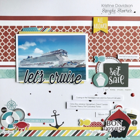
It's Kristine Davidson here today and I'm sharing a layout I created using the Cruisin' Collection. I used a photo of the cruise ship my friend and her Mother in Law took last February. I highlighted the ship, the ports of call and of course the date the cruise was taken.

My background was created with a white piece of cardstock but you could use the gorgeous Simple Basics sheets that come with this collection. I added a few strips of paper in assorted sizes to use more color and texture.

I used a 4x6 photo and mounted it on dimensional adhesive and of course added more on the stickers and diecuts. I didn't want to add to many diecuts around the photo since my photo was the focal point for my layout. Instead of doing clusters around the photo I added the elements on the bottom of my page.

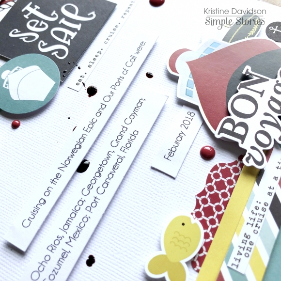
My journaling was created on a piece of white cardstock that I cut in strips to place them on my layout. I was debating on using my own handwriting but I thought typed up would be better.
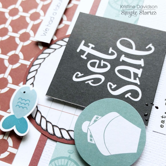
I added a small cluster of stickers and diecuts on the right of my photo. This can be another small photo if you wish or use a 2x2 piece with an image or title even.
I hope you enjoyed my layout today. This collection is super cute for beach scenes and Cruise Ships!
Find us on Instagram @SimpleStories_ and @KristineDavidson


