Love That Smile!
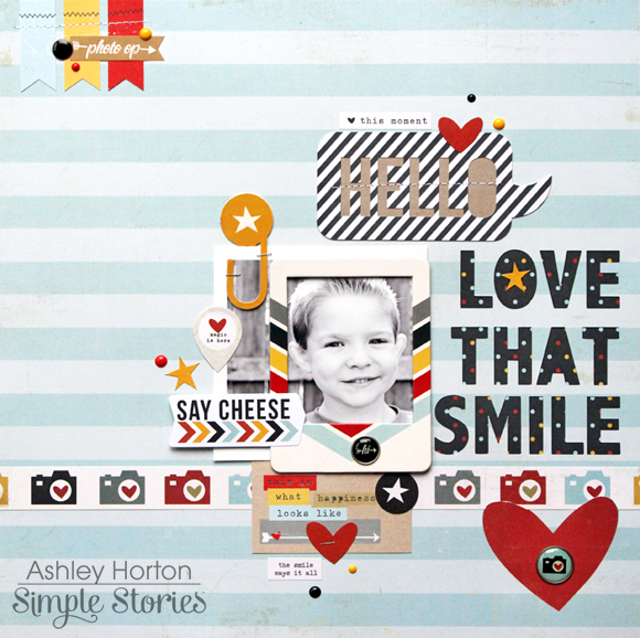
I wanted to create a masculine layout, using the Say Cheese II collection. I love that it's versatile enough to use for your Disney layouts and projects or for your everyday projects. I started my layout by choosing the Laughter patterned paper for my background. Before I started working on my layout, I cut my title from the background paper, using my Silhouette Cameo, and backed it with one of the patterned papers from the 6x6 paper pad.
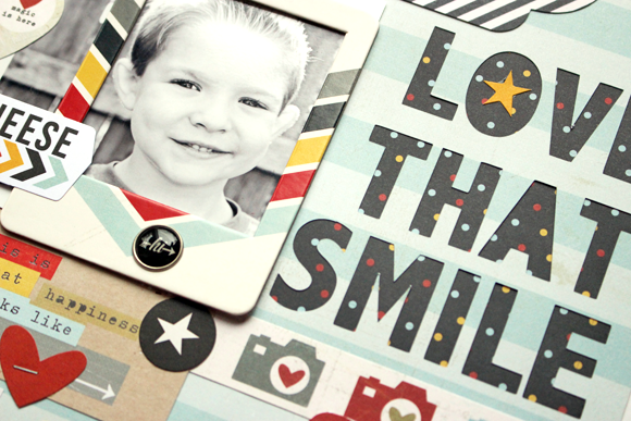
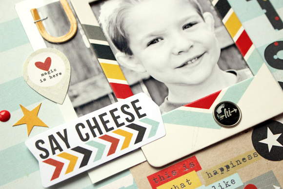
Then I got to work on placing all of my embellishments. I love to cluster elements around my photo, so it helps to draw attention to the subject of my layout. I created a fun look by layering one of the Chipboard frames, some of the Bits & Pieces, Stickers and a Decorative Clip. You just can go wrong with so many awesome coordinating embellishments!
Next up, is a layout using the gorgeous new I Am collection. This collection is perfect for telling your own story...it's okay to be in front of the camera once in a while! If you find it a little too intimidating to create a layout completely focused on you, then why not start out with baby steps, and do a family layout with a fun, family selfie!
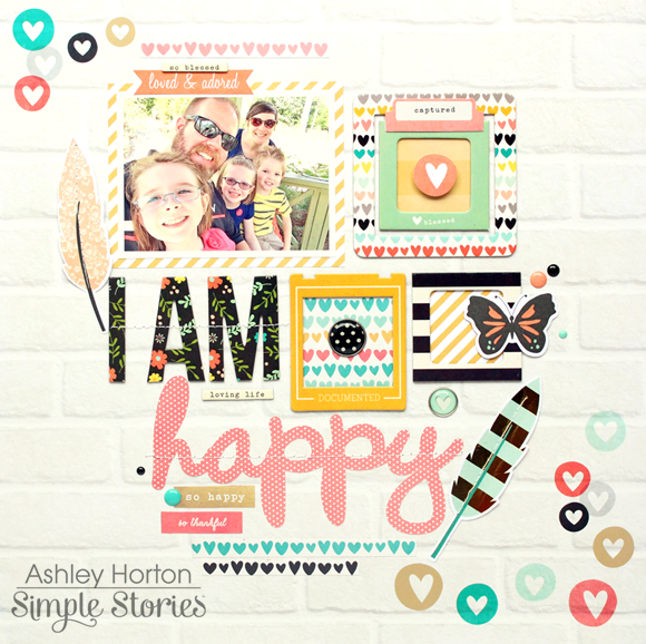
Once I chose the Grateful patterned paper for my background, I knew the I Am Chipboard Frames would look great against the muted pattern. Plus, it's pretty fun to fill them with different patterned papers and embellishments!
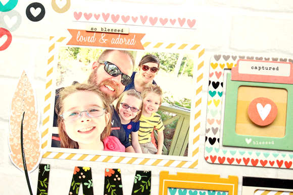
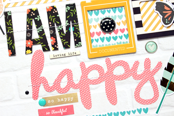
I wanted to create an over-sized title on my layout, to balance out the photo and use of the frames. I decided to mix the large I Am phrase from the Chipboard Stickers, with one of the Simple Stories die cut words, to create my title. Once I had it in place, I added a little machine stitching to add some texture to my page.
Both of these collections are being debuted at WCHA, along with the Enchanted collection and lots of other new Simple Stories goodies! If you are at CHA this week, then make sure you stop by the Simple Stories booth for a visit, and check out all of the amazing new products!

