Mixing Things Up! Weekly Layouts and Sticker Tablets
Hello again everyone! Leah here today and I’m excited to show you some different ways I’ve been using the Carpe Diem Planner sticker tablets to experiment with new weekly layouts in my Typewriter Circles TN.
I have been using the daily insert for my day-to-day plans for a while and I am still loving it. At home, decorating my planner pages is a creative outlet for me, so it’s important to me that whatever layout I am using allows space for the décor and the planning. However, one thing I’ve been missing with this daily layout is not having a weekly view. The good news is, there are lots of options to easily incorporate a weekly view into my TN. Carpe Diem Planners has a horizontal weekly insert which I may try out soon, but I decided to experiment with a couple of other formats this month within the inserts I currently have in my TN.
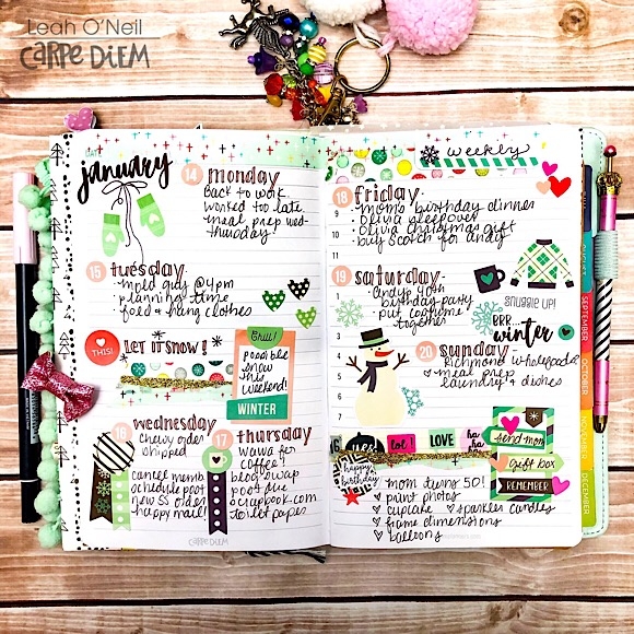
Because the daily insert is undated, one simple option is to use one day’s pages as a weekly view in between weeks. There are hours listed on the right page, but since the numbers aren’t super bold, I don’t feel the need to cover them up, although it would be easy to do so with a thin strip of washi tape. I like the ease of building my weekly view right into the daily insert I’m already using.
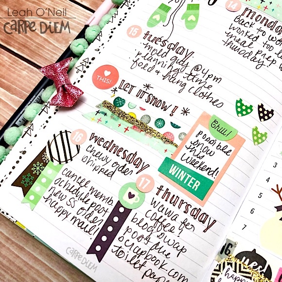
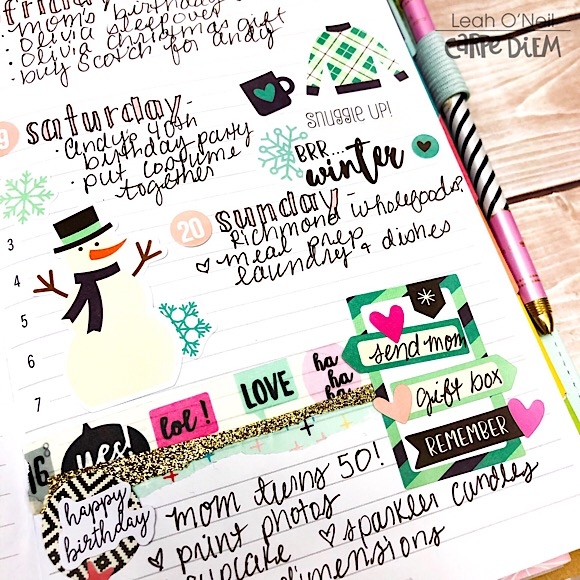
I used a lot of the January stickers from the A5 Seasons sticker tablet to decorate this layout. The color palette for January was pretty subdued with lots of wintery shades of blue. I really wanted to brighten things up by adding in pops of pink. I pulled a few pink functional stickers from my favorite sticker tablet, Planner Basics, to use on the layout. I tied the blues and pinks together by using a couple of my favorite colorful washi tapes that had similar blues and pinks in the design.
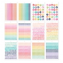
Carpe Diem Planners has a few basic sticker tablets that do not belong to any particular collection. What I love most about these tablets is just how flexible and functional they are. You get loads of stickers in each one and there are so many colors to choose from, so you will always be able to coordinate them with other sticker tablets or Simple Stories collections.
For this week’s layout, I decided to design my own weekly layout in a separate grid notebook insert. While this does mean my week will be in a separate insert from my daily planning pages, both inserts would still be right next to each other in the same TN which works just as well for me.
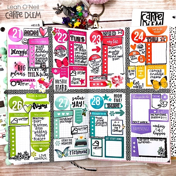
I created this simple layout by dividing two pages into 4 sections using thin washi tape. This created 8 total sections, one for each day of the week and one to write in tasks for the following week. I decided I wanted to go for a fun rainbow color scheme to decorate this layout so I chose a neutral black and white washi tape to create the boxes.
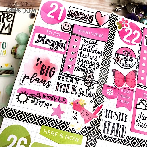
I really love that I was able to take stickers from the Planner Basics, Calendar, and Numbers sticker tablets and group them by color into the separate boxes on my layout. While these stickers are all more functional by design, I added a little whimsy to the layout with a few flowers, birds, and butterflies from the Hello sticker tablet that coordinated with the colors on my spread.
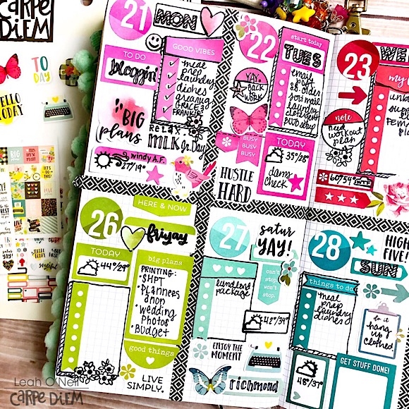
When using a bunch of stickers like this in a confined box, you can sometimes end up with little “awkward” corners or spaces between stickers where you know there isn’t enough room to write anything. To fill these spaces, I used some icons from the Get it Done and Seasons stamp sets. I decided to use black ink so that the stamped images and words wouldn’t compete with the colors.
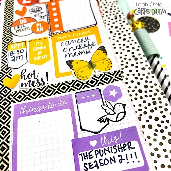
While there is a lot going on in this layout, grouping stickers together by color helps create some order. If I had used this many stickers in this variety of colors, shapes, and sizes without grouping them together by color, the layout would have had a much different impact. Everything would have been “floating” separately and the eye wouldn’t have known where to look.
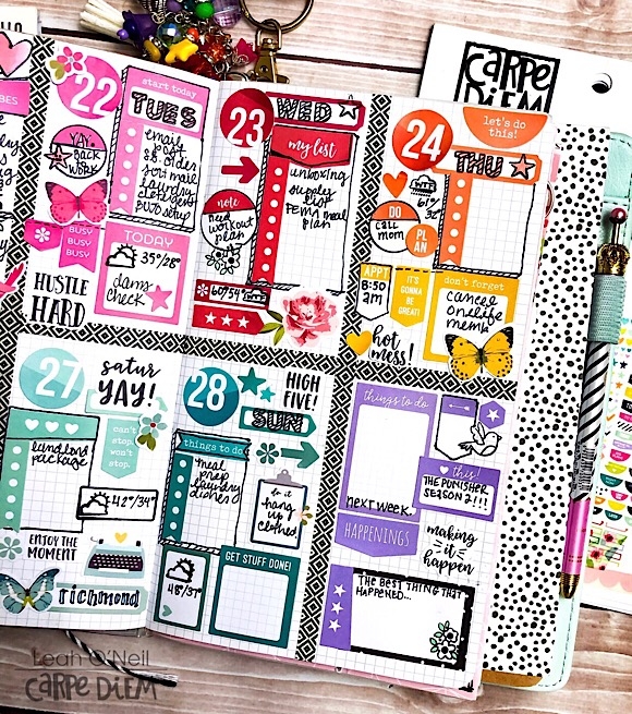
I decorated ahead of time this week, and since I’m going to be planning as I go, there are some elements that I repeated in each box to establish some consistency and to allow for greater functionality. For example, I have designated space for a checklist on each day. I also added the weather forecast. On days where I knew I had a scheduled event or deadline, I added a separate sticker to write it in so that I wouldn’t take up space under the checklist.
Do you have a set planning style/format that has been working really well for you? The search for “planner peace” can be a bumpy one, but unless you get really lucky, most of us don’t figure out exactly what works on the first try (or second, or third, or tenth…). Sometimes you just have to keep experimenting until something clicks with your brain. If you are not consistently using your planner, then that’s a good sign that your current format isn’t working for you. Don’t be afraid to switch things up and try something new, and don’t think you have to spend a bunch of money to do it. You can test out different formats in a single blank notebook using just a pen at first. The beauty of having these undated, customizable TN inserts is that I am not obligated to stick to one specific style or layout when planning. I can adapt my planner to my needs and change up my format any time.
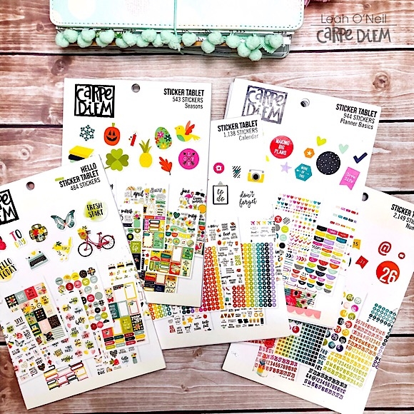
No matter where you go or where you end up, you cannot go wrong with the value and versatility you get from the Carpe Diem sticker tablets. They are flexible enough to transition with you throughout your planning journey.
Follow along with me on my planning journey over on my Instagram @sunny.leah. Until next time friends, happy planning!


