April 2016 Blog Posts

Hey there!  It’s Vicki here just popping in with a quick look at a DIY Stamp class I'll be teaching in New Zealand later this month using the oh so lovely Carpe Diem collection!!!

I love the teal, yellow, salmon and black color palette in this line.  Actually…I love anything with black in it.  And text…I love patterned paper with text!!!

Take a closer look at the fabulous icons in this line.  I loved them when they were introduced with the Carpe Diem planners and I think they are awesome for layouts!!  I used a mix of the Carpe Diem Fundamental Stickers and the Chipboard.

These are some of the stamps we will be creating out of craft foam in the workshop out … aren't they so much fun?  And super easy to make, too!  They complement the flowers you see in the Carpe Diem collection and those that I pulled from the stickers and the chipboard embellishments on the layout.

Thanks for joining me today!

Hello! Jennifer on the blog today to share two layouts I created using the Hero Simple Set. I have to say I do love using the simple sets because you have everything you need to create your project!  Of course I adore the bigger collections with more embellishments but the simple sets are a lot of fun.  I also really wanted to create layouts with Hero because of my military background!  
 
For my first layout, "Battle Buddies"  I cut the striped edges from the B-side of "Brave" and adhered to three sides of my white cardstock. I then lined the bottom of the page with pieces from "Loyalty" and "Courage. I love that the colors of Hero are the traditional red, white and blue along with grey and camo mixed in!   
 
 
I used the camouflage letter stickers from the 6x12 Expression Stickers for my title as well as accented with tiny heart and star stickers from the same sheet. 
 
 
Using my Silhouette, I cut different pennant shapes from the patterned papers and adhere under my photo. I love the star/circle stickers and they make a great accent! Here, I adhere a light blue sticker with a staple over two of the pennants. 
 
 
I'm a huge fan of creating banners so I continued with the theme across the top of my page. I stitched through with my sewing machine as well as added brads from my stash to create some depth.  Also, the cute little star stickers from the 6x12 Fundamental Stickers make cute accents!  
 
 
The Fundamental Stickers also include many fitting sentiments such as this "Basic Training" sticker. I also used a small amount of washi tape and wood veneer stars from my stash.  Lastly,  I added a few ink splatters to my background.  
 
 
____________

For my second layout, "Honor",  I adhered an 11x11 piece of the dark blue "Brave" onto the B-side of "Loyalty".  I also added a strip of the B-side of "Courage" as well.  And my layouts aren't complete without stitching and you can see I stitched around the edges. 


For this layout I wanted to utilize the Journaling Cards of Elements 1 and 2. I layered two of the 4x6 cards underneath my photo as well as a 3x4 card for my title and journaling.  I used the "honor" sentiment sticker from the 6x12 Fundamental Stickers over the heart as well as added a sentiment from the 6x12 Expression Stickers. At the top of my journal card, I added a star/circle sticker and secured with a staple. 
 
 
I also added two additional star/circle stickers to the edge of my photo as well as some bakers twine to accent.  
 
I typed my journaling on my electric typewriter and adhered it just inside my photo so that only three edges are shown.  Again, I added washi tape as well as a a wooden veneer star.  
 
 
​Underneath my photo, I used a star cut file from my Silhouette using white card stock as well a more ink splatters to accent.  
 
 
Thank you for stopping by today! I hope you will be inspired to document a patriotic event or even a loved one's military career! The Hero collection is perfect for both!  


Supplies

Good Morning!  It's Mary-Ann with a couple layouts to share with you.  Both are created with Life in Color.  It is pretty amazing how one collection can take you in so many different ways when creating.  

My first layout, I call it it Stop! Wait a Minute.... makes me sing that song!  Unfortunately, that is all I know of the song so lets just leave it at that!  My title on the page varies just a little but it is important to make people stop so you can document the moment.  The photos on this layout look so similar but if you look close, the expressions are completely different!  After you tell grown ups and boys to "say booger," they tend to smile.  It can totally change everything!


You can see from the photos below that I used the Chipboard Frames as design behind my photos.  These added texture, color and depth all at once.  I also cut up the Here & Now paper and used the polaroid sections for the base across my page.  They are layered and covered a bit, but they added quite a bit of color as well.


For my second layout, I used Life in Color as well.  I started with the photo on the lower center and went from there.  I added until I had the section down the middle.  I imagined this in my mind and it actually came out a little better than I thought originally!  I love it.  
 
 
Below you can see that I cut my title.  I did this because when it was across the page, it was a bit wide.  I cut it where you would in a sentence.  So it still made sense.  


It was a ton of fun to create this layout.  There are so many items that help decorate this collection.  The Bits & Pieces are my fave but I also adore the brads and Decorative Clips.  
 
Thank you for taking time to stop in today.  See you again really soon!


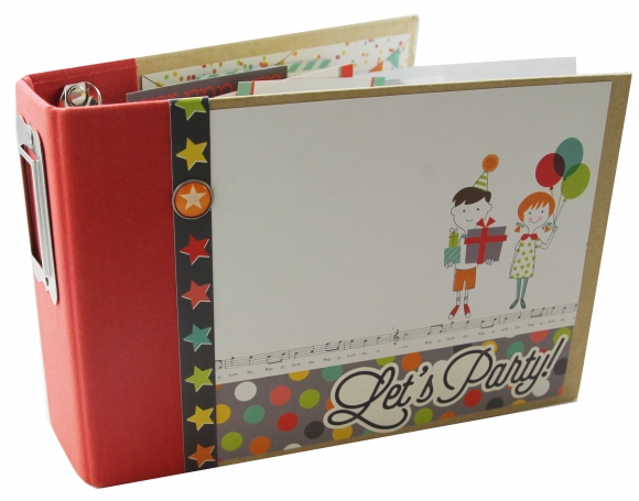
Howdy!  Today on the blog we're sharing a fun 4x6 SN@P! Binder created by in house designer Sue Kendall using our Let's Party collection.   

Sue created this fun project to document one of her son's birthdays, but the collection is neutral enough to document either a boy's or a girl's birthday -

The collection has lots of great traditional birthday icons and fun glitter accents.  Even better - the glitter is just part of the paper design, so you have all the fun look of glitter without all of the mess!  

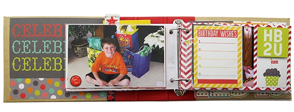
The 2x2 pockets in the 4x6 SN@P! Binders are some of our favorites!  Sue made great use of them in this spread - mixing 2x2 cards to spell 'happy' alonge with different chipboard pieces, die cuts, and tickets - such a fun look!  

The cow that makes an appearance in the Let's Party collection - he's one of our favorites!!  :)

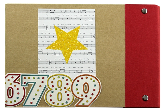
When working with our SN@P! Binders, dont forget about decorating the backs!  Sue made great use of the 12x12 sticker found on the Element Sticker sheet - she started it on the inside of the back cover and wrapped it around to the back cover; the birthday candles sticker is the perfect accent!

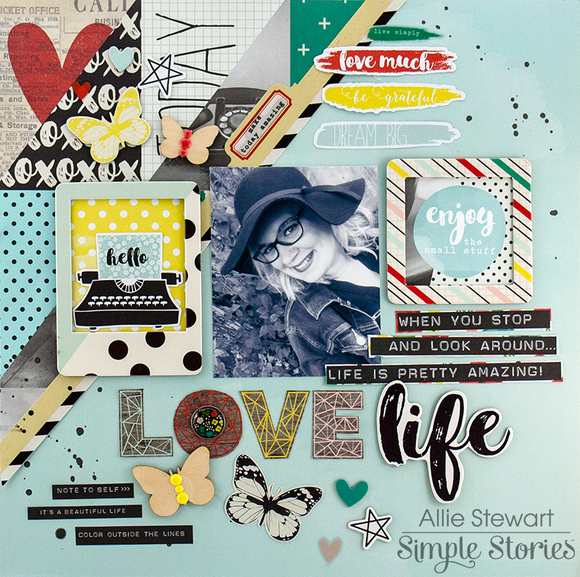
Hello there, it's Allie here today! Today I have two layouts to share, one using the Life in Color Collection and one with the Heart Collection. These collections are both so beautiful and versatile, and they are great for mixing and matching with each other!

For my first layout, I used the Life in Color collection. I love the string-art printed "LOVE" and wanted to use it for my title. There are lots of fun quotes and phrases about living life in this collection, and so I built my layout around the theme of loving life.


To create this layout, I cut the Happy Little Moments paper at an angle and placed it on the teal watercolor paper. I used a black and white photo to match some of the black and white elements throughout the collection, and placed it in the middle of the layout. I kept adding embellishments and bits and pieces until I could add no more!


One of my favorite parts of this layout are the beautiful butterflies! I used chipboard, wood veneer, and metallic die-cut butterflies.


Finally, I finished the layout with some splatters of black mist! For my next project, I used the Heart collection. It is a truly lovely collection, and unique in that many elements are specific to a loved one you have lost. It isn't, however, limited to that, and can be used for a variety of themes! I created a layout about my pup and husband using the beautiful love elements.
 
 
I used my Silhouette Cameo to cut out the background for this layout, then backed each opening with a patterned paper. Next, I used a doily to anchor my photo and title. I embellished using the Heart Fundamental Stickers, as well as a few items from Life in Color!


I love the giant "LOVE" stickers!


I finished the layout with mist splatters and heart stickers throughout the page. I had so much fun using these collections, and I hope this inspires you! Thank you for joining me today!

Supplies

Hello dear Friends! Alexandra here with a new pocket page spread for Simple Stories and I am continuing with the Life in Color collection. 

I like how the touches of primary colors make me think of Spring...

I included the public library receipt of the books miss Lily borrowed. That is fun and priceless info right there! 

And speaking of the Miss, she was kind enough to draw me this little frog as a marker of the leap year.

This page is mostly about the weekend. I did not witness the Polar Plunge (although every year, I think to myself "that is something I would love to do once!") but I enjoy documenting it with pictures found on the internet. Lady Gaga and her fiancé did it for the second time in a row. I didn't do the plunge because I was busy eating doughnuts! No, not really, but we did have a little get-together for the miss and her girlfriends at Glazed & Infused

Beside the photos of what is blooming in the kitchen, a cool mural in Lincoln Park and two dishes I made in the slow-cooker (Seafood Chowder and Moroccan Lamb) I made a pocket with two pieces of printed papers. I can add more journaling this way or more receipts which are a great source of information. I also included a picture of "moi" with the new spex because, why not, and one day maybe I will look at it and think "Gee, I was still so young!". Thanks for visiting and taking the time to leave a comment. I really appreciate it!

Hi planner friends!  Vanessa here with you today to show you how I set my Robin’s Egg Carpe Diem planner for April and a couple of new accessories from the Life in Color and Carpe Diem collection.  In my last blog post for March, I showed a very easy tutorial on how to make a pocket folder for your planner, but I wanted to try one of the Carpe Diem A5 Pocket Inserts since all of the work was already done! 
 
 
I really like all three of the pocket inserts in the A5 Pocket Insert pack and the floral one stood out the most for my April set up.  The folder is very sturdy and it’s perfect for storing the number cardstock stickers I always use and a quick place to store receipts.  You could definitely use more than one of the pocket inserts throughout your planner as a divider or place it in the back if you’d rather see your dashboard first.  I decided to keep mine in front and added one of the cute Carpe Diem dashboard inserts to dress it up.


For my first weekly spread, I like to keep it simple at the beginning of week and decorate using of mix of patterns and bright colors.
 
 
I included a few of the Life In Color Expressions Cardstock stickers for a little motivation throughout the week.  The stickers are not too thick and won’t bulk up your planner.  To make the number cardstock stickers stand out, I made little flags from the Life In Color washi paper tape.
 
 
One of my favorite Carpe Diem planner accessories is the Sticky Notes Bookmark.  It’s so convenient to have, but for April I wanted to make my own with the Life In Color cardstock.  I simply traced around the Sticky Notes Bookmark, punched it with a paper punch, and cut small notches into the holes.  I added a small number of the sticky notes to the bookmark and and dressed it up with some adhesive Bradz and Bits & Pieces from the Life In Color collection.  
 
 
If you want to make the bookmark stand out more, you can glue a small ephemera piece like I did using the Carpe Diem planner ephemera pieces. 
 
 
To me, paperclips are always a staple in my planner and the Carpe Diem Planner Bits & Pieces make super cute planner clips.  I took a couple of my favorite pieces and used a strong adhesive to attach to the paperclip and that’s it!  They look cute peeking out of your planner and make it easy to find the page your looking for. 
 
 
I hope you have fun making your planner clips and bookmarks from any of the Simple Stories collections and have a happy Spring decorating in your planner! 

Pages