April 2016 Blog Posts

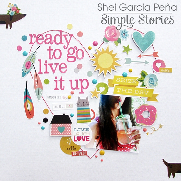
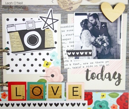
Hey there, friends!  Missy back with you today.  I have two fun layouts to share, and I used the Life in Color collection for both of them.  I love the mix of black with all the bright reds, yellows and teals, and my first page shows how using black cardstock as a background really makes those bright colors pop.  I love scrapping everyday moments, and these photos are of my daughter and her Papa.  She has always loved for him to swing her around, and she just laughs and wants him to keep doing it.  These simple things are such a joy to watch!  I began by using an old gift card to smudge some light blue acrylic paint on the black cardstock.  It made a nice base for my photos and paper frames.  It also added another pop of that gorgeous blue!  You can see how the dark background really enhances the colors.

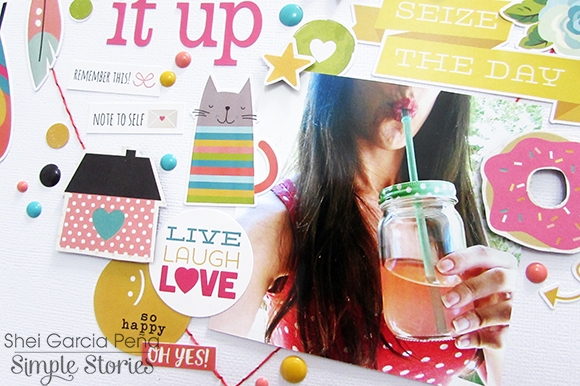
To create the word “snapshots,” I used lots of the Washi Paper Tape.  I adhered strips all the way across a sheet of white cardstock and then ran it through my Cameo.  It cut right through the paper and the tape.  I love how it turned out!  I paired this muli-colored and multi-patterned title with some of the smaller alpha stickers and some fussy cut letters that I cut from patterned paper.  I stitched through them with my sewing machine for added interest and texture.

I also added in lots of tangled thread and used a few die cuts as well.  I fussy cut this cute frame with the camera from patterned paper and added a brad to the center.  The floral die cuts look so cute layered with the paint strokes.

Here you can see how cool the paint looks on the background.  I added a bit more interest with some stitching.  The great thing about using a card to smudge paint is that it dries pretty quickly.  I added some pop dots to this XOXO to create some depth.

Here is the bottom of the page.  I created a cluster using paint, paper, washi tape, fussy cut flowers & leaves and thread.  I wanted to bring all the colors & elements down to the bottom of the page, and creating a cluster like this is a great way to do that.

************

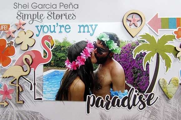
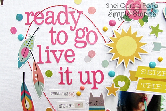
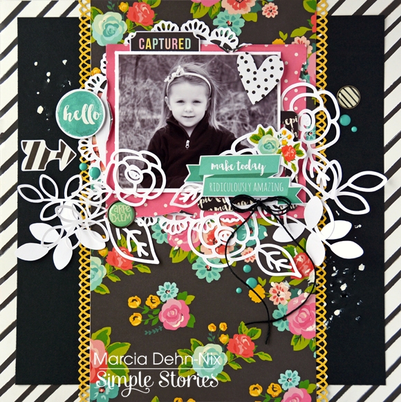
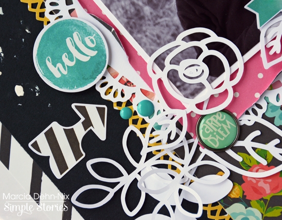
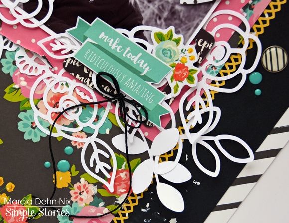
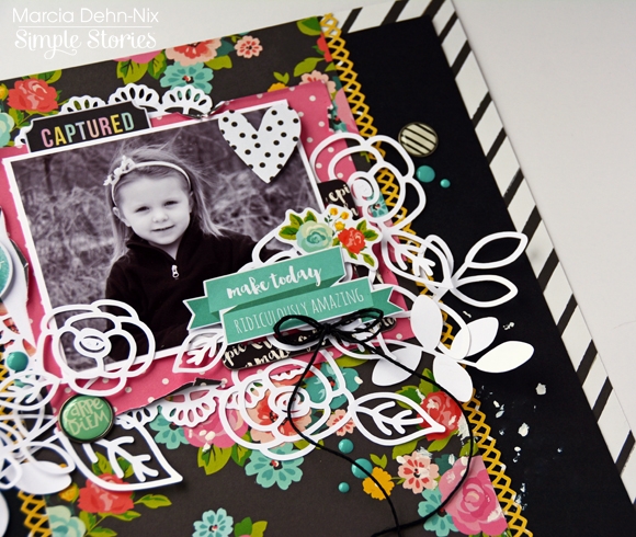
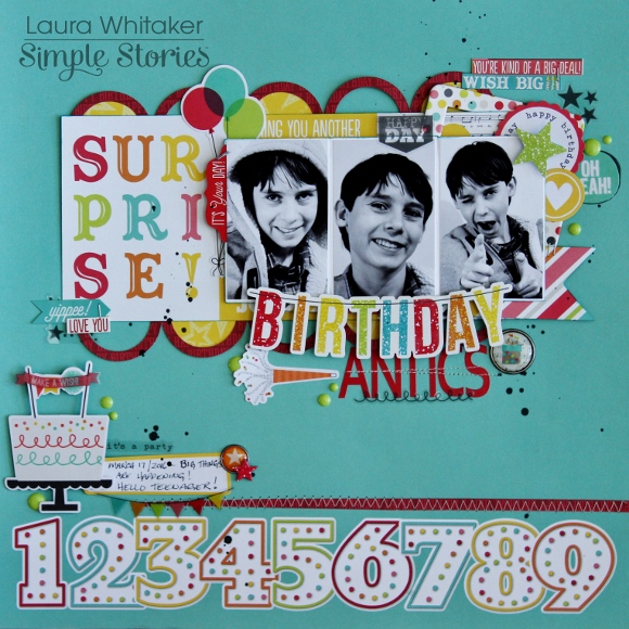
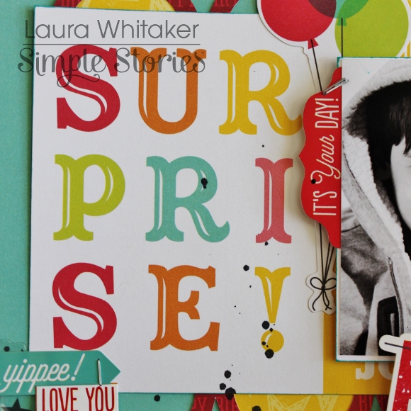
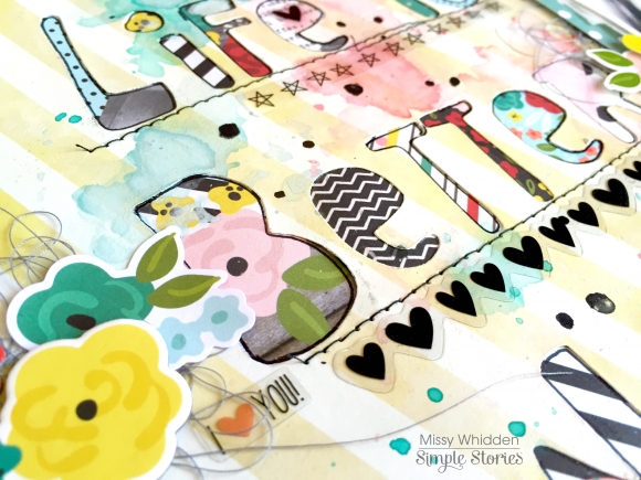
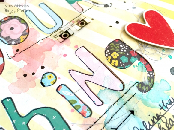
One of my favorite techniques is backing a cut file with patterned papers.  I have done this technique before, and I love it so much that I keep coming back to it.  I read this fun quote on one of the patterned papers in this collection, and I decided to make it my title.  I chose a fun font in my Silhouette software and created a really big title that took up most of my page.  I cut it out and backed it with a lot of the 6x6 Paper pad.  I love the variety of smaller patterns, and there are so many fun colors and designs to choose from.  I got such a fun look from doing this!  I smudged some white gesso down over a lot of the page and then came in with a few watercolors to create a messy look.  I love this beautiful yellow & white striped paper, and it made a wonderful light background for all those bold colors.

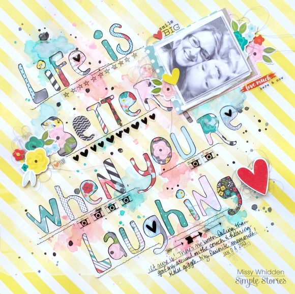
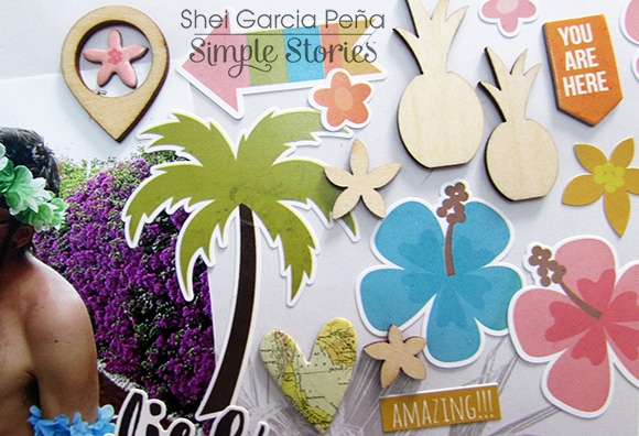
Here you can see a lot of the detail of the layout.  The watercolor is a fun touch to add, and I had lots of fun getting messy with the paint.  After it dried, I traced each letter with a black pen to make them stand out a little more.  I also used several of the clear stickers on this page.  They are the perfect touches in between my title words.  I also combined some chipboard pieces with stickers and die cuts.  They layer together very well.

Here’s another shot of the background.  This lighter background paper (plus the white gesso) really makes the paints and the papers jump right off the page.  The striped paper is still neutral enough to be a background without being overly busy.  Simple Stories always has such a great variety of papers; they do a great job of mixing solids with patterns.

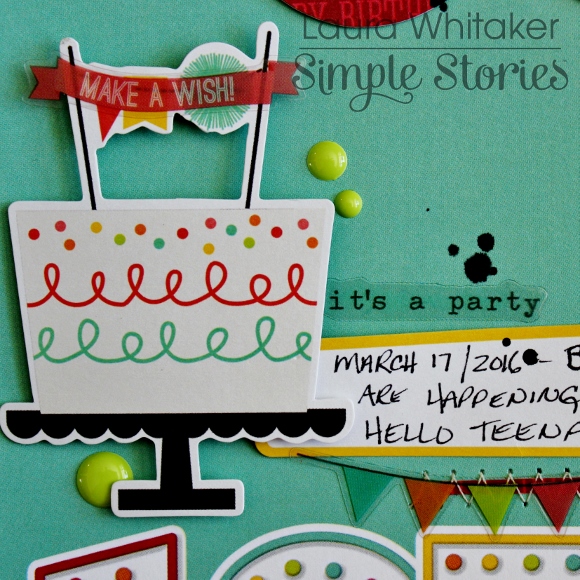
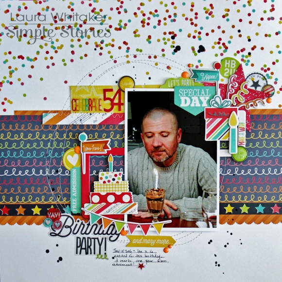
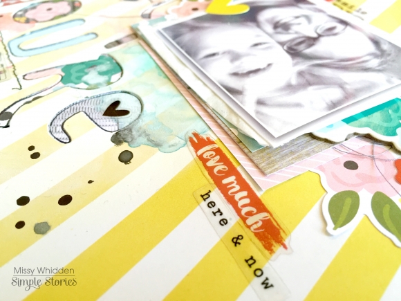
I used a few Snap! Cards as layers behind my photo as well as some tangled grey thread.  I added some stickers here, too.  I think adding stickers or small die cuts on top of the photo can create a great effect, especially if the photo has white space.  My photo really doesn’t, so I just layered this heart on the edge so it doesn’t cover up anything important.

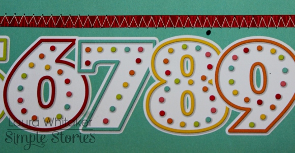
I think I could use these awesome clear stickers on every layout!  They are so versatile, and they show up so nicely on just about every color paper.  They make great accents.  I finished this layout off with some black in splatters.

Thank you so much for stopping by today!  I hope these projects have given you some fun ideas to try!

Hi there!  It’s Shei here today. I’m so happy to be back on the blog sharing two layouts.  Let’s get started!

For my first layout I decided to work with the tropical “You Are Here!” collection.

I started with “Paradise” paper as a background. I really love to use light papers as my background and add color with the embellishments. So… I did it!

I used a colorful pic that contrasts with the background. It was taken during the birthday pool party of my friend Anna. It was a very happy celebration and, as you can see at the picture, we ended up wearing as authentic Hawaiian Hula dancers. 

Then, I added different elements forming a diagonal strip in the center part of the paper. I used embellishments from the Fundamentals Cardstock Stickers and some Woods Veneers: flowers, arrows, hearts, palm tree, pineapples, flamingos, camera… Simple Stories gives a lovely variety of embellishments and them bring colorful to this area of my project. I love all of them! So, I’ve repeated this process at the top and bottom.

Finally, I have titled my project “You’re my Paradise” using the blue abc and the word “paradise” from the Expressions Cardstock Stickers.

************

For my second layout I chose the fun and coloful “Carpe Diem” collection. I’m totally in love with this line!!  I’ve started to sew a heart with red thread in the middle of a white cardboard.

I’ve used a cool photo of me, drinking delicious cherry lemonade. Yummy!! I titled this layout “ready to go live it up” using the pink alpha from expressions cardstock stickers. 

Simple Stories’s embellishments are so cute that it’s very difficult to choose from… So I added many embellishments from the chipboard stickers and the fundamentals cardstock stickers. There are also many fun and cute models, different shapes and bright colors to choose from. My layout includes: colorful feathers, hearts, dots, flowers, stars, a great donut, a sun and the lovely cat and dog... I love all of them!! Finally, to give a bit more dimension to my project, I added some enamel dots of different colors, and that's all!

Thank you so much for taking the time to read my post! I hope you enjoyed my layouts! See you next month!

Never stop smiling! Kisses!!

Supplies

Hi Everyone! This is Jennie and today I’m sharing some pocket pages using the super gorgeous Carpe Diem Collection! As you can see in these pages I like to write and embellish directly on my photos. Many documenters use apps (which I use once in a while too) but I prefer things that I can touch.

I’ve been very into lettering lately so I’m documenting my progress. I change hobbies very often so it’s good to document my latest obsession. They are also good fillers for slow weeks.

This doggie from the Carpe Diem Sn@p Pack is my spirit animal. I also love that this card has a space for a title. The Icon Stickers are geared towards planners but I can stop using them! I love small elements like this to add to my layout. I’m the kind of scrapper who loves clusters and sometimes I go overboard but tiny stickers like these make me feel like I added enough without looking too cluttered. The labels in this pack are also good for stamping on the dates.

My daughter got a sticker at school for being student of the week. She loved it so I slipped it in my pocket pages so I could add it to the album later. When I opened the album I noticed how nice it looked on the back of that card from the Let’s Party SN@P! Pack so I decided to use the back of that card from the previous week. You can see it HERE if you want to see that layout.

I often have to control myself so I don’t put 20 stickers in one photo. My favorite ones to use are the Word Label Stickers! There are so many phrases that are perfect for my photos! You could also use them in your planner or cards.

Have your tried the Photo Flips? They are AMAZING! Now you don’t have to leave a photo or that cool card you wanted to add to your layout because you ran out of space! I really wanted to journal about that day so I used a 3x4 Photo Flip.

I like to use my typewriter to type directly on my photos but some days my brain won’t help and I make a bunch of mistakes so I typed my journaling on a piece of cardstock and cut out the strips to glue onto the photo. Since I can’t seem to place my alphas straight I always bounce them like these, one up and one down so I don’t have to worry too much about them being perfect. I love that the Expressions Cardstock Stickers have different sizes. The bigger ones are great for titles and the smaller ones for photos of to add interest to your title.

This week my daughter was student of the week and she came home with a little book of drawings and notes her classmates wrote about her. For my girls’ drawings most of the times I take a photo and I add the photo to the pocket. These were too special and I honestly couldn’t pick my favorites from 20something so I cut a 12x12 sleeve and put it there. Since I want to embellish all the things I added a little cluster to the sleeve.

That strip of washi from the Fundamental Cardstock Stickers came handy because when I was sealing the sleeve I kind of ruined that side so I hid it behind the stripe.

I hope you enjoyed these pages and found some tips that will help you document your life in a fun and easy way!

Supplies

Hello again! Leah here to show you how I have revamped my Carpe Diem planner for the Spring season! Despite the persistent cold weather that keeps popping up in Virginia, I find that the calendar start of a new season always inspires a fresh start/change, especially Spring. I have been using the Carpe Diem collection in my planner the last few months but in the spirit of the changing season, I felt compelled to give my planner a Spring makeover. The Life in Color collection is one of my favorites by Simple Stories right now! I have been hoarding this gorgeous collection, but it is time to put it to good use. Something about the bold colors and woodgrain and florals just feels so right to transition my planner into Spring!

First things first, I need to update the front pockets! I used pieces from the Life in Color SN@P! Pack, a couple tags and other ephemera from the Bits and Pieces pack, as well as a few stickers from the 12x12 Fundamentals cardstock stickers sheet. If you are curious how I get the large decorative piece to sit over the top of the bottom pocket like that, you can see how I did it here in a previous blog post. 

Next, I wanted to create a custom dashboard for the front of my planner. I recently received some of my wedding photos from our photographer and I am so smitten with them! So I decided to incorporate some memory-keeping into my planner. I cannot put into words how happy it makes me to open up my planner and see such a special memory in my life highlighted front and center.

For this dashboard, I used the 12x12 “Here and Now” paper from the Life in Color collection. It has these darling picture frames on it that were so fun to decorate and perfectly framed the photos I wanted to display. I chose a couple of my favorite black and white wedding photos, resized them to 2x2” and printed them out onto photo paper. I then trimmed them down to size, leaving a very thin white border to help them pop out against the colored backgrounds within the frames. I purposely chose black and white photos so that the bold colors of the Life and Color collection would provide a contrast that allowed the photos to really stand out.

Zooming in, above you can see where I have pasted the photo within the left frame. I punched out a file tab and stamped my wedding date on it and added a few stickers to embellish the photo. In the frame on the right, I glued down a 2x2” square piece from the Life in Color SN@P! Pack, added a floral sticker, a strip of washi paper tape, and a lovely ampersand from the Bits and Pieces Pack.

On the bottom half of the layout, the camera and star in the left frame are also from the Bits and Pieces ephemera pack. The Scrabble letters are stickers from the 12x12 Fundamentals Sticker sheet. I mounted the letters onto colored squares so that they popped off the page a little more. In the right frame, I glued down another square piece from the SN@P! Pack behind my photo. I like how the typed text pattern compliments the other romantic details of this layout, like the wood veneer heart and the washi paper tape with hearts.

I carried the collection further into my planner by dressing up my April monthly inserts. The Life in Color collection has a Planner Set that is made to fit a 6x8 binder, but I trimmed the inserts down (on the side with the holes) to fit into my Carpe Diem planner and then punched new holes. I trimmed off a decent chunk of these inserts so I will not be using the calendar sides of the pages. I glued the sides with the calendar together so that now, just the images are showing on each side. I basically created a sturdy monthly divider. I like the monthly tabs that come on the Life in Color inserts, so although I am still using the monthly inserts that came with my Carpe Diem planner to plan out my month, I cut the monthly tab off the Carpe Diem insert so I did not have two April tabs.

Of course I had to add some decoration to the new divider. So I added a 3x4 card from the SN@P! Pack, some washi paper tape, a floral sticker and a couple wood veneer stars.

At the beginning of every month in your Carpe Diem planners, there is a monthly planning sheet. I want to show you how I use mine. You can see here where I have pre-decorated this page so that I can go back later and add some journaling and memory-keeping for April. The SN@P! Pack cards fit perfectly in the sections of this sheet and I have retitled a few sections by simply covering up the titles that were there previously with embellishments and word strip stickers. I also used washi paper tape, enamel dots and several Life in Color stickers.

I have enjoyed walking you through my Spring planner setup using the Life in Color collection! Check out my Instagram for more details and photos of how I am using these products. Stay tuned here on the Simple Stories blog and social media to catch a glimpse of all the exciting new products coming soon!

XoXo

Hello everyone, Marcia here! I am so excited to share some Carpe Diem layouts with you today. This collection is gorgeous with those bright colors mixed with the black and white pattern papers. 


For my first layout, I really wanted to make a pretty, girlie scrapbook page that showcased the beautiful floral pattern paper. The title for this layout Make Today Ridiculously Amazing comes from one of the Bits & Pieces elements. It really goes with the theme of this collection, Seize the Day. Take a look ...


I used a piece of black cardstock as my background and used the diagonal pattern paper as a border. I think the black really makes those bright colors pop. I softened the look with a white die cut doily and also some white die cut leaves and flowers, Sprinkled amongst the die cuts are some Carpe Diem Bits & Pieces, Bradz and Enamel Dots.


A Chipboard Frame tucked in under the lower right of the photo helps to frame it. There are lots more Bits & Pieces here along with more Bradz, Enamel Dots, and a sweet little twine bow.
 
 
With so much layering at the top, I left the bottom half of my layout clear of embellishments so you can really appreciate that pretty floral pattern.
 
 
************
 
For my second layout I wanted to showcase the fun side of the Carpe Diem collection and I mixed in a piece of yellow from the Life in Color collection. This one is titled Shine Bright. What could shine more than the sun? so I added a big die cut sun on my layout.
 
 
I love adding machine stitching on my layouts. Here I stitched the sun rays.
 
 
A Chipboard Frame made a nice frame for my photo. Look how fun this chipboard lightbulb is!
 
 
I love layering the 4x6 Element pattern paper pieces. This one had an adorable quote choose to Shine. My title Shine Bright is a combination of a Silhouette die cut and the Carpe Diem alpha stickers. 
 
 
Thanks for stopping by today. I had so much fun playing with this collection. I know you will love it too. 


Supplies

This month I wanted to incorporate the new Heart Simple Set into my Carpe Diem planner.  Although the line was made to document our loved ones that have passed, the patterned papers and some of the stickers are versatile enough to use on other projects as well.

I wanted my monthly divider to match my layouts for the month.  I cut down one of the patterned papers and adhered it on the top of the existing April divider.

Then I added a recent photo and embellished with stickers.

I carried the same color combination from my monthly divider over to my monthly layout.  The weather is warming up where I am so I loved that the flowers gave this layout a little bit of Spring!

The first week of April was a busy one.  There were a few days that we didn't have any set plans, so I filled in the empty space with journaling afterwards.  I also added a few of my favorite photos with chipboard frames to finish my layout.

Supplies

Hello scrappy friends!  It's Laura here today sharing two layouts using the super fun and whimsical Let's Party collection!
 

BIRTHDAY ANTICS

My first layout documents my youngest son's most recent birthday, he became a teenager last month!  He is my last teenager, and therefore he was my last little kid - that is just a little sad for this mom.

I can't tell you how much fun I had playing with this collection!  I let the playfulness of the patterned papers and embellishments guide me through the creating process.
 

I love graphic look of this patterned paper and wanted to be sure to highlight the numbers that run across the bottom of it, so I stitched a scrap of red paper above it to frame it in.
 

Which created a great spot for this embellishment cluster and my journalling.
 

Once that was done, I worked on creating some layers to frame my photos, front and centre.  I started by die cutting this circle element.  I kept some of the circles to flip and adhere into every second opening.  These colour play so nicely off of one another and are so perfect with my black and white photos!
 

On top of the circle element I added a strip of 3x4 cut-a-part card to anchor my trio of photos, which were popped up a bit so that I could nestle some embellishments behind them.
 

I love that some of the elements look as if they are glittery, and the clear stickers with black graphics help to anchor my black and white photos.
 

I layered a large sticker element with some alpha stickers to create my title, then I did some more machine stitching to add texture to my page, of course another embellishment or two helps as well! The very last step on this page was to sprinkle on some black Mr. Huey's mist.
 

CELEBRATE 54
My second page is all about my husband, he was so excited to turn 54, which put him one year away from retirement and now the countdown is officially on!
 
Again I kept my patterned paper layers pretty simple, choosing to pull the grey tones from the collection for a bit more of a grown up look, while still maintaining the playful nature of the collection via my embellishing.

After running some strips of patterned papers in a variety of sizes, vertically across my page,I machine stitched some messy circles. This created the perfect focal area for my photo.

 
I used some chipboard frames to "catch" some embellishments.
I have created text in three areas so I suppose any of them really could have been the title for this page, but I am going with this clear sticker combined with number stickers as my official title.  I just love the variety of fonts and styles of these products, and the clear stickers are magic layered over patterns.
 
The cardstock stickers, clear stickers , and chipboard stickers layer up so nicely with each other and the ephemera pack.  There is something for everyone in this collection, or if you are like me you might just have to play with it all! 
 

Thank you for visiting!

Supplies

Good morning and thank you so much for stopping by here today. My name is Brenda Smith and I wanted to share with you the first half of my year-end review I made for my 2015 pocket page album. 

Life in Color is absolutely perfect for this spread because of those watercolor month cards from the SN@P! Pack. How could I not use them? I also used some alphabet stamps from my stash to reiterate the month. 

This spread is obviously a double page 12x12 spread but what might not be as noticeable is that there is also a 6x12 insert in the middle of the two larger pages. I made this insert from Simple Stories 12x12 protectors by simply trimming of the unwanted pockets using my paper trimmer. 

 
The middle insert holds the journaling cards that correspond with each month. So the top card of the insert is the journaling for January, the middle is for February, and so on. Placing the journal cards like this really gives the spread continual horizontal movement. 
 
 
For my journaling, I didn't worry about going into too much detail because all the details are already in the rest of the album. I wanted this to be primarily a recap but also a place to store cute little snippets the kids did or said that didn't get a place in the album otherwise. 
 
 
The photo collages were made in Photoshop. I left one blank spot in the collage, saving that spot for embellishment. I chose to make most photos black and white so as not to overwhelm the spread with too much color. But I did colorize the photos that I thought were best representative of the month to make them stand out a little more.
 
 
The 2x2 Life in Color chipboard frames were the perfect accessories to the photo collages. They add a little dimension but are not too bulky. The labels with the month names are fussy cut from a 4x6 card in the Life in Color Sn@p pack. One of my favorite techniques is to look at journal/filler cards for embellishments that can be cut out. You can stretch your supplies quite a bit in this way. 
 
Thank you again for taking a look. Have you ever made a year-end review in your pocket page albums? Link us up in the comments! 

Pages