January 2015 Blog Posts

Hi everyone, Wendy here today sharing some Magic Moments using the new Say Cheese II collection.  I loved the first Say Cheese collection, it holds a special spot in my heart, so this new collection made me so happy!  
 
 
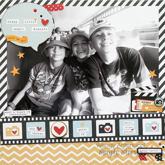
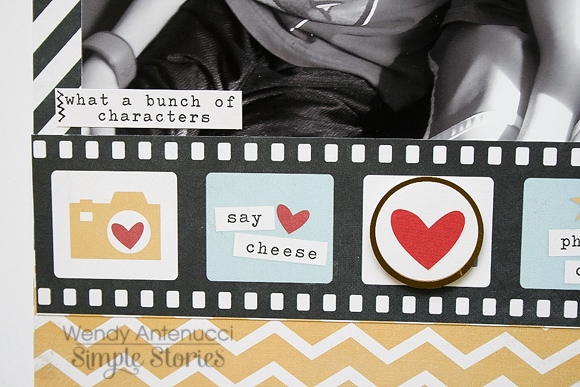
The first layout I made, Happy Little Moments, began with an oversized picture, not my norm, and a black and white at that.  (I printed the photo from my Canon printer.)  Since the photo was the focal point of the page I chose to keep my page rather simple; not a lot of color or embellishments.  I used the film strip border to rest my picture on and I tilted it for a little bit of fun.
 
 
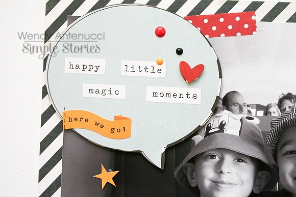
I added a pop of color on the bottom of the page and then I began to embellish my layout.  Since there was a lot of blank space on my photo I chose a word bubble as my title that I fussy cut, I added a few sprinkles and pieces to dress up the bubble. 
 
 
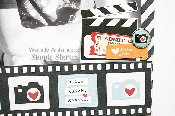
I did an embellishment cluster at the bottom of my page to draw the viewer's eyes through the layout.  I chose other photo type die-cuts to layer, the new self-adhesive Bradz which I love, and a clip to build my cluster.
 
 
Oversized pictures don't need much to dress them up, but the pieces included in the Say Cheese II collection are perfect for giving anything the WOW! factor.


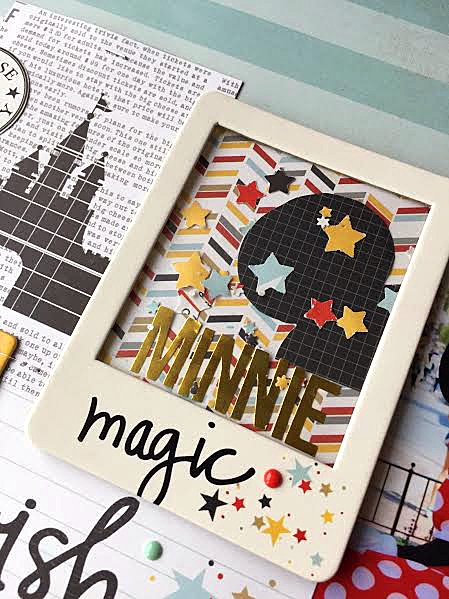
My next layout, Believe, originated with my picture and the I'm All Ears paper (NOTE - this paper was a pre-production sample so it doesn't have the gold foil on the ear!).  I wanted to have the two nestled up to each other and so I actually fussy cut the Mouse ears from the paper and slid my picture underneath.  To further accent the ears on the paper I used my sewing machine to ouline the mouse.
 
 
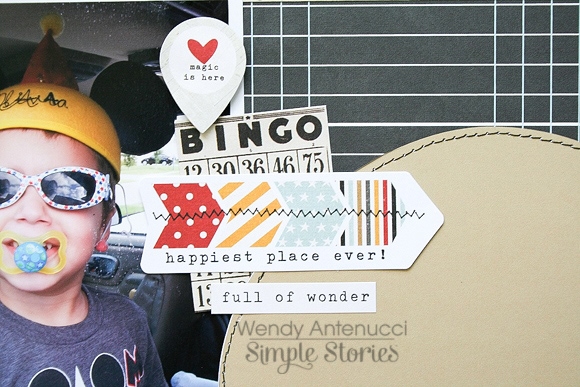
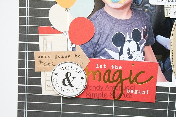
I didn't want to clutter up the Mouse ears on the paper so I again built embellishment clusters at various spots throughout my page to lead the viewer's eyes around.  I chose a few pops of red to use in each of my areas to bring color into my page, staring with the "Let the Magic begin" piece.
 
 
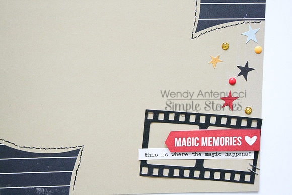
My Mouse ears needed a little excitement at the bottom of the page, so again I chose a red piece to start my cluster.  A leftover photo frame from my other layout and a few well placed sprinkles and stars connected the left top of the page to the bottom right further uniting my layout.
 
 
The bright colors and fun magic designs make this a great collection to create with whether you have "Mouse" pictures or not, it just shouts fun! 

Supplies

Hi all!

Teri here, and I'm excited to share with you some cards I created with Simple Stories' s Enchanted collection.  I've been trying to get a jump on my Valentine's Day cards. As much I love red and white cards, I really wanted to make some cards this year that had a non-traditional Valentine's Day color scheme so I pulled out the Enchanted collection. With castles, hearts and frogs, I think this collection has some really cute elements that work for fun and cute love-themed projects.
 
 
I must admit that I really love the collection's SN@P! Cards. Gosh, who am I kidding? I love all of Simple Stories' SN@P! Cards. They are such a versatile product. They are great for scrapbooking and memory keeping projects, but they also look good on greeting cards!
 
 
For this card, I took a silver foil heart SN@P! card and embellished it by adding a chipboard heart, a strip of Washi Paper Tape and a few die-cuts and enamel dots. 
 
 
To make that banner really stand out, I adhered it with foam tape. I love doing that with die-cuts. I really dig that extra pop that foam tape adds. 
 
Here are a couple more cards I created with the collection's SN@P! Cards. For each of them, I embellished the cards just slightly by adding some chipboard shapes and enamel dots. 


The frog on this SN@P! Card sure made me chuckle. I wonder if he'd turn into a prince if you kissed him! Wink! 
 
 
So I kinda just ran with that whole kissing thing and added a few die-cut hearts to look like they were coming from the frog! And the "I believe in fairytales" sentiment? Believe it or not, it's a Washi Tape Sticker. I used my scissors to cut that phrase off of a longer sticker.
 
 
For this card, I placed the castle SN@P! Card underneath a Chipboard Frame. I customized the frame by adding the purple Washi Tape Sticker and a blue Bradz to it.
 
 
I used another Chipboard Frame on this guy. This time, I customized the frame by adding a few enamel dots to it. 
 
 
I think it turned out pretty fun!
 
 
Thanks for stopping by today! I'll see you again real soon!
 
Enchanted Washi Paper Tape - 4435

Supplies

Hi there Simple fans, Nancy here today with a look at the brand new Say Cheese II collection. The red, yellow, white and slate blue palette is one that I love and find myself reaching for again and again. It definitely has a theme park feel, but I’ve found that on second look it’s definitely versatile!

I began this page with one of my favorite photos and an idea for a shaker box.  I used a chipboard frame from the Say Cheese II collection, stickers, star punch, patterned paper and a transparency to make a custom embellishment that adds movement and a punch of color to the layout.

To add texture, I used a sewing machine to attach a chipboard frame to the layout. Placing a plastic clip in the center of the frame adds dimension and a bit of a ‘flap’ to the area.

Say Cheese II is a practical collection that goes a long way. Here I used to scrapbook a layout about  a cruise vacation. The bold colors compliment my photos without overpowering them.

To add a subtle title, I used a tone-on-tone effect with white lettering on a white background. I used a sewing machine to underscore each word in the title. This draws attention to the title and texture to the page. The overall design is a simple grid that came together very quickly. It’s a design that I use often when I’m stumped for ideas.

I hope you’ve enjoyed this peek at my favorite release this Winter – Say Cheese II!

Supplies

Hi Everyone, Marie here today to share a new Life Documented project using the new I AM collection. I decided to change things up this year and switch to a 6x8 album to document our everyday moments.

I love the look of mixing different size pages and dividers within an album. The I AM collection has a lot of premade dividers, envelopes, and tags of different sizes and shapes.  To carry it one step further I trimmed off the final column of one of the 2x2 page protectors to add even more variety to my album.

I tend to focus on my kids a lot in my albums, so for these first few pages I made sure to document the things that I'm doing right now.   It was a good challenge for me, and the papers and embellishments in this collection really lend themselves to that.

The last couple of pages are about what I am reading/watching right now, and also what I am doing which is mostly a lot of organizing.

I hope you've enjoyed a peek into the start of my 2015 album.  Have a great month!


Supplies

Hi y'all! Suzanna here today for the first time with Simple Stories to share with you two layouts, each created using one of the three new collections released at CHA recently.  Amazing, aren't they, the new collections?! I can't decide which one I love most!
 
I AM... eternally grateful. This collection, the I AM... collection is perfect in so many ways; the colors, the sentiments, the ability to scrap you or use it to diversify.  I opted with a combination of me and diversify by scrapping a friendship.  I met Christine via scrapbooking and though we live hundreds of miles apart, we have an amazing connection.
 
 
The floral paper is just perfect for fussy cutting, something I am known to do a lot of. It's easy fussy cutting, take it from me.
 
 
For the title of the layout I combined the amazing chipboard stickers with stickers and letters that I cut using the smaller designs in the 6x6 paper pad. The shimmer of the gold in this collection is sure to please! I know I want more! A lady can never have enough gold, right?
 
 
The I Am collection has so many fantastic bits and pieces to it. It doesn't matter if you are a traditional layout scrapper, card maker or pocket scrapper, there is something for everyone!


Today's second layout, Magic, uses another of the new collections, Say Cheese II. Just perfect for our Disneyland Paris pictures! No matter where you are, Disney and Disney! Though I have only used the Say Cheese II collection in this layout, it is indeed, the perfect compliment to Say Cheese. You could easily combine both collections and not know they weren't released together.
 
 
In this detail picture, I layered stickers and used foam dots to create some depth to the embellishments under the photo for a more "unique" touch. We all have the same embellishments so using them in different combinations allows you to personalize.
 
 
The Clips that accompany these collections, like the one I used here, are just perfect for something a little different on your layout. I wanted the hint of black but not that much so I put a smaller sticker on the clip, almost like a brad on a clip. 
 
 
I also dressed up the film strip, again, for a more personal touch. The brads and smaller stickers, some on foam dots, are perfect for this!
 
 
Like the other collections, this too has some shimmer in it!  Love the hints of gold scattered through out the collections.
 
Thanks for popping in today!

Supplies

Hello Simple Stories fans!! I've been meaning to get our photos + souvenirs from a 2007 Disney trip all sorted and organized, but have always had a heck of a time finding products that suited my taste. And then along came Say Cheese II...and my problem was solved :)   I've decided to tackle the challenge with one of the classic 6x8 black faux leather SN@P! albums and a variety of pocket pages to slip inside. 
 
 
I am a huge fan of mixing up my pocket pages for variety, as I've found over the years that sticking with a 'pattern' leaves me feeling bored after a page or two. It also keeps the album interesting! The newer configurations of SN@P! Pocket Pages have an amazing mix of sizes to choose from, and I am especially fond of the ones that have 2x2 squares. These are so easy to drop an element or two into, and add some fun!
 
 
One of the new embellishments that I couldn't wait to use were the chipboard frames. In addition to squares, there are 3x4 rectangle frames included and they fit perfectly into a pocket! I backed one with a ledger journal card and added my journaling...also using the red card as is, since I love the gold foil so much. After adding a few drops of gold spray ink, I realized it didn't need anything extra. I used a few pieces of the washi paper tape along the bottom of the 4x6 photo and called that page 'done'. :)
 
 
Here I've used an insert with (2) 4x4 slots and (4) 2x2 slots. I printed off a fun photo for one of the 4x4s and the other 4x4 is a piece of paper from the 6x6 pad that I've decorated with a few diecuts from the Bits & Pieces pack. Along the right edge are 2 of my photos, a square from the 12x12 elements paper and another chipboard frame. This time, I just slipped some sequins into the pocket with the frame and sealed it with a strip of washi tape. I always love to leave a pocket like this where you can see right through it...kind of a 'sneak peek' of what's coming up next.
 
Even if you haven't been to the happiest place on earth recently, don't let that stop you from pulling out your older photos and making a bit of magic with them! 

Supplies

Hello!  Shellye along today with a set of cards using the beautiful new I AM... Collection.  The collection is filled with all sorts of sweet sentiments, or if you prefer, use the pretty papers and embellishments to create an assortment of note cards!

For the first card I used a 3" and 4" circle die to cut the 6X6 patterned papers. 

The circles were layered together with foam adhesive and black pom pom trim was adhered to the back of the larger circle and then attached to the card front.

The typewriter sticker was embellished with one of the cute clips, a label sticker and butterfly sticker.  And I love that the new adhesive brads!  A small strip of washi tape was applied to a scrap piece of paper and then added to the bottom.

The focus of this next card was the adorable chipboard frame!

The inset of the frame was filled with one of the smaller journal cards and then layered onto a black mat. 

In keeping with the floral pattern on the frame, matching patterned paper (for the card base) and stickers were used.  The gold foil chipboard pieces add just the right amount of glitz and shine.

Thank you for joining us today at Simple Stories!

Hello everyone!  I'm Sara and I'm a part of the newly minted design team for Simple Stories digital products!  I have been a long-time digital scrapbooker, in love with memory keeping, but not so much the mess.  I got hooked on Simple Stories a few years ago when I tried my hand at pocket scrapbooing using paper products, so naturally I was thrilled to hear that Simple Stories has introduced digital collections!

The 2 digital collections that were released this month couldn't have been more different and I loved that.  I knew I wanted to try my hand at both of them, so I started with Story of Us.  
 
One of my very favorite things about Simple Stories, that I think will shine through in my layouts, is their cards.  The design, colors, textures, words, illustrations, I just want to fill my page up with all of the beautiful things.  Of course, that might look like a jumbled mess so I had to control myself.  With the Story of Us, I was immediately drawn to the stunning black and white striped card with gold foil "LOVE" on it.  I knew I had to make that a focal point on my page so I just plopped it in the middle and started working around it.  As my page progressed I decided I wanted to make the card a part of my title work and so my layout came together.  
 
 
I love to journal on my pages so the assortment of cards with space for journaling is a huge plus for me.  And I decided to add the finishing touch of some of my favorite song lyrics to the outside of the circle.  One of my favorite things about digital scrapbooking is the ability to move things around and try different things without truly cutting up any paper and I can change my mind on a dime.  This is an excellent quality for a person who can never make up her mind. 
 
 
The other digital release for this month is the Hello Baby collection, which is sweet and precious and light and beautiful.  I knew immediately I wanted to use it to document some photos I took of my newborn niece.  Having two small boys myself, it is a delight for me to make a page that's more girly, but the beautiful thing about this collection is that it's so EASY to use it for either girls or boys (or both!).  
 
 
I was again drawn to the cards first and foremost, so I decided to make a digital pocket style page so I could incorporate my favorite photos from her newborn photoshoot and my favorite cards from this collection.  I loved the woodgrain cards tying the whole layout together, and I used the die cut "baby" card to create my title, layering the different colored woodgrain cards behind the cut-out part of the card.  I layered the beautiful stripe underneath it all to tie the colors together, and finished it off with the tiny pink alphabet.  
 
It all came together so easily and I just love how it looked!  It was hard to choose which elements and cards got used so I will surely be reaching for this collection over and over again to be sure I can make use of it entirely!
 
I hope you have enjoyed a closer look at some of the pieces in these new digital collections!  Thanks so much for stopping by!


Pages