May 2015 Blog Posts

Hello, again!   This is Amber, founder and creative director of Simple Stories.  I can't believe how fast this month has flown by - here I am for another installment of my monthly Document IT blog feature. 
Last month was super busy with our 2nd quarter release and design deadlines for our 3rd quarter release, so you may have noticed there wasn't a Document IT post from me in April; however, as part of our (inter)National Scrapbook Day celebration, we had some fabulous free printables, including April's Month in Review printable.  If you missed those, you can download them here :)

Can you believe it's the end of May already?!  Summer is just around the corner - YAY!  In fact, my kids are already out of school, and that means lots of activities for the kids this summer.  Thank goodness I've got my Life Documented planner to help me keep it all straight!  
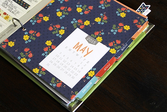
During the summer I like to cook a lot, and that means lots of searching for recipes, weekly menu planning & shopping lists - anyone else out there like me?  If so, you're in luck.  This month's free printables are all about just that!

When I sit down to plan our menu for the week, I use the Menu from the Life Documented Basic Inserts pack.  I don't always decorate my weekly menu to this extent, but every once in a while it's fun to do!
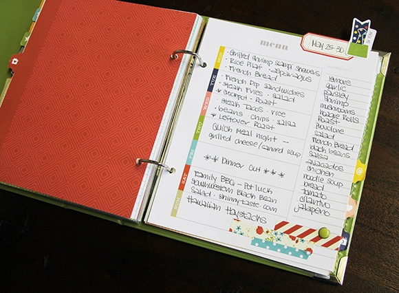
I write my shopping list as I go through the recipes, using the Shopping List included in this month's free printables.  Once I have my menu set for the week, I write it on the days of the week card, also included in this month's free printables.
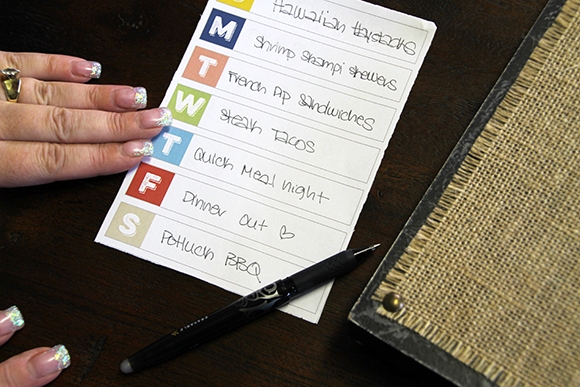
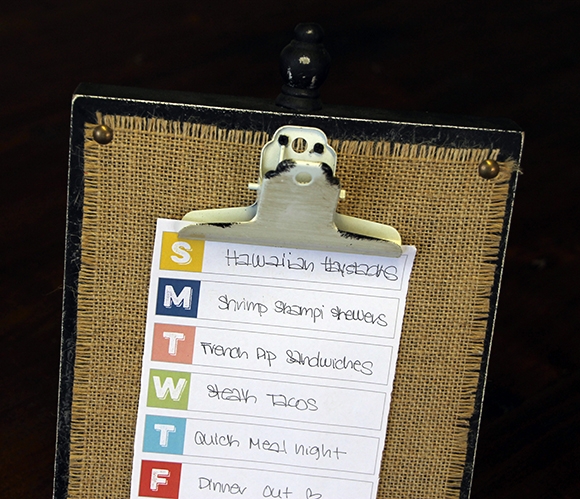
When I'm done, I add it to a cute decorative clipboard in my kitchen so the family can see what's planned for the week.  That eliminates all of those 'hey mom, what's for dinner' questions :)
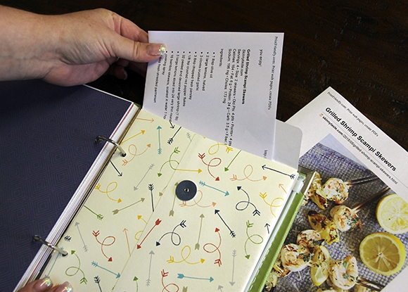
You'll also find recipe cards in this month's free printables!  The Life Documented Envelope is a great place for storing your recipe cards & recipes printed from the internet for the week in your planner.
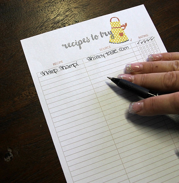
The Recipes to Try included in this month's free printables is a great place to list those recipes you want to try from different cookbooks, Pinterest, etc.  We've even included a 'made it' checkbox and rating scale for each recipe on the list.
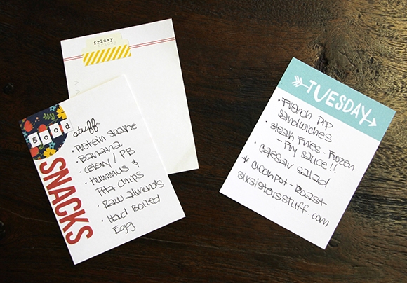
Our Life Documented 3x4 and 4x6 cards are also a great place to note menu, recipe and snack ideas and insert directly in your planner!
 

FREE PRINTABLES!

Now we get to the really fun part!  We've designed these FREE printables for May to coordinate with your Life Documented planner.  Even better, we'll be offering free printables each month!  

Click here to download May's Free Life Documented Printables.

There are a 6 free printables this month, including:

May Month in Review
Recipes to Try
Recipe Cards
Menu Planner
Days of the Week Card
Shopping List

TIP: The May free printables are on a single PDF document with 7 pages - print off what you want and the quantity you need.  We've added cut marks to each printable, so you can easily trim your pages to size.  

Thanks so much for letting me share my insight and vision for our Life Documented Planner system - it's a dream come true for me to finally have my dream planner.  I already feel like my life is so much more organized.  I hope you're inspired to plan and organize your life with our Life Documented Planner system as well and follow along each month using our free printables for a planner stuffed full of fun resources, tools and planning pages!   See you back here again next month!


Click here to download your free copy of the Summer Vibes SN@PBOOKING Guide!  Visit the Project Downloads area of our website for more free downloads!

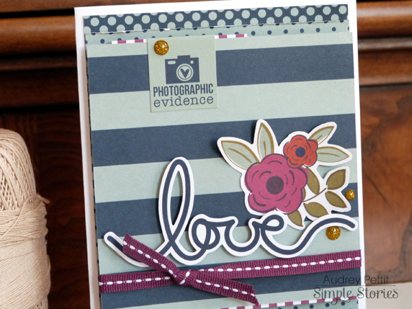
Hi everyone, it's Audrey, here to share a couple of cards with you today made with the super fun and functional Lovely SN@P! Pack. AudreyPettit-Lovely-LoveCard If you like pocket scrapbooking, you are going to go crazy for the SN@P! Packs. Each SN@P! Pack collection contains well over a hundred pieces of pre-cut journaling cards and die cut ephemera, perfectly measured to fit most standard pocket page systems. Talk about making things a snap! But as fabulous as the SN@P! Packs are for pocket pages, that's not all they're good for. They are also super fun to use for regular scrapbook layouts, cards, and so much more. AudreyPettit-Lovely-LoveCard2 Both of my cards today were really fast and easy to put together using journaling cards and die cuts from the Lovely pack. For my first card, I pieced together several of the 4x6 journaling cards to create a fun background in a mix of polka dots and stripes. All you need to do is cut down a bit of length on each journaling card, and you have the perfect fit for a second layer on a standard A2 card base. How easy is that? AudreyPettit-Lovely-LoveCard3 I adhered a few of my pieces with pop dots for some extra interest. Wrapped a bit of matching ribbon around the bottom of one of the panels, and then embellished with die cuts from the Lovely Pack. Enamel dots from the I Am collection add a final little touch. AudreyPettit-Lovely-BestDayEverCard Also included in the SN@P! Pack collections are these adorable little 2"x2" journaling cards, so fabulous for creating quick and easy blocked designs, and small enough to work perfectly on cards. AudreyPettit-Lovely-BestDayEverCard2 At 2" square, these little journaling cards would fit on any number of card base sizes. For this card, I layered four 2"x2" SN@P! cards onto a panel of white cardstock, and then onto a 5"x5" square card base made from I Am Important 12x12 Paper. Boom! Instant blocked grid design. Seriously doesn't get any easier than that. AudreyPettit-Lovely-BestDayEverCard3 One of the best things about SN@P! cards, of course, are the pre-printed images and titles that are great for journaling, but also make fabulous instant card sentiments, too. Love that these cards are all double-sided, for even more creative possibilities. I added a few more Lovely die cuts, a bit of twine, and enamel dots, and another super easy, but super cute, card is complete. Enjoy!

 
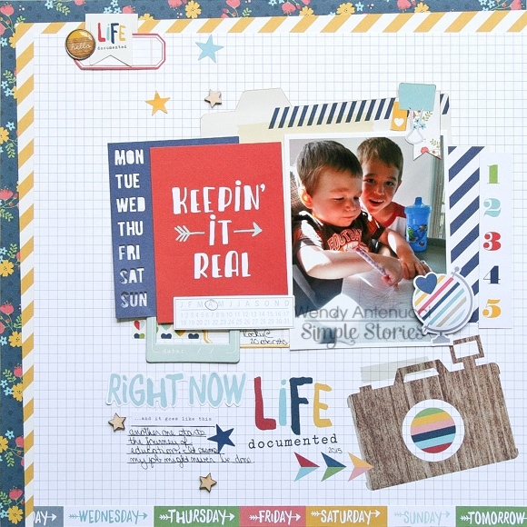
Keepin It Real
 
 
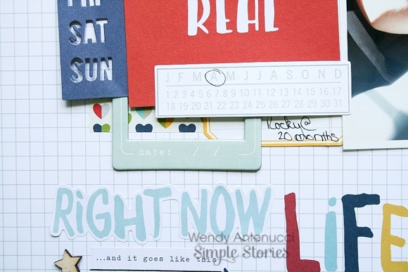
I love to use SN@P! cards to build my layouts!  This layout began with my picture and my title card chosen from the Life Documented collection; I added in a few other 3x4 cards to further build upon my theme of daily learning.  I then chose the camera paper as my background for my cluster of cards/photo because it continued my theme of documenting the everyday moments.
 
 
I snuck in a few Bits & Pieces and even a chipboard frame from the Say Cheese II Collection to add some layers and depth into my page.
 
 
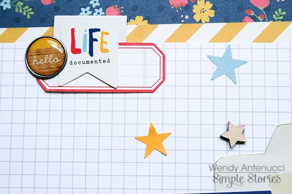
A Clip and Bradz added a little more interest to my page and the final touches were the wooden stars which I added from the Enchanted collection.
 
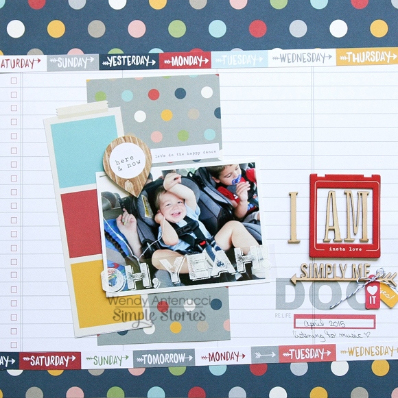
I AM Simply ME
 
 
I had pieces scattered everywhere on my desk from my last layout and all of the leftovers from previous pages and one combination caught my eye and it fit so perfectly with my picture that a layout was born.
 
 
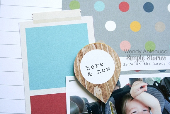
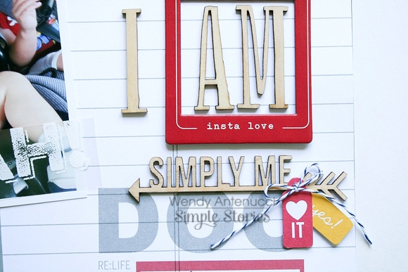
I chose the DOC paper from more of my leftovers and it added just enough interest to my picture grouping and it gave me a place to build my title.  Since the collections match so well I was able to pull in some of the wood veneers from the I AM collection and a frame from the Say Cheese II collection.
 
 
I added in some strips of patterned paper on a slant to further energize my layout and to provide the finishing splashes of color. 
 
I hope you were inspired today to play with some of the older collections and to mix in some of the new products!  Thanks for joining me today, see you next time.
Hey There! Rebecca Larson here to share a layout using one of Simple Stories latest digital kits “Sea to Shining Sea”.  On the tails of a patriotic holiday here in the United States, I was excited to find a way to use this beautiful kit. I love the classic red, white, and blue, but throw some aqua in there and I am all over it!!
 
 
At my son’s school, after they complete the US history unit, they have a wonderful field day living the life of Colonial America. It is filled with games, crafts, a yummy dutch oven lunch, and a much need break from classwork! I knew that this special day was one that my son would want to remember.
 
I wanted to use one of the 3x4 pocket cards as a scaffolding for the photo that I had chosen. To give the photo more of a framed up look, I selected the ticket portion of the  card, copied it onto a new layer, and stacked it right up on top of my photo. This gives it additional dimension, and draws the eye to the picture that I had chosen. I then lined everything up, and cleaned up anything existing from my crop.
 
 
Because of the detail of the elements surrounding my photo, I opted to leave a lot of open space to not make the layout overly busy. I added some quick journaling, flattened and saved it and sent it to my local print shoppe. I am so excited to add it to my book! 


Click here to download the free class!

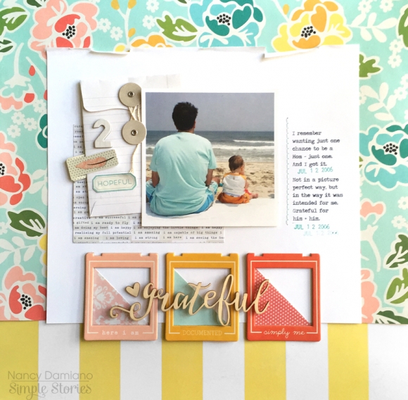
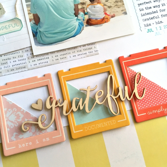
Hello Simple Stories fans!  Nancy here with simple summery page using the I AM... collection. I love this flowery pattern, it reminds me of the tropics and has such a great summer feel.  It was perfect for this story!

I started with a 4x4 photo and then built a large white mat to frame out the photo and separate the flower pattern from the yellow and white border. A few white one white layers of text paper, envelope, clips and stickers add texture while remaining neutral.

The final pop of color was created with three frames from the I AM collection that were backed with triangles of patterned paper in matching hues. This creates the perfect frame for the wood veneer title.

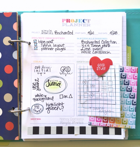
Did you know that we have free printable planner pages?!  You can find them here on the Project Downloads page.  They are a great addition to the Life Documented Planner!  The 3 free printables I use below are all found in the Life Documented Free Printables - March download.

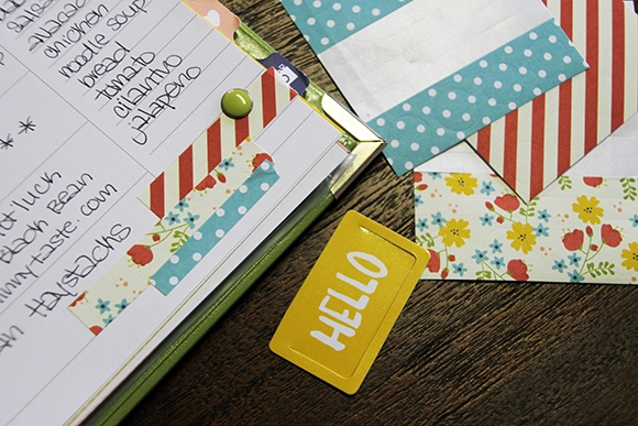
One of my favorite printable is this Project Planner page. I use these to map out layouts I want to complete.  It’s a great spot to gather ideas, sketch out designs and list products you want to use. Some black and white washi tape for decoration and a little bit of graph paper make it functional.

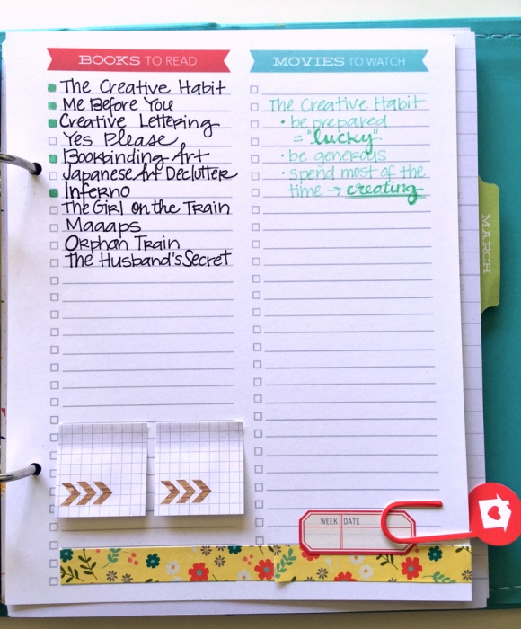
I also keep a running list of books I want to read and plan to read. This list also includes a “movies” column, but I covered that up since I’m not much of a movie watcher. Instead, I use this space to jot down takeaways from the books I’ve read.

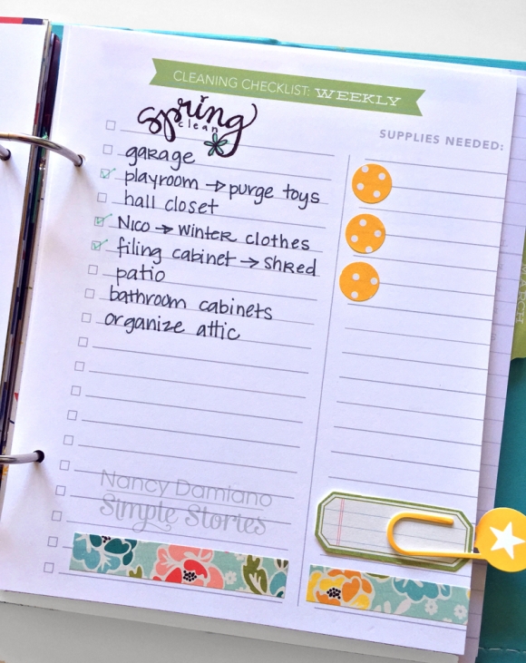
Hello Spring cleaning! I’m using this list to keep track of things that are need of a great big purge. It’s going to feel so good to check all of these off (one day).

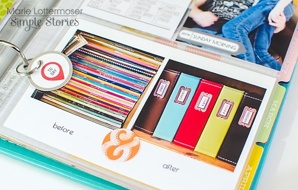
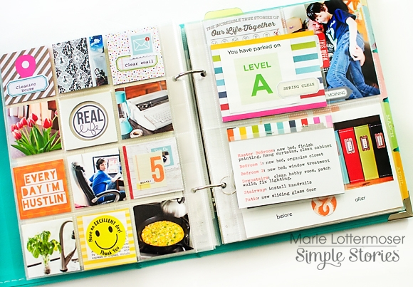
Hi Everyone!  Marie here today to share my latest pages using the Fresh SN@P! Pack.  These sets are such a great value.  I think this is my third set of pages with this pack, and I still haven't run out of cards and embellishments!

It recently occurred to me that we are going to have a lot of house guests this summer, and our house isn't quite looking put together.  I decided to embark on a 30-day organization plan and get things ready room by room.

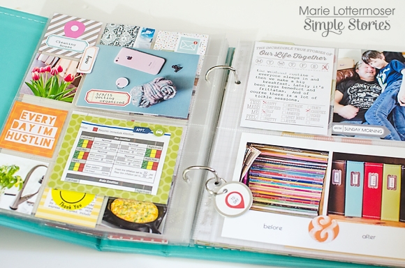
I am using my SN@P! album to document my progress, as well as a place to write out my to-do lists.  I think it helps to have a visual plan of what I need to get accomplished.  The bright pops of color in the Fresh SN@P! Pack are a great inspiration for how I want my home to look.

I added an insert in between my pages with some notes on things I want to accomplish.

The back side of the insert shows a couple more areas I need to get organized, including my car.

The best part of using a SN@P! album to document this project is that the 3-ring binder system will allow me to add more pages in as I get farther along with my plan.  I've also been using some of the Life Documented stickers in these pages, because the colors coordinate perfectly with Fresh.

I hope you've enjoyed seeing the beginning of my organization plan. I will be adding to it for the next month.  If you have a big task ahead of you, I highly recommend making a visual journal of your plan with a SN@P! album.  It will make the whole project more fun and rewarding!

Pages