October 2015 Blog Posts

Happy Halloween Simple Stories fans!!  Suzanna here today to share with you two layouts.
 
 
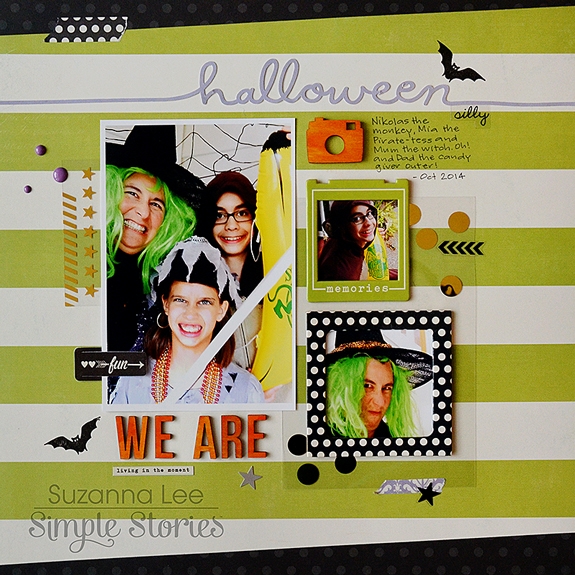
I just couldn't post on Halloween and not share a Halloween layout! That just wouldn't be right now, would it?! In lieu of a Halloween collection, I dug around in my stash and gathered bits and pieces that were black, purple and green and went to town layering the various bits and pieces.
 
 
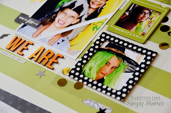
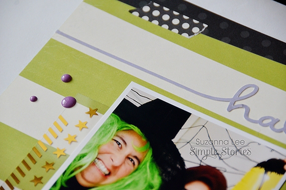
The bulk of the goodies used to create this layout came from the  Enchanted and I Am collections, using the appropriate color coordinated pieces.
 
 
Knowing that the bright orange I wanted wasn't available in the collections I had on hand, I decided to use wood veneers from the We Are Family collection and paint them. What better way to provide the color you want?!
 
 
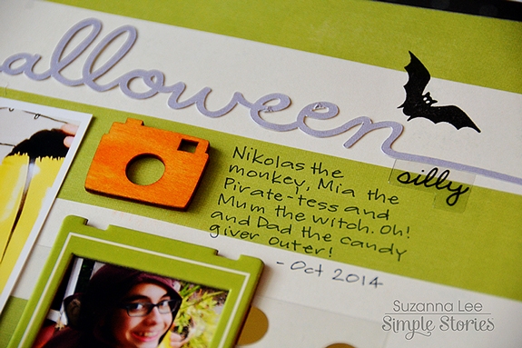
Our costumes clearly give the theme of the layout away but I wanted some "support" evidence. Using my Silhouette to cut "Halloween" out for the title and a bat stamp added just the right scattering of Halloween desired!
 
 
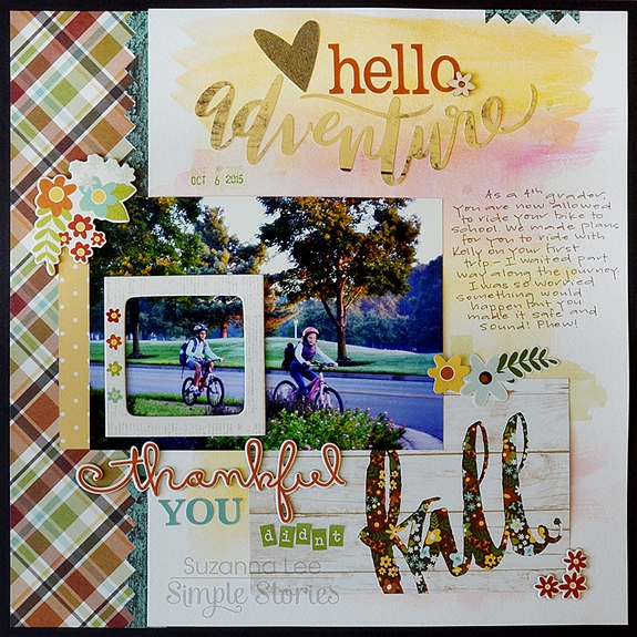
This layout is fall based, using the fall collection Pumpkin Spice, but really it is more about my daughter's bike riding adventure. At our elementary school, 4th graders are granted the privilege of riding their bikes to school. We had put it off and there was no putting if off any longer so we made arrangements for my daughter to ride with a neighbor down the street. The problem, more like, my problem, was that my husband was out of the country and I had to go to work… You know that "mother hen" moment. I was terrified that she would fall and I wouldn't know or be there to ensure a safe journey was completed.
 
 
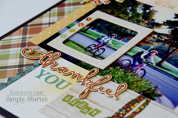
In the above picture, I used the frame to emphasize my daughter in the overall scene of the girls riding to school. You can also see the breadth of the alphas available with the Pumpkin Spice collection. I used them with the chipboard and a SN@P card for my title work, incorporating existing words into a fun title.
 
 
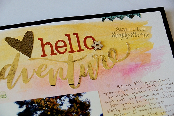
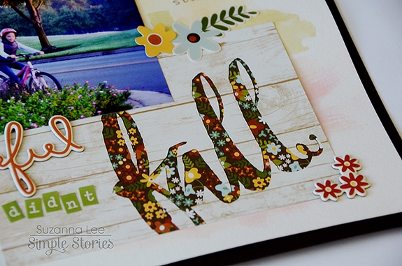
The background was created using watercolors in order to "blend" the SN@P card with "fall" as part of the title  into the background. While it would have been okay on a light background, it felt like the card was floating. I wanted more of a seamless look and as I've been dabbling with mixed media, it was an easy solution to my problem.
 
 
I hope you have some great Halloween plans for this evening! 

Hello, again!   This is Amber, founder and creative director of Simple Stories.  I'm here for another installment of my monthly Document IT blog feature.  

This month rather than sharing how I've been using my Life Documented planner, I thought it would be fun to share our brand new Carpe Diem A5 Planners.  These planners & a la carte accessories will be in stores mid November, so it won't be long before you can get your hands on them!
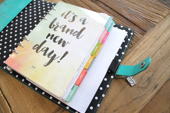
We have so many talented design team members and employees that work with our products; this month I'm happy to introduce you to in-house designer Sue Kendall.  Sue has been so excited to start using her planner that she sat down and decorated each of the monthly dividers included in the planners with a seasonal theme for each month!
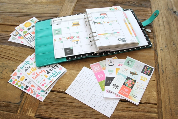
Sue combined different stickers from the collection - the Life Illustrated Stickers, Icon Stickers, Word Label Stickers and the Insta Quote Stickers to customize her planner.
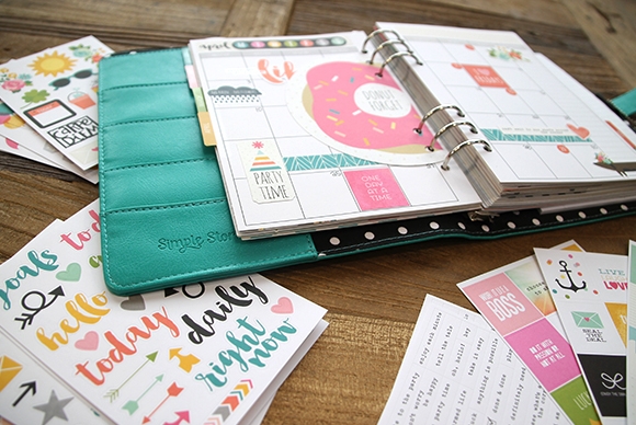
The Insta Quote Stickers are some of our favorites - they were designed to fit perfectly in the squares on the monthly inserts!
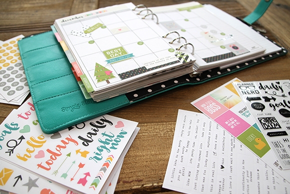
The Illustrated Life Stickers were designed to include icons to cover each season/holiday of the year so that each month you have themed stickers to decorate with!

I love how Sue was able to spend a few hours getting her planner decorated for the coming year so that as each new month draws near, she's ready to go!

FREE PRINTABLES!


Now we get to the really fun part!  We've designed these FREE printables for October; the month in review insert will fit in your 6x8 Life Documented Planner and this month there's an A5 version as well!  In addition you'll find dashboards to fit your A5 planner as well!  

Click here to download October's Free Life Documented Printables.

There are a 6 free printables this month, including:

6x8 October Month in Review
A5 Month in Review
4 Dashboards

TIP: The October free printables are on a single PDF document with 4 pages - print off what you want and the quantity you need.  We've added cut marks to each printable, so you can easily trim your pages to size.  

Thanks so much for letting me share our Carpe Diem planner this month, I cant wait until they're in stores next month!   Happy Halloween :)

Hey everyone, Amy here to share a couple of my recent layouts I've created using Simple Stories Collections.  I really love all the collections, but I have to say that the So Rad collection has always been a favorite. I grabbed it to create this layout of us posing with a monkey on vacation this summer.  I started by creating a loose grid, which I tend to use when I am working with multiple pictures.  Here's the layout.

I felt like I didn't need much journaling, the pictures really tell the story.  Here are some closeups.

For my next layout, I knew the colors of We Are...Family would be perfect to document my son's new friend. Let me introduce you to Flag the Frog.

As you will notice, this is a grid based layout as well, but I changed it up some by working with a vertical grid this time around.  Here is a closeup. I really wanted to feature the chipboard banner, so I created my grid around it.

This layout has turned into one of my recent favorites.  Thanks for visiting the blog today!

Hi everyone!
Teri here, and I'm excited to share some thank you cards I cooked up with Simple Stories'  Pumpkin Spice collection.  I just love this collection. It has such a great color scheme and has so many fun fall icons.   Plus it is jam packed with gratitude-type phrases that make it great for creating thank you cards.
 
I created a scene for this first card by pairing together the fence and tree.
 
 
I always enjoy mixing different embellishments together, Simples Stories makes it easy by having design elements across their collections that work together. I created my custom sentiment by with letter stickers and the "blessed" die-cut from the Pumpkin Spice Bits & Pieces.
 
 
When I think of Fall, I think of leaves.... lots and lots of them! I wanted this card to definitely have a "Fall vibe" so I incorporated three leaves into my design. 
 
 
I really wanted the maple leaf to pop so I adhered it to the card with foam adhesive. And then I added a round Bradz on top.
And I thought it would be fun to really hit it home that this is a thank you card so I repeated the "so thankful" phrase three times.  
 
 
Although this card has a lot of pieces to it, it was a fairly simple thank you card to put together. I simply stacked (and slightly offset) three SN@P! cards and then added the "so thankful" banner on top. 
 
 
To complete the sentiment, I simply used letter stickers. 
 
 
I played it clean and graphic with my "Thankful For" card. 
 
 
I decorated a card with patterned paper and then added the "Thankful For" SN@P! card.
To give the card a more personal touch, I added a few enamel dots and a Bradz. Just a few embellishments can really make a card go from plain to something special.
 
 
I played it clean and graphic with this "Grateful Heart" as well. 
 
 
While I didn't use a lot of embellishments on it, I added just enough to lead the eye from one side of the card to the other. 
 
 
So that's what I have for you today!  Thanks for stopping by. I will be back again real soon!


Rebecca Larson here with a couple designs using some of the latest digital releases! 
 
First up, I wanted to highlight the digital Family SN@P! Set. This small collection on its own can bring so much added dimension to a pocket page, but can be a challenge when creating a stand alone page. I love the colors, and wanted to find a way to compliment some of our fall break photos, so I coupled it together with the digital Legacy Collection. The mix of the two collection's patterns and solidscoordinate so well together and I love the feel it brings to my layout.  I knew I wanted to use as much from the SN@P! Set that I could, so I created clipping masks with a polaroid action that I found online (here). I just used the top layer the action created, and masked it to the different 3x5 cards.
 
 
I love the ability to resize, and change the color or pattern with digital! I didn’t want two coordinating pattern’s to be right next to each other, so I gave the cute polkadot arrow a little makeover:)
 
 
I then filled in the frames with my photos, added a few coordinating elements, and created a title with the red letters/numbers included in the set (the “Fall Break” brushes are from littledreamer.co). I love how it turned out!
 
 
I couldn’t let October pass with out creating a Halloween layout! I have had the digital Frankie and Friends collection on my hard drive since its release! I was so excited to finally use it! When it comes to Halloween photos, I am usually a post season scrapper lol! Like several seasons post hahaha!  It seems when this beloved holiday rolls around, I am already thinking reindeer, snow, and sugar cookies (don’t hate me). I was so excited to use this collection! The colors are not your average orange and black! And the embellishments are so dreamy!
 
 
This collection also includes a very whimsical alpha that I didn’t use on this layout, but excited to use it in the future. I had a hard time not attempting to use almost the entire kit in one layout! (I restrained lol!) I loved creating a fabulous layout that frames the photo of our Star Wars family perfectly!
 
 
Thank you so much for stopping by!
 

Click here to shop from the new Silhouette designs.

Click here to shop from the new digital collections.

Hello Friends!

It's Kristine Davidson here today and I'm  happy to share a spread about my sister and her family featuring the We Are... Family collection.

First I would like to say "YELLOW!" I love this bright yellow that's included in this collection. I really don't use yellow very often in my pages but this color just made me happy!

These are photos of my sister and her children. The picture were taken from this past summer while they were all playing in the backyard. 

In this spread I wanted to showcase a pocket page but include a layout on the left side. I created a simple layout as to not overwhelm the simpler, colorful side of my pocket page on the right.

I really like this format since it gave me the opportunity to create a layout but also with a pocket page it allowed me to add more photos and extra journaling.

here is a close up pictures of the layout details.

I really enjoy creating with pocket pages and I find that sometimes I have too many photos to just put away in a box somewhere or create a few more layouts about this one event.  I added more photos of the day and little extras with embellishments.

As you can see the theme is pretty constant on both pages, lots of yellow, a little bit of red and the pictures are all from the same day.

If you have a family event to document, I would highly recommend trying a pocket page with a layout and don't be afraid to add some color !

A few close up pictures of my pocket page;

Thanks for coming to visit today, and I hope you feel inspired to create and try something new in your scrapbooking!

Enjoy creating with the We Are ... Family collection.

For more of my work you can visit my blog kristinedavidson.com or on instragram @KristineDavidson .

Supplies

HIP HIP HOORAY!! We know you've been waiting & the time is almost here! Our Carpe Diem A5 Planners & Accessories will be in stores in just a few weeks!

Lots of fun stuff taking place over the next few weeks on social media as we await the exciting arrival!  

Make sure to follow us on social media to join in the fun!

Facebook

Instagram - @simplestories_

Twitter - SimpleStories

Pinterest - Simple Stories

You Tube - Simple Stories TV

Periscope - @SimpleStories

Pages