10.31.15
Halloween Simple Stories Style!
Happy Halloween Simple Stories fans!! Suzanna here today to share with you two layouts.
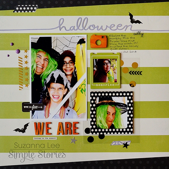
I just couldn't post on Halloween and not share a Halloween layout! That just wouldn't be right now, would it?! In lieu of a Halloween collection, I dug around in my stash and gathered bits and pieces that were black, purple and green and went to town layering the various bits and pieces.
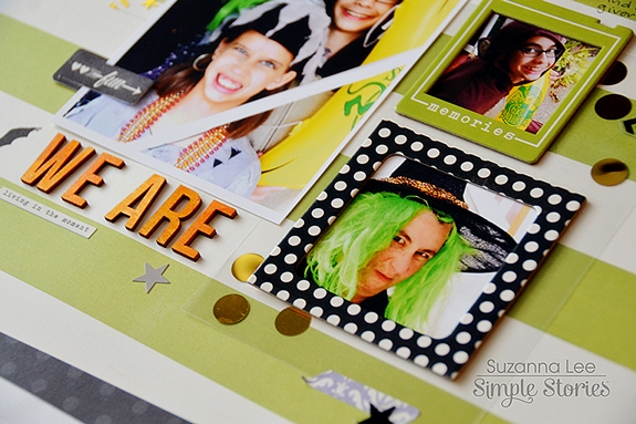
The bulk of the goodies used to create this layout came from the Enchanted and I Am collections, using the appropriate color coordinated pieces.
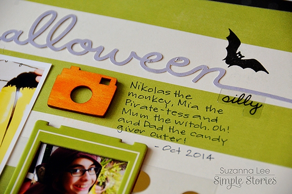
Knowing that the bright orange I wanted wasn't available in the collections I had on hand, I decided to use wood veneers from the We Are Family collection and paint them. What better way to provide the color you want?!
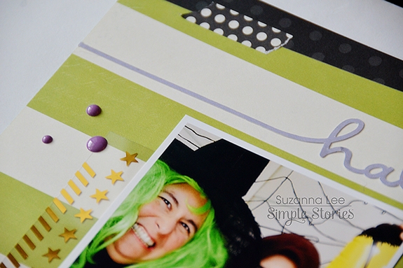
Our costumes clearly give the theme of the layout away but I wanted some "support" evidence. Using my Silhouette to cut "Halloween" out for the title and a bat stamp added just the right scattering of Halloween desired!
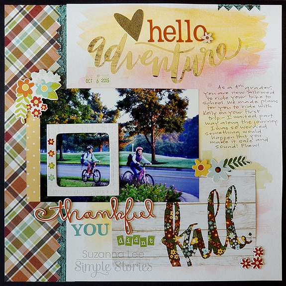
This layout is fall based, using the fall collection Pumpkin Spice, but really it is more about my daughter's bike riding adventure. At our elementary school, 4th graders are granted the privilege of riding their bikes to school. We had put it off and there was no putting if off any longer so we made arrangements for my daughter to ride with a neighbor down the street. The problem, more like, my problem, was that my husband was out of the country and I had to go to work… You know that "mother hen" moment. I was terrified that she would fall and I wouldn't know or be there to ensure a safe journey was completed.
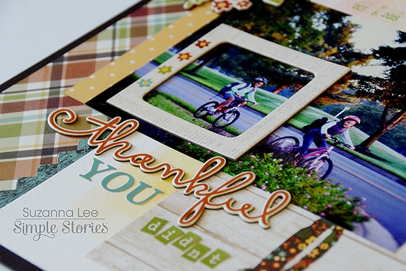
In the above picture, I used the frame to emphasize my daughter in the overall scene of the girls riding to school. You can also see the breadth of the alphas available with the Pumpkin Spice collection. I used them with the chipboard and a SN@P card for my title work, incorporating existing words into a fun title.
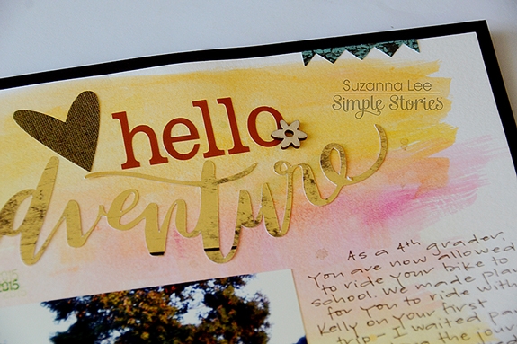
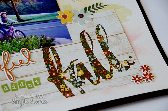
The background was created using watercolors in order to "blend" the SN@P card with "fall" as part of the title into the background. While it would have been okay on a light background, it felt like the card was floating. I wanted more of a seamless look and as I've been dabbling with mixed media, it was an easy solution to my problem.
I hope you have some great Halloween plans for this evening!

