#AWKWARD
Hello friends, It's Laura here with you today sharing two layouts using the oh so fun #Whatever Simple Set! If you haven't had the opportunity to check out this collection yet, you really should! The colours are so pretty and the fun text on the various elements of this collection speak so well to all of those funny photos we take!
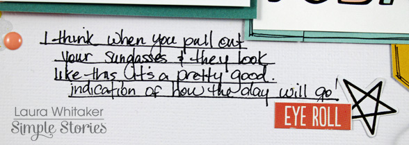
Both of my pages are about silly moments, like this first one that documents a terrible yet hysterical photo of myself on a day I pulled my sunglasses out of my purse and one lens was missing! I don't like having my photo taken but couldn't resist snapping this pic.
I am currently enjoying designing layouts with larger titles that are a feature in their own right on my pages, and this layout has just such a title! As I mentioned earlier, there are fabulous colours and terrific phrases in this mini collection, too!
I also drew some leftover goodies from my stash of the Life in Color collection to help embellish my page, the colours coordinate so nicely.
Of course, this sticker word had to make it onto one of my pages and it is perfect as a title and feature resting upon a pretty strip of paper! The circle element was punched out of another cut apart card.
I cut this floral sticker in two so that it could have twice the impact on my page, nestled in amongst other stickers, chipboard frames and enamel dots.
I think journalling deserves a bit or prettiness too, and being able to embellish it motivates me to write it! ha!
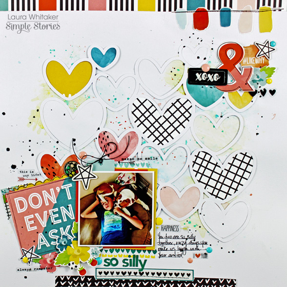
My second layout features a funny photo of our son and puppy, she loves him so much and cannot snuggle close enough!
For this page, I began with a die cut of multiple heart outlines, thinking it would look great with water colour looking splotches of the #nailedit patterned paper backing them. I also added a little bit of mixed media to my background.
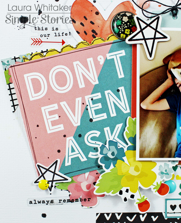
I trimmed down this cut apart card and used it as an anchor for my photo, and then embellished around both of these pieces with some stickers, chipboard and enamel dots.
I added a fairly large embellishment cluster including this fun paint swatch banner to the upper right side of my layout to give it enough visual wight to balance my photo area. I love the way it turned out!
And as a last step, I added my journalling and a bit of embellishing!


