Christmas Shenanigans
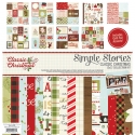
Hey there, friends! Missy here, and I have two fun and festive layouts to share today. There is never a dull moment with my youngest child, and she is constantly doing funny things to make us laugh. These two layouts feature her in 2011 and 2013, and you can see she has quite the the spunky personality. For my first page, I used the beautiful Classic Christmas collection. I’m usually not a big fan of dark red and dark green, but this collection just wowed me. I love the olive greens and light blues mixed in with it. Those colors lighten everything up and make it so bright and cheerful! Plus, all the colors in this line look amazing with shiny gold. To create this page, I was inspired by the big tree in the photo. I decided to use half my background paper to make a big tree. I used a 1-inch circle punch and went to work on a lot of the 6x6 papers. I cut the shape of the tree on a scrap sheet of cardstock and glued down each circle. I machine stitched through each row and then ruffled up the circles. I love how it turned out!
Here you can see all the circles and stitching. I’m so happy this turned out as well as it looked in my mind! It really mimics the photo and creates so much color & texture. I love how the deep browns look with the light blue and olive greens!
To embellish around my photo, I fussy cut a large flower from patterned paper and layered it. I used JOY from one of the 4x6 Sticker Sheets and added foam to it. I used a “Christmas” Clear Sticker to create my title. I added some deep red tangled thread and more clear stickers as well as a sticker from the Expressions Cardstock Sheet.
I love these boughs and berries chipboard pieces! They were the perfect addition here. I also did some watercoloring on my background that you can see peeking out from behind everything. I used white gesso first and then came in with some gold Color Shine and several Shimmerz sprays.
Here’s one last close-up. I love how the watercolor splatters turned out. They remind me of Christmas lights! I did add a little bit of tissue paper behind my photo, which I do a lot, but it seems even more appropriate on a Christmas page.
____________________________________
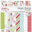
For my second layout, I do believe I scrapped the cutest Christmas photo ever of my sweet girl. Santa comes to school every year, and this year, she decided to lick him. Yes, lick him! She’s a very sensory-oriented child and went through a licking phase where everything was tasted. Santa was no exception…haha! Like I said, never a dull moment with this curious little comedian! I used the gorgeous Mistletoe Kisses collection for this, and it showcases my photo perfectly. I decided to go light and airy, so I began with white cardstock. I already knew what my title was going to be, so I used the Bromello font in my Silhouette software and cut the title really large and at an angle. I backed all the letters with patterned papers. I smudged lots of white gesso over a good portion of the page and then came in with some Shimmerz sprays. I used some light blue, pinks and reds. I used the packaging technique, my brush and created splatters.
I did something I’ve never tried before on this page, and that is machine stitch around my entire title. It turned out like I hoped it would. It took some time, but I went slow and was careful to turn my paper in different directions as I went. I embellished around the page with lots of stickers from the 4x6 Stickers. My favorite is this string of lights!
I pulled this tree die cut from the Bits & Pieces pack and added foam under it to give it some dimension. I also added some tangled thread under it as well as a few stickers. This created the perfect pocket to the left for my journaling.
I used a few die cut trees as background layers and also a fun & colorful chipboard tree. I just love how light and soft this collection is! I added a few cut apart pieces and some tissue paper behind my photo. The tissue paper softens everything up even more and adds a fun an subtle border around the photo.
Here’s one final close-up of the stitching. I added that adorable little bird on top of the “a”…isn’t he so cute? If you’re ever out of ideas on what to do for a background design, try enlarging your title like this. It takes up a lot of room and then you only have so many little spots to fill in with embellishments. Makes it a little bit easier, I think!
I hope these layouts give you some inspiration on how you can use these beautiful Christmas collections! Thanks so much for stopping by!


