Explore!
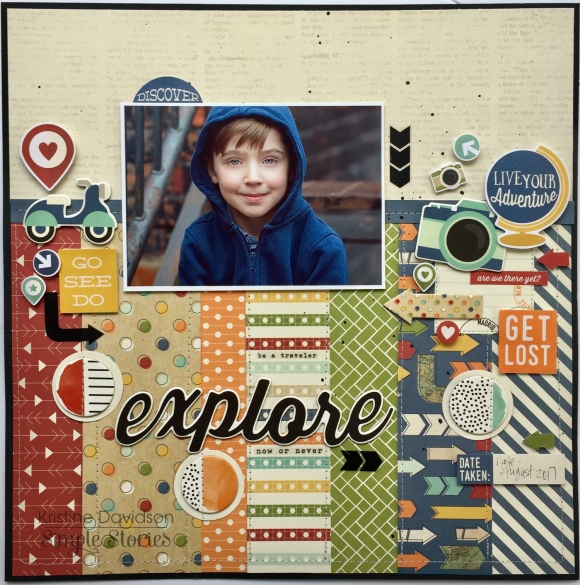
Hello it’s Kristine Davidson with you today! I am sharing a layout I created using the NEW Travel Notes collection. I love this collection because it can also be used for awesome boy pages! I created this with something different in mind. I wanted to use all those gorgeous colors in this collection but I didn’t have a “travel” picture. I used this photo of my nephew and started adding chipboard as well as Bits and Pieces. It Worked!

I used a piece of black cardstock as my base because I wanted the layout to be framed. That enhances the colors for me and since the title in the word Explore was black – it would be perfect.
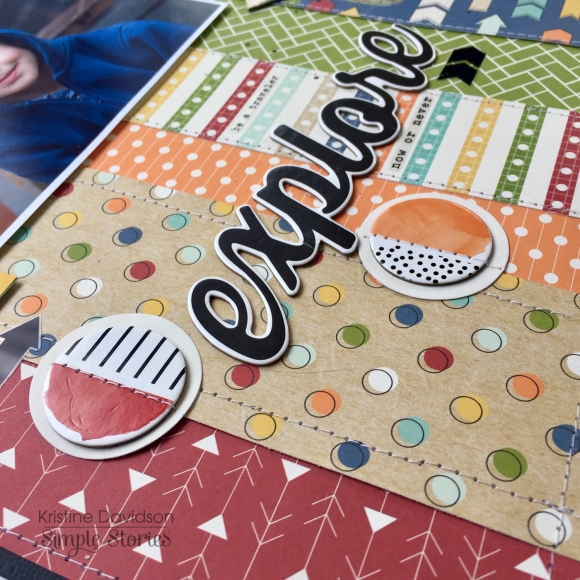
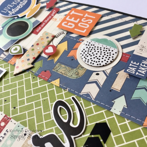
I cut up pieces of pattern paper different widths and the same length (9”). I added the embellishments in random areas and my title in the centre. I didn’t add much for journaling except the date and our location.

I did add texture to my layout by sewing the edges of all those paper strips. This also helps unify all those patterns. I added popdots under my photo, some stickers and also chipboard pieces to give my layout some dimension.

As you can see – this collection can be used for something other than “Travel “ related pages!
I hope you enjoyed this little lesson today and please come find us on Instagram @SimpleStories_ and @KristineDavidson


