Happy Haunting!
Hello friends!
I have been having a little fun getting ready for Halloween which is just around the corner and catching up on some Halloween scrapbooking, too! Of course, the Happy Haunting Simple Set is just perfect for that!
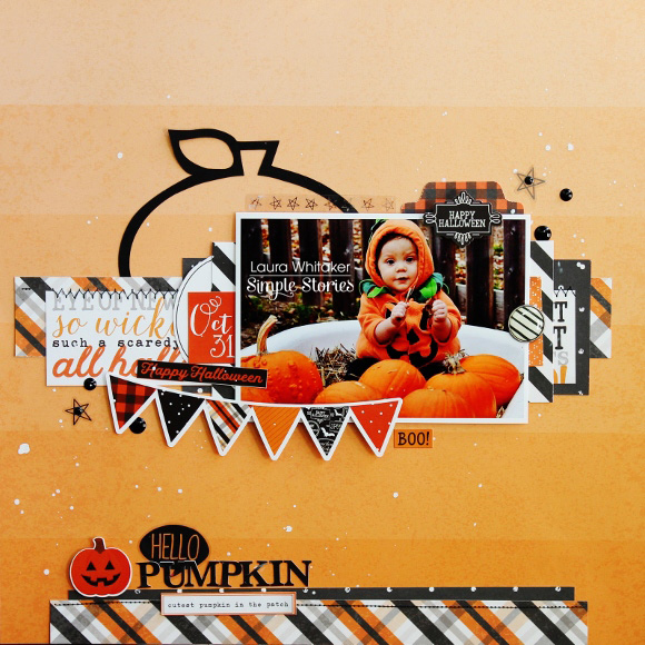
This first layout features a photo of my grandson, taken a couple of years ago, and since he was a wee little guy at the time I opted to create a "sweeter" layout. I love this orange ombre paper in the kit and knew immediately that I would want to use it for a background, it is awesome that you get two sheets of it because the other side is a gorgeous wood-grained paper that I love just as much!
I started my page by die cutting a super simple pumpkin outline and then cut a few strips of patterned papers, since I love layers and "white" space I chose to create a page that has both of these things.
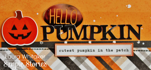
I pulled in a few left over elements from other Simple Stories collections like this phrase die cut from the Hello Fall collection, the silver foiled clear sticker from the Life in Color collection and the small alphas and and bradz from the Carpe Diem Scrapbooking collection!
I think this cardstock banner sticker from the Happy Haunting collection is the perfect way to add some sweetness to my layout! I added a bit of foam behind it to give it a little pop! Actually the sticker sheet for this collection has so many icons that are just perfect for creating several Halloween inspired pages! I also added in some machine stitching with black thread for a bit of fun texture.
The silver foiled star stickers are also from the Life in Color collection, and the enamel dots were left over from the I Am collection. Once my layout was finished I added a bit of white mist. I am in love with the way this page turned out and cannot wait to pop it into his album!
I pulled in cardstock stickers to accentuate my page and that spoke to a more grown up look. I also added in enamel dots from the You are Here collection. I finished off this layout with sprinkles of black and white mist.


