Happy Holidays!
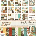
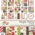
And by Happy Holidays, I mean Happy Halloween, Happy Thanksgiving and Merry Christmas! October through December is my favorite time of the year, and I love creating Fall and Christmas layouts. And Simple Stories has you covered with some great collections for the upcoming holidays...Pumpkin Spice, We Are Family and Claus & Co. Today, I'm sharing layouts using the Pumpkin Spice collection (with a bit of We Are Family mixed in) and the Claus & Co. collection.
Let's start out with the layout using the Pumpkin Spice collection (might as well stick with chronological order!!). I had a lot of fun with this layout. I thought it would be fun to cut a large pumpkin shape and then back it with an Ombre look, using patterned papers from the Pumpkin Spice collection

After I cut the pumpkin shape from White card stock, I traced the shape onto a second sheet of White card stock. Then I cut strips of patterned paper and made sure they were placed outside of the pumpkin shape traced outline. Before placing the die cut pumpkin paper over the second piece of card stock, I machine stitched through each of the paper strips

Then I adhered the die cut pumpkin paper over the background card stock piece. I decided to mix in hand-stitching with the machine stitching, so I stitched around the outside edge of the pumpkin with a mix of embroidery floss.

Once I finished the hand-stitching, I started going through the Pumpkin Spice Chipboard, Bits pack and Sticker Sheet, to add coordinating embellishments to match the color of the patterned paper strips. I also wanted to add some embellishing around the outside edge of the pumpkin, so I added a mix of embellishments, as well as Enamel Dots.
This look can be created with lots of different shapes and collections! Hearts, stars, a large letter, etc. would work great to create this same effect on your layout!
On my second layout, I used the gorgeous Claus & Co. collection. I took this photo of my hubby and the kids last year on Christmas Eve, as they were checking out the Santa tracker. I loved that it was a candid shot, with no one making faces, crying or hitting brother or sister! HA! It was one of those photos I wanted to save for just the right collection, and Claus & Co. fit the bill!
![]()
I knew I wanted to use the frames from this collection in a prominent way on my layout. So I started by mixing three patterned papers in the background, and then added a mix of the Chipboard Frames to the right hand side of the layout.
![]()
I placed the frames on the layout, and moved them around several times, to get just the right placement. When I had them where I wanted them, I went ahead and adhered each one. The frames made perfect spots to add embellishments from the Claus & Co. collection. I added a mix of Chipboard, Stickers, Bradz and Wood Veneers to each of the frames to give the layout dimension and texture.
![]()
I finished the layout, by adding my title on the left hand side of the page, to balance out the design. It also created a visual triangle on my layout, that helps to guide your eye around the page.
So whether you are scrapping photos from Christmases past, looking forward to creating new layouts for this season, or prepping your December Daily, the Claus & Co. collection is perfect for documenting all of your holiday memories!!


