03.24.17
Making Stickers the Hero
Hello Simple Stories friends and welcome back to the blog today. Chantalle with you and I am excited to share two pages where I have made stickers a main focus for my background. The 4x6 sticker packs are definitely a favourite of mine, as each comes with a wonderful variety of alphabets, phrases, shapes and more! Indulge and use up a whole sheet on your next project, I dare you!
More Precious Than Jewels
This page, featuring my beautiful niece, was inspired by the cross pattern on a sheet of Faith ‘Believe’. I absolutely love all the prints in this line but I felt this one had a positive (excuse the pun!) and youthful feel.
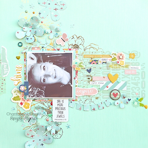
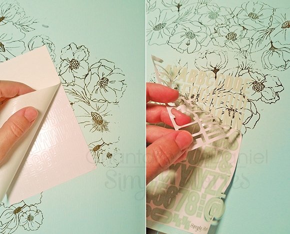
You’ll notice I have used a lot of tone on tone here. I like to do this when I want to add depth but keep focus. I started with a hint of floral foil and then layered a sheet of alphabet stickers over the top. This formed my base, over which I could add my elements.
In order to keep your sticker sheet intact, peel the backing paper off very slowly. Note: You may need to use one hand to steady the upward pull as you peel the paper back. Then, lay the stickers down on your project and again, carefully peel the rest of the paper surrounding the letters, off.
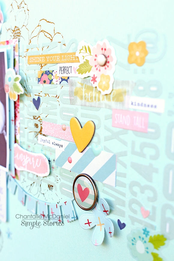
I’ve chosen to work in a sort of T-shape and being black and white, I think the photo stands out quite well against the more subtle colours. As I mentioned above, I’ve used lots of elements in a similar tone to bring the page to life. Lots of stickers - both cardstock and chipboard. The die cut shape provides the title and the stickers bring up the rear with little positive notes!
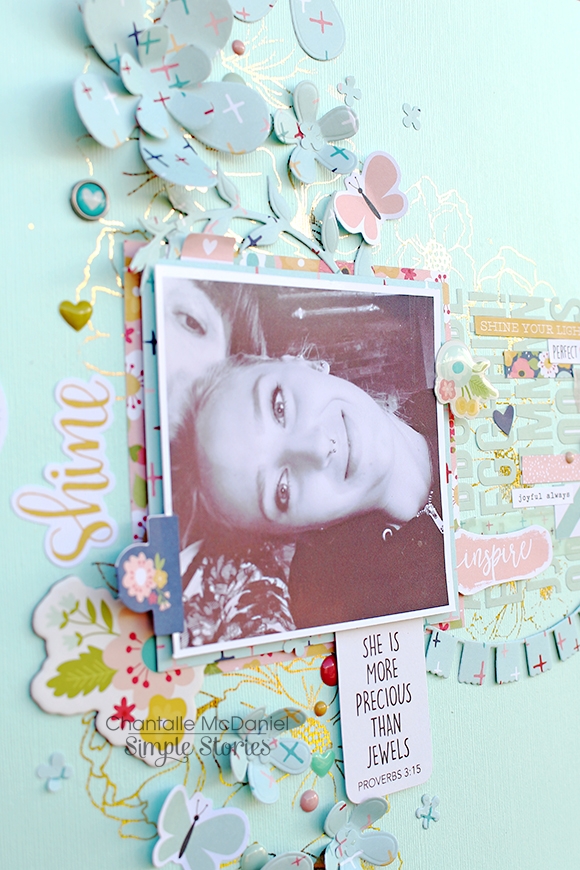
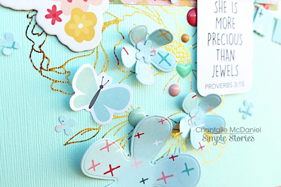
I’ve die cut a few floral shapes using the awesome ‘believe’ paper again and brought out some of the pink tones with a hint of ‘Charity'. (The delicate florals of this paper also help to tie in the floral theme together.)
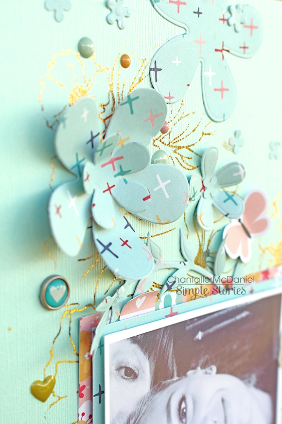
As always, I like to make use of little details to finish my projects off. Enamel dots are also a go-to for me. How adorable do these Reset Girl heart enamel shapes look!
_________________________________
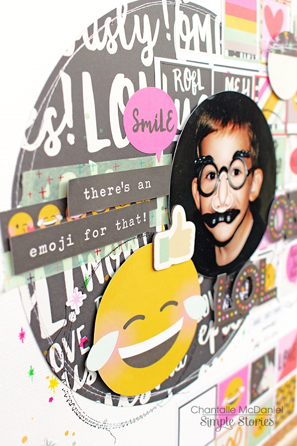
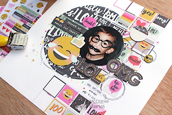
My next page, There’s an Emoji for That, also uses a whole bunch of stickers to build up the background.
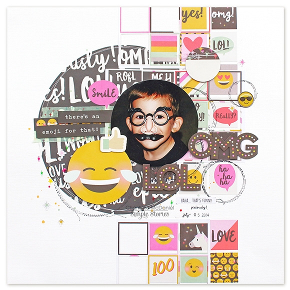
I can’t help but be drawn to the sweet circular faces in this Emoji Love collection. The circular shape calls me! haha.
I first thought to use a square photo but it just didn’t look right. I trimmed the photo into a circle instead and it instantly looked better! I loved the bold black and white script of ‘Be a Unicorn’ but it would’ve overpowered the page, so I’ve cut a large circle as a base shape and placed it on some white cardstock and then, laid my stickers over the top. You’ll notice the design of this page is similar to the one above, but this time it draws the eye predominantly down the page, instead of across.
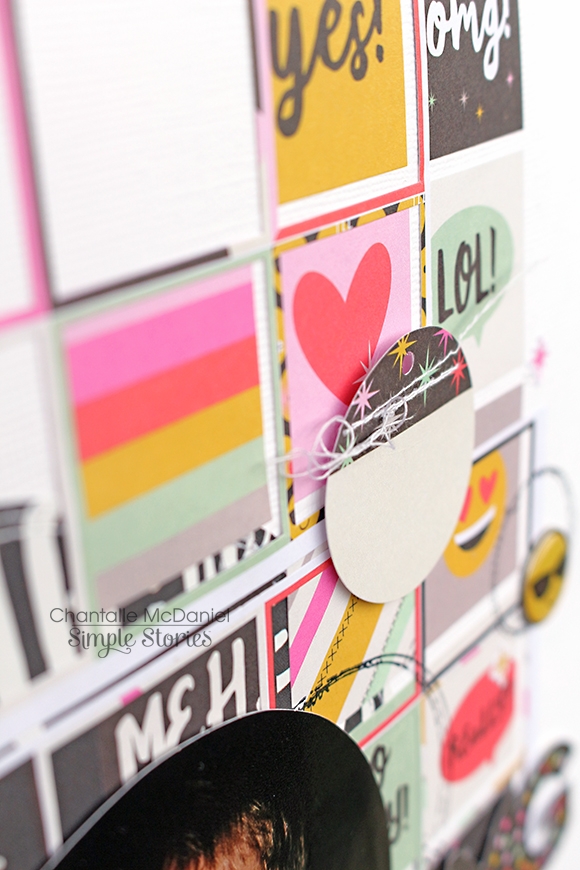
These rectangular sticker shapes from a pack of Emoji Love 4x6 Stickers are fabulous for use in Carpe Diem planners as well as any other paper projects! I love folding them over the top of pages or using them in a title. Here, I have used two sheets of these stickers (removing one or two that I didn’t think added anything to the page) which left behind a few gaps, but I quite like the effect!
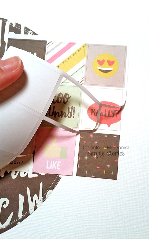
To give them a bit of a less ‘structured’ feeling, I have also used the excess bit of the sticker paper and used it as an overlay.
The title phrase was snipped from a sheet of Emoji Love 4x4 Elements. Journalling cards are such a great resource - they can give you extra wording, phrases and shapes to hand cut. Plus, you get a few on a single sheet of paper - great value! Other elements on this page include die cuts from the Bits & Pieces pack, decorative brads, some roller stamping and a few little hand-drawn elements using some coloured pens.
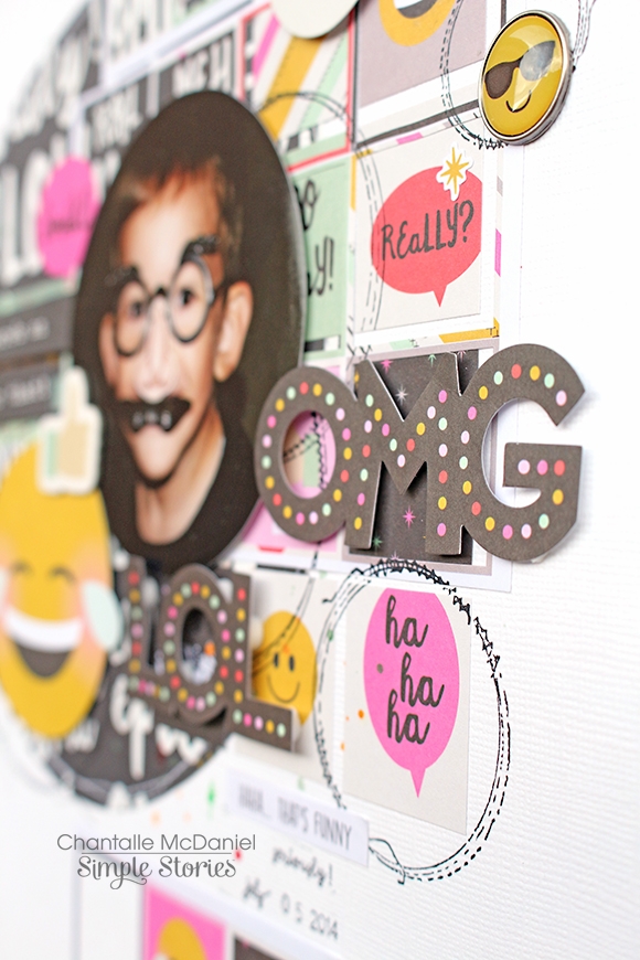
OMG - such fun! ;)
Thank you so much for stopping by today! 'Til next time!


