Howdy friends! Layle here with you today. We've got a fun week planned for you - a Simple Stories & Maya Road product Swap!

Both design teams have swapped products and will be sharing on our blogs all week long. Join us for some great inspiration all week long!
Today creative team member Lisa Abbott-Saunders joins us with layouts from our Cabin Fever & Summer Days collections -
__________________________________
Hello, it's Lisa with you today. I would love to chat about multi photo layouts with you. I know some people are put off by these. I used to be on the 'One Photo Per Page Team', but have more recently switched sides and find myself scrapbooking more and more with smaller but multiple photographs. There's always the worry that by adding lots of photos it can feel too busy and the photos can dominate the page so you have less space for fun designs. A one photo layout just seems cleaner and neater, so today I want to share some tips with you. How to create multi photo layouts and still have space on your page to breath and have fun.
I'm going to start with my Explore layout that I've made with the Cabin Fever collection.
I have used a free editing website called PicMonkey to create a photo mosaic. It's really easy to do and a great way to add a few photos to your page without the page looking cluttered as you can see here.
I like the white border giving the photos a clean look. It's then really fun to embellish around your photo grid. I've used stickers and the 'Bits and Pieces' here.
I wanted to create a fun title. I have layered up one of the Die Cut cards that I cut from one of the coordinating 12x12 sheets and added a couple of the 'Bits and Pieces' and the 'Explore' is from the 12x12 Sticker Sheet stuck across the center.
I continued with the embellishing around this area. I also added a few Maya Road stamps which I thought were a really fun addition.
I think it's important to allow some white space on a page to give it a less cluttered feel. To break this white space up a little I used this Die Cut tag from the 'Bits and Pieces' pack and added some word stickers. I love how this kind of acts as a sub title to my page.
I also added some of the washi tape from this collection around the whole edge of my layout. It's a great way to add further decoration without over doing it.
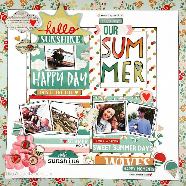
My next layout for you is called 'Our Summer'. I've used the 'Summer Days' collection here.
I've created a grid design in the center using 12x12 patterned paper cut down and also using some of the Die Cut Cards cut down to fit within that space . The idea was to contain the photos and design within this area. I've gone for white space surrounding my center art work here, so again having some clean space on my page, tricking your eyes in to thinking that it's not 'too' busy.
I have printed off my 2 inch photos individually this time and once again with a white border. This really helps to stand the photos away from the patterned paper backgrounds. Sometimes they can disappear in to the background if you aren't careful. The white background really helps the photos to POP!
I've cut one of the die cut cards from the 12x12 sheet to use as my title. The design was looking a little busy, so I've gone around everything with a black pen and this includes the wording on this Die Cut card. Once again it's just something that really helps things to stand out. I added a little heart sticker to the 'R'. So Cute!!
I loved the 'hello sunshine' which was on a larger die cut card. So I cut it out and stuck it on with a 3d foam tape pad. I love how I'm saying 'hello sunshine' and the August photo that was taken in Wales last year was cold, rainy and so blowy. Oh how I love our weather!!! : )
I love the little packs of brads. These are adorable! I used one of the clouds from the 'Bits and Pieces' pack and the other is one of the brads.
I also used some Maya Road flowers. They are rather bulky and I don't want my pages to bulk out my scrapbook albums so much, but I really loved the flowers and the colour matches perfectly, so I took one to bits. I removed the flower head from the stem and removed the larger petals from the back of the flower to give me these three individual flowers. I stuck them in place with a little pva glue and them added 3 more of the brads. I love the colour and added texture these add to my page. A perfect finish to my Summery layout.
__________________________________
Now for even more fun!! Enter via the Rafflecopter widget below and we'll draw one lucky winner next Monday to win both a Summer Days & Cabin Fever collection kit!
a Rafflecopter giveaway
After you enter, head on over to the Maya Road blog to see what their team has created.
Want to follow Maya Road and keep up with all of their great projects & products? Here you go!
Join us again here tomorrow for more inspiring projects!
SaveSave


