So Much Love!
Hello friends!
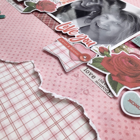
It's Kristine Davidson here today and I'm sharing a layout with you using the My Valentine collection. I wanted to create something different for this layout. I just felt like using more papers but I didn't want to layer them like I usually do. I ripped the edges of the background paper and added some different patterns behind it. It is different but I feel like the papers from this collection all go together so very well.
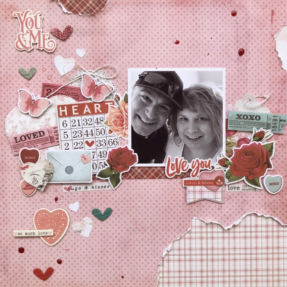
I added layers of clusters of course using some chipboard stickers and Bits & Pieces from the collection. Layering different elements on your page creates a wonderful dimension and creates texture when using different pieces.
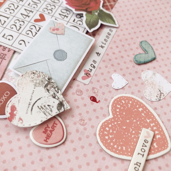
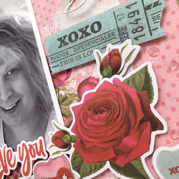
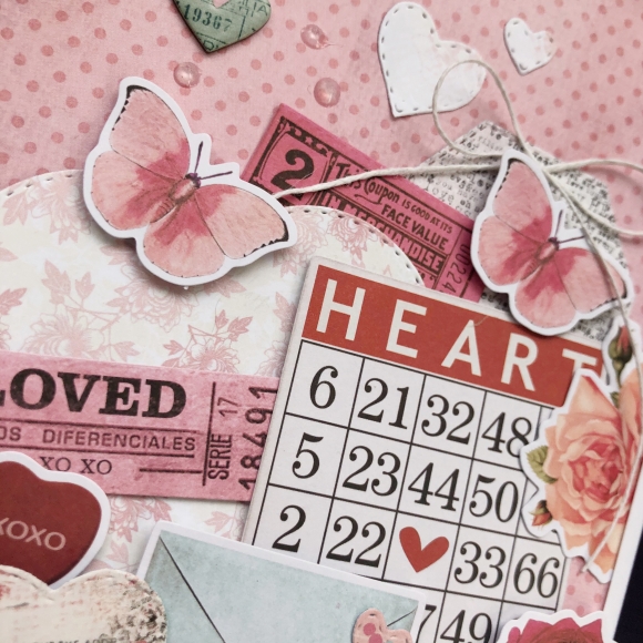
Here is another close up of my ripped edges. I added some pop dots underneath to create more shadows and dimension.
I hope you enjoyed my project today and please come share on instagram your recent layout using Simple Stories!

