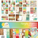
A Summer Album in a SN@P!
Hi Simple Stories fans! Rebecca Keppel here today with a Simple Stories SN@P album documenting the fun of summer. Simple Stories created the SN@P albums and pieces with people like me in mind. People who love the idea of mini albums, but kind of freak out at the idea of making them lol! When you typically create layouts and design with a larger space such as 8.5x11 or 12x12, the smaller format can be a bit scary. Not so with SN@P! albums. Much of the work is done for you and the parts that are not done are super user-friendly. You can easily complete an entire album in one weekend. I used the Good Day Sunshine collection to make a SN@P album documenting all the fun we had this past summer. The Teal Chevron Burlap album is gorgeous as is, but I decided to tie some trims and add a 4x6 card with stitching for the cover mounted on a scallop cut piece of wood grain paper. It's always nice to have the year on the cover too.

The inside cover page says it all, doesn't it?!

The first page features the last day of school! Anyone already looking forward to that again? The 6x8 SN@P! pages feature awesome die cut pages and they really don't need any embellishing at all, they create such a statement on their own. I love how you can see the next page through the die cut letters.

I am in love with the Pocket Page formulation here. It includes two 4x4 pockets perfect for either Instagram photos OR the 4x4 cards and four 2x2 pockets again perfect for mini photos or cards. The sun die cut page is AWESOME! I loved backing it with a sky page :)

I used the full 6x8 pages to introduce each month of the summer.

On the back of the intro page I used a typewriter to journal about the main events from that month. On the right you see another die cut page. This is one that came with the album. It is awesome as-is, but I thought it was fun to spritz it with some coordinating mist.

Another die cut page - LOVE THEM - and you get a bunch in the pack. This Pocket Page is fun for a bunch of photos and one journaling card. I like to mix handwritten and typed journaling in one album.

Love that the 3x4 cards are double sided so the green polka dot is just the backside of the card from the previous page. I simply added a chipboard sticker to spice it up ;) On the right you can see a couple of pictures that were smaller than the pockets. One is mounted on a 4x4 card, and one is stuck in a pocket with a 2x2 card behind it. Don't worry about having just the "right" size.

In this whole spread there is really only one 4x4 photo, but it feels like there is lots going on thanks to the Good Day Sunshine cards, brads, stickers and SN@P pages.

Here is July's introduction. No photos at all here, just journaling.

The SN@P cuts are fun too. On the left one is backed with a 4x6 card so you see a fun pattern through the lettering.

I used the 4x6 transparencies on a photo from the previous page and the one on the left here. What's nice about the 4x6 pockets is that you don't need to adhere the transparency, just slip it into the pocket in front of the photo.

The banner die cut SN@P page is another of my favorites. I love that it is a unique size and shape that allows you to see the page behind it.

The 6x8 pages can also be used to highlight one large photo like I've done on the right here.

And again here on the left. Stickers and chipboard can be fun on the empty space of a photo.

Here is the introduction of August the final month.

Here I have more journaling and a 4x6 photo that I made into a vertical strip collage before printing. On the right is the last title page and introduces our last weekend of the summer.

I had fun added little bits to the top of pages with binder clips. The Today is a Simple Stories die cut available here in the Silhouette online store.

Last, but not least, the final page to my album.

This album was fast and simple to pull together, but I love the colors, the bits and pieces and of course all the memories it holds! I can't wait to make my next SN@P! album!


