01.20.16
Today
Wendy here today to share some inspiration from the brand new Life in Color collection. I used this collection to capture some everyday moments in our life; there were so many pieces and colors that worked for any topic from a fun moment with my husband to some selfies on Dumbo!

I just couldn't resist grabbing the fun Here and Now paper with all the Polaroids to begin creating with. This paper was perfect for all the many selfies I have taken with my boys while we ride Dumbo over and over again! I began my page with some small wallet size photos placed throughout the page and then I began to decorate and bring the page to life.

I loved using the bold Life chipboard piece and I paired this boldness with a 2x2 Sn@p! card with the month of the pics. One of the photo stickers allowed me to add in a thought without detracting from my grouping.

My next piece was the Hello Bit & Piece that added a pop with the black and it added to my title to make it more comprehensive and led your eyes through the entire layout. I also took some Bits & Pieces and layered them to decorate the other Polaroid adding some interest and color.

My final touch were some of the chipboard binder clips that I "attached" my photos with giving each photo some pizazz with the shiny clips and forming a visual triangle of sparkle.
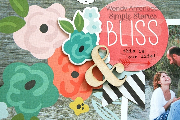
My next layout, Bliss Today, began with this picture I had just taken at our photo shoot and the 4x4 Sn@p! card that expressed love in the bold black.

I nestled my "photo block" on the lovely woodgrain paper to match the sand color. I loved the triangle pieces which I used to bring in some color that matched the grass and pulled your eyes from top to bottom. By adding the darker colors I was able to get away with the pink (which I thought was lovely), but which my husband might have fussed about.

I dressed up the black Sn@p! card with some Bits & Pieces and added to my title. I loved the sentiment on the 4x6 card which I cut out and used to bring your eyes down the paper. A few scattered circular pieces carried throughout the layout also helped carry your eyes through the page and make everything cohesive.

A grouping at the bottom of the page incorporating the triangles, flowers, black, and circular elements continued the trend of bringing your eyes through the page.

And one last look at what gave my page its title and started the circular downward descent to tie the page together and create a lovely layout.
Thank you for joining me today, I hope you are as excited about the Life in Color collection as I am!

