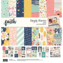
Travel Faith
Hello friends! It is Stacy here today with 2 layouts using the Simple Stories Faith Collection. When I laid eyes on this collection for the very first time, I thought of all the travel photos I could craft with it. Travelling to me is always a new adventure, setting foot on foreign soil and not knowing what could come next. Every culture has its own unique characteristics so each experience is special. Every time I travel, I get inspired. There is always a new perception to grow my knowledge or inspire me on a different level. Every trip I go, I let God decide what is good for me. This faith keeps me wanting to go travelling often, to explore and be inspired.
The recent trip to US for the Creativation 2017 show was an eye opener. I had never flown halfway around the globe before, and this trip gave me new experiences I would never forget. For my first layout, I decided to document the trip to San Francisco just before heading to Creativation 2017.
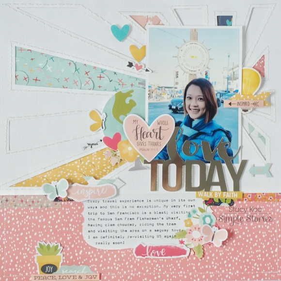
The sun was up that day despite it being extremely cold. The weather was a blast! Love this picture taken at San Francisco Fisherman’s Wharf, the background in the photo gives me a lot of memories to remember!
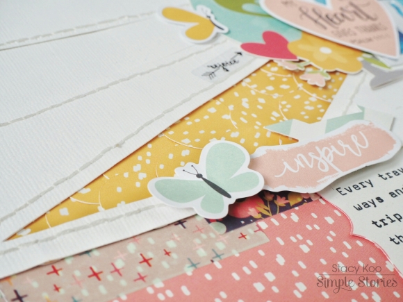
Inspired by the weather and the logo of the Fisherman’s Wharf, I used a sunburst digital cut just behind the photograph to give it a spotlight. I also did some regular back stitching to highlight the rays of the cut. I left some of the negative spaces intact. On alternate sunrays, I punched some circles in different sizes to fill up the spaces in order to give it some colors. The Faith collection has a good range of pattern papers! The colors appeal very much to me, so I could not help but to showcase some of the lovely colors in the sunburst die-cut.
I have also added Faith Collection Washi Tapes at the joint between the white cardstock and the pattern paper. It is a good way to mildly eliminate the contrast between the 2 sections!
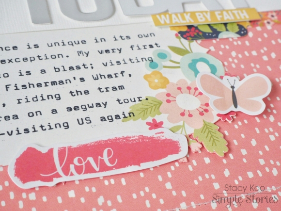
On the lower half of the layout, I have cut a bracket shaped element from the pattern paper. This time, I had a lot more journaling which I wanted to add to the layout, hence the choice of this element to fulfil my journaling purpose. I later added elements from the Bits & Pieces pack. I like to stick butterfly embellishments by folding it halfway, and only applying foam dots to the centre of the butterfly. I find that it gives the butterflies some flexibility and it looks like it is fluttering away!

There are so many new experiences in the trip where I felt inspired! So, I could not help but to add the light bulb chipboard piece, marked with the inspired sticker. I have also added a little digital cut arrow as the background for the sticker piece.
_______________________________________
For the second layout, I have used a photo taken at the San Francisco Palace of Fine Arts.
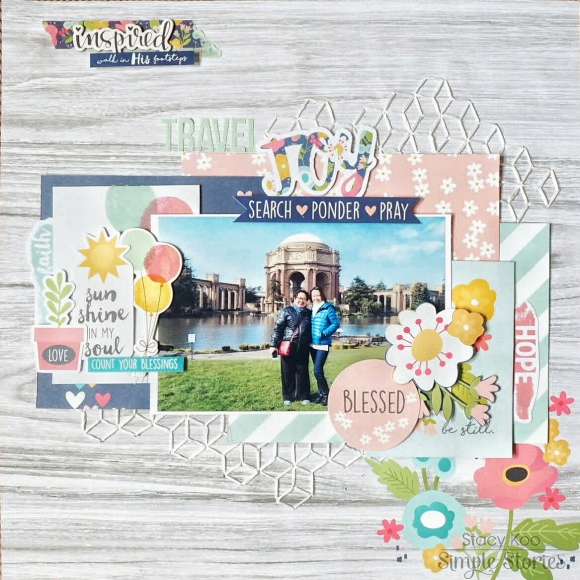
It was a beauty and quite a sight to breathe in, and every walk around this palace was calming and inspiring. It was always a joy to travel, and especially so with a great crafty friend like Aida!
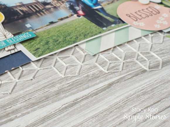
I started the layout by first doing some random stitching on the background. I like the wood grain background, smoothing and calming suitable for this photo.

I love the Sn@p pack! It is great for many different reasons, and I used it as part of the layering behind the photo to create contrast. There are so many wonderful pieces in this pack! In here, I have layered it up with chipboards and embellishment pieces.

Here, I have completed the layout with a title “Travel Joy”. The mint alphabet stickers are available in the sticker pack. It is also a good size for subtitles, or naming the places where you have visited.
Hope you get some inspiration from the layouts, and thanks for stopping by today!


