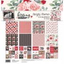
"I Love You" Featuring Kissing Booth!
Hello Friends!
It’s Kristine with you today and I’m sharing a little LOVE today! I created a layout using the Valentine’s day collection called Kissing Booth. I used a photo of my cousin and her husband for this layout and a cut file from Paige Evans. The cut file allowed me to use several pattern papers and then I was able to add some Bits & Pieces!
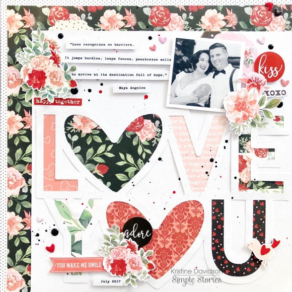
Creating layers on layouts always gives such beautiful dimension and even a bit of texture. Add some adhesive that is dimensional under your diecuts and stickers and see what effect this gives your page. You can add layers to titles, photos, diecuts and even your entire cut file on a piece of cardstock!
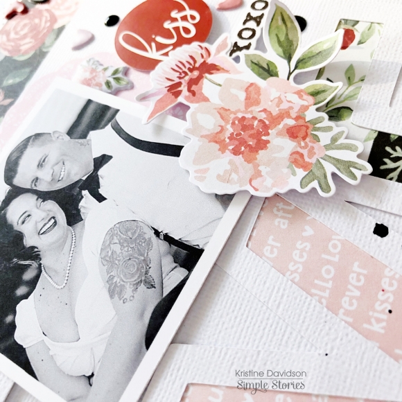
I added my cut file on a piece of white cardstock and then to add interest and color I added it to the bottom right of my page. The cardstock is cut 10”x10” and gives me space to add some pattern paper on the edge of my layout.
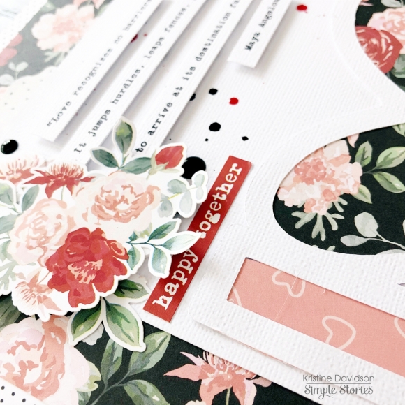
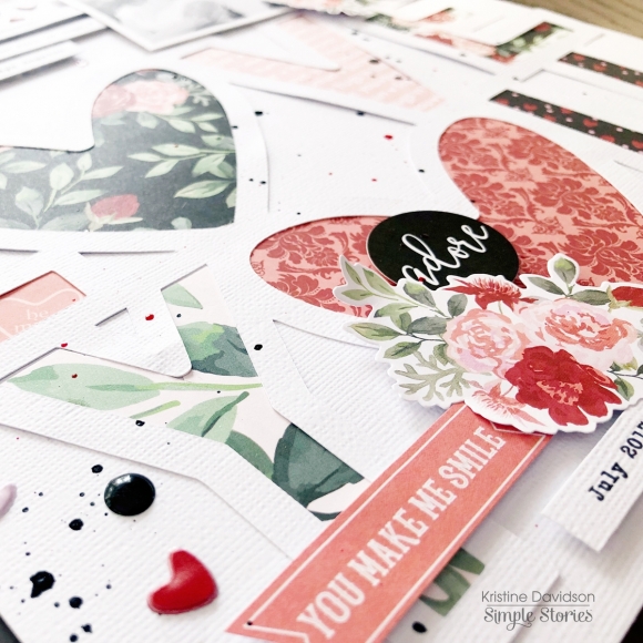
A few enamel dots and some paint splats adds interest to your page and eliminates a bit of that white space. Some prefer not to use splats and that’s okay – why not try some of the small puffy stickers we have. Those are super cute and you can add them anywhere ;) I added some hearts to my layout and love the little punches of love all over my page!
I hope you enjoyed my layout and come join us on Social Media @SimpleStories_ and myself @KristineDavidson


