March 2016 Blog Posts

Good Morning!  It's Mary-Ann with you here today on the blog with 2 layouts featuring the Let's Party collection.
 
As we celebrate my boy's 11th birthday, I realize that I never documented last year's party!  When seeing this photo, it is hard for me to see how much he has grown in the last year.  He is now as tall as I am, which isn't saying much!  WHAT!  
 
 
NOTE:  That cow.  I just had to.  Isn't he adorable?  
 
For this layout, I focused on using the 3 x 4 cards from the SN@P! Pack.  I aligned them across my page to highlight the photo in the center.  When picking through, I chose the lighter colored papers.  Ones that would help enhance the photos and help the balloon clump pop.  I would have loved about three more clumps of balloons.  It is bright and beautiful.  
 
 
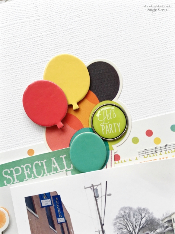
You can see from this close up that I added the chipboard balloons to the top of the coordinating colored balloon and added a cute brad to the green one.  Go back and take a look at the entire layout, doesn't the cluster just pop off the page?
 
 
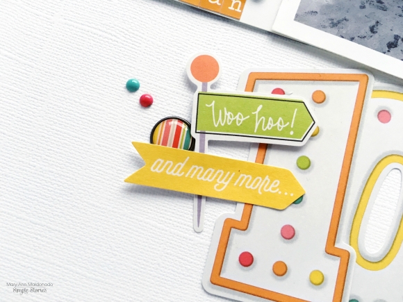
The Pocket Pieces are perfect for documenting any age.  The package contained two of each number so I could coordinate my colors.   I could even document a photo of my Great Grandmother who lived to 107!  True story!
 
 
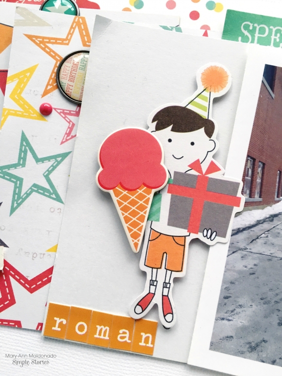
If you were blessed with a girl, you are certainly not going to be left out.  You could change the boy out for the girl and still create the same page!  Adding the ice-cream to the the boy just added dimension.  
 
************
Ever have an idea in your head for a layout and the photos don't allow you to do exactly what you want?  Well, that happened to me on this layout. I wanted to use a standard shape balloon but my photos were too wide for that.  So I opened the balloon file in my Silhouette, and stretched it out of proportion to create funky balloons that would work with my idea (see tip below on how I did it).  


I layered and layered.  Combining Chipboard, Bits and Pieces, enamels and brads all together to create my adapted idea.


Take a look at the crazy background at the bowling center.  Perfect for party photos and perfect colors for this Let's Party Collection!
 
TIP for creating the balloons - Upload your photos on a separate page in your Silhouette Cameo.  Copy the balloon file and place it over your photo.  Stretch the balloon and manipulate your photo so they will work together.  Then remove the balloon from the top of the photo.  Cut that exact balloon, print that exact photo.  Place the cut balloon on top of the printed photo.  Trace with a pencil and cut the picture with scissors and you have your photo in the shape of a balloon!
 
Thank you stopping by today to see my colorful layouts.  I hope you will give shaped photos a try!


Supplies

Hello dear Friends! This is Alexandra waving from Chicago and I have a brand new double-spread I would like to share with you. 

For these pocket pages I have used the beautiful collection called: Life in Color which I think is perfect to showcase indoor and outdoor pictures of our daily life.

★★★


I have noticed that in the dead of winter,  pictures taken outside become rare so I made a point in taking more pictures of the outdoors even if that meant including grey skies and lots of bare trees. They are part of what we see daily in Chicago after all! I also think it is important to include other family members' pictures (my husband sent me an aerial picture of North Carolina).  I took a picture of my order from Thistle Farms. I love their products, especially their Lavender liquid soap and their mission is very noble. The big news is that I finally had my eyes checked and surprise, surprise, I needed glasses! Got myself my first pair of Progressive Lenses!


On the above close-up,  one can see a tag with the date printed on it. Adding a title and an embellishment directly onto a landscape photo serves two purposes: it adds a little color and gives an important piece of information.

★★★


Another thing I often do when I place my pictures in the pocket pages is that I place close-ups at the bottom of the pages and landscape pictures with a piece of the sky all the way to the top. It is not a rule by any means but I think it helps achieve a good sense of scale.


The clear stickers can be used in so many different ways, directly placed on a picture, added to a card (see left page) or like here, adhered to the center of a butterfly embellishment. 


Hi planner friends!  Vanessa here with you today to show you how I used the beautiful Life In Color collection in my Carpe Diem planner.  With Spring just around the corner, this collection definitely added some color to my Robin’s Egg planner and it may even motivate me to do some Spring cleaning!
 
 
For the inside pockets of the planner,  I like to switch things out according to the season and theme of my planner.   I decided to add in some of the Life In Color Ephemera Bits and Pieces, along with the coordinating journaling cards from the same collection.  These not only add a pop of color and look pretty, but they can also be added throughout your monthly or weekly pages.  I like use the journaling cards for memory keeping and events I don’t want to forget.


Instead of a dashboard for March, I made a really simple planner folder using one Life In Color “So Much Happiness” cardstock.  I use the folder to store my Carpe Diem stickers, journaling cards, and receipts.  I also dressed up the folder with a few Life In Color bradz and ephemera.


The folder is simple to make and it does not require any adhesives.  I only needed one 12x12 cardstock, paper trimmer or scissors, and a single hole punch or an A5 hole punch.
 
 
Take the 12x12 paper and fold the bottom up about 3.5”.  Then fold the sheet in half, vertically.  Take one of the planner inserts to trim down to size and the folder should measure 5.75” x 8.5” when folded.  Punch in your holes and that’s it!  If the paper is double-sided, you can reverse it as well.
 
 
For the monthly pages, I decorated them again using Expressions cardstock stickers, washi tape, and the ephemera bits and pieces from the Life In Color collection.
 
 
To add a little decorative piece, I punched in a Snap vertical 4x6 pocket page and inserted some of the Life In Color 3x4 journaling cards and ephemera bits and pieces.  You can definitely use these pocket pages for photos, journaling and memory keeping. 
 
 
I used the Carpe Diem number stickers to add a pop of color and to give the pages a cleaner look.  The number stickers come in a variety of colors, but of course I had to use green for March!
 
 
 I hope you enjoy using the Life In Color collection in your planner and be sure to try out the folder and the SN@P! vertical pocket pages.  Be sure to follow me on my blog and happy planning!

Hey there!  Vicki here to share two of my favourite Simple Stories products…SN@P! Packs and 4x6 SN@P! Binders!  I love that these items allow me to make an awesome project in no time flat!!!  I chose the We R…Family Sn@p! Pack and the yellow 4x6 SN@P! binder along with some Bits & Pieces to create this fun album.

Love how colourful this line is and this album will be the perfect place for random family photos.  Here is a closer look…

Here I created a pocket by adhering the bottom and sides of a 4x6 card to one of the pages included in the book & then added 3x4 cards inside.

I layered a few 4x6 cards to create flaps on this page.

And another pocket page.

Minibooks are one of my absolute favourite things to create and these 4x6 Binders are compact and fun!  The SN@P! Packs offer a great sampling of the Simple Stories lines and the addition of diecuts are perfect for embellishing!  If you haven’t grabbed these items yet make sure to consider them the next time you need to put together a quick mini!  You won’t be disappointed!!!!

Hello there! Allie here today, sharing two layouts using the fun and cheerful Carpe Diem Scrapbooking collection! The colors are so lovely and springy, and they make me so happy. I also love how versatile this collection is! There are lots of different elements that could be used for a variety of themes.


One of my favorite techniques is fussy cutting designs from patterned paper, and the Brand New Day pattern is perfect for it! I used my trusty scissors and cut out as many flowers as I could. Next, I added flower elements from the chipboard and sticker sheets, to add variety and dimension. I arranged the flowers so they looked like they were cascading down the page.


I used the fun watercolor hearts as another accent, just because I love them so much! Another one of my favorite embellishments from this collection are the frames. They're just the perfect thickness and I love the patterns they come in. I used two of them to highlight my photos.
 
 
Since this layout had a lot going on, I decided to make it "distressed" by crinkling the edges of the layers and adding a watercolor background with gelatos.
 
************
 
 
For this next layout, I wanted to highlight the coffee themed elements, which are my absolute favorite thing about this collection. I used a heart die cut and added different patterns behind each heart using the 6"x6" paper pad. I grabbed the coffee cups (LOVE them), and added them to either side of the page.  Next, I used the letter stickers to make my title!
 
 
Embellishing was so fun! I added mist, enamel dots, stickers, and various hearts from the chipboard, wood veneers, and paper clips.
 
 
To finish this layout, I sewed around the edges. I'm still learning to sew, so my sewing is anything but straight. I passed it off as messy and added corners to cover up where I tried to transition. Luckily there are no mistakes in scrapbooking!
 
I had so much fun creating with this collection, I hope it inspired you!

Supplies

Hey planner loves! Meka (instagram.com/yespleaseplanning) here with you today, sharing how I mixed elements from Life in Color and the Carpe Diem scrapbook and planner collections for my March Carpe Diem planner  setup. I gave myself permission to use what I love, even if there’s no clear-cut theme.  The fact that I adore the pieces makes me super motivated to pick up my #teamaqua and get my plan on!

My front pockets are filled with decorative clips, washi paper tape, and a few quick-grab notes off the Sticky Notes Bookmark. Bradz and chipboard stickers were transformed into paperclips in seconds—my stickiest washi tape keeps them attached to standard paperclips, but I can remove and repurpose them whenever I’m ready. I cut down 12x12 inch Expressions Cardstock Sticker sheets, stuffing the mini alphas and word strips inside my secretarial pocket with my other planning essentials.

This cheery patterned cloud “Fist Bump” scrapbook paper from the Carpe Diem line is right at home in my planner. It kinda hurt me to cut into it, but the cloud cut outs layered on top of the transparent dashboard adds unexpected dimension that’s just perfect.

March means luck and green, green, green!  I transformed a Sn@p binder page from the Life in Color Planner Set into a lucky inspiration piece, and adhered it to my March cover. My own handlettering, paint splatters, and doodles make this page totally me.


For the monthly layout, the bold March green gets softened up with florals, hearts, and polka dots.


Saturday and Sunday are where the action is, and I think of them as a unit. So, I covered the original Sunday to Saturday headers with washi paper tape, and gave them new days with cardstock flower stickers and alphas.

The Easter eggs were cut from Carpe Diem scrapbook paper, and strips of washi paper tape.

Meal planning has always been a struggle for me, but this month I’m putting more effort into it—gotta love on myself, right!? This week-on-one-page Life in Color  insert will be perfect for listing meal ideas.

I think these gorgeous Life in Color cardstock stickers will make it hard to ignore my healthy plans.  

Remember to use what you love in your planner. Mix and match and make it your own— and that’s super easy to do with the Life in Color and Carpe Diem collections!

Hello Friends! 

It's Kristine Davidson and today and I am going to share a few projects I created using the new Heart Simple Set. When I saw this collection I first fell in love with the gorgeous colors and once I really took a few minutes to read the sentiments I realized it wasn't necessarily a collection about love but more a collection of documeting the loss of a loved one.  I decided instead of using this collection for what it was meant for - I was going to use it to document the everyday love.   

My first layout is called Love Today.

I created this layout using a white background and also a white die cut background from the silhouette store. Adding a bit of gold to my cardstock was something I did to showcase the hints of gold in this collection.

Here are a few close up photos and you'll be able to see more details and what I did to create dimension with the Fundamental Sticker sheet that comes with the "Heart" collection.   

I do have another layout that I created using this collection but it's 'top secret' as it's being published this summer, so I'll show you 3 cards that I created using the same collection and a sneak peek of my layout that I'll be able to show you later in the year :)

Here are a few sneak peeks of my second layout -

You can tell that I loved creating with the Fundamental Stickers and I really did use this entire collection kit on 2 layouts and 3 cards.

The cards I created are for those special moments of remembering a loved one. We always create cards that are happy, birthday themed, or for anniversaries. This SImple Set is really perfect for those compassionate moments in our lives. 

I used a pieces from every sheet of paper on this card. Isn't that navy blue with green and yellow amazing? I added Kraft tags to my cards and of course a project wouldn't be complete without some twine ;-) 

This next card is simple - created with a little sentiment for those dear to us. 

My last card was created with leftovers from my patterned papers. I cut up some pieces and sewed them on a piece of Kraft cardstock. I made some messy sewing and added a Kraft tag for my sentiment. 

I guarantee you will enjoy creating with this collection regardless if it's for sentimental reasons or everyday love stories.  I hope you enjoyed my projects today and enjoy creating with Simple Stories!

You can find more of my work on instagram @KristineDavidson

Supplies

Hello everyone ! It's Mindi here with you today.  I am excited to be sharing some pocket pages here on the blog. They are all about a fun weekend getaway last year. When the new collection,You Are Here, came out I knew it would be perfect for this project. I was right ! 
 
Last summer we made an impromptu weekend away down at the coast. There were lots of stories, photos, and then more photos that I wanted to include. I added in an insert by cutting a page protector in half and sandwiched it in the middle of the two 12x12 pages. Here is a look at all three pages layered together.  
 
 
The left side of my spread includes stories and photos from Day 1 of our trip. This collection has some great colors that lend themselves to match a number of travel photos. As I went along with my pages I made sure that I tried to spread the colors all throughout. 
 
 
I always like to create a title card. For this one I didn't need much in the way of journaling so I added the date using stickers. I decided to go a step further and add in some embellishments, the chipboard frame and a few stickers throughout. 
 
I used a few journaling cards to remember all the little details of our trip. The weather die cut piece was perfect for adding to the fact that we got rained out on Day 1. 
 
One of my favorite products to use and embellish with are the clear photo stickers. They are simply awesome and are easy to add that person touch to any photo or journaling cards.
 
 
Here is an example of using the clear photo stickers. I added the word Wander to the empty space in my photo for a great look. 
 
 
Moving on to the insert now. Ever since moving to California I have developed a love for Palm Trees. So as you can probably guess I loved all the palm trees in this collection. I added a chipboard sticker onto my photo. 
 
 
I created this filler card by adding the wood veneer palm tree onto the filler card. To make sure we always remembered where we went I added in the city and state name onto the card using some stickers and stamps. Here is a close up.
 
 
Here is a look at the back side of the insert and the right side of my spread. 
 
 
During our beach stay we rented a family sized bike. That pink scooter was to cute not to use, it was perfect. I stayed a little simple with that journaling card by only using the scooter die cut and a clear photo sticker layered on top. 
 
 
I used a couple different pocket pieces throughout but this creme colored tag was one of my favorites. By using a combination of different elements to embellish it making it a great substitute for a journaling card. 
 
 
By using some acrylic paint I transformed this wooden veneer piece. It was easy to complete. I used a ruler and made a line from one corner to the opposite corner. Then brushed on some paint and there you have it. A simple, easy, and great way to add a fun look to any wood veneer piece. You should give it a try. 
 
 
One last close up for you. I combined a few different elements for this card. I started out by adding in a photo to the 4x6 journaling card. To complete this look I cut the journaling area out and added the journaling card on top of my photo. The fun camera pocket piece was so fun to layer on top. I added more layers Iby adding some other die cut pieces. 
 
 
Thanks for coming to the blog today. I am so happy to have this fun weekend documented now. It was so fun to play with this great collection. I hope you might have found some inspiration and can go and create some projects for yourself. This collection can be used for any number of themes so be sure to be on the look for it. 
 

Pages