November 2016 Blog Posts

One of the things we love most about working with the amazing community of passionate scrapbookers and planner lovers is getting to know the many customers and store owners who give their time and creativity to special causes. One of those people is Wisconsin scrapbooking store owner, Therese Hennessy.
 
Therese is the owner of Polkadots and More in South East Wisconsin, and her passion is to help people preserve their memories. In 2014, Therese was working in her store and met the proud family of a local veteran. She was moved by the pride they had in their family's patriarch and for his service.
 
Later that day, Therese heard about the Honor Flight Network on the radio. She learned that the Honor Flight Network gives free transportation to America’s veterans to Washington, DC to visit the memorials dedicated to honoring their service and sacrifice.
 
She was so inspired by both stories she developed the idea to create an organization that donates customized scrapbooks to veterans who take Honor Flights so they could have a personal keepsake of their trip.
The Honor Scrapbook, Inc.. Therese reached out to Simple Stories for help with designing and manufacturing the custom albums and supplies, and we were thrilled to be part of such an amazing project.


Therese has had the pleasure of meeting some of the veterans with inspiring stories and has gotten to present them with their very own Honor Scrapbook. Her goal is to provide every veteran with a memorable album that they can enjoy and also pass on to family.


Please read more about Therese and her passion by visiting thehonorscrapbook.org. While you’re there, you can donate to the cause to provide an album to a veteran or purchase albums for friends or loved ones.

Thank you, Therese, for letting us be part of your journey. And to all of our nation’s veterans, thank you for your sacrifice and for your service.

Hello again crafty  friends! Leah here to show you how I am using one of my Doc-It journals as a gratitude journal. Did you know that gratitude boosts levels of dopamine and serotonin in your brain? Just the act of thinking about what you appreciate can trigger these “happy” chemicals in your brain, making you feel happier.  November is the month of the Thanksgiving (in the USA) and often inspires many of us to spend more time reflecting on what we are thankful for. This month seemed like the perfect time to start a daily gratitude journal.

In the past, I have tried to incorporate documenting gratitude into my daily routine, but I have failed time and time again with establishing it as a habitual practice. I am just recently realizing why that keeps happening. I don't know if any of you feel this way, but when I think about what I am grateful for, my brain immediately goes to BIG, general ideas, such as family or my health, or the roof over my head. While I truly am SO grateful for all of those more obvious things, thinking on such a large scale really limits my list. When you are trying to establish a daily gratitude practice, you start running out of ideas pretty quickly if you are too generalized. My dear friend Tiffany spoke to me a little about how she has been documenting her gratitude and I have found her method to be quite helpful for me.  At the end of the day, she reflects back on that day and asks herself, “what is the best thing that happened today?”  Then she writes it down. This practice has really helped me get more specific with what I am feeling grateful for, which makes the process a little more exciting because I now have more variety in my answers. This method has also become a wonderful way to document memories! You will notice how my daily pages so far have a scrapbooking vibe, which is making this project feel even more special, by including mementos and photos with each gratitude message.

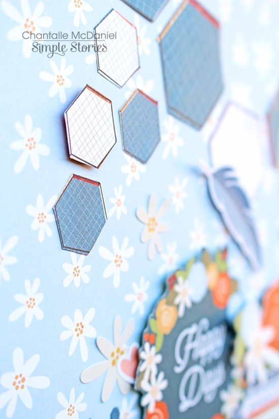
For this journal, I started with the Posh Doc-it journal and covered it with one of my favorite 12x12 papers from the Hello Fall collection. I added watercolor to the background and then layered some gold glitter washi tape, tissue paper, a small square SN@P! piece, and a couple of those beautiful leaf die cuts from the Hello Fall collection. I used foam adhesive under the square to make it pop off the background.

The bottom is just torn pieces of patterned paper that I layered and inked to add a little dimension. In the corner, I inked a doily and added some Hello Fall stickers and twine.

The inside cover and first page of the journal act as a cover page. On the left side is an element from a page in the Hello Fall 6x6 paper pad. I felt it was appropriate because I am grateful for all of the things listed (which is why I love autumn so much)! I used some leftover paper scraps to layer behind the words. I inked the edges of the yellow paper to give it a burned look and added some string from my stash that reminded me of sweater material, which I thought gave the layers a “cozy” feel. Last but not least, I punched a tag out of some orange patterned paper and added twine and a clear sticker from the Posh collection.

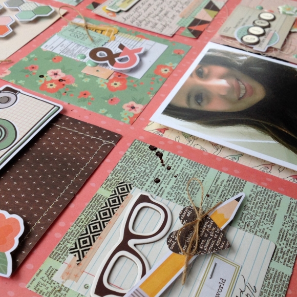
On the first page of the journal, I used more of that paper I covered the front of the journal with, but I painted the leaves with different colors of watercolor paint. I also painted some of them with a gold shimmery paint. I drew a border around the paper with a fine point sharpie. On top is a Hello Fall SN@P! card and the letter and number stickers are from the Posh collection. 

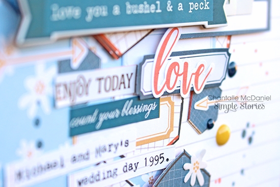
 I then added a cluster of embellishments: a gold doily, enamel dots, a tab, word strip stickers and washi tape. 

The bottom part of the page has a picture of my entire family and the gather together words are fussy cut from a 12x12 paper in the Gather Together collection kit.

I am only documenting a couple of days from the end of October because my husband and I celebrated our first wedding anniversary over Halloween weekend. I wanted a chance to scrap those memories and express my gratitude on those special days.

The first layout in my gratitude journal is highlighting the date night that kicked off our wedding anniversary weekend! I documented the memories from that night with some photos, movie tickets and journaling. On this day, I was thankful for date nights! All the décor used in this layout is from the Happy Haunting Collection kit, except the washi tapes. I LOVE adding watercolor to my layouts because it adds so much vibrancy and interest! The paper in the Doc-it journals is very thick; it takes the watercolor so well and doesn’t bleed at all!

The next layout is from a trip to a Halloween event that my husband and I took with my youngest sister. Even though the event itself was not all that we expected, the spooky atmosphere and the company made this night a blast. On this day, I documented the experience and expressed gratitude for my sister’s wild, super goofy and amazing personality. She is one of the funniest people I know and we took so many crazy photos that night- this is only some of them!

All of the décor is again from the Happy Haunting kit. I fussy cut the date and the crossword pieces from the 12x12 elements pages to create die cuts. I added lots of watercolor to the background to allow the die cuts to pop off the page.

I really love how the crossword looks with the watercolor peeking through!

Instead of gluing the card at the top of the layout down, I stapled it onto the page so that I could add journaling underneath.

The next layout is really special. This one went a little against the grain in that I didn’t journal about anything from that specific day. We had to work on our actual anniversary, which is why we spent the weekend celebrating. So for this day, I printed out some of our wedding photos and journaled about how thankful I am that my husband challenges me and truly makes me a better person.

This layout understandably has a more romantic feel than the last few pages. I used the beautiful Posh collection for this one. I mostly used SN@P! pieces and die cuts from the collection and used several of my paper punches to punch different shapes out of the 6x6 paper pad to layer behind the photos. I used my scalloped edge punch a lot in this layout, which was inspired by the white doily that spans both pages underneath all of the photos. It is a large square doily from my stash with a scalloped edge. 

I really like adding ink to the edges of most of the layers because it adds dimension by creating some separation between the layers. In this case, it makes them stand out against the white background as well. I also frequently add faux stitching to my layouts, like I did to the vellum circle, because I love how it looks and am often too lazy to do the real thing.

How lovely are the clear stickers over the photos?! 

I really hope I am able to continue diligently with this gratitude journal! Many of my upcoming layouts are only going to be one-page, the two-page layouts will be reserved for special occasions. I hope you will follow along with me on this journey and try creating your own gratitude journal, or just use a notebook or your planner to write down something you are grateful for every day. Remember to stimulate those happy brain chemicals! Follow me over on Instagram to see my upcoming journal layouts!

With love and gratitude.

Supplies

Hi everybody ! It's Mindi here with you today. I am happy to be here sharing some pocket pages I recently put together using the Posh collection. 
 
This collection is among my all time top favorites. The colors are so pretty and the rest of the collection is perfect for the every day documenting. 
 
 
As I have mentioned before I typically do my pocket pages weekly. I chose some photos that seemed to match up well with the Posh collection. This week's photos was perfect. Here is what the left side looks like. 


Here is my title card. I love these little 2x2 month squares that come in the SN@P pack. I used the square as the beginning of my title card by placing it onto the big label on this 4x6 card. 
 
 
During this week McDonald's was hosting a kids eat free breakfast. I took the kids to eat breakfast before school and it was a win/win. I didn't have to cook and we all got free breakfast. 
 
 
One of the things that I like to do in my pocket pages is to use the letter stickers and other stickers to help tell my story. I used the stickers on the bottom picture to spell out BOYS. My son kept bringing home rocks that he found on the way from the bus. 
 
 
This gold foil chipboard piece was the perfect embellishment to tell a story about my oldest daughter. She was chosen to be on the robotics team at school this year. I also wanted to add in some sort of robot to help tell my story. So I decided to use two pockets to tell this story. I simply cut the chipboard piece in half to fit on both of the cards. Then I used it as my starting point, adding everything else around it. 
 
 
Let's talk about the right side now. Here is a closer look. 
 
 
I continued with the color scheme on this side as well. The navy blues, the pinks, and yellows. 
 
 
I made a cluster of embellishments on this journaling card. 
 
 
I am really loving using these big journaling cards as a weekly recap. The cards are already embellished for you so it makes it super easy to add to it if you want to customize it. 
 
 
This particular week I had a few less photos than normal. So I decided to use this filler card that seemed to fit my week perfectly. Using this filler cards is always a nice way to go. I need to do this more often. 
 
 
Thanks for coming over to the blog today. Have a great day and take some time to be crafty. This Posh collection is fabulous and is perfect for just about any project. 


Hi again and welcome back to the blog today. Here in Australia we don’t officially celebrate Thanksgiving but that certainly doesn’t mean we can’t count our blessings! Hello Fall is perfect for taking stock of all the good things in my life. I’m so thankful for my beautiful family!
 
Thankful for you
 
A tender moment captured between siblings is gold!!
 
 
The little apple in the Hello Fall was the inspiration for this page. I’m so thankful for my two cheeky monkeys!
I wanted a way to reproduce the shape… I was looking through my stamp stash to see if I had anything I could use when it occurred to me I could use an actual apple!
 
 
I chopped an apple in half and coated the cut side with acrylic paint. I primed some smooth white cardstock with gesso beforehand and then went about stamping a pattern on the paper. It took me right back to my Kindergarten days, stamping with potatoes!
 
 
Once I was happy with my little apples, I filled in some details with watercolour paints.
 
 
The final finishing touch was to pop some little leaves on to the stems. I had a look through the collection and found leaves in various forms, which added a quirky charm to my apples.


____________________________________
 
Happy Days
 
Here’s a throwback page to 1995 when my husband and I first started dating. So fresh-faced we were back then, haha!  Through life’s ups and downs, I am grateful to have him along for the journey.
 
 
I’ve kept to a predominantly blue pallet on this one, to coordinate with the tones in the photo. I pulled out lots of little elements that I thought would work and combined them on a bit of a mixed paper background.
 
 
The main background is a sheet of Hello Fall ‘Heart Fall’ 12x12. I loved the pretty daisy print but I wanted to add a bit of contrast, so I added a section on the right hand side which comprises a 4x6 card from the Hello Fall Sn@p! pack and a bit of the 2x12,4x12 & 6x12 Elements Page (#6915). To bring out the blue notes, I added some hand cut hexagons from a sheet of ‘Warm & Cozy’ and then added some smaller hexagons from my Hello Fall 6x6 pad. I don’t know about you but I love seeing all the patterns in a smaller version in a 6x6 pad - so cute!
 
 
I’ve typed up a few notes about the photo and layered those over some label stickers from a pack of Hello Fall Stickers (6932) and a few other bits and bobs. The little details I add at the ‘end’ of a page are always my favourite. Those tiny elements just pull everything together I think!
 
 
Thank you for stopping by today.   Happy creating!


Supplies

Hi everyone!  Theresa here with a look into my Carpe Diem planner for November!  I'm using The Reset Girl line in my Marigold planner this month!

I covered my November divider with patterned paper I cut down to size.  I then attached a cut down SN@P card to create a pocket for my stickers and documents.

My family is traveling quite a bit this month, so I used washi tape to highlight our vacation days!

While researching for our trip, I wrote down places we wanted to go on sticky page flags.  I used different colors for activities, restaurants and stores.  I was able to move the page flags around and play with our itinerary.

When I wrote our final itinerary in my planner, I used the same color stickers as I did page flags to color code where we would be going.  

Using the page flags and color coding helped a lot in creating my itinerary!  With the holidays and vacations coming up, I hope you give this little tip a try!  Happy planning!

Hello fellow crafters! Stacy Koo here on the Simple Stories blog today and I am using the gorgeous Reset Girl collection in 2 of my layouts!

I was drawn to this collection pretty much! It is currently used in the layout of my journals and organizers. Being a crafty soul, I can totally relate to all of the sentiments and images in this collection!

When I first laid hands on this collection, some of the elements have already inspired the idea of these 2 layouts. It seems to me that I didn’t have to think twice! Sometimes I let the paper do the work, and I go through that particular inspiration to come up with a layout.

For my first layout, I was inspired by 2 things: the hexagons which you find in the bits & pieces pack, and the lady with wide open arms in the 4x6 Horizontal Elements

For the background, I used a pattern paper from the Sn@p Basics collection. Basic collections like these help me emphasize on the hexagon sewing techniques and showcasing the other decorative elements clearly. I hoard a few packs of these basic collections, because I always get to use them in a project or another! Here is a closer look at the stitching with some DMC thread and the title.

I have also done some fussy cuttings from The Reset Girl collection2x12, 4x12, 6x12 elements I find that the words “You Go Girl” fits the idea of travelling. In this photo, I went to Thailand with one of my best crafty pals and the entire trip was a blast!

As you can see, I am in love with how the 4x6 Horizontal Elements co-relates to the photograph! Sometimes the inspiration just comes to you and I love how easy it was to fix my mind to all the pretty elements in the pack. Fussy cutting images also help me to utilize the pattern papers in different ways!

The other cluster of embellishments all specify a single theme – travel. This collection is super versatile. I like how the elements fitted together - the organizer / passport, travel tickets, flight tickets, camera – they remind me of every single moment during this trip! I like how this collection comes with the small and big pieces! It gives me so much more possibilities!

In addition, I added a stamp just above the date of the travel. Yes you heard me right, there is a roller stamp in this collection and you must have this! 

On to the next part of the embellishments, I added a single chipboard decoration. Because it shines in perfect harmony to my travel theme, there isn’t a need for more! Just pack it up with some layers below from the bits & pieces pack! I love how the words shine in the light!

Another embellishment I love is the using of clips! This clip is a total blast – I love the gold rims highlighting the rounded jewel. 

___________________________________

On the second layout, I was inspired by some of the pattern papers in the collection: Like A Boss and 24/Seven pattern papers. With the photograph on hand, it was easy to find these inspirations from the collection. My best crafty pals give me the best reset when days are tough, through the creative process we go through together!

I started by cutting the pattern paper Like A Boss into its individual triangular pieces and layered it as the background. Then I did some machine sewing all around the layout to define this piece. I like to use sewing as a frame to capture attention to the center of this piece.

The next part started with layering. I like to layer the pieces near my photo to create attention. It is really easy to find the piece you need from the bits & pieces pack and then top it up with the journal stickers from the Combo Sticker.

I have also added some clear stickers to my layout. These clear stickers are so cool! You don’t have to be afraid that the background will interfere with the colors and arrangement of your elements since the backgrounds is clear! The fun part – it comes with cute hashtags!

Another close up on the clear stickers and a cute little stamp sentiment from the roller stamp!

The other part of embellishment comes from fussy cuttings. There are so many gorgeous things you can use in this collection, especially with the shiny elements! 

Last but not least, the fussy cut from the 24/Seven pattern paper! I had to use this piece, the gold trims really stands out and it best fits what I think of my crafty pals! You girls are truly amazing!

Hope you liked these layouts that I have shared with you today!

Supplies

Hello Friends, It’s Kristine Davidson with you today and I am going to share 2 layouts using the Reset Girl Collection. The colors in this kit are so versatile that they can be used for any season. I was drawn for my 2 pages and loved adding some extra colors with it. 
 

The first layout I'll be sharing is called "Reset"

If you take a look at this layout – it is filled with layers and so many diecuts. I seriously could not stop myself from adding and adding and adding and … you get the point. I love how all the colors blend so well together and create a busy focal point but not to the extreme of getting lost.

I created a title using my silhouette cameo and added a small diecut on the bottom right to create a bit of a “subtitle”.

_______________________________________________________________

My Second layout for you today is called "Girl, You are Amazing"

I created this layout based on a sketch from Creative Scrappers. It is also one of my favorite go to patterns. I love creating each little square, adding photos where I’d like to have them and of course adding little details to finish up my page.  

The chipboard pieces and diecuts from this collection can be used for so many themes. If you purchased the diecuts you can use them in your planners or yours pagesJ

To see more of my work you can find me on instagram @KristineDavidson 

Thank you so much for reading and being a fan of Simple Stories!

Supplies

Good morning friends! Brenda Smith here with you today to share a planner spread I made in my Ballerina Pink Carpe Diemusing the Posh collection. 

I really like to use the vertical inserts for my weekly planning pages because the layout just makes sense to me for this type of project. I started this vertical spread in the way I start most. First I cover the little grey header above the vertical boxes. For this spread, I used little strips from the Weekly Stickers and washi from the Modern Meadow set from the Reset Girl line. 

The next thing I do is grab the vertical box stickers from the Weekly Stickers package. I try to balance the weight of my spread by not having too many stickers or embellishments in any area without equal visual weight on the opposing side. I added the dates using the Number Stickers in navy. I like the whimsical look the oversized numbers give. 

After I’ve placed all my vertical stickers, I focus my attention on the bottom of the page. I usually like to do some extra decorating down there and take it as an opportunity to add some scrapbook paper and embellishments to my spread. I used my favorite paper from the Posh line, Love Life, and trimmed down to size.

Next, I took some hole reinforcement stickers from the Planner Basics stickers to add a little additional visual interest to an otherwise boring area of my spread. I tried several different color combinations of hole reinforcements for this spread but landed on aqua and teal. I added the October 2016 calendar sticker from the Mini Monthly Calendar Stickers to the top right and love being able to see the month at a glance without it detracting from the spread.

Then I get out my Bits and PiecesWord Label Stickers, and Designer Stickers in addition to the Planner Basics and Weekly Stickers to finish off the embellishing of this spread.

Lastly, I used the sketch pen and my Silhouette Cameo to add the “pen” (words) to my page. I like the clean look it gives the page and it really doesn’t require that much effort.

How have you been creating in your Carpe Diems? If you are sharing on Instagram, be sure to tag @simplestories_ and @CarpeDiemPlanners and use the hashtag #CarpeDiemPlanner so we can find you and give some love to your posts.  

Pages