October 2017 Blog Posts


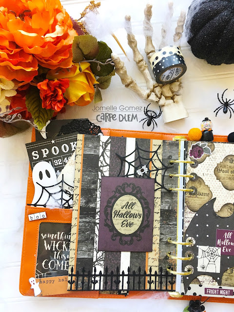
This month I am using the Black Vintage Floral Travlers Notebook with Vintage Blessings collection.

I used the VIntage Blessings digital files to print on acetate paper. It really adds a beautiful touch to your planner or TN!

I did the same with some vellum paper. I just love the sound of it when I turn my pages. I also made some pockets .

Dashboards are so easy to make and it really personalizes your travelers notebook. You will also notice some doilies I made using the 12x12 paper pads. Thank you to everyone who stopped by the blog!


Howdy friends, Happy World Card Making Day!

Are you participating, being craft & making cards today? We'd love to see your SImple Stories card creations! Post your card(s) on Facebook and/or Instagram with the hashtag #simplestoriesWCMD - we'll be keeping our eyes out throughout the day and doing some fun random giveaways!
Card maker extraordinaire Jeanne Jachna created these gorgeous cards in honor of World Card Making Day with our Beautiful collection -
___________________________________
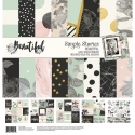
Simple Stories hit the nail on the head when they named this collection BEAUTIFUL! It includes florals, hearts, and inspirational sentiments on black and white pattern paper with a subtle tint of pink and green, and elegant gold foil embossing.

The focal point of my card is a sentiment from the Bits and Pieces pack. The pack contains loads of embellishments like the pretty florals on my design.

The 6x12” Chipboard Sticker sheet includes even more florals and hearts, and the thick chipboard pieces add lots of dimension to your projects.

___________________________________
My second card features images with the soft pink tint I mentioned.

The classic floral print and gold accents make this collection elegant and formal. The fun gingham and polka dot prints give it a fun fresh feel!
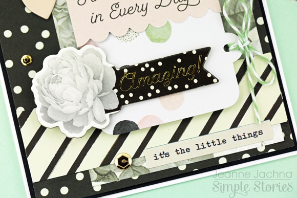
See what I mean? Aren’t those gold chipboard hearts total eye candy?
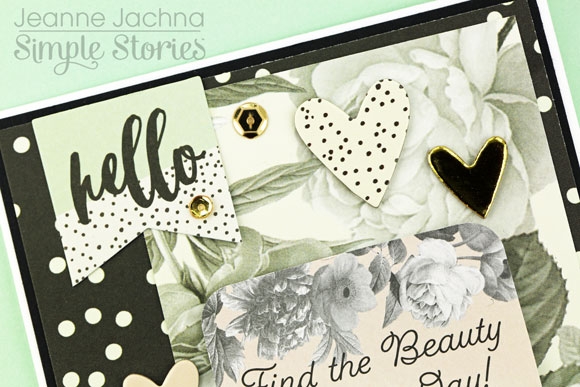
This aptly named Beautiful Collection is dressed to impress!
Hello scrappers! It's Lisa Dickinson here with you today, sharing some tips on getting mileage out of those paper collection kits! For me, that means they have to work with both girl and boy layouts. Even if the papers tend towards masculine (lots of plaid or wood) or feminine (lots of florals) I love to find ways to incorporate them into any type of design!
Today I'm working with the Vintage Blessings collection, a great mix of prints in autumnal colors and patterns. Since the first layout features my daughter, I wanted it to have a more girly feel. But instead of working with only the floral patterns or softer colors in the collection, I chose to add feminine flair by creating flowers from several of the patterned papers.
I hand-cut petals from a variety of papers and then adhered each bloom atop a piece of scrap white cardstock. Then I added machine stitching around each petal and adorned the centers with plain wood buttons. Once finished, I trimmed out each flower and adhered them on the page to frame my photo.
The resulting design has a definitively feminine feel even with plaids, ginghams and stripes included. And the flowy script title reinforces the page theme as well. Now, let's see how I used the same paper collection for a boy layout!
In this design, I wanted to focus on more masculine approach since the page is about my son. Though I used many floral papers, I incorporated them into a chevron pattern so they would seem overly girly. And I mixed in some darker plaid ad a few gingham patterns to balance the florals.
For the title, I chose the blocky die-cut Silhouette cut file, Love Today, and cut it out of gray cardstock to further reinforce the masculine theme. A few simple chipboard embellishments finish off this page!
So don't shy away from papers just because you think they'll only work for one gender! Try these tricks for using them on any type of page you might want to create!

I'd like to share with you how I've set up the Blush A5 CarpeDiem planner using the Bloom collection.
I took the brave decision to use a set of the Bloom personal size monthly inserts and use a variety of punches to make an assortment of bits & pieces to decorate the pages.
You can see here how I've used some of these to decorate the September insert.
I made tags to add the Bloom sticky notes onto and placed them in the front pockets of the planner, this was to not only make it look pretty, tie in the theme but also add functionality.
I didn't want to waist any of the paper from the personal inserts so I thought it would be fun to create a pocket page.
The Bloom sticker tablet was a great way to inject colour onto my monthly layout, I also used a black pen to doodle boxes, which I think have tied it all in nicely.
I hope you've enjoyed looking at how I've set my planner out, you can find lots more detailed pictures on my IG account https://www.instagram.com/heartsbyemma
Hi friends! Linsey here today sharing some spooktacularly festive treat ideas for Halloween! The Spellbound Simple Set is just perfect for all kinds of crafty desires this Halloween! In addition to treat holders and decorations, this set will be your go-to collection to preserve you Halloween photos and turn them into beautiful and classy Halloween scrapbook layouts! Spellbound has a touch of elegance and sophistication, which makes it great for older teen and adult Halloween festivities too!

The 3x4 Journaling Card Elements were used to decorate the front of each treat bag and some of the cool stickers from the 6x12 Sticker sheet were added as well. A pretty satin ribbon slider was tied around each bag and a few sequins for a sparkly finishing touch.

Each treat bag holds a decorated tube filled with a special concoction from the mad scientists lab...Mwahahahaha!

Thanks so much for visiting today! I hope you've enjoyed my Spellbound treat ensemble and feel inspired to have some spooky crafty fun of your own with this great Simple Set collection!


